We independently select these products—if you buy from one of our links, we may earn a commission. All prices were accurate at the time of publishing.
When you’re working with a small or dated space, finding good-looking kitchen storage solutions might seem tricky, but trust me, you can do it. If you need more room for cookbooks or a few key serving or prep pieces, a narrow, shallow bookshelf may be the perfect solution. For others who want easier access to cooking items and dinnerware without spending any money, removing upper cabinet doors can be a great option. If you find yourself somewhere in the middle of those two solutions — looking for a stylish, functional, and budget-friendly option — then you might want to check out this unique idea for storing more in a cook space.
For more content like this follow
A paper artist living in a 600-square-foot apartment in Buenos Aires, Argentina, Diego Martinez has been renting his current place for six years, and it serves as his home, studio, “chill space,” and home office all at once. Despite the size of his digs, Martinez knew he could turn it into a fully functional home, and that’s exactly what he did with s series of creative and intentional small space solutions. “I took my time to find each thing that is in my home — it is a continuous process,” Martinez says.
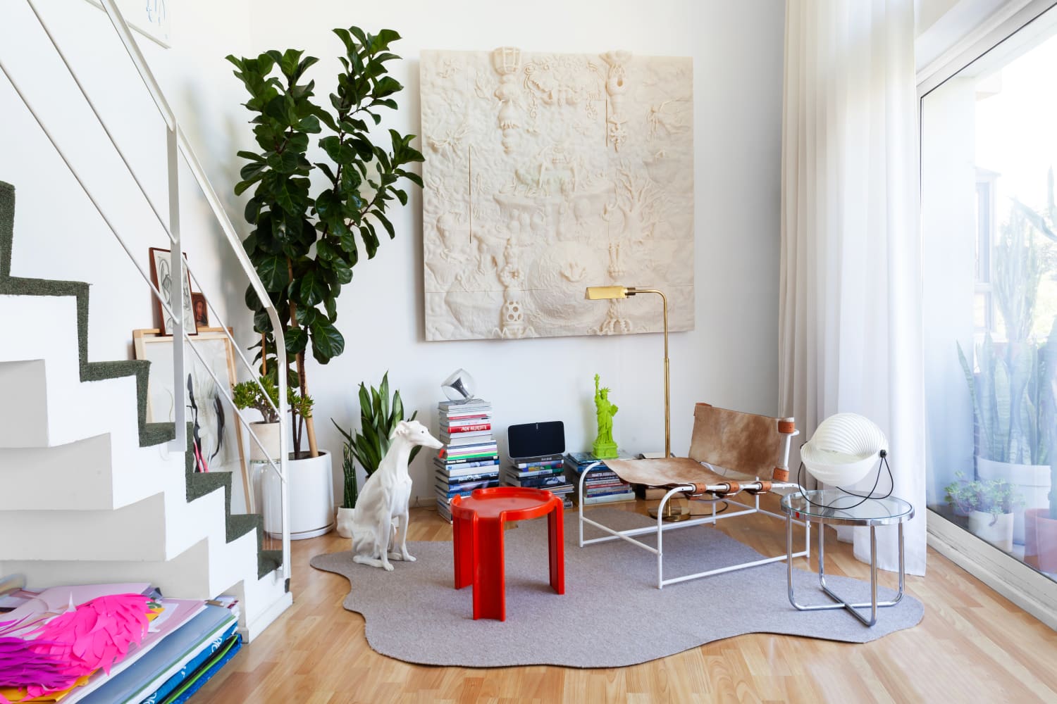
One space that needed extra thoughtful planning? His kitchen, which is one of the tiniest rooms in the house. With just floating shelves above a bank of lower cabinets, Martinez needed more space to store his plates, bowls, and knickknacks. That’s where a sleek three-tier storage rackcomes in handy, and you’ll love where Martinez put it: right next to his kitchen peninsula, as shown above.
On a stretch of empty half-wall space by his kitchen peninsula, where many people choose to place stools, Martinez opted for storage instead. “My biggest challenge has been finding my own style and choosing the objects I really like,” he says. This shelf provides a great opportunity to display some of those items and keep cookware and other serving pieces at the ready. Sure, Martinez has to forgo seating in this spot, but it’s worth it for the storage. He also has a table right next to this spot for dining, so it’s a decision that doesn’t really impact his ability to entertain or host. Come to think of it, putting a shelf in this space mimics the effect custom kitchen islands often have, where built-in shelving provides the perfect spot for cookbooks and more.
The style of this particular rack is great for multiple reasons. For one, it’s made entirely of metal, so you don’t have to worry about the shelves being sturdy. The height of this rack is also pretty low, so it won’t take up too much wall space. Find a version like Martinez did — which matches his peninsula’s wall pretty closely — and not only will your rack recede into space and look visually light, but your cool objects will also take center stage. You can barely see the rack in this pulled-back view of Martinez’s home below.
So if you’re looking for a sleek, affordable way to display some things you don’t presently have the space for, you might consider one of these low-slung storage racks for your kitchen. Chances are you aren’t really using those stools you pulled up to your kitchen peninsula, and your smaller cook space might be better served with a storage rack in this spot instead.
When Bobby and Ann got married, they decided to call Ann’s house of 10+ years their home. While the space worked for Ann during her single years, the couple were looking to give the house some practical upgrades that made it better suited for two people. In the latest episode of HGTV’s “No Demo Reno,” the newlyweds called on Jenn Todryk to help them turn their house into a home where they could entertain their friends.
For more content like this follow
With a budget of $85,000 and timeline of seven weeks, Jenn got to work with her team. The focus points of the renovation were the kitchen and the main bathroom, which were both in need of several updates.
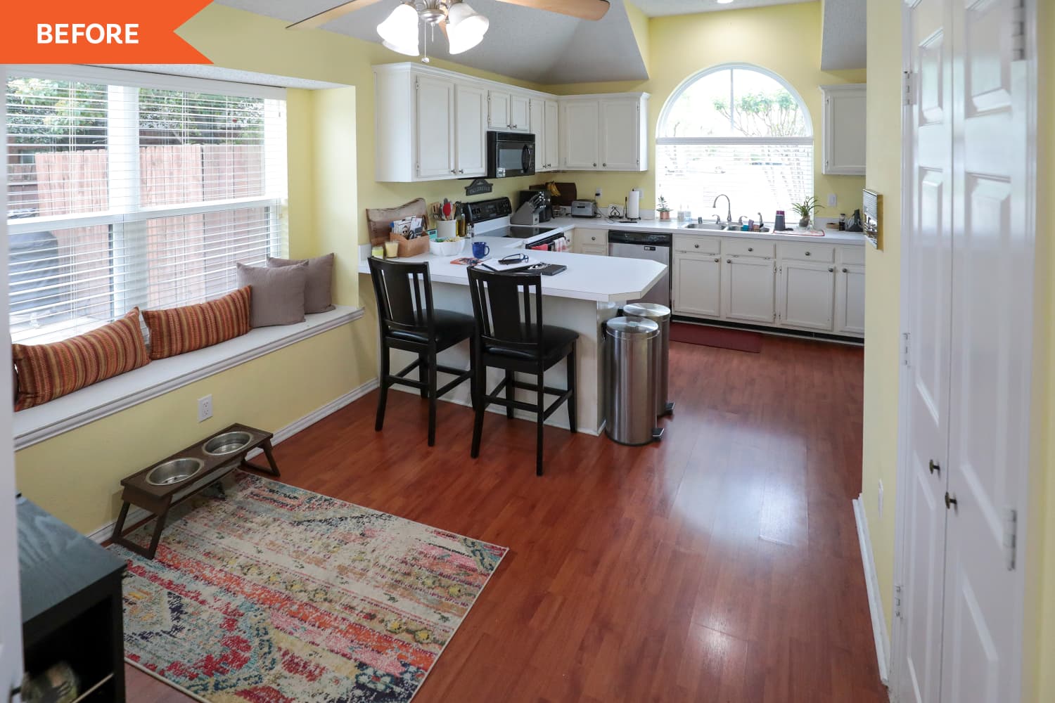
The kitchen’s biggest issue was a lack of function. The room began as a yellow, slightly outdated cooking space with no table. Bobby and Ann were able to eat at the countertop, but it was hard to find seating for any additional dining guests. The room was crowded by a wine rack and fridge, and two bulky trash bins. Bobby also noted the lack of storage in the space, which kept them from properly storing their smaller appliances.
Jenn and her team began the renovation by removing “pretty much everything except for the walls.” They gutted the old counters and cabinets and replaced them with all new products. The countertops were a simple, clean white and the cabinets came in two colors. The top cabinets were white and the bottom cabinets were navy blue. Both sets of cabinets provided a wealth of additional storage. The team also painted over the yellow walls with a white-gray color. After asking the newlyweds about pattern preferences, Jenn opted for an intricate tile backsplash.
“I went calm on the countertop because I wanted to give you all something fun, funky, and geometric on the backsplash,” she shared during the reveal.
Jenn installed a polished nickel light fixture to give the room some additional brightness (while still matching the gray tones in the room). She also brought in a new dining table and black chairs that matched the black counter stools. The room was finished off with a nook by the table, which allowed for additional seating for extra guests.
Like the kitchen, the bathroom lacked a natural flow. Although there were two sinks in the vanity, Ann’s stuff had slowly overwhelmed the space and made it difficult for her and her husband to get ready at the same time. The beige and tan room was also outdated, with old tiles on both the floor and countertop. The shower was also an issue for both parties, since it was too small to comfortably fit Bobby and didn’t have a convenient place for Ann to shave her legs. The duo requested a bright space that was calming, serene, and easy on the eyes.
Jenn and her team started by painting the walls green-gray and adding new patterned tiling to the floor. “I want something fun and funky, because it’s such a small bathroom floor that we can get away with, like, a really cool marble cut,” Jenn explained. She had her team move the shower to another part of the room altogether, which allowed them to elongate the vanity and install two new cabinet spaces for extra storage. The additional space made the bathroom, and the home as a whole, more functional for the day-to-day lives of two people.
“No Demo Reno” airs Thursdays at 9 p.m. ET/PT on HGTV.
After having their first child, California residents Megan and Jeff realized that they wanted to be closer to their family and began looking for property in New Hampshire. Following an intense online search, they purchased a 1798 Pelham, New Hampshire farmhouse sight unseen. The young couple called on farmhouse expert Jonathan Knight to help them bring the home into the 21st century (while maintaining some of its historic charm) in the season 2 premiere of “Farmhouse Fixer.”
For more content like this follow
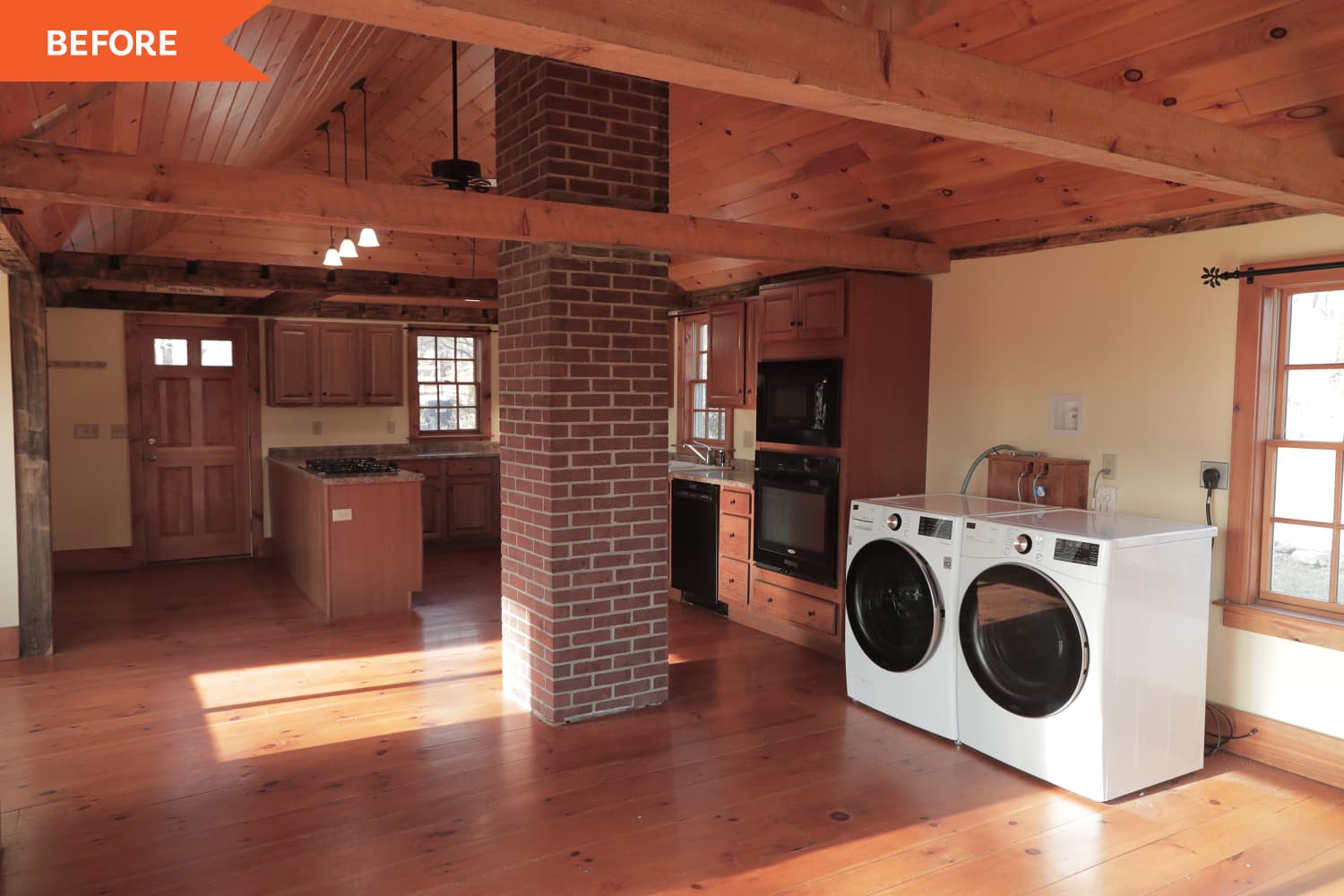
While most of the house needed some work, the bulk of Jonathan’s renovations took place in the kitchen. The space began as a wood and brick-filled room. The darkness of the old wood floors matched the kitchen cabinets and ceiling. The space was cramped by the peninsula-shaped countertop and the inclusion of a washer and dryer. The entire flow of the space was thrown off by the brick pillar chimney that was built in the center of the room. Megan’s main hope was for an island countertop, rather than a peninsula, and Jeff requested that they remove the chimney to help open up the room.
With the help of designer Kristina Crestin and the rest of his team, Jonathan gave the room a neutral, modern makeover. After removing the peninsula and bringing in a massive kitchen island, the team added white walls, white trim, white countertops, and taupe cabinets. They also painted the ceiling white, but kept the dark wood beams. Jonathan re-finished the wood floors, which gave them a lighter and cleaner look (rather than the original orange hue) that was more complimentary to the brightness of the room.
“I love that you kept the beams,” Jeff said, upon seeing the final product. “It ties into the rich history of the home and the character.”
The team removed the brick chimney, which wasn’t structural, and the space immediately opened up. They also brought in a wooden dining table, curtains, and two accent chairs to help flesh out the room. In an effort to help give the room some pop without introducing major colors, Kristina picked out black counter chairs and black fixtures. She said that she categorized the color as a neutral that was still able to add contrast to true neutrals. “It feels appropriate to the house, but it can also feel kind of modern,” she explained.
The highlight of the kitchen was the new pantry that Jonathan and his team built. The white and light wood pantry was created in an effort to discreetly house the washer and dryer, but it also became a beacon of extra storage. In addition to subtle shelving, Kristina added eight reclaimed pickle boxes for easy, classic storage (and as a tribute to the home’s origins).
“All this old farmhouse needed was a family who wanted to take a chance,” Jonathan said, “And now, that leap of faith is paying off.”
“Farmhouse Fixer” airs Wednesdays at 9 p.m. ET/PT on HGTV.
Arielle Tschinkel is a freelance pop culture and lifestyle writer whose work has appeared on Shape.com, WomansWorld.com, FirstforWomen.com, Insider, HelloGiggles, and more. She loves all things Disney and is making her way to every park around the world, and is a die-hard Britney Spears fan for life. She’s also obsessed with her Bernedoodle, Bruce Wayne.
Erin and Pete Connor spent seven years in their Tudor-style home waiting for their kids to get a bit older so that they could “make it nice.” When the time came, they enlisted Meg and Joe Piercy to help give the living space — including the kitchen, dining room, and office — some much needed updates. In the latest episode of HGTV’s “Renovation Goldmine,” the Piercys helped modernize the Oak Park, Illinois home and make it more functional for a busy family of five.
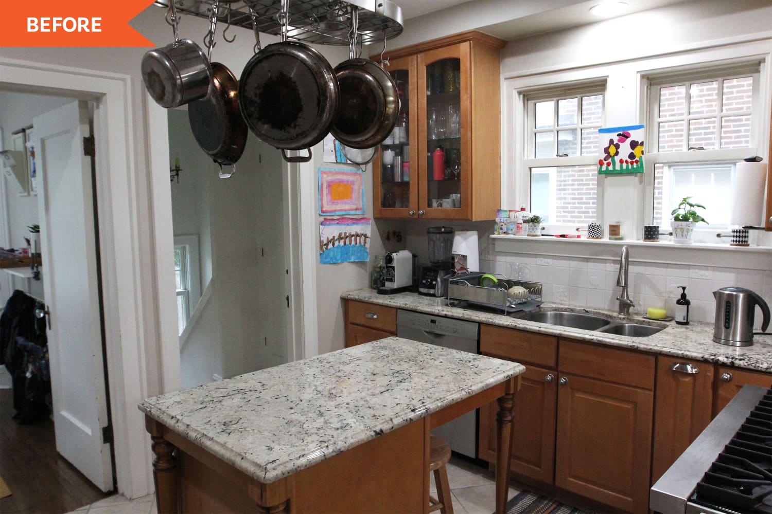
Before the renovation, the layout of the house was tight, consisting of several small rooms that were loosely connected. The kitchen was cramped (especially in proportion to the rest of the house) and had no cabinet space. The pots and pans were hung awkwardly over the small wood and marble island and all of the dishes had to be kept in the dining room, which was situated in a small dining area off to the side of the kitchen. The cramped dining room extended into a large catch-all back room space, which the family once used as a playroom for the kids and had since turned into an office space.
With a $75,000 budget, the Piercys kicked off the renovation. They began by tearing down one of the kitchen walls and opening up the entire space. They also gutted all of the original counters so that they could rebuild the kitchen from scratch. With the new square footage, they installed dark wood (upper) and green (lower) cabinets along an entire wall. Erin picked out an understated gray backsplash, which added warm tones to the cabinet colors.
Meg and Joe got rid of the original small island and instead brought in a “massive” island that extended along the majority of the room. To help with the sizing, the couple and their crew “waterfalled” the island so that the white counter dropped off to a walnut wood tabletop at a slightly lower height. The variation in height helped make “it feel like it’s not quite so long,” according to Meg. They also added chairs to the tabletop for casual dining experiences.
The Piercys decided to swap the office and old dining area. In the new dining room (the back room), the Piercys ripped up the carpeting and added black and white “checkerboard” tile for a vintage (but still updated) look. They also painted the trim and walls “off black,” because it was balanced out by the abundance of natural light that came in through the windows.
The new office space (the old dining room) received the most colorful update in the house. The room started out as a blank canvas, with white-gray walls, white window trim, and white built-in corner cabinets. The Piercys removed the old dining table and placed a classic wooden desk and chair in the center of the room. They painted the trim and cabinets blue and brought in floral wallpaper (with a light blue background) to help pull the space together. The wallpaper had a very traditional look, which gave the appearance that it had been a part of the house’s original build.
“This was a budget-saving room,” Meg explained to the homeowners. “We really just wall-papered, painted, and everything else was already here.”
“Renovation Goldmine” airs Saturdays at 10 p.m. ET/PT on HGTV.