10 Dark Green Color Pairings That Will Infuse Your Home with Organic Beauty

10 Dark Green Color Pairings That Will Infuse Your Home with Organic Beauty

Post Image

Dark green shades bring a delicate balance of drama and tranquility to any space. This sector of the color wheel has become a mainstay of interior design schemes across a range of styles. Hunter, forest, olive, and similar green hues have reigned supreme in the post-pandemic world as well as we’ve learned how soothing and refreshing biophillic design can be. While choosing a dark green for the aesthetic of any room can feel a bit bold, we’ve rounded up 10 clever color combos to infuse a sense of organic elegance, laid-back coziness, or eclectic juxtaposition for whatever look you’re going for. 

For more content like this follow

Post Image

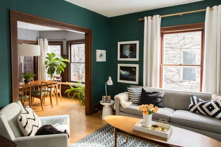
1. Dark Green, Black, White, and Gray

Dark green may be a great choice for those who are fans of neutral color schemes and Scandinavian design but are seeking more visual interest. The living room in this Minneapolis home proves that even a saturated shade of dark green can still act as a neutral. Here, it pairs splendidly with muted, neutral hues.

Post Image

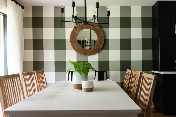
2. Dark Green, White, and Bamboo

White and lighter shades of brown can help balance a deep green, plus they make an excellent color combination for those seeking to bring the outdoors inside. Here, the owner of this adorable Ontario home painted a DIY buffalo check wall in various shades of green. The result is an enlivened dining room for any season and holiday that doesn’t overpower. It’s the perfect complement to any modern farmhouse aesthetic.

Post Image

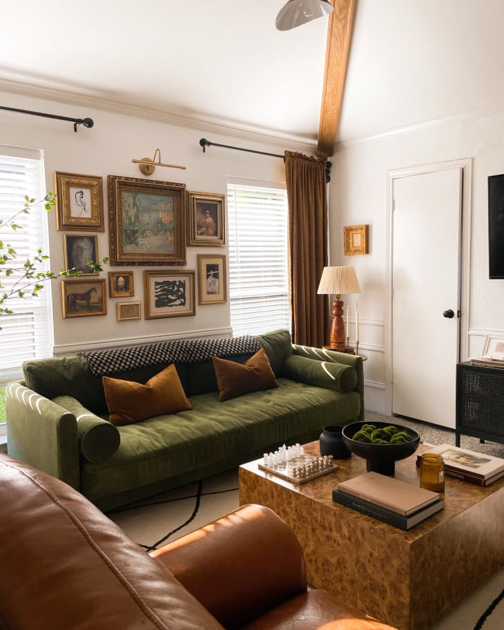
3. Dark Green and Mustard Yellow

Dark greens are often associated with plant-centric bohemian style. Here, we love how the Wovn Home team paired the color with a mustard yellow for a well-collected look. Textured accents like boucle pillows, a velvet sofa, and dark yellow blooms bring sunshine to dark green walls without stealing the spotlight.

living room with green wallpaper

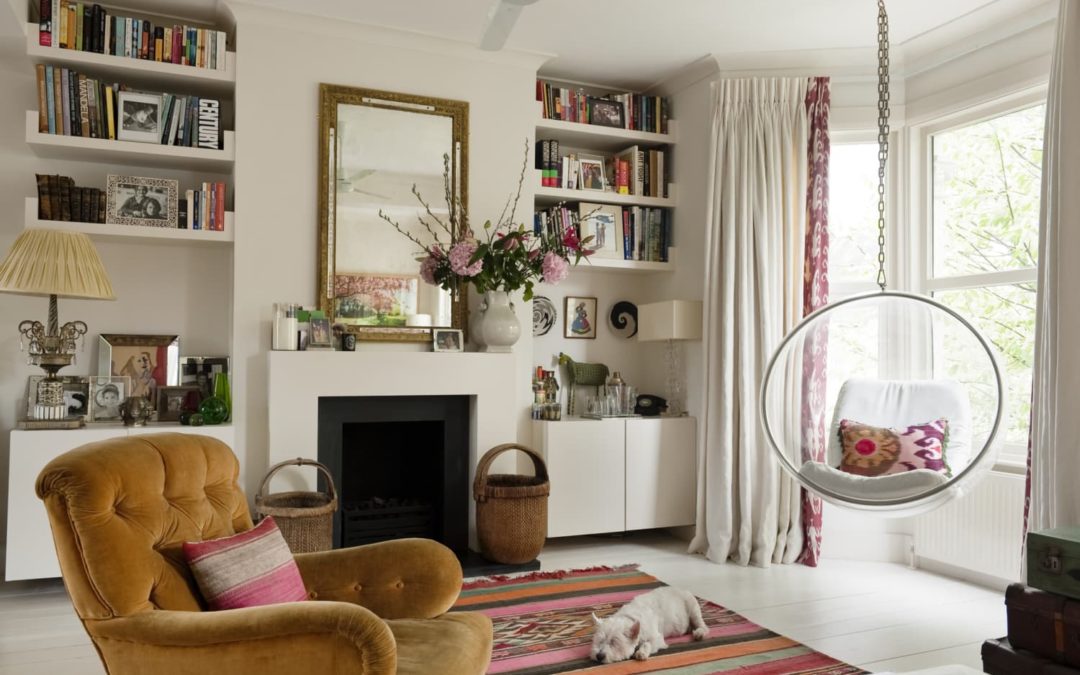
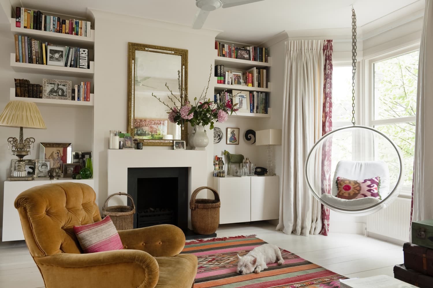
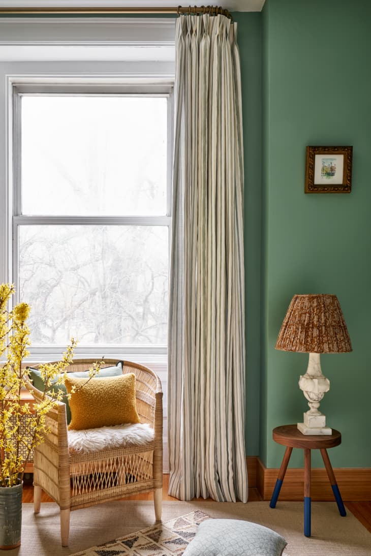
4. Dark Green, Gray, and Dark Brown

Sarah Malek Barney of Band/Design loves to pair a rich shade of dark green with softer tones. The result is a well-rounded space inspired by the outside world. Additionally, a mix of sumptuous textures and beautiful woods adds to this sitting room’s organic yet elegant vibe. 

“Combining this dark, earthy green paint color with the softer gray tones of the surrounding furnishings gives the room an overall natural look and feel,” says Barney.

Post Image

5. Dark Green and Magenta

Designer Louise Misell created this lovely space to fit the period features of her client’s home while still feeling appropriate for the modern age. A punchy shade of pink, like magenta, makes a serene yet indulgent pairing with a bit of unexpected pizzazz. 

“Using dark green can seem a little scary, but it’s actually very versatile, and always adds a warmth and depth to any room it’s used in,” says Misell. “I chose dark green as it has the effect of embracing us in a cocoon of comfort, almost like the room is giving us a hug. I paired it with quite a punchy pink with touches of blue and peach to add some drama and contrast to the scheme.”

Post Image

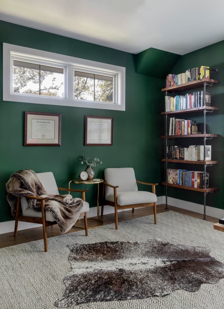
6. Dark Green, Cream, and Chocolate Brown 

We love the level of restrained drama in this sitting room by Albion Nord. The space proves that you don’t need multiple patterns or vibrant colors to make a powerful design statement. Plus, leaning towards a chocolate brown hue feels more elevated than pairing dark green with a lighter shade. 

“I tend to avoid anything gray and prefer to use architectural creams or earthy greens,” says Camilla Clarke, the firm’s creative director. “Our favorite hues to use in an interior are muted tones which create calm and soft spaces.”

Post Image

7. Dark Green, Dark Blue, and Yellow

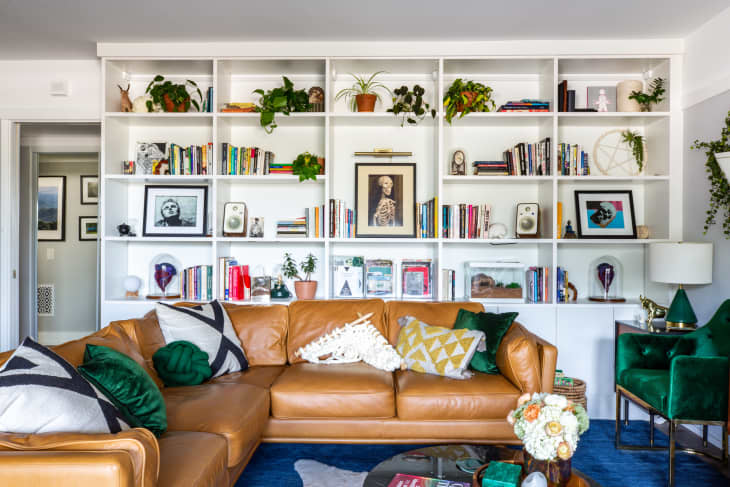
The L.A. home of artist Ben Cuevas features a jewel-toned dark green paired with a saturated dark blue hue and a dusty yellow for a one-of-a-kind space. White walls allow this pairing to shine and keeps the living area from feeling too busy or maximalist. 

Post Image

8. Green, Gold, and Brown

If you’re all about those mid-century vibes, look no further than this Plano, Texas home that is full of green, gold, and brown touches. The owner infuses her love for Parisian and French country style here with antique framed artworks, sculptural pieces, and elegant fabrics that feel equally refined and welcoming. 

A green bedroom with a pink rug, bed, and overhead light

Main bedroom 1

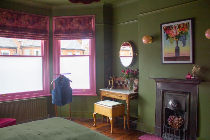
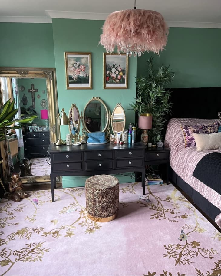
9. Dark Green, Black, and Pale Pink

Color and pattern abound in this Hampshire, U.K. home. The bedroom is no exception and evokes the home’s 1920 roots. The subtle shade of dark green feels more accessible to color newbies while black adds a chic accent color. Lastly, a pale pink rug and bedding lend a touch of femininity. 

Post Image

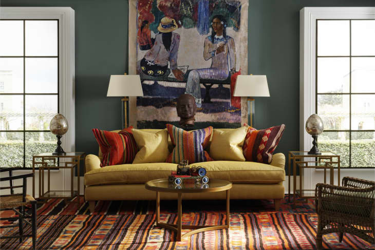
10. Dark Green, Tomato Red, and Mustard Yellow

“Green hues pack a full yet understated punch,” says Martin Waller, founder of Andrew Martin. “It can transport you to the cool tiled floors of Marrakesh or to the traditional drawing room of a late 18th-century Georgian mansion, and it’s being used more and more in interiors today.”

The Andrew Martin team brings global flair to a gracious sitting room. Dark green paint anchors the room while color, pattern, and texture abound. This pairing feels both modernized and Old World, allowing you to explore and define your personal design aesthetic. 

A Designer Spices Up a Black and White Palette With Pops of Warm Color and Art

A Designer Spices Up a Black and White Palette With Pops of Warm Color and Art

We independently select these products—if you buy from one of our links, we may earn a commission. All prices were accurate at the time of publishing.

Designer Marie Cloud of Indigo Pruitt Design Studio always starts her projects with the why, asking her clients what home means to them. From there, she comes up with a strategy for shaping a space that reflects that vision to intentionally furnish rather than just fill a house. That’s precisely what she did at this home: She turned what was basically a blank slate into a warm, welcoming haven perfect for the family of two that lives there.

For more content like this follow

Prior to starting on the project, the home wasn’t in disrepair — the rooms just needed personality and purpose. “The home didn’t really have any decorative features,” says Cloud. “The walls were the standard off-white and even a weird baby blue in a few rooms — very bizarre. There was furniture but only from a functional standpoint… nothing eye-catching.” Certain areas of the home weren’t really being used for anything so they became catch-alls for random items. The whole space needed an overhaul, and Cloud was up for the challenge.

To kick things off, Cloud sat down with her client, a doctor raising a five-year-old. “She wanted a space that felt like home and that was mature and inspiring,” says Cloud. “From the moment I met her, I was so inspired by all that she took on and how she exuded strength and worked so hard daily. My goal was to create a space that reflected that strength that I saw in her yet still be a place of retreat and recharge after a long work day.” 

Cloud likes to ask prospective clients this simple question: What do you want to feel when you enter a room? “It’s my favorite topic to have with a client, and I spend a lot of time processing over their responses to ensure that my design is not only gorgeous, but it also sparks something within them,” she says.

For this home, the descriptors that came to the forefront were inspiring and uplifting, but still cozy and relaxing. So Cloud set about creating an environment that was just that, first by curating a palette of airy whites and grounding blacks — and then peppering in a mix of warm shades like coral, lilac, green, and cranberry with decorative accents, furnishings, and finishes. 

Artwork, pops of pattern, and paint in particular all play starring roles in the home. “We used all Sherwin-Williams products and colors,” says Cloud. “Each room was strategically selected to create playful contrast with hints of bold saturation.” For example, she had the living area walls coated in Eider White (SW 7014), and it sits perfectly next to the renovated fireplace coated in Black Magic (SW 6991). Cloud also incorporated that same black hue on the ceiling of the “she cave,” which has Modern Gray (SW 7632) walls and centers on a curved channel-back lilac sofa that’s meant for sinking into and relaxing.

The dining room, painted in Worldly Gray (SW 7043), features a warm mix of materials, including a handsome wood table, beaded chandelier, and set of oversized floral prints. The ceiling sports a graphic patterned faux coffered look, while metal chairs amp up the glam factor of the space. 

In the kitchen, Pewter Green (SW 6208) cabinets introduce a little earthiness to the bold, matte black hex tile backsplash. Black and cream square printed wallpaper above the wainscoting in the nearby breakfast nook plays off the tile’s geometry, while the base of the caned table introduces yet another hexagonal shape to the mix.

The bedrooms, in particular, are true respites from the world for each of their respective occupants. In the kid’s room, soft neutrals and sherbet accents create a sweet backdrop for sleeping. Floor cushions stacked in the corner of the room become a cozy book nook when paired with shelf rails that hold favorite reads.

Splitting the work into two phases over the course of about a year, Cloud did encounter some pandemic-related setbacks — from material shortages and increased supply chain lead times to inflation and the a couple COVID-19 exposures and necessary quarantines. Still, everything was completed without any major hiccups. “We were very cautious in our efforts to try to keep everyone safe and not put pressure on ourselves to rush the project given all that we were up against,” says Cloud. “In the end we were able to finish well and finish strong, in the midst of that adversity, with a beautiful result that everyone is proud of.”

Talk about house pride — now decorator and homeowners alike can’t believe how beautiful fans functional the spaces have become. “I love that each room has its own uniqueness and personality, yet all spaces have great chemistry and play so well together,” says Cloud. “The homeowner loves that she has a home that has character and reflects her tenacious and bold personality. More importantly, she is so pleased to have a home that she proudly shares with friends and family.”

5 Things I Learned from Taking an Interior Design Class

5 Things I Learned from Taking an Interior Design Class

When my husband and I were quarantined together in our one-bedroom apartment for the first half of 2020, after my workday ended, I found myself learning Portuguese on Duolingo, watching roller coaster videos on YouTube, and constantly daydreaming about redesigning our entire apartment. I was yearning for a creative outlet, and the thing that felt the most exciting to pursue was interior design. Especially since we were home all day, the itch just wouldn’t go away. I finally decided to enroll in Kelly Robinson’s Where Spirit Meets Space, a 28-day design course, with the intention of transforming our little apartment, one project at a time. And I am so glad I took the plunge. 

For more content like this follow

The course went beyond just design principles and explored the deeper connection we have with our home, ourselves, and the world around us. I did indeed transform our apartment, and the impact on my mood and overall well-being was huge. Here are some of my favorite takeaways from the course, and the one thing I learned not to do.

Mixing colors and textures balances out a space.

In my early 20s, for some reason, I thought dark brown would pair well with just about everything. And while there’s nothing wrong with dark brown, at the time my husband and I had a brown sofa, chair and ottoman, coffee table, dining table, and dining chairs. It was a lot of dark brown. I had no clue how to balance it out. Robinson’s course describes balancing out a space with the five elements: earth, fire, water, metal, and wood. A balanced space will have a mixture of all of these elements, and while they’re not all literal, the quality of each element should be present in some way. Earth can show up as anything made with brick, clay or ceramic, as well as anything earth toned. Fire can be a candle, a salt lamp, or the color red or orange. Metal and wood are self explanatory, and water shows up as the color blue, black, or gray, or materials like glass or mirrors. I love looking at decorative shelves around my home through this lens — if something feels off, I’m usually missing at least one element. 

Bringing nature in makes you feel good.

There’s a reason people tend to vacation places with picturesque landscapes, like beaches or the mountains. Nature is calming, whether you’re watching a sunset or swimming in the ocean. So it makes sense to have natural elements in your home as another way to create calm, and help you feel comfortable and at ease. Decorating with houseplants and flowers is a great way to bring nature inside, and faux counts as well! Even having artwork of natural scenes does the trick, and opening up your windows for fresh air and sunshine is a way to add beauty to a space that doesn’t involve design at all. 

Your outdoor space is an extension of your indoor space.

Prior to taking this course, my small balcony was empty. Then, I learned any outdoor space you have is an extension on your indoor space. I first added solar powered string lights, and the change was immediate. All of a sudden, we could see the soft glow of twinkle lights coming through the window after dark, and it instantly made our space cozier. I eventually added some plants, a small patio set, and an outdoor rug — and it felt like we’d added square footage to our apartment. Mind blown! Even if you don’t spend a ton of time outdoors, notice if you can see your outdoor space from inside your home, and consider anything you could add (or take away!) that would add a little more beauty to your lives inside.

Clear your space before you add to it.

I was definitely in the camp of, “Let’s go buy a bunch of things to create my dream space!” prior to taking the course. But then I learned the very important first step of any project: decluttering. If you don’t take the time to clear the space you want to work on, you can set yourself up for introducing more clutter, and even overspending. You may discover you’ve been hanging on to some things you don’t need anymore, and clearing the clutter away before you dive in can also help you see a room in a whole new way. 

Robinson introduced me to the idea of essentialism, or only having things in your home that are essential to you, your family, your happiness, and your well-being. It’s not necessarily about having less, but more about knowing the value and purpose of every item you choose to keep. This can be quite a process, especially if you’re decluttering, but there is so much to gain when you let go of items you don’t use anymore, or have fallen out of love with. If you’re diving into your own design projects and bringing new pieces into your home, be sure to check in and ask yourself how essential each item is. And yes, decor pieces like art, unique furniture, and tchotchkes can be essential too!

Don’t wait for permission to decorate your home. 

Ironically, the one thing this course taught me to never do is wait for the approval of a third party to design my own space. Following my curiosity, investing in myself and taking this course was the permission slip I didn’t know I needed to start designing and styling my own space. I spent so much time daydreaming and creating mood boards in my mind, but didn’t have the courage to act on any of it because I thought I needed some sort of credential, or a stamp of approval from someone else doing it on a larger scale than I was. The truth is, I didn’t need a permission slip! While I did learn so many valuable things from the course, the biggest thing I learned was to trust my instincts, and to have fun. You don’t need a degree to make your space beautiful, and while I definitely added design and styling tools to my tool belt, I mostly learned to take the pressure off of myself to get things perfect, try new things, and enjoy the process.

This piece is part of Transformation Month, where we’re showing off amazing home makeovers, brilliant tiny tweaks, inspiring before & afters, and so much more. Head on over here to see it all!

The 15 Best Sources for Outfitting Your Small Space

The 15 Best Sources for Outfitting Your Small Space

We independently select these products—if you buy from one of our links, we may earn a commission.

Furnishing a shoebox of an apartment or a tiny home can be quite the challenge, especially if custom goods are beyond your budget. But it is possible to be strategic about how you source items, from carefully choosing the retailers you shop at to browsing sections like the “back to college” department, for example, where you might never have thought to look. And of course, double-duty items, smart storage pieces, and clever repurposing opportunities are always your small space’s best friends.

No matter your style or budget, there’s a small-space-friendly store out there for you. Add these 15 designer-approved sources to your bookmark list, and happy shopping!

It’s always good to have a plan when it comes to shopping at IKEA since this Swedish megastore is constantly introducing new products and has lots of inventory. So what do pro designers recommend? “Their open-back shelving is super flexible and can go in a ton of different types of rooms — playrooms, libraries, bedrooms,” says designer Jennifer Jean Morris of JMorris Design. “I added some interior shelves to an entry, and it became a great shoe depot, and with some bins, I can grab gloves or sunscreens for on-the-go.”

In fact, IKEA’s KALLAX series is also a favorite of designer Janet Lorusso, principal and owner of JRL Interiors. “This is my favorite piece for small spaces because IKEA also sells a variety of bins that fit the cubbies, as well as drawers and doors, so you can configure it to be covered or open storage specifically for whatever you need,” says Lorusso. “It can function as a cabinet, a drawer, a display, or a bookshelf and comes in a variety of configurations that can be used vertically or horizontally.”

Lorusso is also a fan of the new HEMNES daybed. “It’s a sofa by day and a bed by night as well as a dresser because of the storage space underneath,” she says. Talk about a triple threat! These kinds of multitaskers are the kinds of pieces you should invest in to maximize your square footage.

When you want more of a choice in patterns and colors, or maybe something a little trendier than IKEA, give West Elm a look. “What I love about West Elm is that they have smaller apartment-sized sofas and smaller chairs in all kinds of colors, styles, and patterns,” says Alice Chiu, principal of Miss Alice Designs. They even have a curated “Small Space Solutions” landing page, so modestly sized abodes are clearly top of mind for their in-house design team.

This one may come as a surprise if you don’t keep up with home news, but Pottery Barn actually launched a dedicated small-space collection, PB Apartment, a few years back, and it’s good, y’all. You’ll find transitional sofas, desks, consoles, beds, and dining tables with petite proportions, plus modular shelving and items with extra built-in storage. A lot of the pieces are in stock and ready to ship, meaning you don’t have to wait weeks for custom-made designs, and many are also part of PB’s “everyday value” pricing structure, so they won’t break the bank.

This NYC-based retailer is the place to go for multifunctional pieces and furniture that transforms — think Murphy beds, sofa beds, and furniture with streamlined silhouettes. Their modular pieces can also accommodate drop-down desks and extra storage compartments. “One room we designed for two brothers with Resource Furniture featured tall storage units with beds above and desks below,” says designer Elizabeth Sanchez Vaughan of In-Site Interior Design. “It was a lot of function for one small room.”

Designer Melanie Morris of Melanie Morris Interiors is another fan of the brand. “Going to Resource Furniture with a client is like taking them to a magic show,” says Morris. “One of their products I absolutely love is their Goliath Glass Console Table that goes from 17 inches in depth to a full-fledged dining table up to 115 inches long.” Magic indeed! Morris is also a fan of their Murphy beds.

Looking for a sofa that’s tiny but doesn’t skimp on style? Check out modern e-tailer APT 2B for a bunch of apartment-sized, made-in-the-USA options. The store stocks lots of different silhouettes, and you can order fabric samples if you want to check out one of their bold colorways in real life before committing. (Don’t worry — beige, gray, and navy are options, too.) APT 2B is also the exclusive upholstery partner of designer Kyle Schuneman, who was named a House Beautiful top 20 new design talent to watch. Did I mention the sofas also come with a lifetime warranty? That’s a lot of mileage, folks.

Over the years, modern furniture emporium CB2 has quietly built up its more modestly sized offerings. They don’t have a small-space collection, per se, but they stock folding tables, wall mount shelves, and cabinet-style wardrobes for those who deal with another small-space tragedy: lack of closets. If you’re looking for clean and compact home solutions, definitely check them out.

When designer Hillary K. Cohen of hCO INTERIORS is working on a spatially challenged room, she loves to visit Calligaris, especially for dining tables. “They have modern pieces that are designed with great proportions and smart touches,” says Cohen. “In our ‘River Residence’ project, we used a round dining table with a marble top that expands when you have more guests.” Not only is the base of the table designed to fit as many chairs as you need, Cohen says the extension pieces for the top are also stored within the table. That’s a true space saver.

Sara Cannon, designer at House Heroes LLC, is all about shopping at chain stores targeted to young folks, like Urban Outfitters and even PB Teen, for scaled-down pieces. “My own home is a 1920s row house, so it’s super narrow and has smaller rooms that are way more compartmentalized than a modern home,” says Cannon. “While I treasure my ‘grown up’ pieces, I have to admit that I scored quite a bit of decor and storage items during back-to-school sales when retailers are targeting college students moving into little apartments or dorms.” Urban Outfitters is great for sofas and beds, but they also offer rolling rack storage solutions, shelving units, side tables, and ottomans from a lot of the same vendors as sister store Anthropologie. On the whole, UO furniture is just a bit smaller and more youthful.

When you’re looking for special storage pieces, make sure Expedition SubSahara is on your list. Founder Sofi Seck stocks beautiful woven baskets in tons of different colors and sizes, with or without lids, so you’ll surely find something that catches your eye and fits in with your design scheme. Many of the styles are great for entryways, bathrooms, and media rooms.

Fans of a more minimalist aesthetic will appreciate this Japanese chain store‘s stylish brand of housewares and storage items. Additionally, many of their pieces have simple, scaled-down silhouettes, particularly in the furniture collection. If you are looking for more compact cooking utensils and closet organization solutions, you can find these kinds of items here, too.

If you have a bigger budget, Made Goods is an amazing resource. “Small-sized heaven — they often have petite sizes for bedside and console tables that can be nimble,” says Jennifer Jean Morris. Translation: Their little pieces can really go anywhere in the house and (literally) fit in. The craftsmanship is on point, too. “Their quality and finishes are so refined, so you really don’t feel like you are giving up anything,” adds Morris.

Don’t let the name fool you — since 1969, this New York-based store has been a go-to for far more than just cabinetry. You can find relatively affordable custom wood furniture of all sorts, including storage beds, wall units, radiator covers, and dining tables. Freestanding and built-in styles run the design gamut, from Early American and Art Deco to Shaker and mid-century modern. Many pieces are backed by a lifetime warranty, and you can get a custom job quote for free. Check out their clearance and floor sample section for ready-to-ship items at even deeper discounts.

Think of the newish direct-to-customer brand Open Spaces as a tightly curated, cooler younger cousin to The Container Store. Their current collection includes different kinds of organizing accessories, from bins and baskets to racks and dividers. The overall look and feel is clean and modern, thanks to a muted palette of light woods, gray felts, and powder-coated steel.

Another great Japanese minimalist brand is Yamazaki, which specializes in small-space-friendly storage and decor pieces for every room of the home — particularly the kitchen, bathroom, and entryway. If you love quiet wood pieces that mix and mingle with black and white, then this is a site fo you to shop, for sure. Keep in mind that popular sites like Amazon, Urban Outfitters, and West Elm also stock Yamazaki, so it’s always a good idea to compare costs to snag the absolute best prices.

If simple, Scandinavian-style interiors speak to you, IKEA is not your only option, particularly when it comes to shelving. In 1960, German designer Dieter Rams introduced his 606 Universal Shelving System, and this modular design is still a small-space dweller’s dream. Fill out this questionnaire, upload a photo of your room, add dimensions, and specify your budget. Then Vitsoe (606’s exclusive manufacturer) will come up with a configuration that’s best suited for you and your space (with no obligation to buy). The best part? You can keep adding to the unit and take the entire thing with you if you ever move.

Sarah M. Vazquez also contributed to reporting. 

Danielle Blundell

Home Director

Danielle Blundell is a New York-based writer and editor that covers interiors, decorating and organizing. She loves home design, heels and hockey (not necessarily in that order).

This Asheville Apartment Has Big Apple Energy

This Asheville Apartment Has Big Apple Energy

We independently select these products—if you buy from one of our links, we may earn a commission.

Sometimes the fourth time really is the charm. That was the case for one lifelong New York City couple, who at the beginning of the COVID-19 pandemic found themselves as empty nesters yet still somewhat cramped in their Manhattan duplex and ready to retire down south. The only problem? None of the local designers really “got” their style once they decamped and downsized. So they enlisted architect Daniel Ian Smith, principal and lead interior designer of Village West Design, who they had worked with on three prior projects, to turn their large, upper floor apartment into their dream destination.

Smith’s task was a tall one, as the apartment had fantastic views of Asheville’s historic landmarks and great bones but felt “cookie cutter” and “colorless” in the way that newer construction sometimes can. That wasn’t his vibrant, arts-and-culture loving clients at all. The space would need a serious dose of personality, as the clients planned on sourcing almost all new furniture and lighting that would let their prized art collection truly shine. Smith got to work right away, honing in on a crisp, clean decorating scheme anchored by soothing shades of blues and grays, handsome woods, and whimsical pops of warm, bright colors like yellow, red, and orange — often provided by the couples’ blue chip artwork.

For Smith, color is more than just paint on the walls, and his subtle but high-impact approach with this element of design is on display at all turns in the apartment. In the open-plan living room and dining area, whisper-light cream walls put the focus on the Asheville cityscape right outside the floor-to-ceiling windows, while a dark blue sectional grounds some of that airiness with its intensity. In a separate sitting area, another blue sofa plays off light grayish walls, both surfaces energized by the multicolored geometric rug underfoot and pops of red in a bookshelf, domed lamp, and pillowscape.

In some rooms, such as the primary bedroom and bathroom as shown above, these color relationships are inverted, with blues on the walls and lighter hues woven throughout as accents. Paired with wood furniture and hits of texture — like the grasscloth wallpapered focal wall behind the bed, for example, or even the navy tiled backsplash in the kitchen (shown below) — the space feels cozy, layered, and welcoming even though it’s on the more minimalist side.

Mellow yellow just might be the sleeper hit hue of the space — present in a few unexpected spots, from the guest bedroom walls to the second bathroom, where it provides the base color for a fun, geometric wall mural that strikes a retro note stylistically. In fact, the whole apartment has a bit of a contemporary meets mid-century modern vibe, thanks to key pieces from brands like BluDot, Room & Board, CB2, and West Elm, among others.

Smith also worked to ensure the couples’ art would be spotlighted. In fact, finding the right pieces for his clients, matching them with complementary frames, and placing them in the home properly is one of the designer’s favorite decorating challenges. For this particular project, he even sourced a special Marc Chagall work that the wife of his client couple wanted to surprise her husband with as a “thank you” for finally agreeing to settle down south. Framed by local purveyor, Blackbird, the piece now hangs above a console table and brightens up a dark bare wall. Smith also surveyed the local art scene and helped his clients make a few key Asheville acquisitions, including pieces by potter-glass blower husband-and-wife duo Courtney Martin and John Geci, whose shared studio Smith visited in person after touring it virtually from his California office. 

Of course, considering the scope and timing of this project, things exactly didn’t go off without a hitch. “Lead times started to creep up as we were sourcing, and we were working with a fixed deadline — the homeowners had already agreed to vacate their NYC apartment by a certain date, and as long-time repeat clients, the pressure was on to have everything ready for them when they arrived,” says Smith. “There were so many false starts with various vendors, an abrupt cancellation from the movers whose crew all seemed to contract COVID at the same time, and so many cancelled flights and postponed trips.”

To help offset some of the chaos, Smith brought on a local concierge to serve as the group’s eyes and ears on the ground in Asheville as the home took shape. She was able to offer local suggestions and pivots when logistical issues arose, mainly due to supply chain issues.

Against all odds, the project took exactly twelve months, from the homeowners’ first email inquiry on working together to the big (tears of joy-inducing!) HGTV-like reveal of the space. “The homeowners have texted, called, and emailed with gratitude so many times and seemingly love everything we created,” says Smith. What could be a better testament of a job well done than that?

Danielle Blundell

Home Editor

Danielle Blundell is AT’s Home Director and covers decorating and design. She loves homes, heels, the history of art, and hockey—but not necessarily always in that order.

Follow Danielle