by Furnishly | Jun 25, 2026 | Design Inspiration, Style
We
independently select these products—if you buy from one of our links, we may earn a commission. All prices were accurate at the time of publishing.
Amazon Prime Day is here, and our editors are sorting through thousands of deals to find the ones actually worth shopping. Shop our favorite furniture, smart home gadgets, cleaning essentials, and more here, now through June 26.
Out of everything in my closet, I would say that purses are the biggest pain to store. For a while, I was hanging them on regular clothes hangers because that method seemed like it took up the least amount of space. But I quickly realized that doing so was not good for the purse straps. Now I keep my handbags on the shelf above my closet’s hanging rod. They take up way more space that way, but at least they’re safe from damage.
I was browsing online for a solution that could help me store my bags more efficiently (without ruining them) when I came across the Wiosi Purse Hangers on Amazon. Shoppers largely agree that this is the brilliant closet solution every handbag-lover needs in their life, and more than 400 of the purse hangers were bought in the previous month. In other words, these hangers might be just what I’ve been looking for.
What Are the Wiosi Purse Hangers?
The purse hangers come in sets of three and retail for $18.95. That’s a relatively high price for one hanger, but reviewers are unanimous in their assertion that the hangers’ sturdiness and impressive storage capacity are well worth it. Each one is made of thick acrylic and features the standard hook head, only it’s coupled with a narrow body instead of your standard wide-shouldered body. To be specific, the part you hang your purses on is just under 2 inches wide, so it’ll barely take up space inside your closet.
Since each hanger measures 1.5 inches deep, that’s how much space your purse straps have to rest on. It’s a generous amount when you consider that most straps don’t measure that wide. This means the straps won’t be crowded or smooshed on the hangers, so they won’t sustain wrinkles or tears as a result of hanging. What’s more, shoppers note that each hanger can comfortably hold up to three purses while maintaining that clean boutique closet appearance and keeping your bags in tip-top shape.
What Amazon Reviewers Are Saying
Regardless of whether your purse collection is large or small, these hangers are a must-have. They’ll help streamline your closet and make your favorite bags more accessible — not to mention, they’ll keep each item in good condition for the long term. And if your bag assortment expands, you can always grab more!
Buy: Wiosi Premium Clear Purse Hangers, Set of 3
by Furnishly | Jun 20, 2026 | Design Inspiration, DIY, Style
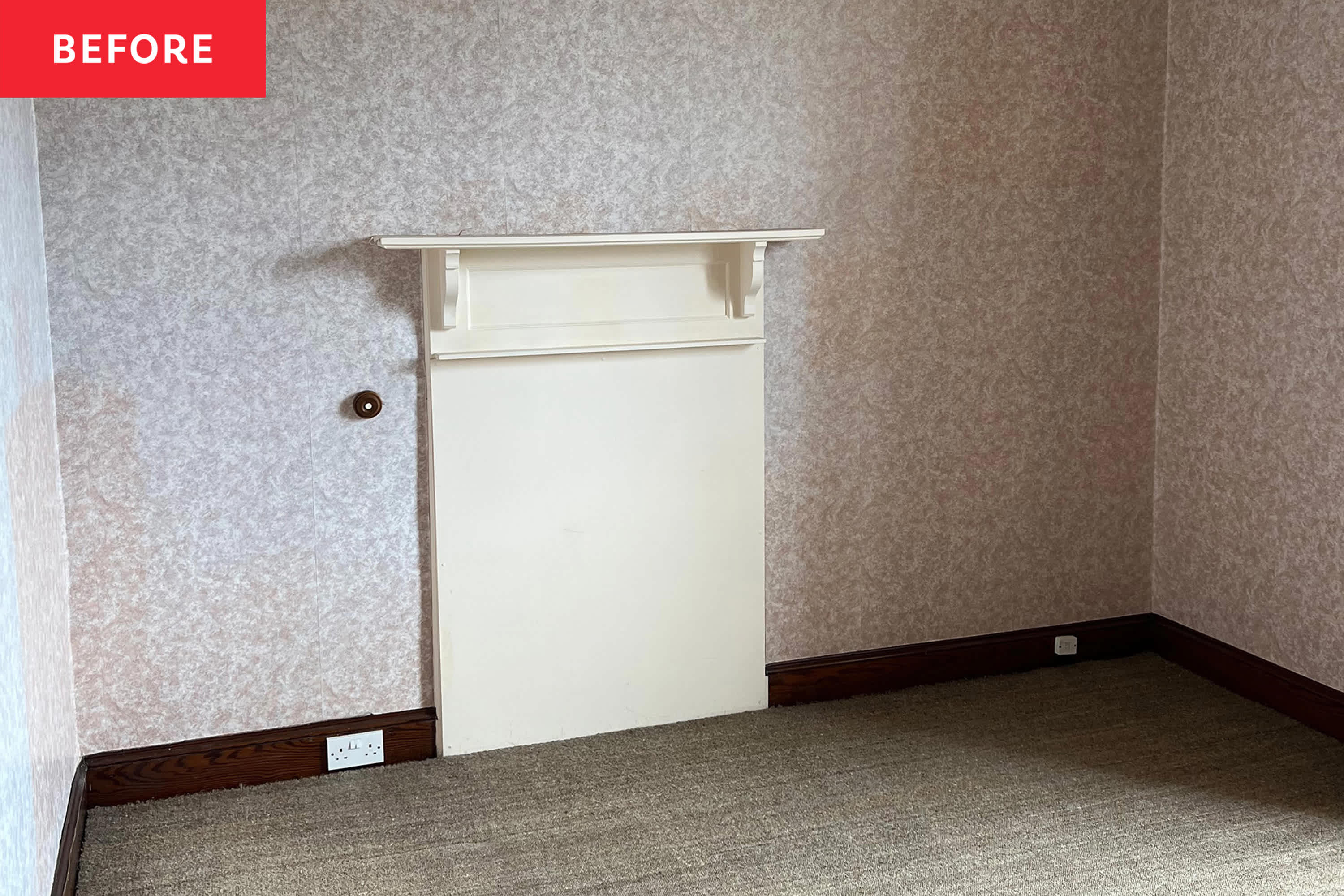
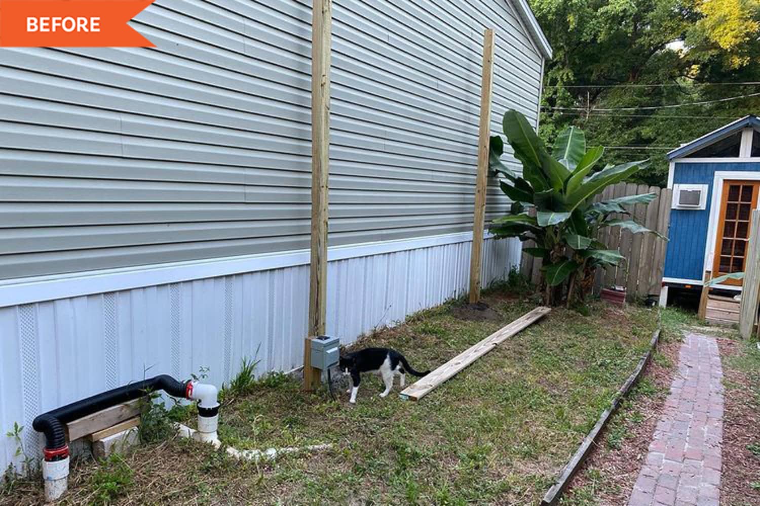
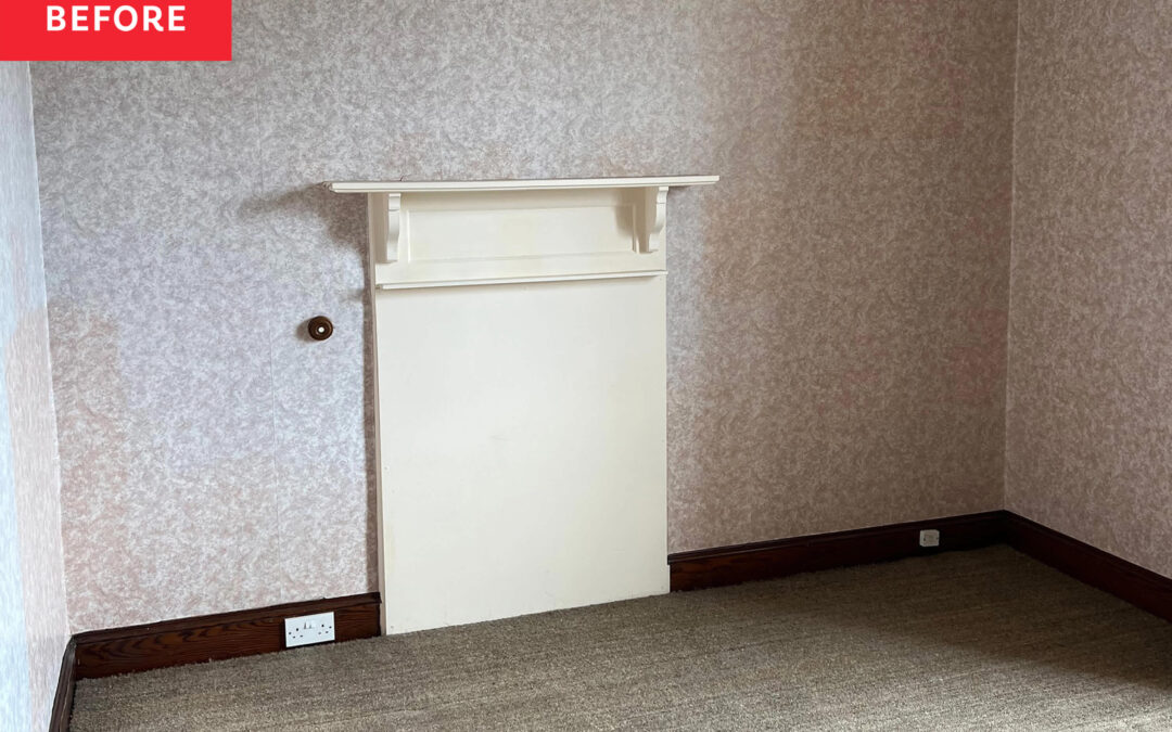
A color consultant discovered a bright cobalt blue Victorian fireplace boarded up in her 1890s home office — and it pulled the whole room together.
READ MORE…

by Furnishly | May 30, 2026 | Design Inspiration, Lighting, Style
We
independently select these products—if you buy from one of our links, we may earn a commission. All prices were accurate at the time of publishing.
In case you haven’t heard, IKEA released the 10th edition of its famous PS Collection in stores earlier this month, and now it’s finally also available online. The collection features over 40 modern and playful pieces for every corner of your home (like the viral inflatable chair and the collapsible side table that left editors in awe). It’s hard to choose favorites from a lineup this good, but if I absolutely had to, it’d be the PS 2026 Floor Uplighter. No exaggeration: but the sleek floor lamp looks straight out of a modern design museum – and for only $50, it’s too good to pass up. Here’s why.
What Is the IKEA PS 2026 Floor Uplighter?
Designed by Alexander Pott, the Floor Uplighter is an apartment dweller’s dream. Its slim silhouette will fit pretty much anywhere, and it has an 11-inch-wide base that doesn’t require much floor space. Even better, it can be adjusted to direct light wherever you need it: bend it down while reading on the couch, twist it upwards as an uplight, or twist it toward the wall to create a soft, mood-setting glow. It’s essentially three lamps in one super-stylish piece.
The Floor Uplighter has a glossy, powder-coated steel body that makes it look quadruple the price too. It’s available in dark red, blue, and yellow, making it a stylish pop of color in any room. It’s a gorgeous piece that’s destined to become a collector’s item. Just remember to buy the GU10 light bulb separately!
What IKEA Shoppers are Saying
by Furnishly | May 29, 2026 | Design Inspiration, Style
We
independently select these products—if you buy from one of our links, we may earn a commission. All prices were accurate at the time of publishing.
As much as I appreciate a fresh bouquet from the farmer’s market, I’ve developed a newfound obsession with paper flowers — specifically, FreshCut Paper’s Pop-Up Bouquets. They last forever, require zero maintenance, and they easily double as decor (they’re also fabulous gifts!). My fixation runs so deep that AT’s very own Home Director — and resident Maxxinista — Danielle Blundell, instantly alerted me when she stumbled upon FreshCut bouquets at her local TJ Maxx store. Now that I know you can get your hands on these for an even lower price, I’m spreading the good word to all of you.
What Is the FreshCut Paper Pop-Up Bouquet Set?
The FreshCut Paper Pop-Up Bouquet Set is like the grown-up, designy version of those crafty pop-up cards that were popular when I was a kid. Everything, from petals and stems to the included vase, is made out of paper. It starts flat and pops up to the size of a real flower arrangement, making it a sculptural home decor piece and a brilliant way to send flowers to a long-distance bestie without worrying about them arriving already dead. The set includes a bouquet, vase, blank note card, and a large mailing envelope to contain it all. The only thing you need to add is postage.
FreshCut makes a ton of different styles, and there’s no telling which will be available at your local TJ Maxx (the chance discovery is part of the fun!). But if you want a specific kind of flower, say an orchid or poppy, Anthropologie is still your best bet.

by Furnishly | May 28, 2026 | Design Inspiration, DIY, Style
Sarah Everett
I organize the Before & After series and cover DIY and design. I joined AT in October 2020 as a production assistant. I have an MA in Journalism from the University of Missouri and a BA in Journalism from Belmont University. Past editorial stops include HGTV Magazine, Nashville Arts Magazine, and local magazines in my hometown, Columbia, Missouri.
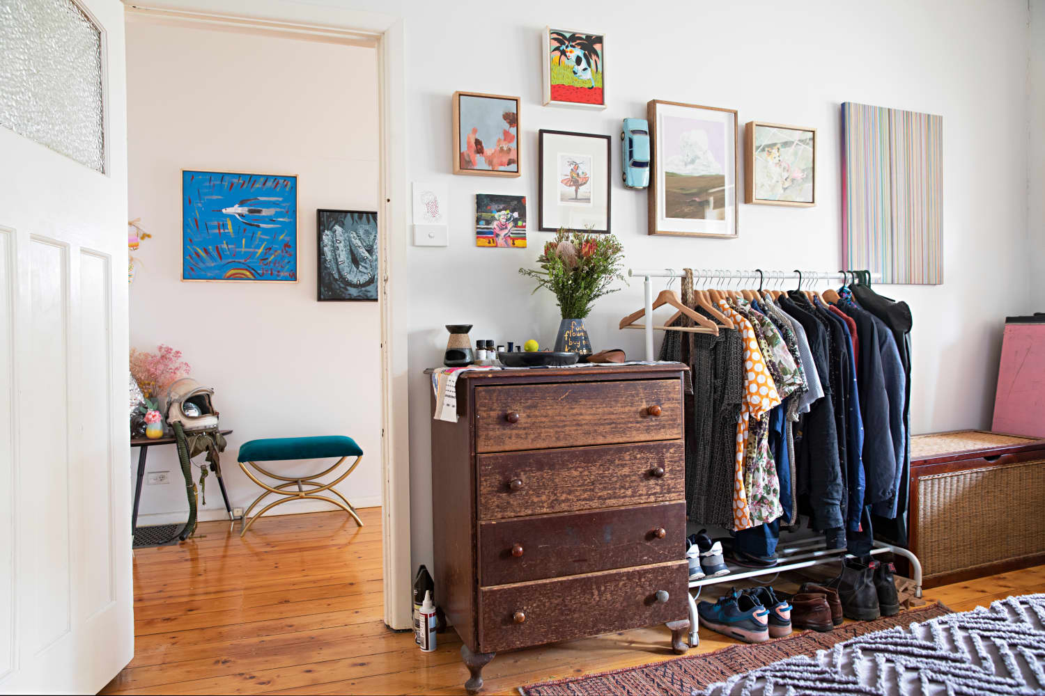
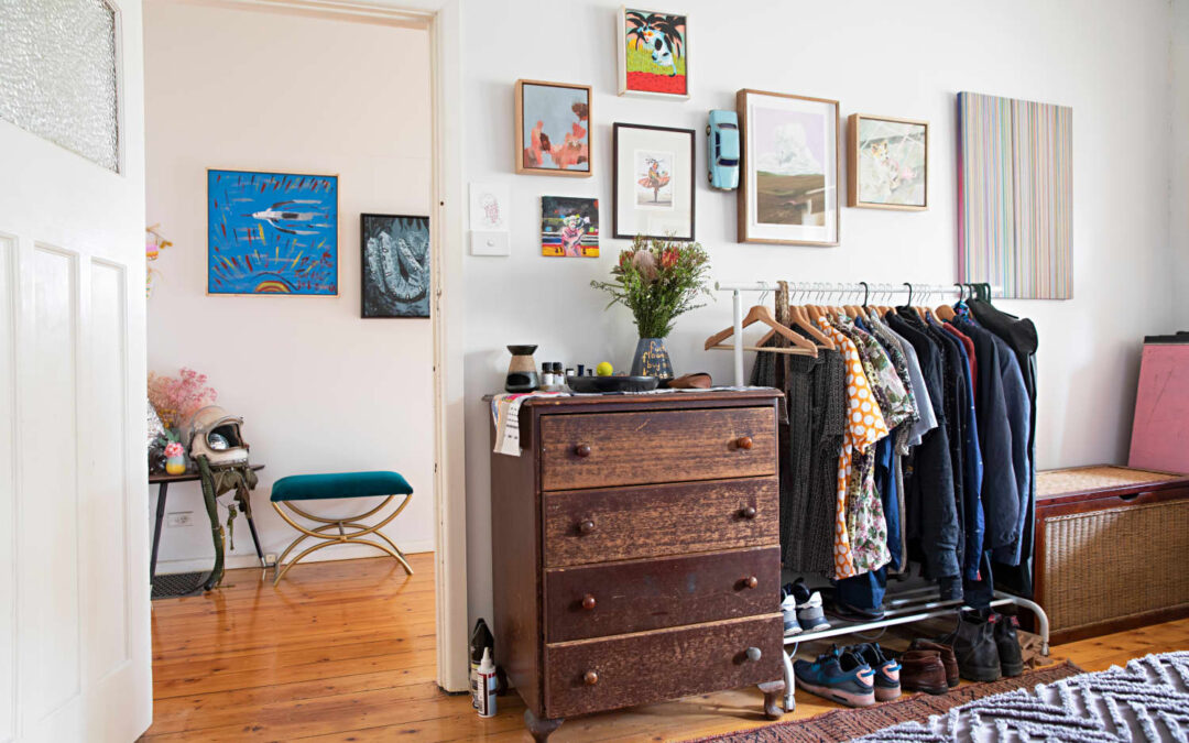
by Furnishly | May 21, 2026 | Design Inspiration, Style
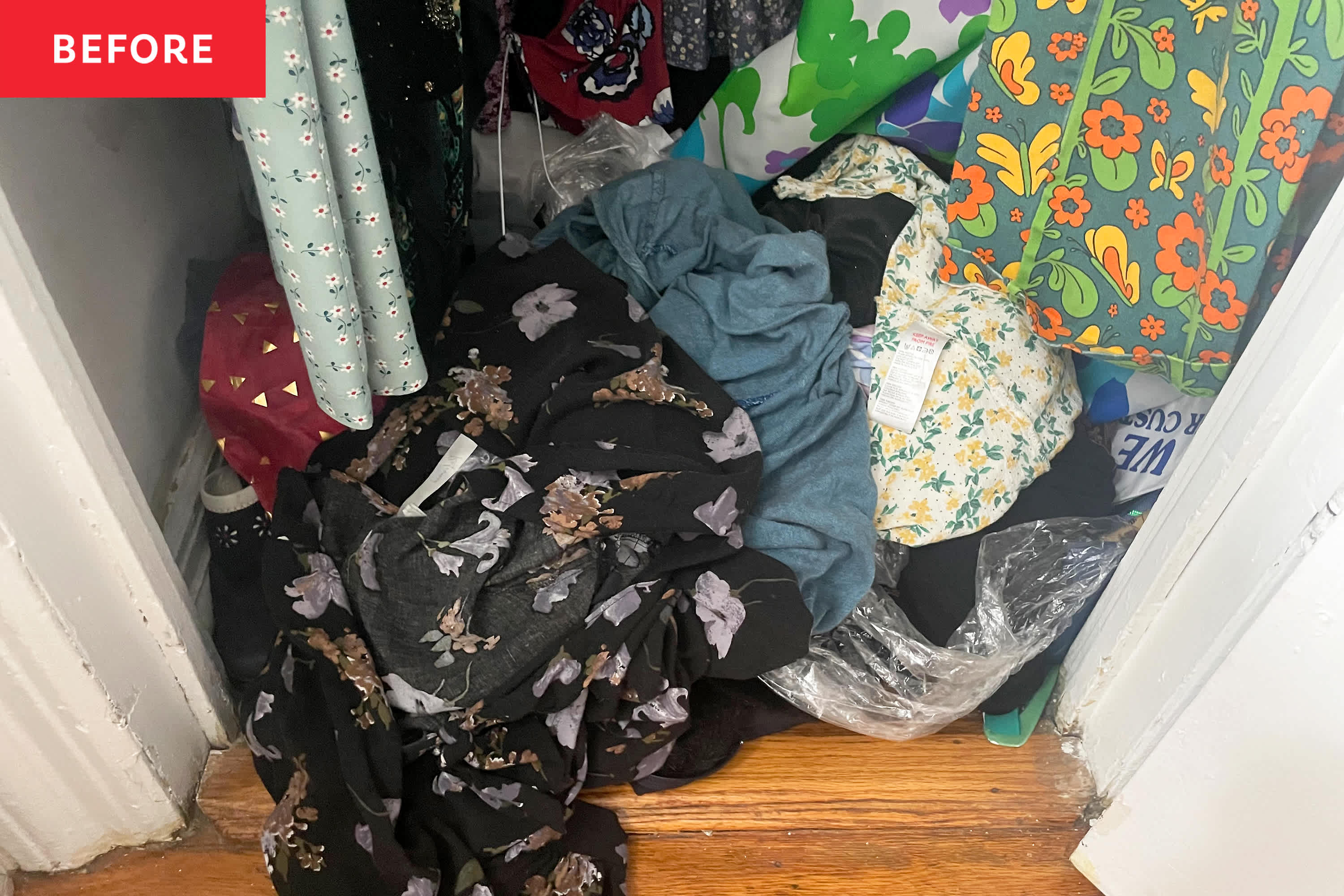
I got rid of so many things!
READ MORE…