by Furnishly | Dec 31, 2022 | Design Inspiration, Style
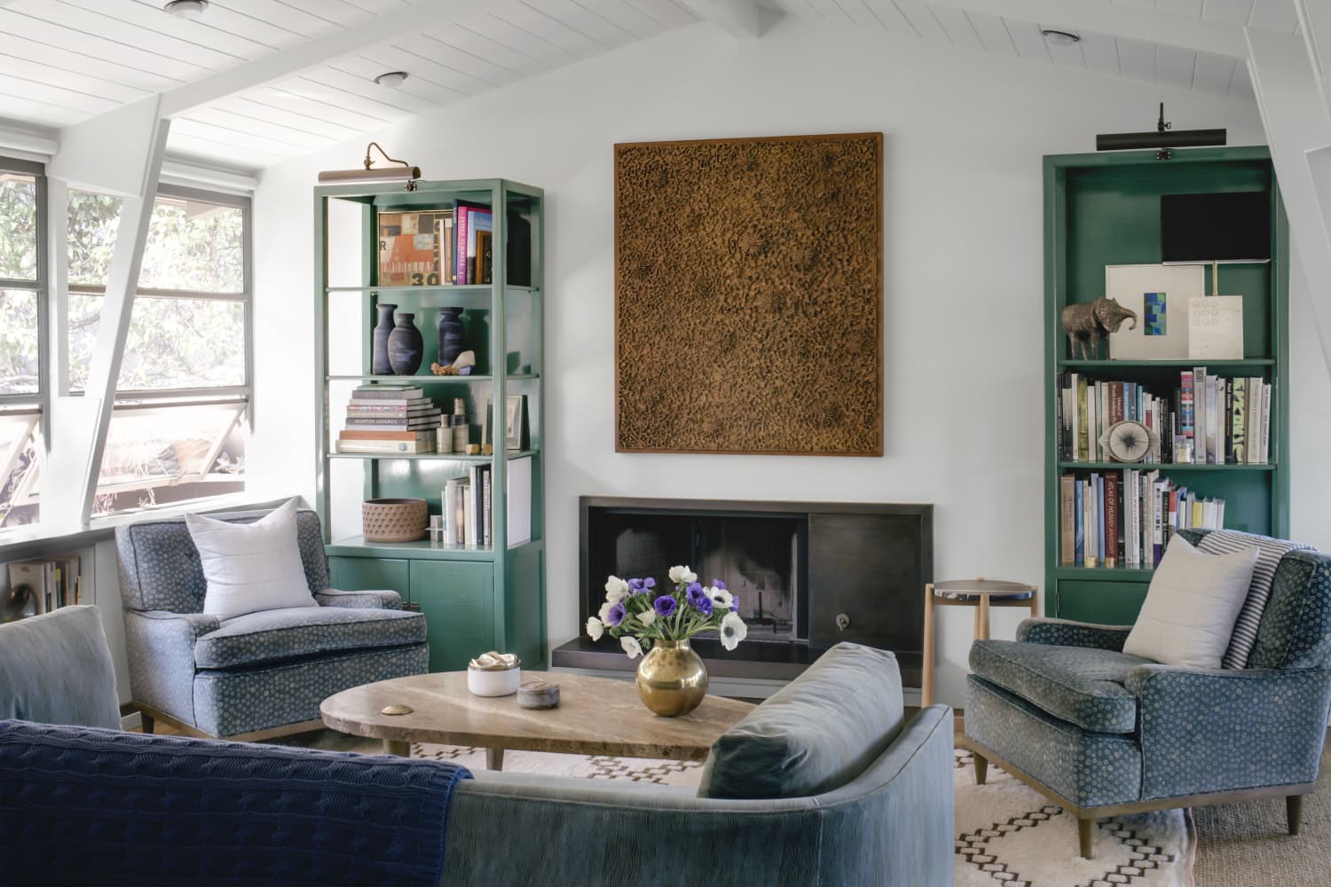
Dark green shades bring a delicate balance of drama and tranquility to any space. This sector of the color wheel has become a mainstay of interior design schemes across a range of styles. Hunter, forest, olive, and similar green hues have reigned supreme in the post-pandemic world as well as we’ve learned how soothing and refreshing biophillic design can be. While choosing a dark green for the aesthetic of any room can feel a bit bold, we’ve rounded up 10 clever color combos to infuse a sense of organic elegance, laid-back coziness, or eclectic juxtaposition for whatever look you’re going for.
For more content like this follow
1. Dark Green, Black, White, and Gray
Dark green may be a great choice for those who are fans of neutral color schemes and Scandinavian design but are seeking more visual interest. The living room in this Minneapolis home proves that even a saturated shade of dark green can still act as a neutral. Here, it pairs splendidly with muted, neutral hues.
2. Dark Green, White, and Bamboo
White and lighter shades of brown can help balance a deep green, plus they make an excellent color combination for those seeking to bring the outdoors inside. Here, the owner of this adorable Ontario home painted a DIY buffalo check wall in various shades of green. The result is an enlivened dining room for any season and holiday that doesn’t overpower. It’s the perfect complement to any modern farmhouse aesthetic.
3. Dark Green and Mustard Yellow
Dark greens are often associated with plant-centric bohemian style. Here, we love how the Wovn Home team paired the color with a mustard yellow for a well-collected look. Textured accents like boucle pillows, a velvet sofa, and dark yellow blooms bring sunshine to dark green walls without stealing the spotlight.
4. Dark Green, Gray, and Dark Brown
Sarah Malek Barney of Band/Design loves to pair a rich shade of dark green with softer tones. The result is a well-rounded space inspired by the outside world. Additionally, a mix of sumptuous textures and beautiful woods adds to this sitting room’s organic yet elegant vibe.
“Combining this dark, earthy green paint color with the softer gray tones of the surrounding furnishings gives the room an overall natural look and feel,” says Barney.
5. Dark Green and Magenta
Designer Louise Misell created this lovely space to fit the period features of her client’s home while still feeling appropriate for the modern age. A punchy shade of pink, like magenta, makes a serene yet indulgent pairing with a bit of unexpected pizzazz.
“Using dark green can seem a little scary, but it’s actually very versatile, and always adds a warmth and depth to any room it’s used in,” says Misell. “I chose dark green as it has the effect of embracing us in a cocoon of comfort, almost like the room is giving us a hug. I paired it with quite a punchy pink with touches of blue and peach to add some drama and contrast to the scheme.”
6. Dark Green, Cream, and Chocolate Brown
We love the level of restrained drama in this sitting room by Albion Nord. The space proves that you don’t need multiple patterns or vibrant colors to make a powerful design statement. Plus, leaning towards a chocolate brown hue feels more elevated than pairing dark green with a lighter shade.
“I tend to avoid anything gray and prefer to use architectural creams or earthy greens,” says Camilla Clarke, the firm’s creative director. “Our favorite hues to use in an interior are muted tones which create calm and soft spaces.”
7. Dark Green, Dark Blue, and Yellow
The L.A. home of artist Ben Cuevas features a jewel-toned dark green paired with a saturated dark blue hue and a dusty yellow for a one-of-a-kind space. White walls allow this pairing to shine and keeps the living area from feeling too busy or maximalist.
8. Green, Gold, and Brown
If you’re all about those mid-century vibes, look no further than this Plano, Texas home that is full of green, gold, and brown touches. The owner infuses her love for Parisian and French country style here with antique framed artworks, sculptural pieces, and elegant fabrics that feel equally refined and welcoming.
9. Dark Green, Black, and Pale Pink
Color and pattern abound in this Hampshire, U.K. home. The bedroom is no exception and evokes the home’s 1920 roots. The subtle shade of dark green feels more accessible to color newbies while black adds a chic accent color. Lastly, a pale pink rug and bedding lend a touch of femininity.
10. Dark Green, Tomato Red, and Mustard Yellow
“Green hues pack a full yet understated punch,” says Martin Waller, founder of Andrew Martin. “It can transport you to the cool tiled floors of Marrakesh or to the traditional drawing room of a late 18th-century Georgian mansion, and it’s being used more and more in interiors today.”
The Andrew Martin team brings global flair to a gracious sitting room. Dark green paint anchors the room while color, pattern, and texture abound. This pairing feels both modernized and Old World, allowing you to explore and define your personal design aesthetic.
by Furnishly | Dec 27, 2022 | Design Inspiration, Style
You likely decorated your home in a palette of several different colors — perhaps bold and bright hues; deep, saturated tones; or an array of calming neutrals. But what if you made a bold move and, instead of multiple colors, emphasized just one in your home?
For more content like this follow
Sarah and Gregory Jackson decided to fully commit to the color green in their New York City apartment, choosing to do so in order to brighten up their home in comparison to the outside world. “We have discovered that having those earth tones throughout the space is such a great way to make it feel full of life during the harsh NYC winters,” Sarah told Apartment Therapy during her house tour.
Green appears in various shades throughout their entire apartment, including on the wallpaper, pillows, lamps, and even their dog crate. The green seeps into the kitchen, as well, with a darker shade for the kitchen tiling backsplash. Of course, the plants are green, too.
When Sarah couldn’t find a bookshelf in the color she wanted (ahem: an earthy green), she painted one herself. “It was actually an IKEA hack that I DIYed after a few months of intense searching for a bookcase that not only perfectly fit the space but was also the color I wanted,” she explained in her house tour. “Because of its massive size in comparison to other pieces, getting the correct color to ground my color scheme in the apartment was critical, so I use the bookcase as a sort of ‘color anchor’ for the space.”
In another even bolder example, Tania, also known as Ms. Pink, used her namesake color as inspiration in her London home, incorporating pink from floor to ceiling — literally. She has a hot pink couch, a pink fireplace, and pink shelving.
While the color choice may be shocking to some people, Tania loves the decision she made. “The best thing we ever did was not to limit the amount of color in our home; it’s made us feel so happy,” Tania shared during her house tour. “The rest of the world may feel gray at times, but it’s always colorful here! People are always surprised when they visit that it actually feels much calmer than it looks. In the evening when we go for more subtle lighting, it’s actually a really comforting feel.”
Her tip for choosing a color for the home? “It’s really useful to paint a large piece of paper in your chosen color/colors and place it on the area you want to paint to see how it looks at various times throughout the day,” she suggested. “Lighting can make colors look different at different times of the day.”
So tell us: would you decorate your home in only one color?
by Furnishly | Jan 25, 2022 | Design Inspiration, Style
Blair Donovan
Shopping Editor, Style
Blair is Apartment Therapy’s Style Shopping Editor, where she covers the latest brand launches, need-to-buys, and anything related to her two unofficial beats — cane and rattan. Whenever she’s not perusing for the latest home finds (a rarity), you’ll probably find her reading, watching a horror film, or on the hunt for the best tacos in New York (recs are encouraged).
Follow Blair
by Furnishly | Dec 9, 2021 | Design Inspiration, Style
Laura Fenton
Contributor
Laura Fenton is the author of The Little Book of Living Small. She writes about home design and sustainability, and is a regular contributor to Apartment Therapy. Her work has been published in Better Homes & Gardens, Eater, New York Magazine, and Real Simple.
Follow Laura
by Furnishly | Jul 28, 2021 | Design Inspiration, Style
We independently select these products—if you buy from one of our links, we may earn a commission.
For years, I’ve held onto this vague idea that writing things down has made them come true. It started with my “magic notebook,” which was an incredibly ordinary thin pink Moleskine I used to track all my tasks, notes, and hopes right after college. Somehow everything I wrote down — whether it was something I could control or not — actually happened. I noticed as this technique continued to produce results, over time, across notebooks. The practice felt like a healthy balance of organized and witchy behaviors, and I liked it.
Recently, though, I realized I wasn’t seeing the results I wanted to see. The fallout of the pandemic left me largely discouraged, and if I’m being honest, pretty depressed. I wasn’t getting things done, and things weren’t getting done. I couldn’t access my magic.
Then, I started listening to a podcast called “Your Magic,” courtesy of my Spotify algorithm. On each episode of the podcast, host Michelle Tea talks to a celebrity — people like Phoebe Bridgers, Busy Philipps, and Roxane Gay — about their magical practices and experiences, and through the conversation, reveals how simple and adaptable magical practices can be.
In March, it inspired me to create a practice of my own: Guided by color magic, which uses colors to guide spell-casting, I started using colored pens to help evoke results from my daily journaling and to-do lists. On days when I wasn’t sure what color to use, I’d ask the universe to supply me with what I needed and blindly pick one or two of my 12 MUJI pens. Even though my pen practice was entirely made up, it felt good to be doing something that might generate results. And then I started getting more productive.
Recently, I asked Tea, a modern tarot reader and author, if my practice felt like a valid form of magic. “The kind of magic that I really like and try to work with and that we like to put into the world via ‘Your Magic’ is this respect for traditions, but at the same time, understanding that those traditions just came about because regular people like you and me created them, and we can continue as human beings in 2021 to create new magical practices,” she says. She adds that my pen practice feels “intuitively true” based on its marriage of traditional color magic with modern intention.
And in fact, on a psychological level, using color to spark moods and outcomes is intuitively true. “There are many studies that show, both from a physiological and psychological standpoint, how color influence starts very, very early in our lives,” says Leatrice Eiseman, executive director of the Pantone Color Institute and author of “The Complete Color Harmony, Pantone Edition.” In daily life, your interpretation of colors helps you recognize signals, express creativity, and even convey emotions.
In using colored pens, I’m drawing from the emotional signals of the colors, affirms Karen Haller, an applied color and design psychology expert and author of “The Little Book of Colour: How to Use the Psychology of Colour to Transform Your Life.” You can try it, too, to “[use] color to support your intention,” she says. It might even make less exciting tasks more enticing. Writing a to-do list in a color associated with joy, like orange for many people, could make that to-do list seem more fun. “Cleaning the toilet, cleaning the bathroom, having to do your tax file — if that was written in your happy color, see if that would give you a different mindset,” Haller suggests. Looking back at your list, “you’ll connect to the color before you connect to the words,” she explains.
Despite using just a small amount of color for the colored ink concept compared to the grand scheme of your surroundings, this approach can still be impactful thanks to the amount of emphasis placed on each color. “If you’re journaling, you are really focused on what you’re doing,” Eiseman says. “Your surroundings become secondary and you’re focused on the page or on your computer. So, that focus means that that color takes on even more significance because you are zoomed in on it.”
Want to try a similar ink (or digital ink) practice yourself? Here are the most common emotions associated with each color, according to color psychology experts.
Keep in mind that specific color associations for an individual might veer off the collective path. “There are psychological traits that are positive and adverse for all colors, but we also pick colors because of a personal association we might have to it,” Haller says. Associations can also be culturally influenced (the breakdowns below skew Western), and a traumatic incident could bring about a negative connotation with a dominant color that was present at the time.
Red is physically stimulating and associated with energy and excitement. Of course, it’s the color of lust and passionate love, and it highlights urgency. “Color is actually wavelengths of light that comes into our eyes, and red is the wavelength that advances towards us the quickest, so therefore we see it the quickest,” Haller explains.
Pink is physically soothing. It signals compassion, nurture, care, and a more romantic or friendly love. It’s a good color for self-care.
Orange “is the color of fun, playfulness, and joy,” Haller says. It can also add a hint of mischief.
Yellow simulates sunshine. It represents cheer, happiness, optimism, and illumination. “It opens you up to new thoughts,” Eiseman says.
Green is the color of life, safety, growth, and health. Perceptions of green are tied to nature. (Magic takes the idea of green’s prosperity one step further — Tea calls it “abundance magic,” explaining that you can use it for an “abundance of cash or opportunity.”)
Blue is the color of the mind, Haller describes, ranging from soothing and calming light blues to focused and concentrated dark blues. We align blue with the ocean and the sky, always vast and waiting for us, ascribing a sense of loyalty and constancy, Eiseman says.
Purple “is about connection to your inner self and connection to your higher self, so it’s tapping into your own personal beliefs and connecting to who you are,” Haller says. (Personally, I often use a purple pen for new moon journaling or when I’m trying to access deeper thoughts.)
Black is tied to power, elegance, sophistication, and authority. It can also create barriers. “There’s no mucking around with black,” Haller says. But big caveat: When it comes to writing with black ink, achieving those emotions can be tricky, Eiseman warns. “Because we’re so accustomed to black or blue ink in pens, it’s really not as much of a presence as it is in other applications,” she says. So if you aren’t regularly using other colors, black’s perpetual sameness will dominate over any other potential emotional powers.
White is a sanitary and clean color, particularly after we’ve spent so much time thinking about germs and bacteria during the pandemic, Eiseman points out. It’s not the easiest color to write with (personally, I don’t), but when it comes to your workspace, “if you have too much white, it can cause eye strain,” she says, so it’s good to cut pure white surroundings with off-whites or pops of color.
Complex Colors Bring Complex Emotions
A complex color is one that is made up of two different colors. So secondary colors orange, green, and purple are all complex colors, and they spark some combination of the emotions of the primary colors (the “mother colors,” Eiseman calls them) that mix to make them.
For example, purple is made of red and blue, and because warm red and cool blue are opposites in color temperature, it can generate high activity on the one hand and tranquility on the other, potentially sparking the most complex emotions. “People that like purple are usually people that are a bit more creative and complex in their thinking,” Eiseman says. “They don’t like things that are too straightforward; they like things that are just a little bit running contrary to each other.”
Taking this idea of complex colors one step further, if a complex color scales closer to one mother color, it will take on more of the characteristics of that dominant mother color. Consider lime green: Green is made up of blue and yellow, of course, but Haller refers to lime green as “green’s alter ego,” because “if greens are normally very soothing and calming,” then “lime green is on steroids…because of all the yellow in it.” I use a yellow-green pen when I’m trying to tick through my to-do list, and I use a blue-green pen for more serene productivity.
Different Shades Spark Different Emotions
Adding white to any color is going to essentially turn down the volume on the associated emotions, making them gentler and less stimulating. (This is why people tend to decorate baby nurseries using colors low in chroma — to create a soothing environment.)
For example, look at the difference in emotions associated with red and pink. Pink, as we know, is red with white mixed in, so while red may create feelings of passion and arousal, pink tones it down to compassion or even friendship, depending on the shade.
“There are the softer, lighter pinks, but there’s also the hot pinks, and the hot pinks get closer to the mother color of red, so the hot pinks take on the same characteristics as the mother color red has,” Eiseman says.
Darkening a color by adding black, on the other hand, will “add depth,” Haller says. “The color will no longer be light or reflect, but heavier, making a space look darker, more somber, for people more serious.”
Ultimately, though, it’s up to you to recognize how colors make you feel and lean into those specialized interpretations. There’s no definitively right or wrong way to use color, but paying attention to the colors dominating your line of vision and how they impact you can help to guide emotional well-being and generate positive outcomes.
Alissa Schulman
Contributor
Alissa Schulman is a freelance writer, covering products, home, lifestyle, and entertainment. She has written for Good Housekeeping Institute, Architectural Digest, MTV News, and more.