by Furnishly | Sep 1, 2021 | Design Inspiration, Style
We independently select these products—if you buy from one of our links, we may earn a commission.
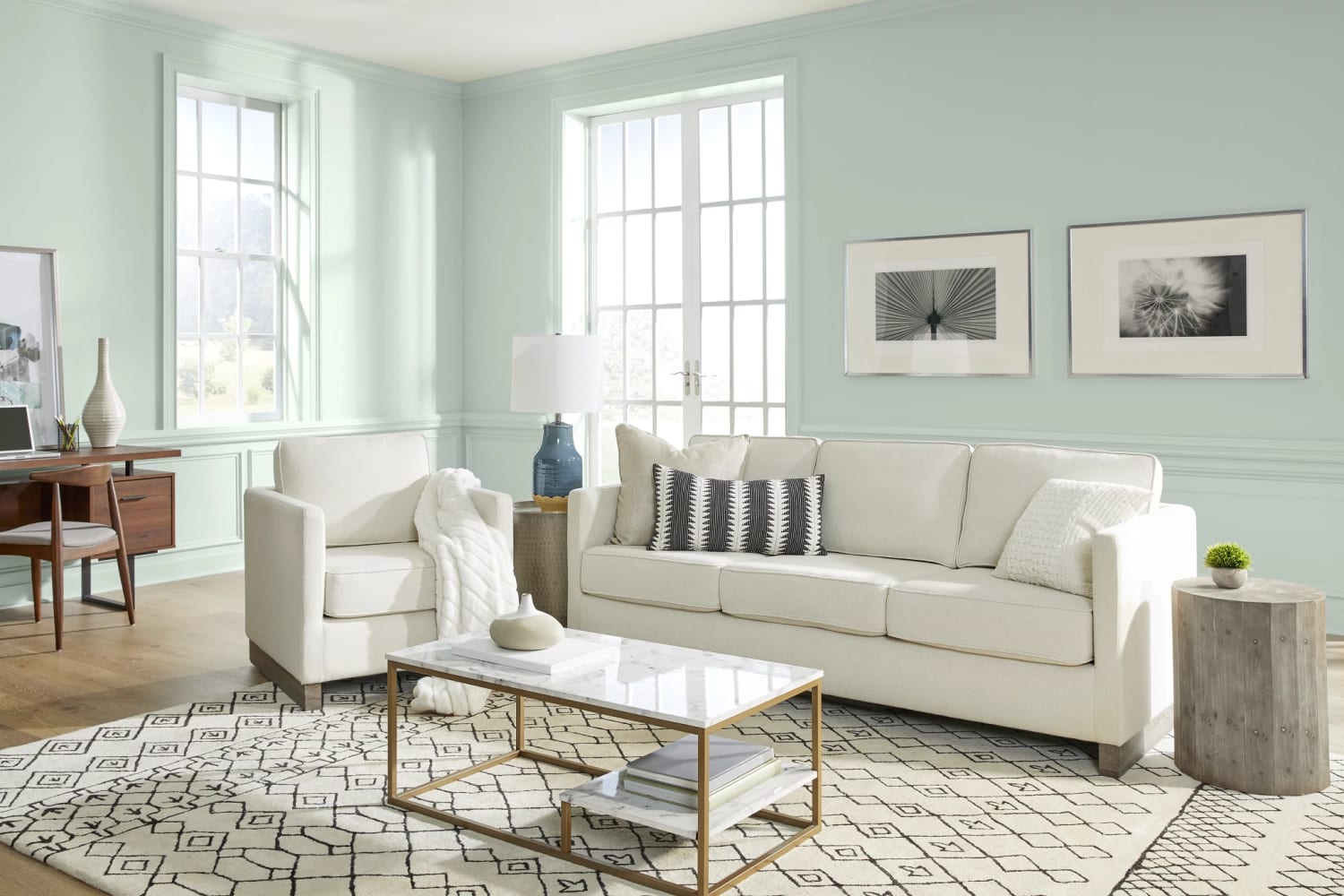
It’s officially September — and the most wonderful time of the year for color enthusiasts everywhere. Yesterday, Behr Paint announced Breezeway (MQ3-21), a gentle, light silvery green with cool undertones, as their 2022 Color of the Year, kicking off a quarter that’s sure to be ripe with more trending hue news. Evoking feelings of peace and tranquility, this color is inspired by earth’s beauty and brings to mind the look of sea glass.
“A new year brings the opportunity to embrace a sense of renewal and pursue untapped passions,” says Erika Woelfel, vice president of color and creative services at Behr Paint Company, in a press release for the announcement. “Whether it’s lacing up our hiking boots or breaking out the gardening tools, Breezeway inspires us to fully embrace the hobbies or adventures, both near and far, that excite us. We look forward to a color that welcomes a hopeful sense of renewal, restoration, and healing.”
Neither too bold nor soft, this light, cool color’s decorative strength lies in its versatility. According to Sarah Fishburne, director of trend and design at The Home Depot, Breezeway’s a great color for dining rooms, entry ways, living rooms, and bedrooms. You can also try it as an accent on doors, trim, or kitchen cabinetry, and it works well as an exterior color, too.
She suggests pairing it with pretty much anything: creamy white, taupe, softened black, brown, pink — the list goes on and on. Honestly, Breezeway makes a pretty good combo with the rest of the other shades in Behr’s 2022 Color Trends palette, a collection of feel-good hues that range from adventurous blues and bold terracottas to soothing whites and grounding greens.
Breezeway wasn’t the only news Behr announced yesterday. Building upon their 43 year partnership with The Home Depot, Behr is also launching what they consider to be the most advanced formula in their portfolio, BEHR DYNASTY, exclusively with the home improvement superstore. A four-in-one product, this paint promises to be extra stain-repellent and scuff-resistant along with fast-drying. It’s also a one-coat wonder, too, meaning a paint-and-primer in one.
Behr and The Home Depot also upped the ante on the sweepstakes they typically run in tangent to the COTY announcement. To celebrate this year’s launch, Behr’s offering a grand prize of up to $50,000 for one lucky winner to discover their passion, be that starting a new business or traveling the world (when that’s a possibility again). You can enter the Color in Motion Sweepstakes for a chance to win (before Sept. 28), and if you don’t get the grand prize, five first prize winners will each receive a $1,000 gift card to The Home Depot.
If you want to bring home Breezeway or any of the other shades in Behr’s 2022 Color Trends Palette, the collection is available exclusively at The Home Depot stores nationwide now. You’ll find exterior and interior formulas and a variety of finishes, so there’s surely something for whatever design project is next for you.
Danielle Blundell
Home Editor
Danielle Blundell is AT’s Home Director and covers decorating and design. She loves homes, heels, the history of art, and hockey—but not necessarily always in that order.
Follow Danielle
by Furnishly | Aug 27, 2021 | Design Inspiration, Style
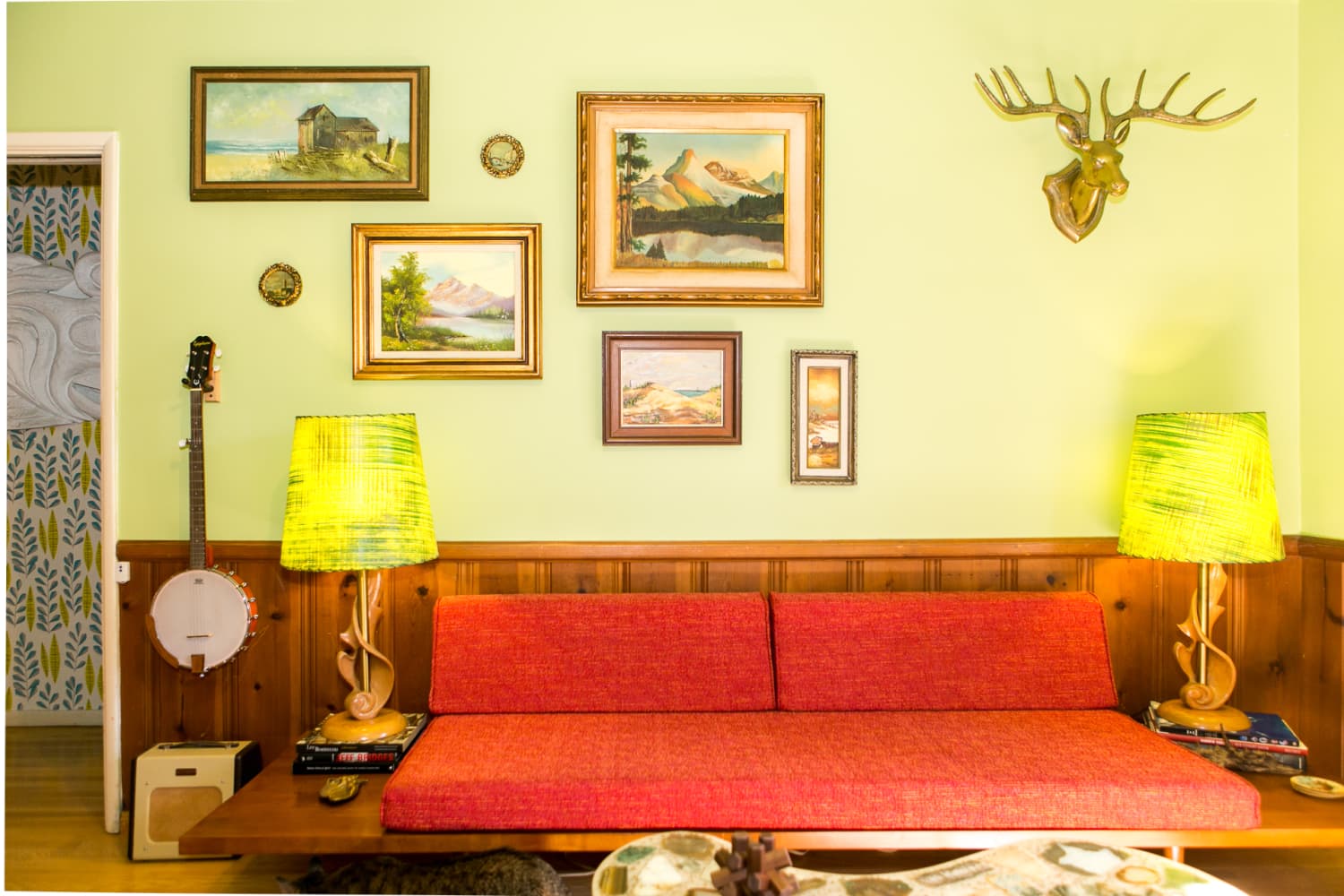
When you think of the Great Depression, images of people standing in long bread lines and banks boarding up their windows may come to mind. The Depression certainly marked the end of the glamorous, champagne-filled Roaring ’20s era of excess, but that doesn’t mean everything during that period was drab and colorless. Enter Depression Glass, the cheery-hued, inexpensive glassware of the 1930s that reminds me of the colorful pieces that have been trending again recently.
When unemployment skyrocketed to 25 percent in 1933, funds for new home decor pretty much fell to the bottom of the list in the average family’s budget. Glassmakers began to pivot from making luxury crystal, which was out of most people’s price range, and instead focused on making colored glass. Produced largely between 1929 to 1941, these pieces were made by the tons through pouring liquid glass into pre-made molds and were either given away for free or sold on the cheap for pennies. Generally, pieces weren’t polished and edges were left rough, which accounted for a lower quality but also more economical end product.
As a way to bring people to their establishments, local movie houses gave away glass dinnerware during “Dish Night” promotions, gas stations offered pieces as prizes for playing games when fueling up a car, and some grocery stores even popped little glass trinkets into the bags of customers’ orders. Around twenty manufacturers made about 100 different patterns, which often mimicked traditional crystal, and people scrambled to spruce up their dining rooms with everything from pink ashtrays and yellow candlesticks to technicolor-looking matching dinnerware sets. Of course, fine crystal continued to be made during this period, but it certainly didn’t keep pace with colored Depression Glass.
As the pandemic taught many people firsthand, little inexpensive indulgences can help to keep morale up, and that’s exactly the role Depression Glass played almost a century ago. Pieces came in a riot of hues, including pink, amber, jadeite (Martha Stewart’s favorite), royal ruby, and even uranium green. Color not only disguised the lesser quality of the glass, but it also provided a little bit of extra cheer. “Color was very important in Depression Glass because those were such dark days,” Dixie Davis, the president of the Arizona Depression Glass Club, told The Arizona Republic in 1986. “L.E. Smith made black glass. But my mother never let dark colors in our house. She thought color perked us up.”
Colored dishware may have also helped to make plain, meager meals look more appetizing. With economic strife often comes lackluster dishes, but even beans and bread looked almost restaurant-worthy on pink glass plates. “In the present era, with glass so pronounced a vogue, it is not difficult for the homemaker to have the dining table as refreshing in appearance as in substance,” the Lincoln Journal Star reported in 1931. “Color of glass serving dishes can lend zest to otherwise plain viands and aid in making them appeal to the appetite.”
Sometimes the colored glass itself solely was the draw. A 1930 advertisement hammered home the idea of these items as small, affordable treats. “I bought myself a present that I really needed,” an advertisement in the Tampa Times read. “A covered pitcher and six tall Ice Tea glasses in colored glass and crystal.” The seven-piece set retailed for $1.25 and conjured thoughts of impulse purchases, “just because” presents, and even hosting friends on one’s porch — all of which brought up memories from an easier, more normal time.
Depression Glass also served one last purpose beyond brightening up the home and making food more palatable: escapism. Hunting down pieces to finish a growing collection not only brought purpose, but it also sparked an immense amount of joy for relatively low costs. “To have an interest in anything is to have a decidedly pleasant view of life,” a hobby collector told The Wichita Eagle in 1937. “The origin and history of anything you collect is an education in itself, and there is a liberal share of humor through making a collection. Leisure time spent in collecting is not wasted.”
Once the economy began to correct itself, many families traded in their colored glass sets for fine china again. As they packed away the Depression Glass, they also hoped to forget the memories of a difficult decade. “People were ashamed of it because it represented a bad time in our history,” Davis explained to The Arizona Republic.
Today many collectors hunt down entire Depression Glass sets, but you can just as easily find a drinking glass or serving plate at a thrift store or garage sale. Etsy’s also a great resource for inexpensive Depression era pieces. These little glass bric-a-brac and dinnerware pieces are like postage stamps from a bygone time, reminding us there’s always a glimmer of hope — and bold color — to be found during our darkest periods.
It’s hard not to draw a parallel between back then and the surge in colored glassware again today. Support an artisan glassmaker today if you can, sure, but also keep your eyes peeled for authentic Depression Glass. If you’re lucky, you may even find some in your grandparents’ china cabinet!
Marlen Komar
Contributor
Marlen is a writer first, vintage hoarder second, and donut fiend third. If you have a passion for finding the best taco joints in Chicago or want to talk about Doris Day movies, then she thinks an afternoon coffee date is in order.

by Furnishly | Aug 25, 2021 | Design Inspiration, Style
We independently select these products—if you buy from one of our links, we may earn a commission.
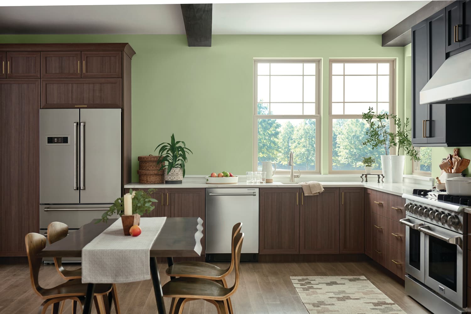
I don’t know about you, but it feels like 2021 is breezing by. Case in point: Paint companies are already talking colors of the year for 2022! PPG’s first up, and today, they’ve officially declared 2022 the year of Olive Sprig (PPG1125-4), a sprightly gray-green that channels the great outdoors and the resiliency of nature to signal regrowth in what’s hopefully a post-pandemic world, sooner than later.
With many people spending more time on screens than ever, PPG wanted a shade that would speak to the desire to take it outside. “As many of us know following a year of lockdown, the easiest way to shift your mindset is to change your environment,” says Amy Donato, senior color marketing manager of PPG Paints in a press release. “While we begin to trade sweatpants for strappy shoes, recipes for reservations, and a night in for a night out, our paint color preferences are shifting, too, in both residential and commercial spaces. DIYers, property managers, designers, and architects are shifting away from the stark, neutral palettes of yesterday and opting for color in all forms. Call it rebellion, but we are certainly here for the resurgence of optimistic colors to guide us into a new era of home design.”
According to PPG, this soft, soothing hue also offers a sense of rejuvenation. Though the name Olive Sprig clearly references olive trees, this silvery-green is also close in color to the aloe vera plant. Either way, the connotation is clear, when you think about the role olives played in ancient Greece and still play in the Mediterranean today. Olive oil is the lifeblood of that region and the trees themselves symbols of immortality and resilience. This shade selection also subtly plays into the classical design resurgence that’s been happening as of late, too, with things like arches, columns, and busts trending in the home design world.
PPG really hit the mark with a trendy, but still extremely usable, color. Sure, Olive Sprig is decidedly upbeat and not totally neutral, but it certainly can hang with natural materials like rattan, cane, and wood. The hue also pops nicely against warm brass finishes but works with cooler nickels, chromes, and matte black, too. I could see this color being used to pep up a home office and to ground a living room full of more luxe finishes. It’d also be a nice option for someone who doesn’t want to go with blue or gray for a serene-feeling bedroom. Can you imagine it surrounded by a bunch of plants in a sunroom or a bathroom? Me too. I’m digging the way it looks with the neutral checkerboard floors below as well.
This COTY selection feels special to me specifically, as I was one of a few home editors that actually got to sit in on PPG’s talks to arrive at this versatile shade during their annual Global Color Forecasting Workshop, which was fully digital this year and held at the beginning of 2021.
If you think a lot goes into the selection of these trending shades, you have no idea. I loved how nuanced these digital discussions got — with individuals from all over the globe weighing in on what certain hues mean in their countries and their particular facet of the color business, be it cars, planes, or even coatings for electronics. Somehow, from 30+ different opinions comes one COTY — and, typically, a larger palette that’s reflective of broader color trends that the COTY fits into seamlessly. This year’s palette is themed “Horizon,” referencing hope for the world — and the home — as the sun begins to set on 2021. Colors are organized into three stories under that umbrella: “Invaluable,” which is all about depth and warmth, “Introspective,” a palette that speaks to self-care, and “Inspired,” a set of bold, mood-boosting shades.
To learn more about Olive Sprig and the rest of the 2022 trend colors, visit PPG Paints or your local The Home Depot store or Menards in the Midwest.
Danielle Blundell
Home Editor
Danielle Blundell is AT’s Home Director and covers decorating and design. She loves homes, heels, the history of art, and hockey—but not necessarily always in that order.
Follow Danielle

by Furnishly | Aug 24, 2021 | Design Inspiration, Style
We independently select these products—if you buy from one of our links, we may earn a commission.
Have you recently felt the urge to replace your sensible Studio McGee table lamp with something that has a mauve plastic shell base? Do you feel inexplicably drawn towards rounded edges, tessellated stone, and spiraled details? If so, you’re not alone. The design world is currently in the midst of a shift, one that’s marching home furnishings towards a decade society as a whole pretty much swore it would never embrace again: the ‘80s.
Look through your feed on Instagram or TikTok — or browse through a recent house tour — and you’ll notice quintessentially 1980s furniture and decorative accessories sneaking back into the decorating equation. Whether you notice wavy mirrors and ditsy florals or rounded sofas that look more like marshmallows than sectionals, know it’s not your eyes (or the algorithm) playing tricks on you. Pro designers are incorporating these highly photogenic statement pieces into their projects more and more, and data from home retailers backs up this renaissance, too, particularly resale marketplaces and secondhand sites that stock authentic ’80s wares.
“We have seen a 14 percent increase year-over-year for ”80s’ in search, including a 90 percent increase in searches for ‘tessellated furniture’ in the last two years,” says Anthony Barzilay Freund, editorial director and director of fine art for the retail site 1stDibs. The question then isn’t whether this is happening, but why? To trace the origins of this design shift, let’s first look back on this once polarizing decade’s characteristic design trends.
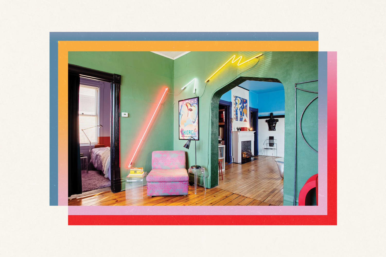
The ‘80s were nothing short of eclectic. Depending on what style you gravitated toward, the color palette ran the gamut from Laura Ashley’s English garden-style sweet pastels to Synthwave-esque neon to Memphis Design‘s primary colors. Houses were decorated with tessellated stone side tables, deep leather sofas, laminate coffee tables, and white Formica bedroom sets. In general, furniture was known for curvier silhouettes, which rejected the straight, sleek lines of mid-century modern design to embrace the rounded corners, spiraled poles, and waterfall edges of a new decade. Patterns ranged from ditsy florals and pastel, almost Southwestern motifs to the familiar geometric shapes — circles, squares, triangles, and squiggles — synonymous with Memphis Design.
It was a look, one that many people are guilty of bashing, along with the teased bangs and shoulder pads of the era. As the saying goes though, everything old becomes new again. Of course, there isn’t just one catalyst behind this current design shift; instead, it takes several independently-brewing circumstances at the same time. The first of which, in the case of this ’80s renaissance, has something to do with the rise and maturation of millennials and Gen Zers.
Late millennials and Gen Zers are just far enough removed from the 1980s to appreciate its style earnestly and free of context. “It’s a product, I think, of the usual evolutionary process in which younger folks ‘discover’ the coolness of periods that we older folks lived through far too recently to feel nostalgic about them or to acknowledge that they — like we — are now considered ‘vintage,’” Freund says.
Home influencer Miki Carter of Plot Twist Interiors, who’s a lawyer by day and an interior design aficionado by night, can attest to this phenomenon. She’s had an ‘80s tessellated coffee table since 2019, years before it hit its current “hot ticket item” status. While she’s since swapped hers out for perhaps maybe an even more ‘grammable checkered mirror-and-travertine table, she first gravitated towards the tessellated stone piece for its funkiness. “I liked it because it looked like it was from the earth, but it also looked like it was from another planet, like Mars,” Carter says. “It was just very organic and rocky.”
Even more than being drawn to its texture, Carter loved that the ’80s table was stylistically at odds with her late 19th-century apartment building, once a Victorian hotel. “I’m always drawn to juxtaposition,” says Carter. “So if there’s something that’s very definitive of a decade or a point in time, and I can put it together with something from a different point in time — in a way that is cohesive — that’s kind of my style.”
Opportunity to create and play with contrast aside, this current ’80s interiors revival also owes something to mid-century modern design. In fact, mid-century modern design dominated both the decades leading up to the 1980s and was the preferred aesthetic of Gen Z’s parents, Generation X. “What Generation X loves, millennials and Gen Z are going to reject as much as they possibly can,” says Justin Riordan, the founder of Spade and Archer Design Agency. “‘We hate everything you love, and we love everything you hate’ is the mantra. Every generation does this… take what their parents hate and make it new and beautiful for themselves, so they can claim interiors for their own.”
Economics also play a role in this resurgence, too. Some millennials and Gen Zers may be embracing ‘80s furniture because, save Ettore Sottsass’ Ultrafragola Mirror, pieces on the whole can be relatively easy on the wallet. You can certainly source high-end designer ‘80s furniture, but, right now, you can just as easily stumble on a funky clam shell lamp for $20 at a thrift store… or in my case, a laminated side table abandoned in an alley. Why? Well, Baby Boomers were, in large part, the original buyers of the ’80s Art Deco revival, Memphis style, and country chic Laura Ashley designs, and since some are currently downsizing and shifting into the retirement stage of their lives, they’re getting rid of the ‘80s furniture they held onto at a rapid rate. This creates more supply than demand, keeping pricing relatively affordable.
Carter, for example, snagged her tessellated coffee table on Facebook Marketplace for $50 from a woman who won it at a storage unit auction. Meg Gustafson, whose 1885 Workers’ Cottage in Chicago is decked out in eclectic pieces, was first drawn to her ’80s aesthetic for its affordability, too. Her obsession began with a $7 Memphis Design poster for a Picasso exhibit being held in a since-closed gallery in Chicago, which she found at a garage sale in 2011. She loved the look and decided to decorate her entire house around the bold, primary colors of the poster. “That’s one of the fun things about ‘80s stuff — it’s kind of low stakes,” she says. If you make a mistake buying a piece of furniture, you can just resell it for a few bucks and break even.
All this said, there’s a twist to today’s ‘80s design resurgence. This time around, interiors aren’t just carbon copies of those from forty years ago, but rather, they combine the loud, geometric forms of Memphis Design with the soft colors and curves of Art Deco — and may even mix in a little mid-century modern, too, for good measure. “When you didn’t live through that period, you don’t realize that one of those styles was a resurgence from the 1930s and one of them was a new invention of the 1980s,” says Riordan. “Millennials and Gen Z just see the whole thing as ‘80s style’ and are taking that whole genre and mixing it all together, so we’re getting this new genre that I call ‘Memphis-Deco.’”
Memphis Design, which was itself a reaction against the more traditional styles that came before it, came to the fore as budding technologies like the computer began revolutionizing the world. According to Riordan, one would not have put Memphis and Art Deco together in the 1980s because they were from the opposite ends of the design spectrum. Millennials and Gen Z can though, he says, because “they have the luxury of not knowing.”
Riordan points to the Proper Hotel in San Francisco, designed by Kelly Wearstler (and shown right above) as a prime example of Memphis-Deco design, since its lobby looks like a late 1920s reimagining of “Pee-wee’s Playhouse” — but in the best way possible. Memphis Design, Riordan says, is playful almost to the point of immaturity, whereas Art Deco is really clean, luxurious, and so luscious, it’s almost pretentious. When you mix these two styles together, you get something that is lighthearted, beautiful, and just plain fun. At the Proper San Francisco, “They put this very Memphis style fabric over these very Art Deco pieces of furniture, completely combining them into a mishegoss,” Riordan says.
Even though she runs an ’80s style appreciation Instagram account, Gustafson still wouldn’t characterize her house as “pure ‘80s” style either. “I’ve had people come in and say, ‘Oh, I was expecting worse’ or ‘I was expecting something so much more ‘80s,’” she says. She recalls that one commenter on her first house tour with Apartment Therapy wrote, “I like that it wasn’t just an 80’s pastiche but 80’s reinvented.” That’s maybe the key to this ’80s resurgence: It’s a true blending of styles and time periods — not just one.
Finally, fun — and the idea of creating joy at home through interior design choices — underscores this ‘80s style resurgence, especially during a time that is marred with a global pandemic, rising inflation, and a possible housing market crash on the horizon. “I also think the recent surge owes to the fact that the 1980s produced furniture (and art and fashion) that was often bold, bright, confident (read: brash) and playful,” says Freund. “Today’s collectors turn to these objects as a happy antidote to the environmental, social, political, and health issues that seem to define these times.”
Carter agrees. “Visually, it’s a great aesthetic to have in our space right now,” she says. “As everyone knows, the world is a freaking mess right now, and it feels good to go into a room that feels like a dream.” Carter’s own theory is the new ‘80s revival mixes in the childhood pieces that millennials and Gen Z wished they owned, but their parents didn’t get them. Think the zebra-striped cabinet from “Clarissa Explains It All” or the ice cream sandwich couch from “iCarly.” Says Carter, “When I was a kid, if I could own bright pink bookshleves or checkered anything, that would have been awesome. And now that I’m in my thirties, I could finally buy myself that. It feels kind of like a daydream.”
If you want to try this new Memphis-Deco style yourself, make sure you mix in some more modern pieces. “Don’t buy everything for one room in one style,” Riordan says. “Buy a piece here and a piece there, and mix it in with the things you have. Keep it organic, keep it growing. So if you’re going to buy an ‘80s couch, don’t buy the massive ’80s chair to go with it.”
The same goes for tessellated pieces, which are a great stepping stone (get it?) into ‘80s design, since they’re typically cream-colored and very neutral. “If you want your home to be serene and calm, pair the tessellated piece with a lot of neutrals, like beige walls, white curtains, cloud sofas, that kind of thing,” Carter explains.
You can still balance out your ’80s period pieces with more modern items, even if you don’t gravitate towards neutrals. “It’s just mixing old with new,” sys Carter. “If you get an old table from the ‘80s, surround it with things from the current times. Add one trendy thing you’re drawn to, like pastel candles that are twisted, or stage it with items from a favorite store you’d ordinarily shop at that isn’t vintage.” Think pottery from H&M Home or a tray from Urban Outfitters.
Worried about buying flash-in-the-pan pieces that won’t have much longevity? You can always invest in 1980s pieces dubbed as “classics” if you’re able to. After all, the ‘80s began forty (!) years ago. “Cini Boeri and Tomu Katayanagi’s Ghost chair from 1987 has garnered much attention recently and is now regarded as a classic,” Freund says. “The chair is transparent, so it’s immune to color fads — and the low, wide, rounded shape foreshadowed the neotenic movement we see everywhere today. In fact, Faye Toogood — the godmother of neotenic design with her Roly Poly chair — recently cited the Ghost chair and Boeri herself as major influences on her work.”
The moral of the story here? If you find yourself oddly gravitating towards a spiral lamp on Facebook Marketplace or a pastel pink marble column at a thrift store, then take this as your sign to snatch it up and incorporate it into your space. You’re not the only one out there looking to make their home a little more tongue-in-cheek, and the time is now to score these pieces on the cheap before they really hit prime time. Follow your instincts… and if someone scrunches their nose at it the next time they come over to see your new favorite piece, all the more power to you. You’re probably onto something, at least when it comes to being ahead of the interior design curve.
Marlen Komar
Contributor
Marlen is a writer first, vintage hoarder second, and donut fiend third. If you have a passion for finding the best taco joints in Chicago or want to talk about Doris Day movies, then she thinks an afternoon coffee date is in order.

by Furnishly | Aug 20, 2021 | Design Inspiration, Style
We know for a fact that design history repeats itself — pick a current trend (any trend… really!), and there’s a good chance this isn’t its first go-around. From recent resurgences in mid-century decor and ’70s-era maximalism to cane and rattan, there’s proof that just about every formerly “old school” style has significant comeback potential.
That’s why, when I started brainstorming ideas for our first-ever Throwback Month, I tapped into my built-in throwback experts — my mom and dad, who were more than willing to reminisce on the interior fads (good and bad) of their youths. We chatted everything from split-level “Brady Bunch”-style architecture to colored appliances and ubiquitous ’80s Laura Ashley bedding. Which, got me thinking: If my own parents loved dishing on decades-old design, surely others would also want to get nostalgic, right?
I then prompted the rest of the Apartment Therapy team to ask their parentals what they remember growing up with at home. Ultimately, the responses did not disappoint, running the gamut from Farrah Fawcett posters and floral prints to more, er, perplexing flashbacks (hint: eagle-infused accents). Check out some of the most memorable decor trends from the 1950s on because you never know which ones may get resurrected next — even (*whispers*) shag carpets.
“The design fad was ‘colonial’ in the ‘70s. . . rustic-looking pewter lamps and wood everything, along with bald eagles and bubble mirrors with eagles on the frames. U.S presidents’ busts were popular — even statues and framed pictures! My grandmother had a picture of Robert Kennedy. Lots of gold colors, deep reds, and forest green in kitchens. (The appliances came in gold, red, and avocado!) Plus, carpeting in the kitchen. Oh, and we had ruffles everywhere, too! On bedspreads and mostly curtains. Ruffles, ruffles, ruffles!
I think the ‘country’ style of now has come back from the ‘colonial’ of the ’70s. I see the Ethan Allen furniture of the ’70s coming back — and it’s funny that you call furniture from that time vintage! But I never want to see sunburst mirrors or picture clocks come back. I do like that macrame has returned though. When I was younger, I made a double-hanging macrame planter that went from the floor to the ceiling.” — Diane Bilis, mother of Real Estate Editor Madeline Bilis
“Flower power was a big thing everywhere! And I remember my parents had a retro orange couch — it was solid bright orange with striped pillows. There was a matching orange chair. Very modern look! They had pine cabinets in the kitchen and a porch with jalousie windows. The living room had a large sectional and was covered in plastic for protection. We also had the leopard round chair! You could almost lay down on it. That was a real conversation piece!” — Sandy Richardson, mother of Entertainment Editor Nicoletta Richardson
“A bean bag chair and a poster of Farrah Fawcett, plus humongous speakers.” — Chris Goode, father of Manager of Brand Planning & Activation Madeline Goode
“Light green appliances and shag carpet in the ’60s and ’70s — I never want to see either of them again!” — Pat Donovan, father of Shopping Editor Blair Donovan
Fancy for the sake of being fancy
“The ’50s and ’60s were very big on French provincial, plastic-covered couches, decorative dining rooms, heavy European furniture — not contemporary at all. The colors were brown, gold, and beige (very popular!); olive green and gold threads for fabrics. Very ornate. . . a lot of gold filigree in lamps and accent tables. The kind of stuff you’d run away screaming from. We have traumatizing memories of the same things, even from across the country.” — Bob and Carol Pous from Kansas City and Brooklyn, parents of Managing Editor Terri Pous
“When my parents renovated their bathroom in the ’60s, they went all in on pink fixtures. They carved space out of a bedroom to add a brand new pink tub, toilet, and sink with a drop ceiling above, and it was very on trend. Over the years, it started to feel dated, but now, seeing that pink bathroom brings back memories, and I think colored bathrooms are even in style again. What goes around comes around!” — Marilyn Blundell, mother of Home Director Danielle Blundell
“House plants became a big part of indoor decor in the ’60s and ’70s. My room was full of them in little pots.” — Ellen Groff, mother of Commerce Managing Editor Ivy Ford