by Furnishly | Aug 25, 2022 | Design Inspiration, Style
We independently select these products—if you buy from one of our links, we may earn a commission. All prices were accurate at the time of publishing.
Name: Emanuel de Sousa
Location: Porto, Portugal
Size: 1470 square feet
Type of Home: Apartment Terrace
Years Lived In: 2 years, owned
For more content like this follow
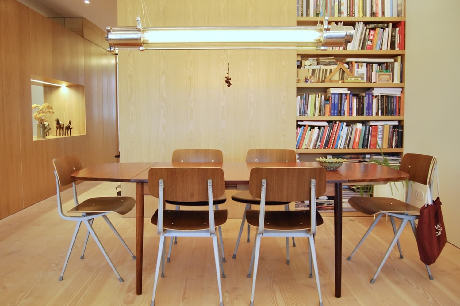
Emanuel de Sousa actually found this apartment by chance. An architect by trade, he’s worked on a variety of projects, from a luxury townhouse building to a concept store and art gallery, so he was well-prepared for the challenge of renovating his own home. When his sister spotted the place, de Sousa says it was rundown and abandoned, but he was leaving his rental of four years at the time, “so it was almost serendipity,” he says, “to be able to continue in the same neighborhood” while refurbishing this home.
The best parts about this apartment? De Sousa loves being in the center of the city, as well as having a terrace, the morning light from his bedroom, the sunsets in the summer “when afternoon rays of light enter through the terrace and gets refracted by the kitchen mirror, flooding the living room with rainbows,” just to name a few. He spends a good deal of time relaxing in his Eames chair, reading and listening to music, or working on architecture and art pieces. He particularly loves the blend of Porto backyards, city center liveliness, and “‘pinheiro manso’ (stone pine or umbrella pine), a favorite tree of mine, which is very traditional in the forest near the Atlantic sea in Portugal.” In sum, “in summer, with the windows open listening to the birds, it is perfect.”
Apartment Therapy Survey:
Inspiration: Anything and everything around me, my daily life, my travels. Everything becomes “material” to work with or around.
Favorite Element: My favorite is surely the most complicated to get together as well, and possibly also the biggest indulgence. It was the adaptation of a standard counterweight sash window to become the partition of the kitchen and living room, which in the end works as an open kitchen or counter. But from the complication of adapting the window framework into this new function, a sort of curiosity cabinet was born, an homage to the glass display storage (common in Portuguese family homes). These display cases truly enchanted me as a child, and later as an architect, opened up a deep enjoyment and admiration for these cabinets. They were actually originally an entire room rather than a piece of furniture, and here, it really does it all. It’s almost a space in and of itself — it displays everyday life objects along with unique pieces, a collection of my notable objects, which I’m always rearranging, enlarging, expanding.
Biggest Challenge: This three-bedroom, ’60s modernist apartment was readapted in the ’90s for a kindergarten, and oddly enough, they didn’t demolish any walls to make the spaces large enough for classrooms, but they did install two large beams (which you see in the living rooms and bedrooms). Although they are actually obsolete, they became the “trigger” for the entire renovation. Now it’s a two-bedroom home, but the spaces are more generous, more contemporary, and up-to-date with our present daily needs.
Proudest DIY: It wasn’t an actual DIY on my part, but the stainless steel cabinetry in the terrace was put together by reusing an industrial kitchen counter that was dismantled and was almost trashed in another design project I had at the time of this refurbishment.
Biggest Indulgence: Looking at the overall budget, these are the most biggest indulgences in a quite tight budget:
— The Douglas solid plank wooden flooring of extraordinary dimensions, some of the planks were 5m long (and a nightmare to deliver and unload), by the Danish DINESEN. These were an extravagant purchase, but definitely worthwhile and wonderful to walk barefoot on.
— The minimal window frames were definitely quite an adventure, and the large panes were actually brought in aerially with the help of a work site close by at the time. But the end result is brilliant, you almost don’t see the frames, as they are less than 2cm, so it’s almost as if there are no windows separating inside and outside. In the summer, the sliding windows and doors almost disappear, and you get this amazing fluidity between living room and terrace, indoor and outdoor.
Is there something unique about your home or the way you use it? The second bedroom turned out to be the home gym and the guest room, and the odd beams in the end became the perfect imbedded architectural solution for a sort of contemporary workout, from yoga to low pressure fitness to a basic level of calisthenics.
What are your favorite products you have bought for your home and why? I guess it’s always the latest thing we buy, and for now, it’s the Beni Ourain Rug that just arrived directly from Marrakech. It’s a handmade, 100 percent virgin wool, milky-colored rug with entrancing diamond shapes.
Please describe any helpful, inspiring, brilliant, or just plain useful small space maximizing and/or organizing tips you have: All my design and interior projects are based on a basic concept, the “working wall,” which means I tend to convert any given wall or partition into hidden cabinetry. In domestic projects, either small or large, the issue tends to be always about storage, as individuals — no matter what — tend to collect things over time. Giving the wall a function besides dividing space is always a win-win, even if you seem to be “losing” space.
Finally, what’s your absolute best home secret or decorating advice? Never forget mirrors, especially large ones, like floor-to-ceiling, as they work wonders, either in small or large spaces, from creating an illusion of more space to refracting natural light. I tend to use lots to mirrors, either as one more architectural material or as a piece of decor.
![Connecting With Family and Nature at The Totoro House [Video]](https://furnishly.co/wp-content/uploads/2022/07/connecting-with-family-and-nature-at-the-totoro-house-video.gif)
by Furnishly | Jul 18, 2022 | Design Inspiration
Inspired by the powerful family ties of the clients and their connection to the environment, the Totoro House concept erases boundaries between living spaces and the garden. Designed by CplusC Architectural Workshop, this design was named after Studio Ghibli’s animated fantasy, My Neighbor Totoro, which explored the importance of such relationships more than three decades ago. To keep these bonds unbroken, the lounge, kitchen, and dining space are merged into one family zone that melts out into the garden. The outdoor space acts as an extension of the living room, including its own cooking area and seating, so that family life can flow freely and contentedly.
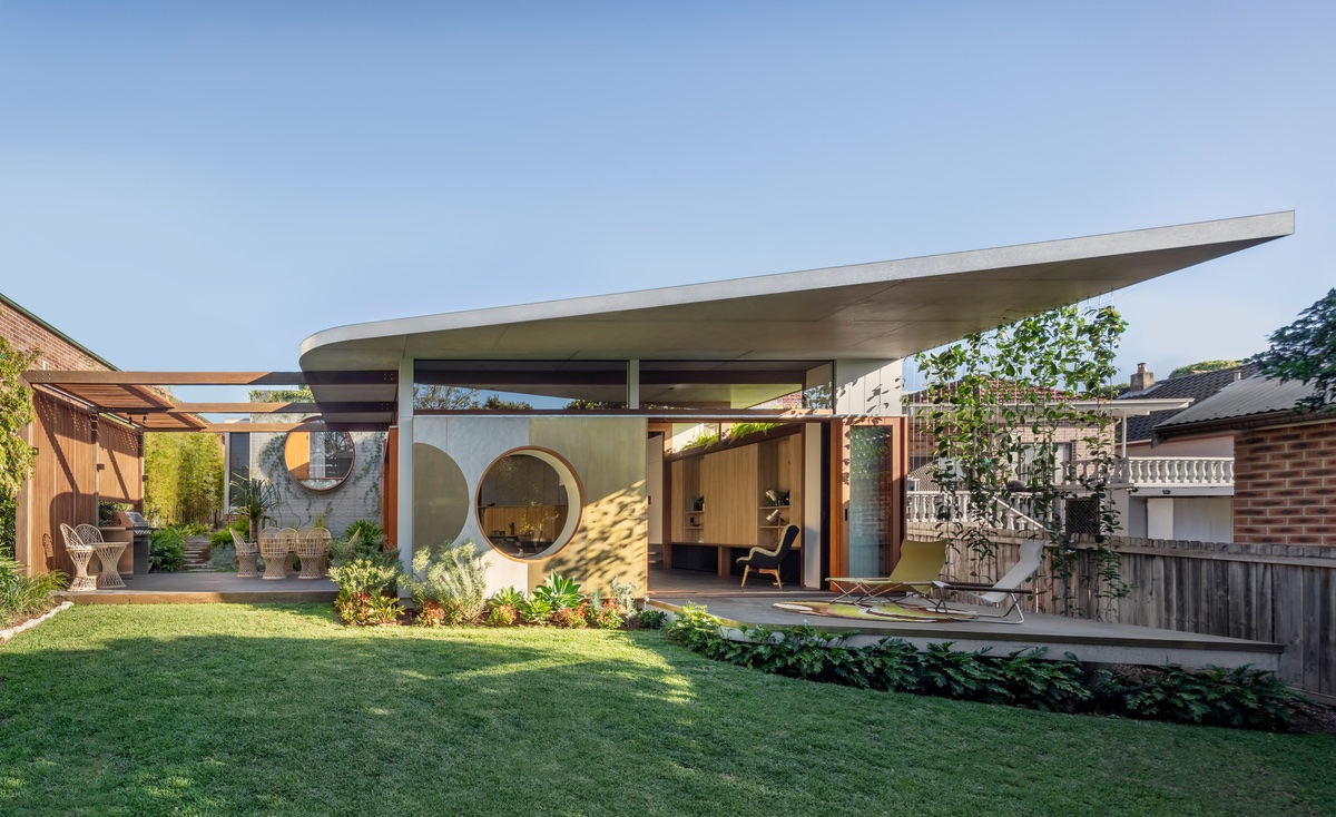 The exterior of this unique home design has a distinct space age appeal, synonymous with the futuristic thinking of late 1950’s architecture. An overhanging roof sweeps around the side of the house with a widely curved corner before soaring into the sky as a great angular projection.
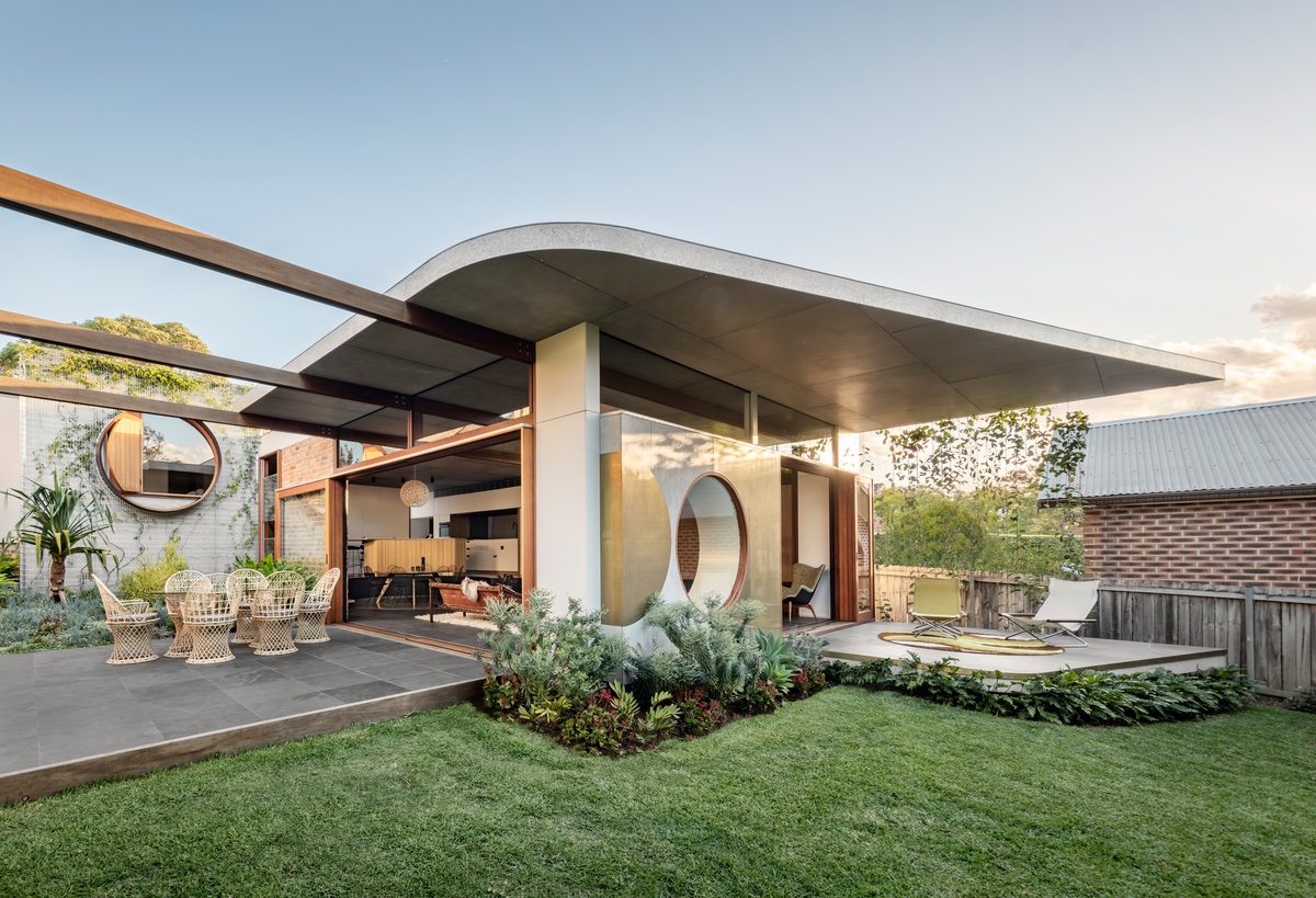 The aerodynamic-like roof design shades a single-story build with interesting fenestration. Clerestory windows cut around the full perimeter, crowning walls of glass bifold doors and round feature windows.
 At night, the effect is dramatised under warm glowing lights from inside and outside of the home.
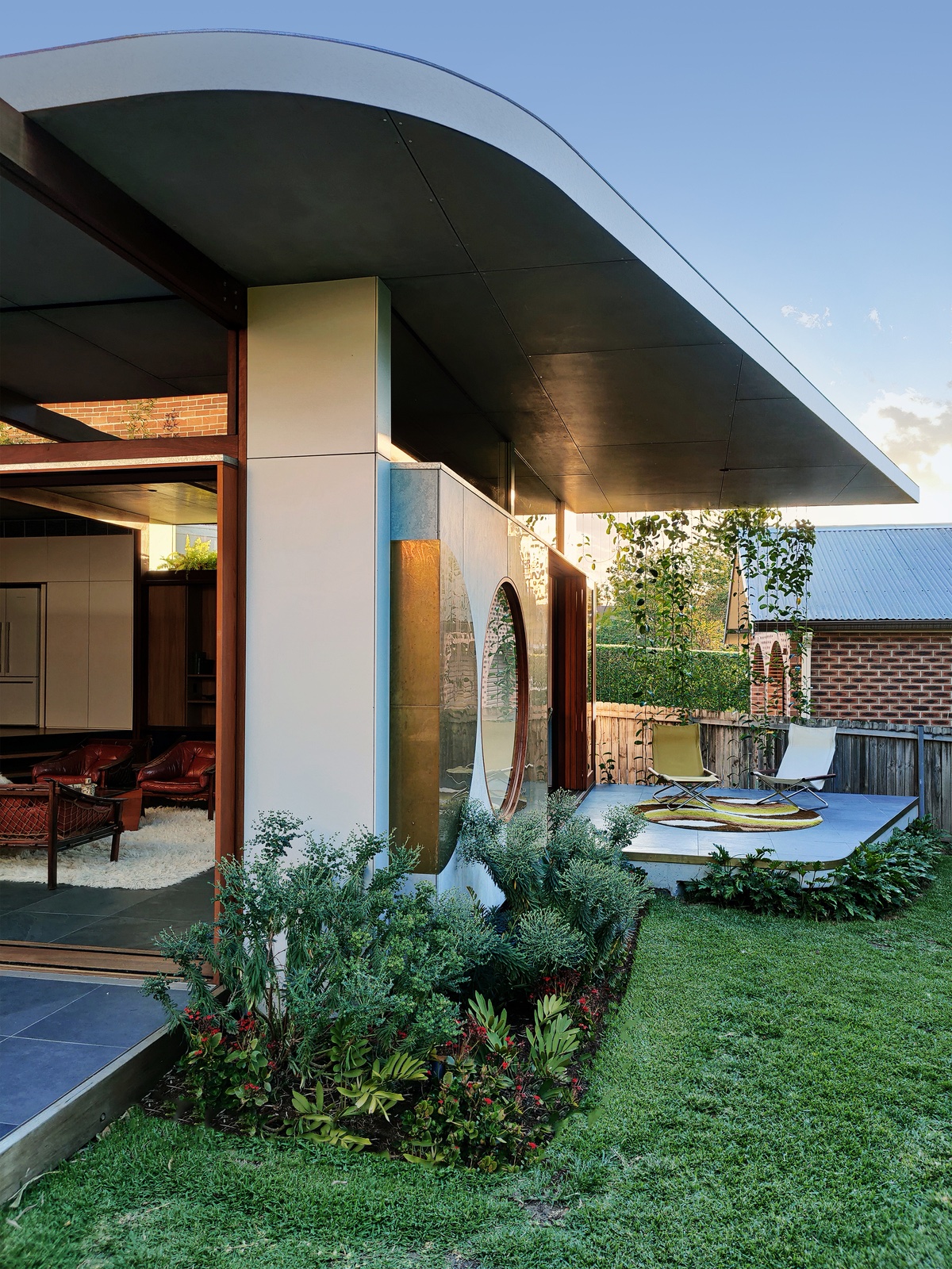 The original house on this plot suffered disconnection with the rear garden because of the topography. A new extension was added to bridge the gap that hindered the homeowners, creating an easier transition to the outdoors via a fresh living space. Small patios were added to extend the usable area, like this shady spot with outdoor lounge chairs.
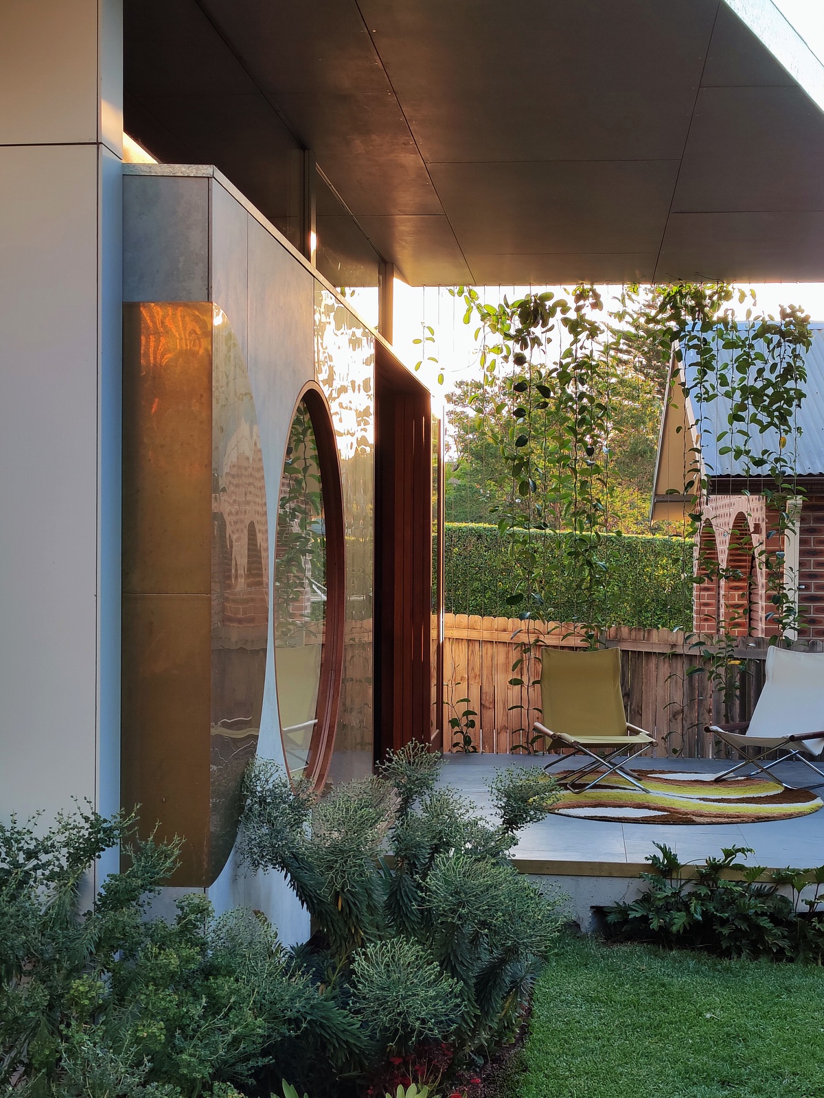 The new outdoor spaces were arranged with the privacy of both the homeowners and their neighbours in mind, ensuring all could continue to enjoy the environment in peace and seclusion with their families.
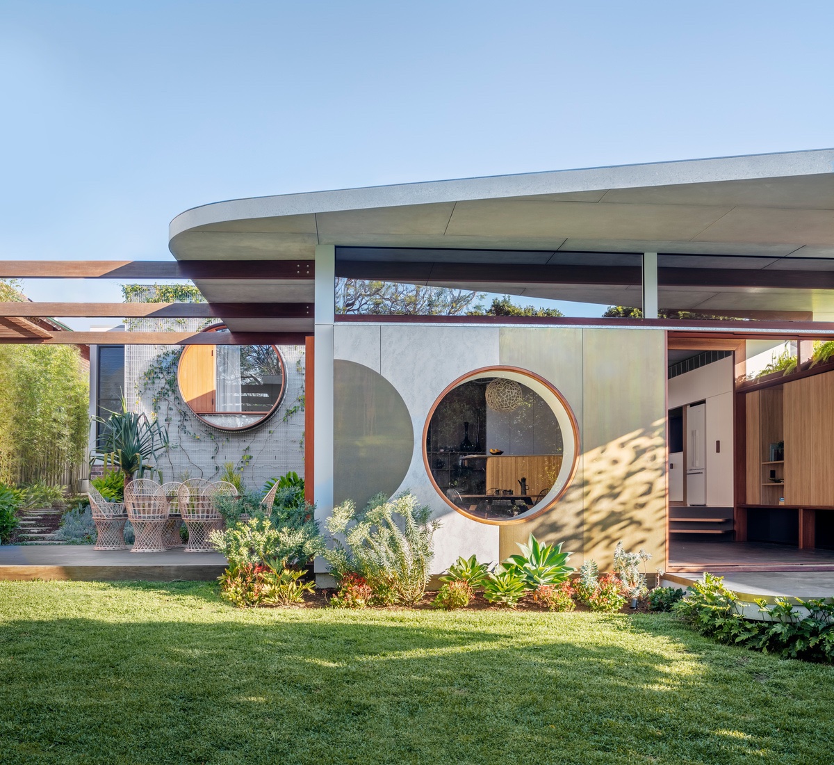 The roof overhang blurs the margin between indoor and outdoor living spaces, making exterior areas into partially roofed rooms.
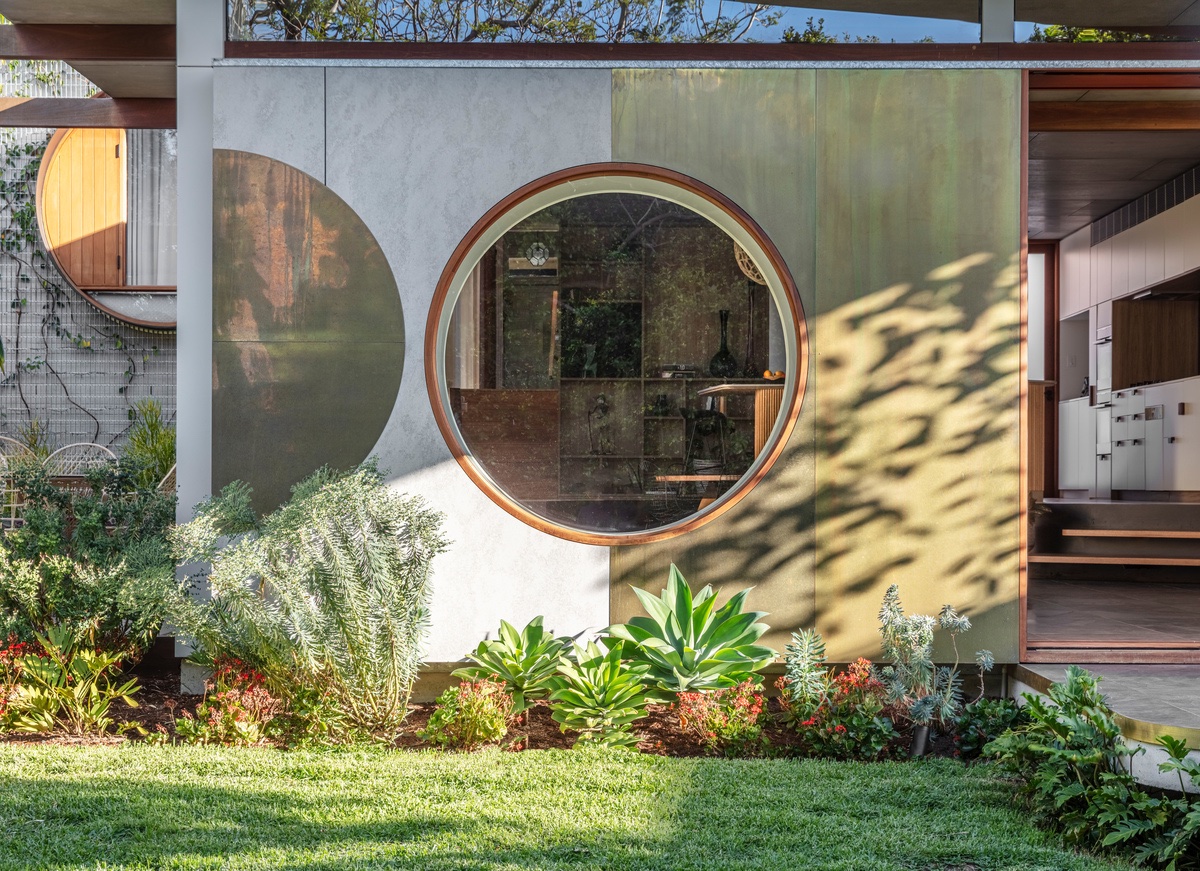 The new home extension features a large round window that accepts a wonderfully framed view of the landscape into the living room.
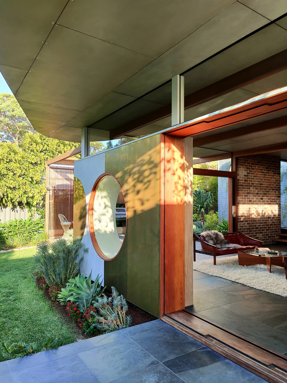
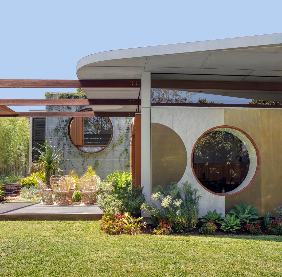 The circular motif is repeated on the face of the building and in a second window behind the outdoor dining room. To achieve the decorative brass cladding with environmentally conscious practice in mind, careful calculations were made in order to cut from only two standardised sheets.
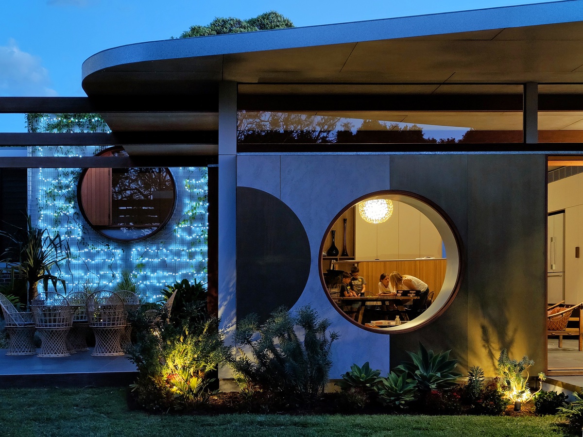 From the exterior, the round window designs are a porthole into the family’s close-knit lifestyle.
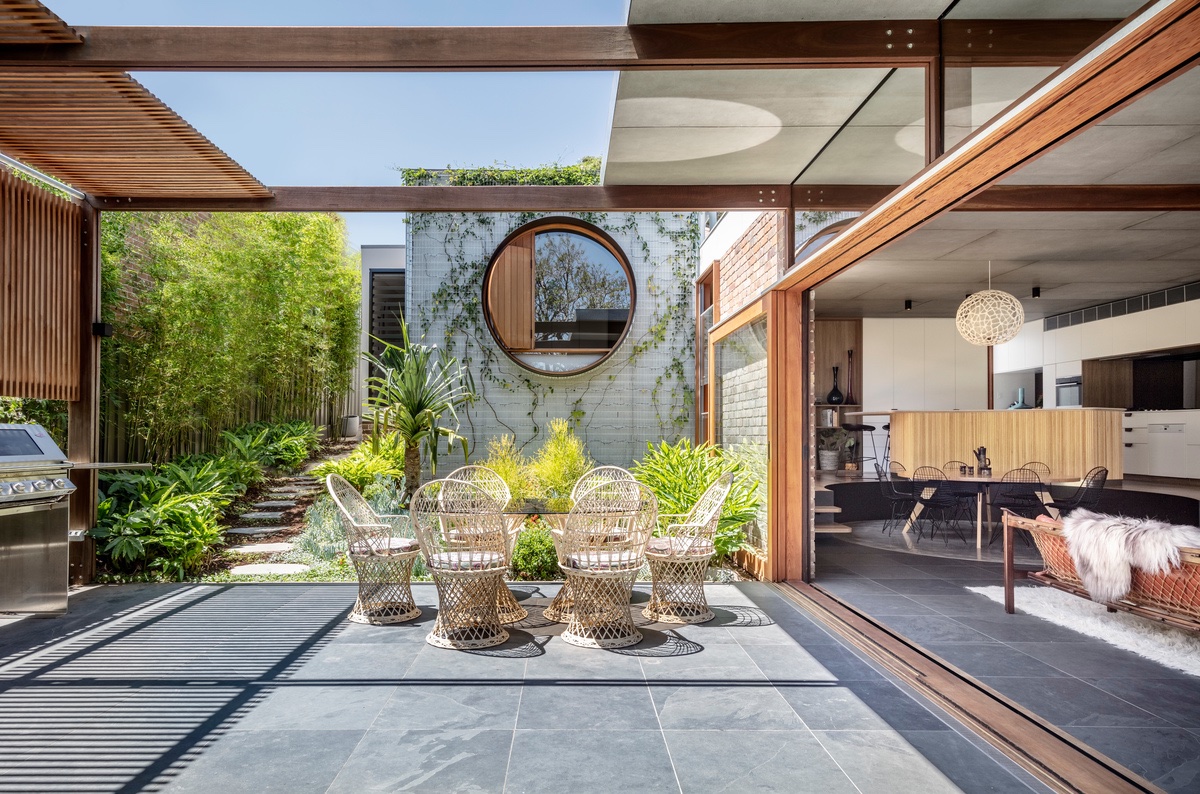 The threshold between the architecture and the garden was buffered with the help of a landscape designer. Native plants make soft borders around the patio and climbing plants are intended to lushly envelop the master bedroom facade over time.
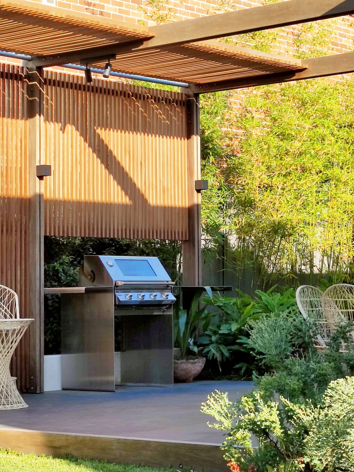 Alongside the outdoor dining set, a high-end barbeque stands ready for a cookout underneath a shady pergola.
 The new home layout has transformed the formerly gloomy living areas into a single light-filled open-plan space. This free-flowing concept granted the homeowners’ wish to be more united with their children.
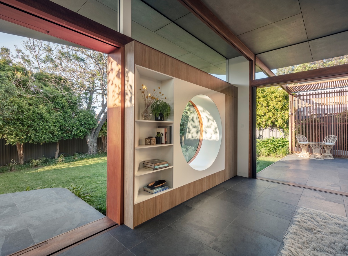 The round window concept that frames the garden view was motivated by the traditional Japanese concept of Shakkei. Shakkei is the principle of including background landscape into the composition of a garden, or “borrowed scenery”. In this instance, the large porthole delivers a scene of tranquillity during the school day and a snapshot of fun family activities on evenings and weekends.
 The curves of a wingback chair complements the circular window design.
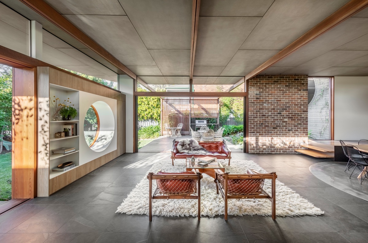 With the glass doors at each side of the room retracted, there is a blissful through-breeze all day, as well as the fresh scents and calming sounds of nature.
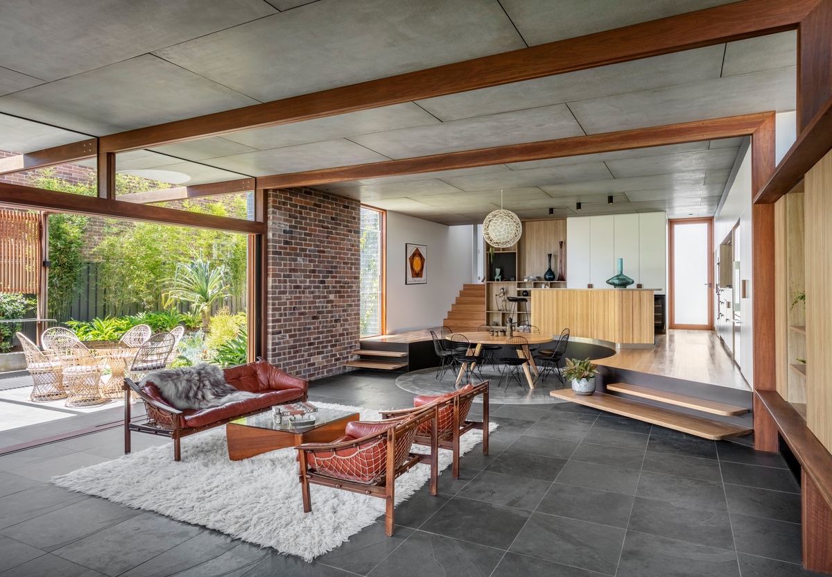 The lounge furniture rests on a welcoming white living room rug, providing plush comfort from the hard, tiled living room floor.
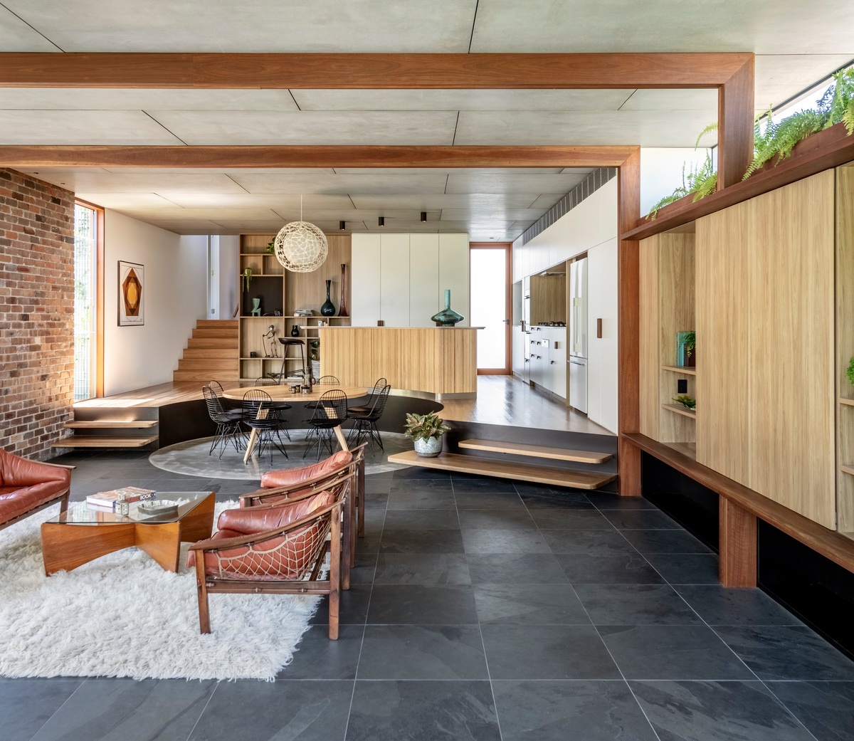 The kitchen is visually separated from the lounge by a change in floor height, which allows the parents to oversee their children playing whilst they cook dinner.
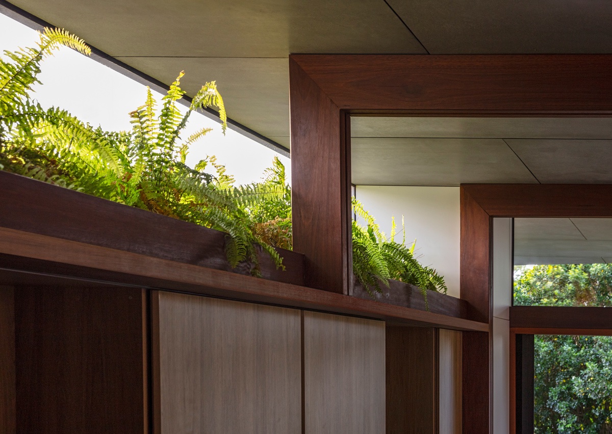 Indoor plants are situated along the sills of clerestory windows to strengthen the link with the garden.
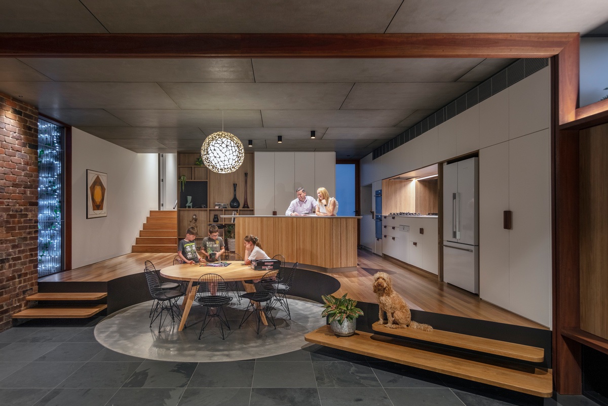 Steps climb the circular kitchen diner setting on both sides, facilitating easy movement around the main living space for multiple family members undertaking different tasks.
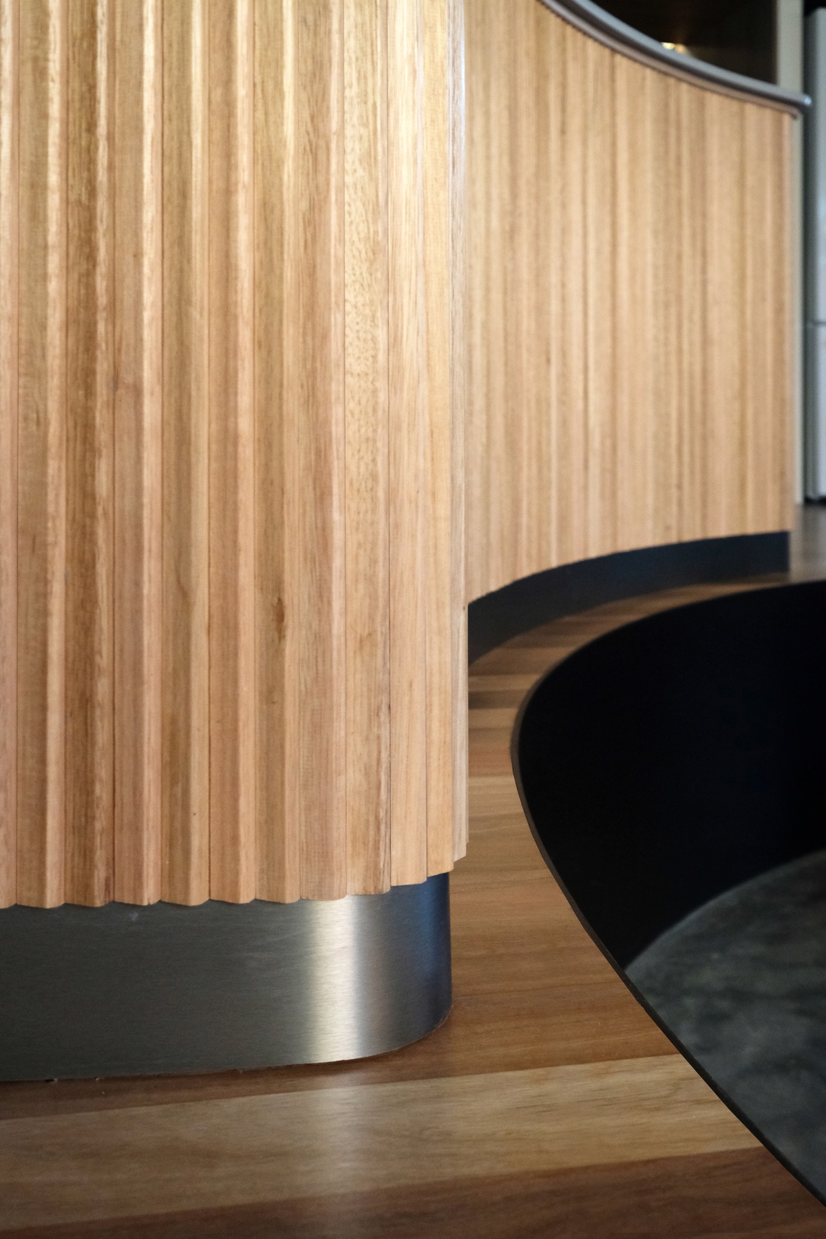 Fluted panels add modern texture to the wooden kitchen design.
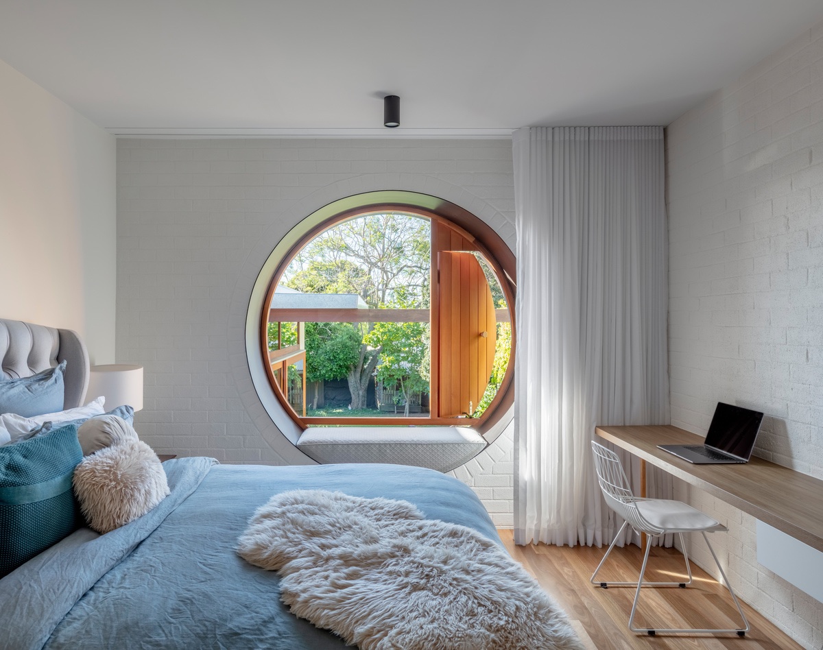 In the bedroom, part of the round window was made operable to permit natural ventilation. The curved frame serves as a fun window seat for the children.
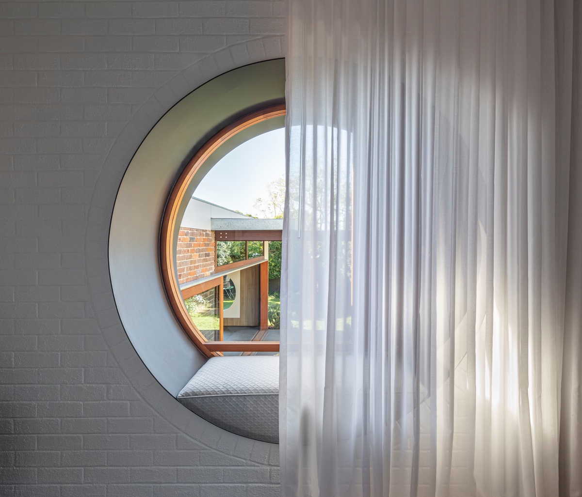 Two layers of blinds provide control over the level of light and privacy.
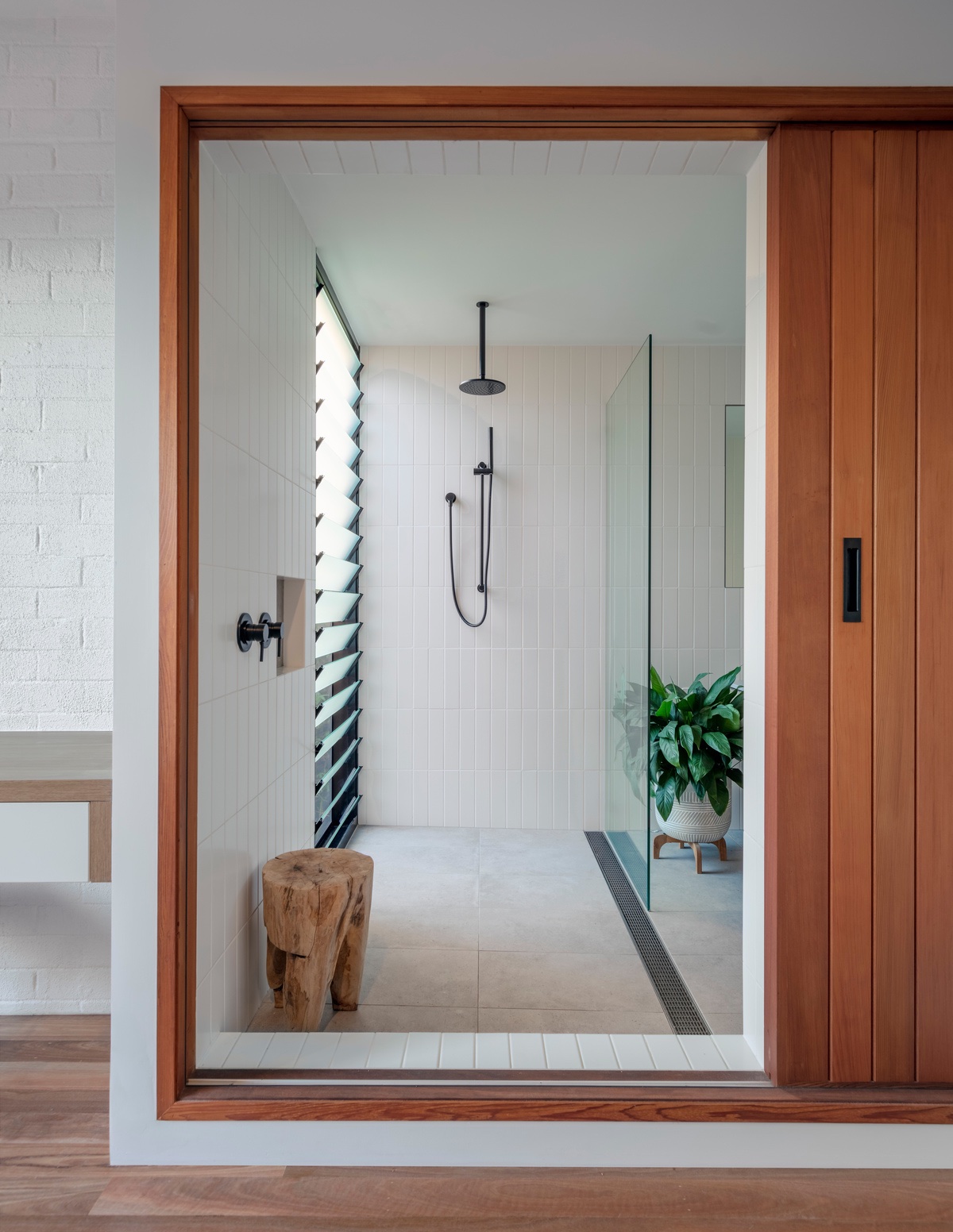 In the master bedroom, a pocket door slides away to reveal an ensuite shower space design.
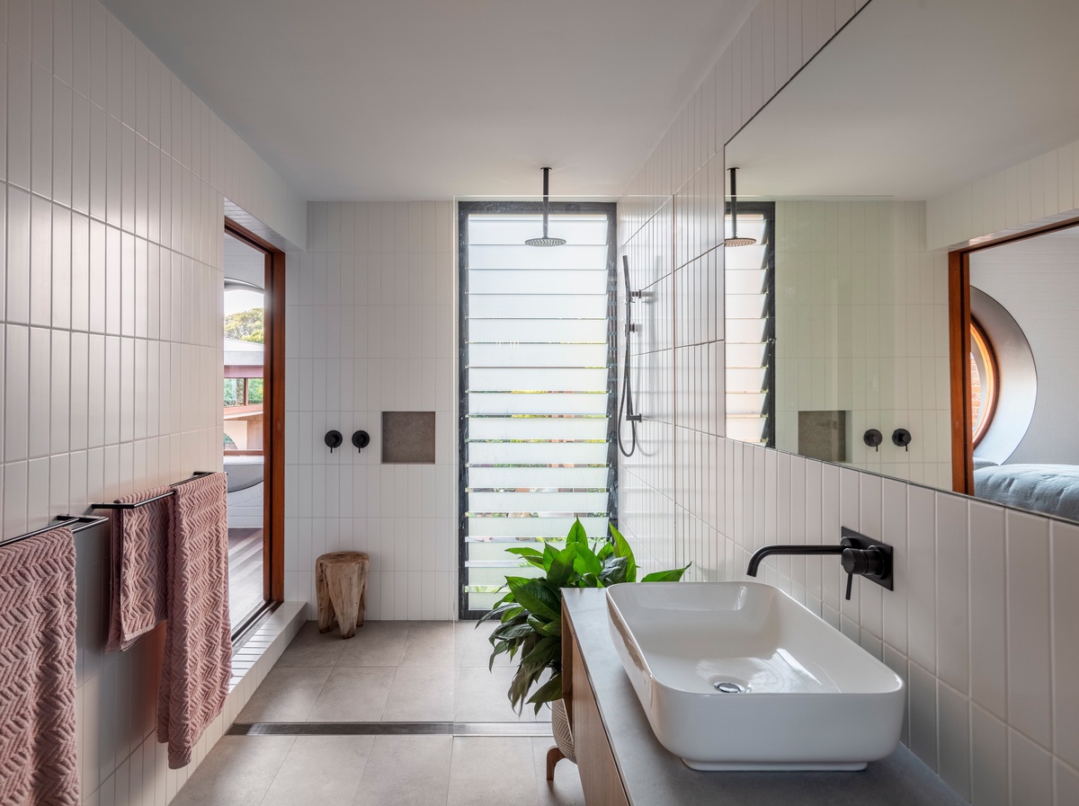 Moving from the shower area, we come to a unique bathroom sink beneath a frameless vanity mirror. The walls of the ensuite bathroom are clad with vertical subway tiles, which makes the room appear taller.
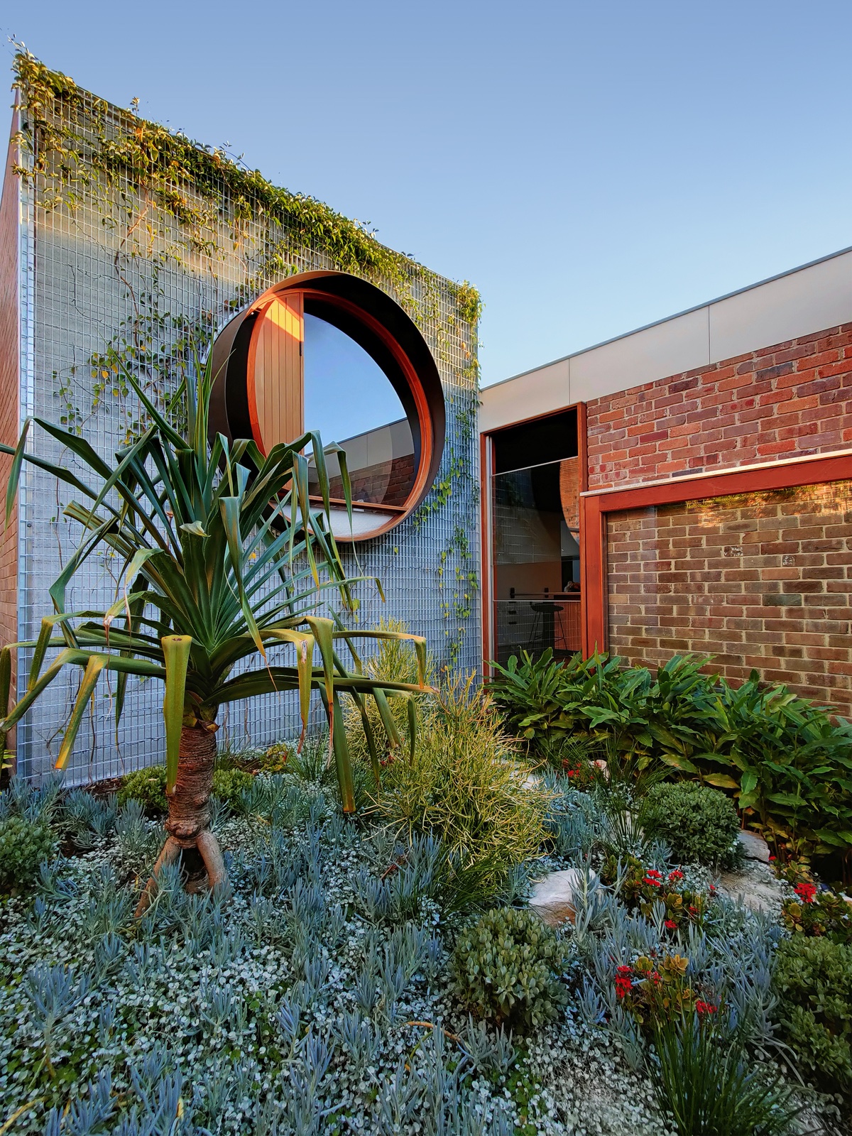 All the original areas of the home have been upgraded to fit with the new extension, including the modern landscape design.
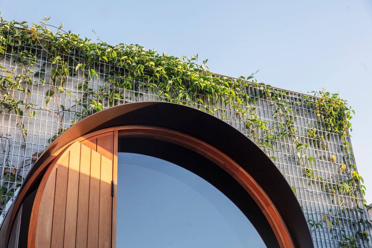 The new spaces have improved family life and fun.
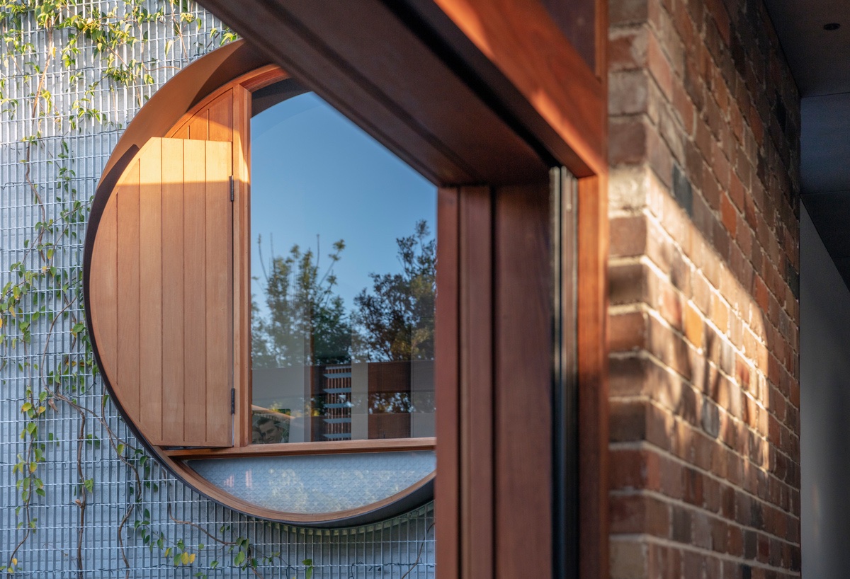 Careful consideration has been given to the use of materials in the design of Totoro House, with many existing materials reused and repurposed to reduce waste.
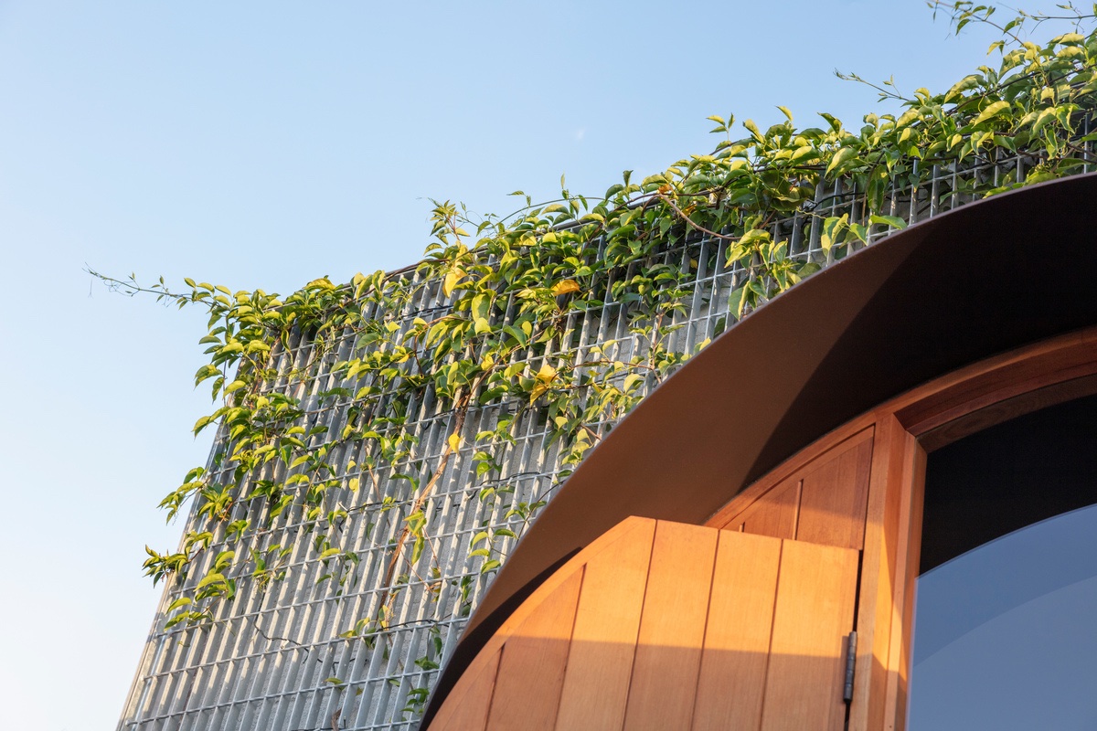 This design ethos coincides with the sustainable lifestyle of the family.
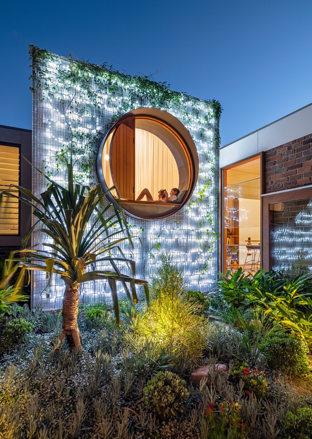 Daily environmental impact has also been reduced by including an 8000L rainwater tank.
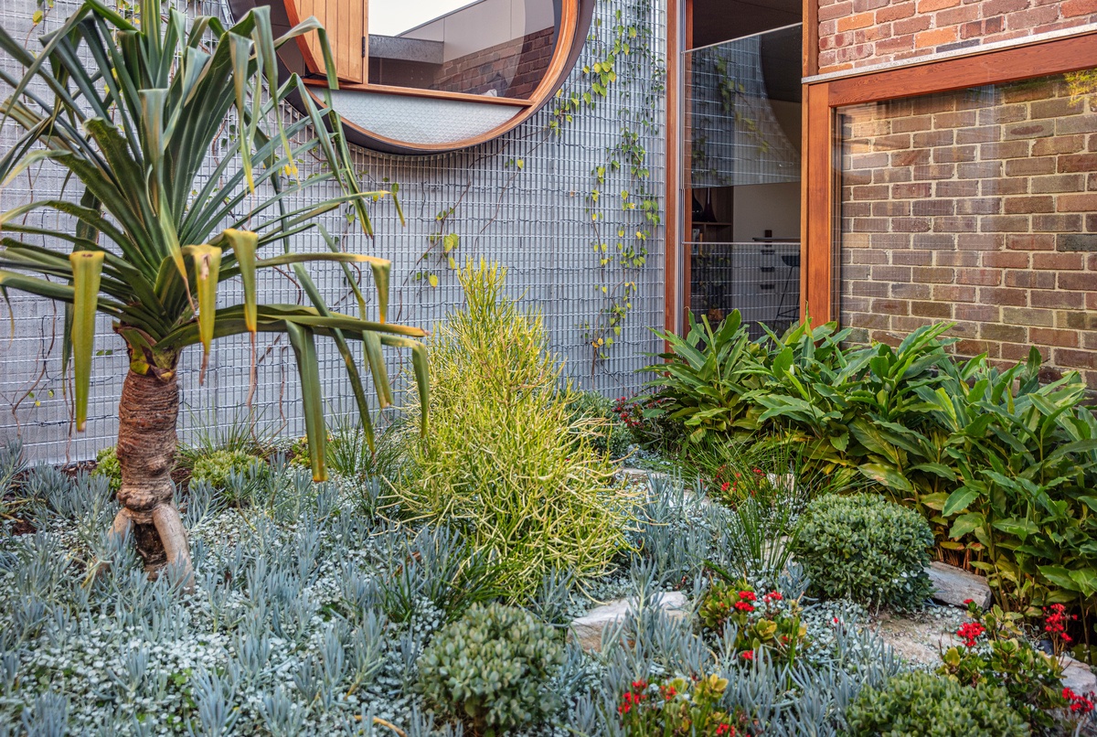 A 3kW photovoltaic system was also installed to power the home with solar.
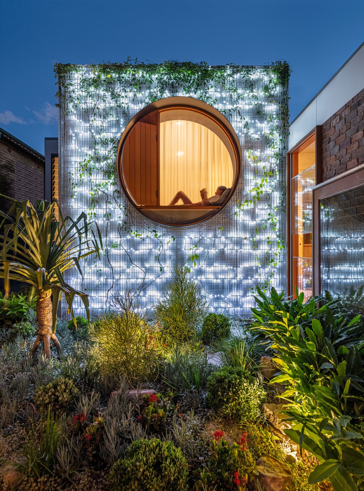 The solar store powers exterior lights long into the night.
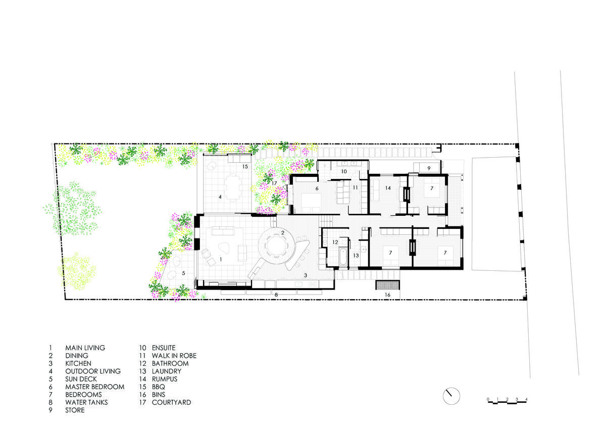 On the floor plan, we can see the relationship between the private bedroom quarters of the original house, the new open-plan living room extension, and the garden.
Here is an atypical house tour that does not use music to prop up the visuals, instead it embraces the natural sounds in the house’s setting.
Check out the home tour video:
[embedded content]
Be sure to subscribe to Home Designing on Youtube for regular architecture and design videos.
Did you like this article?
Share it on any of the following social media channels below to give us your vote. Your feedback helps us improve.
Other related interior design ideas you might enjoy

by Furnishly | Jun 29, 2022 | Design Inspiration
It may have taken us a while but we are proud to bring to you our very special Dream Home Kit, the most comprehensive home design resource kit ever assembled for the first-time homebuilder. This package has been diligently complied with three years in the making to offer an extensive set of design sources. It includes guides, house plans, color palettes, plant combinations, and contact details for some of the world’s best architects, interior designers, and landscape designers. If you have ever yearned to create your own dream home but were not sure how to make your vision into reality then this is for you. Check it out here, and get special early bird pricing along with bonus ebooks for a limited time only!
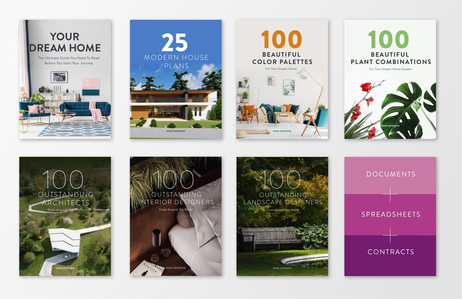 Thing of it as your Infinity Gauntlet for designing your dream home, but with way more gems!
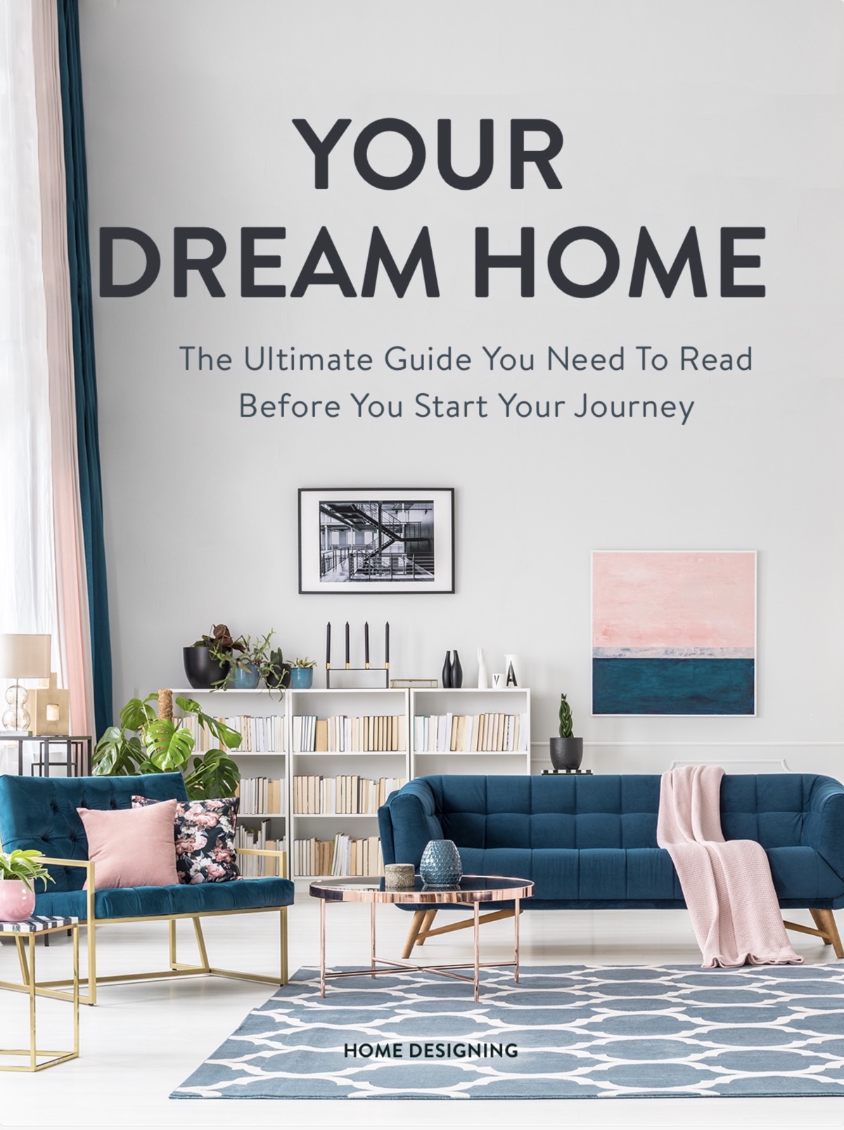 Your Dream Home: Included in this pack, Your Dream Home is the ultimate guide to read before starting your design journey. This in-depth, feature-packed resource has over 300 pages of comprehensive advice for anyone who is considering building a home of their very own. It covers every step of the home design process, including the initial decision-making process, how to avoid common mistakes, timing, budgeting, and funding for your construction. You’ll find out what to expect at every stage of the custom build process, how to identify the right professionals and choose the right location, layout, style, and finish, and how to retain property value for a lifetime.
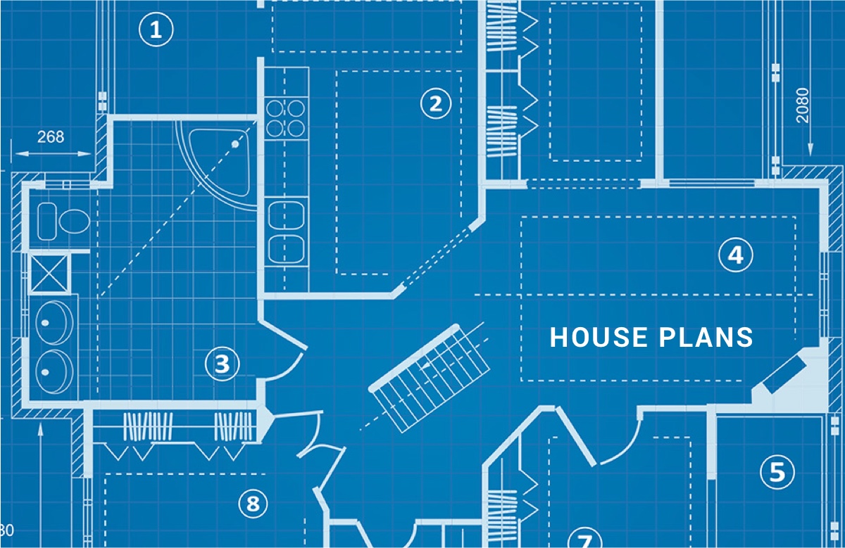 House Plans: Provided with both imperial and metric dimensions, this multipack of 25 house plans also includes lights and power line positions, furniture layouts, information on concrete mixes and concrete hollow block reinforcement, plus floor, wall, window, and door specifications. The plans cover a range of two, three, and four-bedroom designs for two-story homes. Each informative home plan set also includes CAD files, detailed section drawings, side elevations, and slick 3D renders.
 100 Outstanding Architects: The Outstanding Architects book features superb talent from around the world. Spotlighting one hundred accomplished architects with a proven track record in fantastic feats of engineering, this supreme round-up provides an invaluable resource for your home-building journey.
Inside the book, you’ll also find the professional website information of each architect, so that you can delve much deeper below the surface of this inspirational collection. This valuable tool is designed to help you forge a successful partnership with like-minded talent that will make your dream home come true.
 100 Outstanding Interior Designers: The Outstanding Interior Designers book is a carefully curated list of one hundred creatives from around the globe. With this book in hand, you will be able to handpick from an outstanding talent pool that can assist you in realizing the inner spaces of your dream home.
This crucial book has been compiled to offer a wide diversity of styles and creative flair so that all different outlooks are catered for. The inspirational images within demonstrate work from interior design professionals at the peak of their craft, and you’ll find the designers’ website information alongside for further study before getting in touch.
 100 Outstanding Landscape Designers: This guide to Outstanding Landscape Designers From Around The World will help you nurture your own little piece of the globe. This green-fingered talent pool of 100 nature-loving souls are equipped to tame and trim wild habitat and fine-tune green spaces to elegantly complement your architecture.
Whether you’re looking to create a layered landscape, install a compact vertical garden, or plant paradise at your poolside, this book has inspiration for all. When it’s time to dig a little deeper, you’ll find links to the landscape designers’ websites so that you can commence your journey.
 100 Beautiful Palettes: Picking paint colors can be fun yet stressful at times, due to the vast amount of options on offer. Take the guesswork out of color matching and effective contrasts with this book of beautiful palettes, which features one hundred inspirational combinations.
You’ll find effective color combos to suit every decor taste and interior aesthetic, every room type and size, and to suit different levels of natural light. From pale, tonal palettes to brightly saturated bolds, you’ll never be short of inspiration for your next painting project.
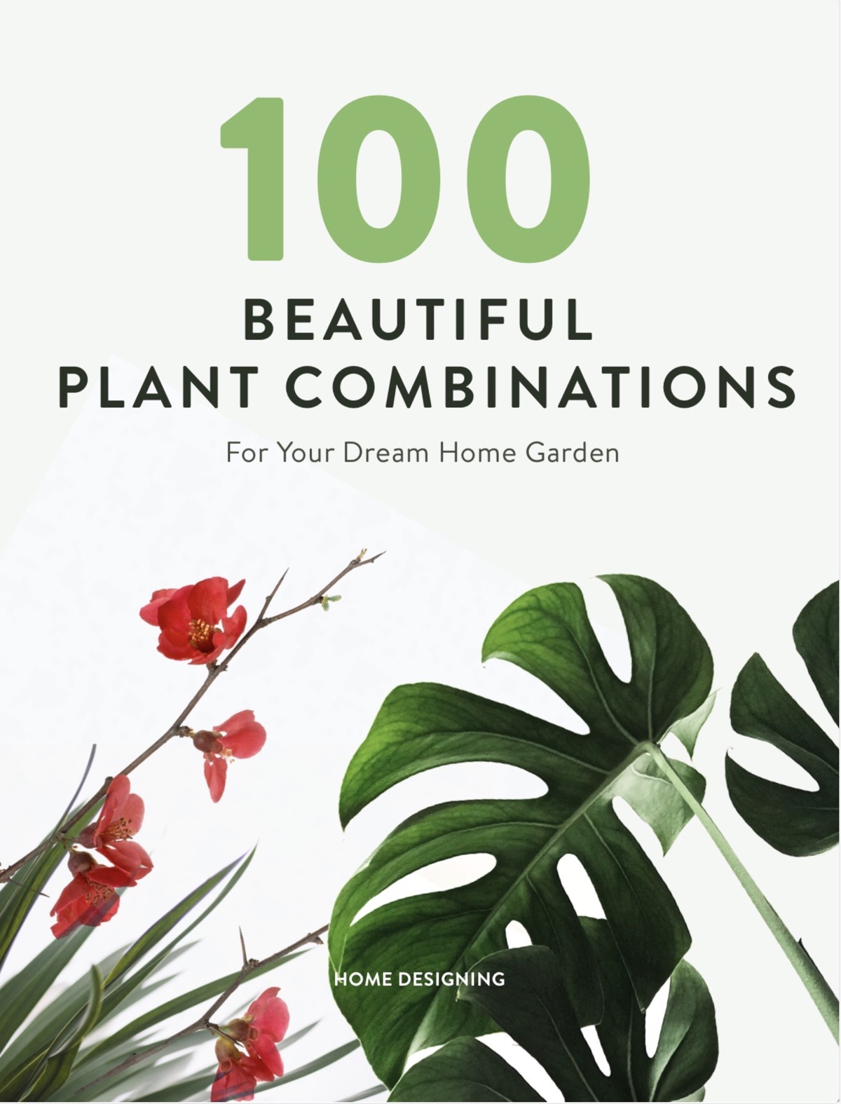 100 Beautiful Plant Combinations: Get down into the details of your future dream garden with this book of beautiful plant combinations. Featuring one hundred inspirational groupings that will encourage you to come outside of your dream home all year round, this guide is essential for gardeners and novices alike.
You’ll discover planting inspiration with variety, color, and wow factor delivered through creative placement and display. You’ll also receive important information on which plants thrive well together by climate and conditions so that your new garden truly thrives.
 Spreadsheets & Contracts: Compiling all of the information for your new home design can be a tricky business, so you’ll need a system by which you can keep track of your contracts. This set of spreadsheets will fast-track you on your way to staying organized as you book contractors, and safe from losing essential contact information.
You’ll also find an architect’s brief template enclosed to assist you in clearly setting out all of your wants and needs, so that your creative team can make your home design dreams come true.
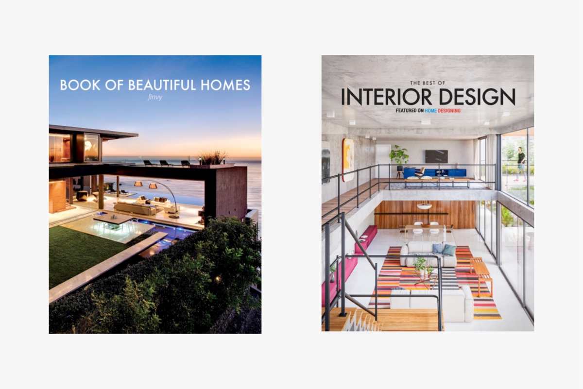 Bonus Ebooks (For A Limited Time Only): We’re including our Book Of Beautiful Homes and The Best Of Interior Design as featured on Home Designing for a limited time only. Be sure to be an early bird to catch yourself an even more exciting deal!
Get it here. (Psst, use the coupon ‘EARLY’ at checkout to get an unbelievable early bird discount!)
Did you like this article?
Share it on any of the following social media channels below to give us your vote. Your feedback helps us improve.
by Furnishly | Jun 21, 2022 | Design Inspiration, Style
As most house aficionados know, in the early 1900s, Sears (yes, those stores known for selling jeans, tools, and everything in between) got in on the home selling game, resulting in hundreds of Sears “kit” houses and craft homes being built across the United States.
I’d never heard of them before until I bought one. I sent a picture of the house I was interested in buying to my mom, who is a historian of sorts, and she recognized it right away as a Sears kit home. Excited that my new home might have a bit of neat history to it, I started digging to learn more.
I discovered that the Sears Modern Homes program sold 447 ready-to-build, customizable house varieties via catalog to buyers between the years of 1908 and 1940. They reportedly sold around 70,000 houses, and an estimated 70 percent of them are still standing. These “kits” came with almost everything that would be necessary to see the final house built, including nails, flooring, doors, and even the paint (though cement and plaster were not included, nor were electrical, heating, or plumbing systems).
I fell in love with the house for its quaint touches, but once I moved in, I really began to spend time getting to know the charming details — and understand just why these homes are highly prized for their style, workmanship, and durability. Above all, I love the kitsch factor that represents a chapter in American history when things were built well and affordably.
In the case of my home, the style is quite sinuglar. Once I was able to distinguish its notable exterior features, such as columns in the front and the small windows situated on the roof’s peak, I noticed quite a few others like it throughout the rural Pennsylvania neighborhood where it has stood since 1920. Our house, along with many like it, has been remodeled over the years.
Ours has an addition placed in the back, and offers a large pool in the backyard. The layout is extremely user and family friendly, with a spacious attic and basement, decent-sized bedrooms all located on the same floor, and roomy closets throughout the home. The place boasts original glass doorknobs, unique-looking windows and shutters, a solid wood banister, and original doors. It also has ornate woodwork on the front porch and maintains its original sliding “pocket” doors on both sides of the kitchen. (I guess so one can bake in private?)
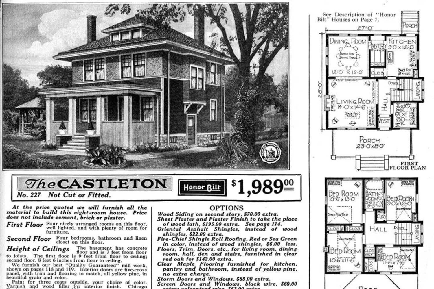
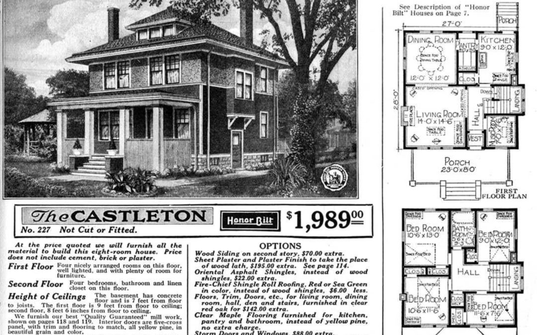
My mom thought our home bore resemblance to the Castleton model, but it appears to have features of the Hillrose as well. As these homes were highly customizable, it wouldn’t surprise me if the original 1920 owner mashed the two together.
Though many Sears kit homes have been customized and heavily remodeled over the years, some markings identify that the house is. For instance, in a Sears kit home often has stamped wood in unfinished areas like the attic. I looked in some unfinished areas of my home to see if I could find any of these markings, and I haven’t been able to locate them, yet. While I’m certain that it’s a Sears home due to my mom’s identification and to the fact that it bears a stunning resemblance to the images I’ve found of the Castleton model, I do intend to research the mortgage document history to confirm that it’s a Sears, Roebuck and Co. home. I may even opt to list in the National Registry of Historic Houses, as other kit house owners have done.
My home is large, sturdy, and lovely inside and out, and is adorned with many quaint features. The lumber used on many of the Sears homes was virgin wood, pine in some cases (I believe this to be the case with our house), resulting in a strong home that’s built to last. I would have never guessed a house ordered from a catalog in the ’20s would fit that bill, but I’m sure glad it has.

by Furnishly | Jun 11, 2022 | Design Inspiration, Style
From skyscrapers and museum buildings to cathedrals and historical structures, architecture plays an important part in where we choose to travel to. If you think about the tourist attractions in your nearest city, there’s a high chance that it will involve at least one magnificent piece of architecture that people flock to snap a photo and marvel in the impressive design. But which is the most popular piece of architecture in America right now?
A new study from online art and design marketplace SINGULART has revealed America’s most photographed architecture, taking into account Instagram data and the number of posts across relevant hashtags.
In first place is the Brooklyn Bridge, having received 3.5 million posts under the hashtag #brooklynbridge at the time of the study. Whether stood under it, in the middle of it, or the classic perched on the edge of it pose that graces many Instagram feeds.
In second place is another bridge, but this time on the West Coast: the Golden Gate Bridge in San Francisco. The iconic red structure had 3.1 million Instagram tags at the time of the study. Taking the bronze medal is the Empire State Building, following up closely behind with three million posts. From exterior photos to snaps taken at the very top, the 102-story Art Deco skyscraper is a popular pick among both tourists and locals.
For those looking to up their game in photographing architecture, professional photographer Gregory Herp, who focuses his work largely on architecture, shared his top tips with SINGULART.
“Look around you and look for another angle, try to get on a roof on the other side of the street, or shift your position completely by incorporating one or more elements into your composition that will reinforce your image,” he says. “It’s not just a matter of standing at the bottom of a building, looking up and taking a picture! I have to look for my point of view, make these lines and volumes the actors of my image. Architecture is fascinating if I can make it bounce off something else in my composition.”