Erin Napier’s Fresh Take on Traditional Subway Tiles Is Far from Square
2-Day Shipping on most products. Shop Now!

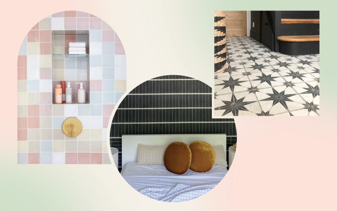
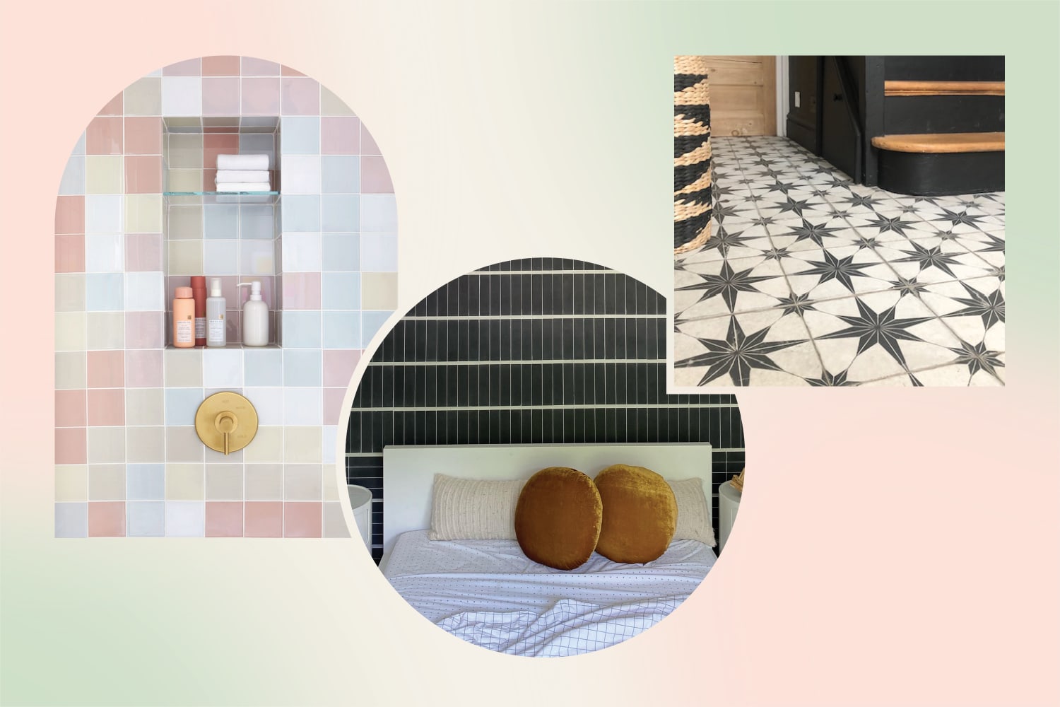
From shimmery zellige and colorful hex tiles to simple squares, we’re living in somewhat of a tiled surfaces renaissance right now. “After the last year-plus of staying home, people are expressing themselves more in their spaces,” says Kali Gibson, PR manager for Fireclay Tiles. “It feels like people aren’t playing it as safe and are leaning into going bold with color or pattern (or both!). It’s less about trends and more about personal expression.”
Because there are so many tile shapes, finishes, materials, and colors out there — and infinite patterns to lay those shapes, finishes, materials, and colors out in — it can be difficult to find a tile that works well with your your personal style. If you’ve honed in on your aesthetic but aren’t sure how to translate that into a tile you’ll love, look no further than this expert-sourced, handy guide of go-to tiles that’ll complement different design styles.
Design elements from the 1980s are huge right now, and square tiles provide a fun throwback to that era. “Square tile is definitely timeless and a classic tile shape, but it definitely had its moment in the ’80s and ’90s and has made a comeback in a fresh and modern way,” Gibson says. The ’80s iteration of the simple shape involves selecting fun colors — even purposefully mismatched ones, as shown in blogger and graphic designer Joy Cho’s bathroom above. Think of tiling a backsplash, shower surround, or even full wall covering in this way as creating your own personal, life-sized Tetris board in the colors you love. “Essentially in tile, you can use all shapes, and the idea is to elevate bold, bright colors accentuated in shapes,” CEO of Mercury Mosaics and tile designer Mercedes Austin says.
For the cottagecore aesthetic, Austin recommends going in the other direction and “sticking with classics like white and off-white.” Both Gibson and Austin say to keep the colors muted and add interest by varying up shapes or the way you place the white tile. For instance, a herringbone or hex pattern would also work well in a cozy, cottage-like space. “Don’t forget details like trim pieces to finish the look,” Gibson adds.
Interiors photographer Margaret Wright is drawn to the minimal, Scandinavian influence of skinny rectangular ceramic tiles, sometimes called “Kit Kat tiles” because of their shape. The ones Wright used in her guest bathroom, shown in the second image above, were handmade by artisans in Japan, which makes them the perfect choice for the Japandi aesthetic, which blends Scandinavian elements with Japan’s more rustic, nature-inspired palette.
Wright also says she’s photographing a lot of zellige looks in peoples’ homes right now. “I think the zellige trend is for the artist-type person because they’re all unique, and some of them might be damaged, or they don’t fit together perfectly, but they create such a beautiful look when it’s all finished,” she says.
“The old Hollywood style for me summons the use of the scallop-shaped Moroccan Fish Scales,” Austin says. “Complementing [them] with gold, glamorous plumbing and hardware gives off that classy feel, no matter the space.” Stick to darker colorways like the bold blue and green jewel tones shown here to really nail a period style 1920s Art Deco or Art Nouveau look.
While Hollywood Regency is about keeping things dark and moody, Scandinavian style is about keeping things airy and simple. “Scandinavian style is all about editing it down to the essentials and is ideal for layering natural elements and rustic finishes,” Gibson says. Her advice? Don’t feel pressured to stick with only white tile or classic installations. “Scandi aesthetic doesn’t have to mean you have to go for neutral-colored tile, so long as the overall feel is minimalist and streamlined,” she says. Sticking with straight edges but creating a pattern with movement is also true to Scandi style, she adds.
Subway tile can definitely work with other aesthetics if you make bold choices with color or use it in an unexpected spot, Gibson says, but if you’re looking for something tried-and-true, go with a classic white subway tile in the kitchen. You can pump it up with dark grout if you want something a little more pronounced than the classic all-white kitchens you see here.
The black and white color combo is also a classic, and a black-and-white cement tile is perfect for the modern farmhouse aesthetic. A patterned cement tile reminds Wright of a quilt, which is why it’s the perfect choice for this popular design style. Try a black-and-white starry scintilla pattern, shown here, to complete the cozy, lived-in look of any farmhouse-style entryway, kitchen, laundry room, or bathroom.
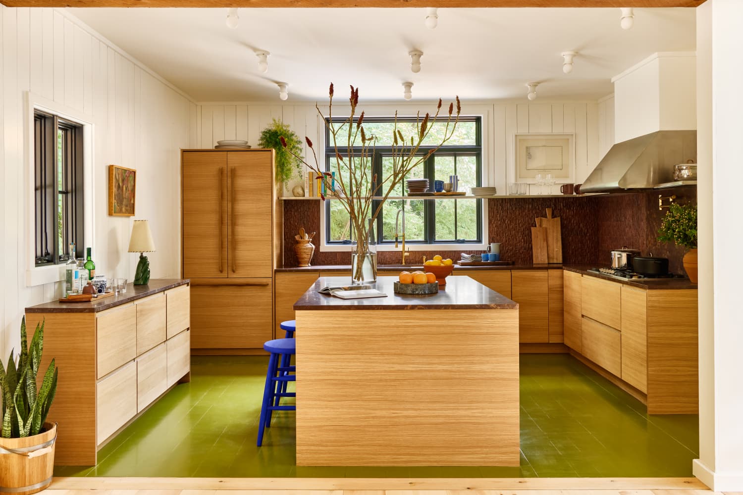
Finally, no tile round-up would be complete without a hex in the mix. Deep red-orange stone is all the rage right now — and perfect for an old-world Spanish feel in your home. “From bathrooms to kitchens, we’re noticing more clients going for warmer neutrals, pinks, and oranges,” Gibson says.
“You should always start with the general feel/style you’d like (the fun part) but ground it with specific goals,” Austin says of tile design. Here are some other steps to consider before installing your dream tile.
Logistics: Austin recommends padding your plan with extra money and extra time for shipping delays. That’s a 20 percent contingency to your budget and aiming to acquire most, if not all of your project materials before starting the labor on the project. “The logistics part isn’t incredibly fun, but if you discipline yourself on these elements, it will allow you to have fun with the fun stuff,” she says.
Grout: Your grout color and thickness can make a difference. These days, experimenting with grout is trendy, according to Gibson. “More and more people are wanting to incorporate a larger grout joint as a part of their design to create a sort of striped look,” she says.
Pairing tiles: If you’re working in a bathroom or kitchen, you might be selecting two types of tile at once. Wright says that small spaces are great for going with bold patterns and splurging on the luxurious finishes. As for pairing, she says, “You could either do it according to color, like a solid-color tile with a patterned tile that has one of the same colors in it, or you could do what I did, which is to choose a neutral and then put any pattern you want with it.” And Gibson says the same: Threading a common color or tone into each area helps create cohesion, echoing the same shape across multiple types of tile can increase the overall visual completeness, and knowing “when to let one pattern be the main star and the other serves as the supporting role” is key.
With these ideas in mind, you’ll be on your way to extremely stylish tile in no time!
We independently select these products—if you buy from one of our links, we may earn a commission.
Linen, white walls, the second season of “The Office”… some things are just timeless in their appeal, thanks to their comfort, versatility, and universality. A duo of materials that should be added to that list of things? Calacatta and Carrara marble. Perennial favorites for literally centuries, these tend to have all the characteristics of what many people consider “classic marble:” milky-white backgrounds, thick grey veining, and an undeniably luxe appeal.
However, there’s always room to mix things up a bit, which is exactly what’s happening in kitchens right now. For every designer or home chef that opts for traditional Calacatta or Carrara marble countertops, there’s another that’s pushing the envelope with something even more bold and dramatic. Red stone is edging out sandy travertines as a popular pick for countertops, backsplashes, entire wall coverings, and even furniture and smaller furnishings.
Natural red stones — think Rosso red marble, Red Levanto marble, Red travertine, and more — can be just as chic, timeless, and neutral as their calmer white counterparts. Just look at the solid block of Rojo Cehegin marble used for actress Kirsten Dunst’s kitchen island (above), which was just published in Architectural Digest. In her Jane Hallworth-designed space, the russet red really reads like an earthy brown. It’s not just natural stones popping up in reds either; even engineered versions are getting in on this shade, too; Cosentino just released a new colorway, Arcilla Red, in their popular Silestone quartz product, as seen below. The trick lies in knowing how to work these somewhat livelier materials into your decor.
That’s where the pros come in to offer their input, many of whom have been already working these dramatic stones into their projects. “Bold deep hues are the trending colors for 2022 — think crimson, deep teal, and mustard tones,” says Taniya Nayak, a Boston-based interior designer and featured designer on “Restaurant Impossible.” “Neutrals have been the hot look for the last five years, but now people are looking for more depth and richness in their space. Perhaps because it gives a feeling of much-needed comfort like a big warm embrace. And let’s clarify a bit — when we say “red” we actually mean deep clay or brownish-red. Not ‘in your face’ riled-up red.”
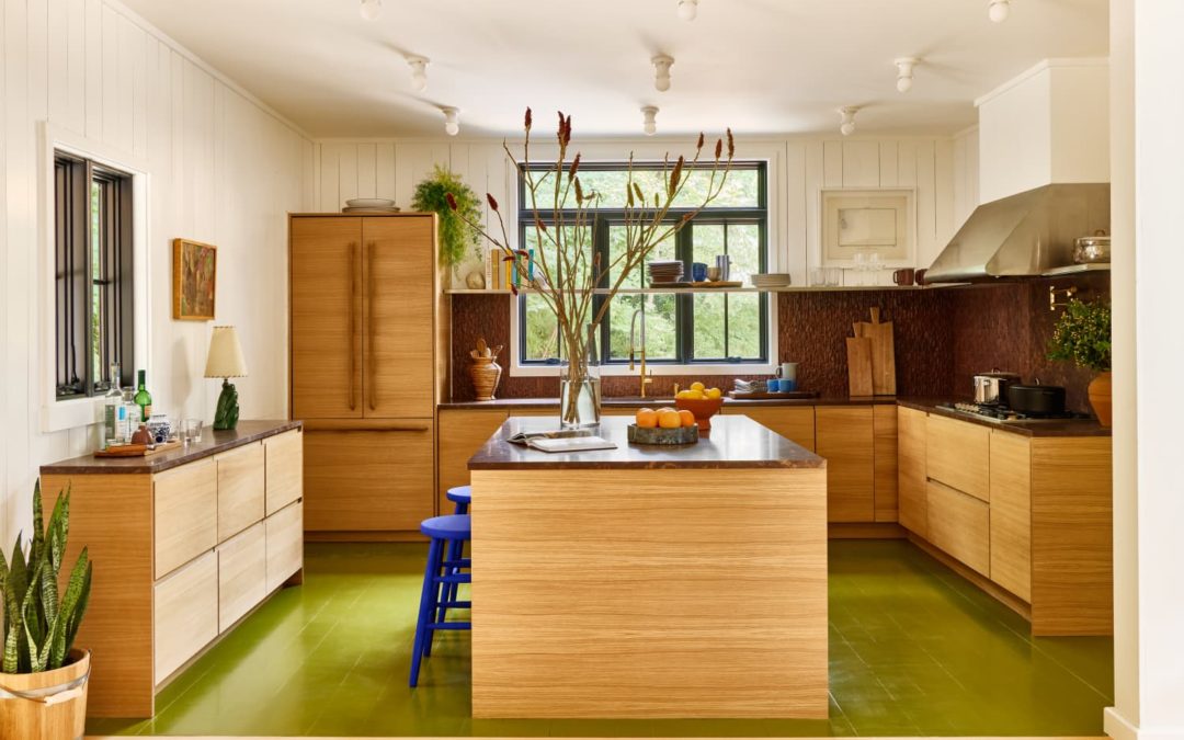
Designer Robert McKinley, founder and creative director at Studio Robert McKinley, recently used red travertine in the kitchen of a Montauk project, the Edison bungalow, which is pictured at the top of this story and just down below. From this space, you really get a sense of how striking this kind of stone can be, particularly when it’s given the room to be the star of a design scheme. Part of its appeal is that, while totally unexpected aesthetically, it reads as timeless with the right styling and accompanying materials.
If you do decide to go big with a red stone on a countertop or backsplash in an upcoming kitchen or bath reno, both McKinley and Nayak encourage striking the right balance in the rest of the surrounding decor. “Always play with texture and materiality,” suggests McKinley. “Stone, even in a more eye-catching color, can fall flat if it’s accompanied by materials of the same depth, and it won’t pop or stand out in the room. I would suggest pairing it with organic materials and fabrics in the space, such as wicker, rattan, or even pine wood.”
According to Nayak, it’s all about putting what you learned in your elementary school color-combining days to use. “When in doubt, remember the color wheel back in third grade art class,” she says. “Offsetting the red tone with deep opposing colors like green or teal is a win — and it can never hurt to balance it off with some neutrals for good measure.”
If large applications of a bold material like this feels like too much of a commitment, both in design and budget, don’t worry. Red stones are slowly but surely making their way into the decor and accessories market, too, making smaller items an easy way to experiment with natural hues of clay, brick, and more in your decor. “I love seeing the stone applied to more decorative items in a space,” says McKinley. “A small side table or even vases or sculptures in a red stone would do the trick.”
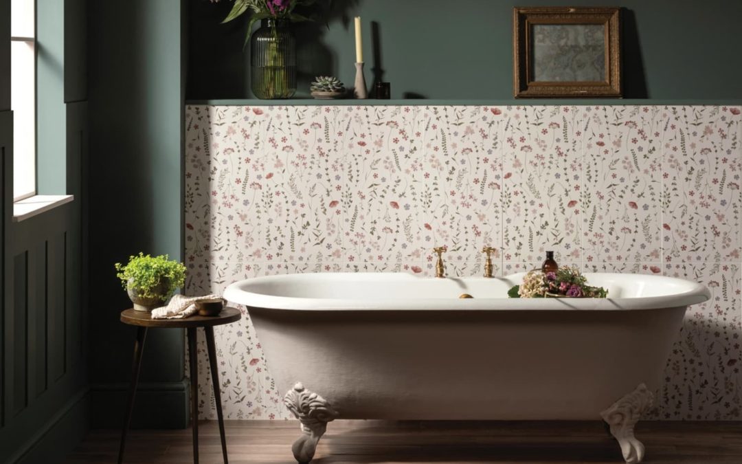
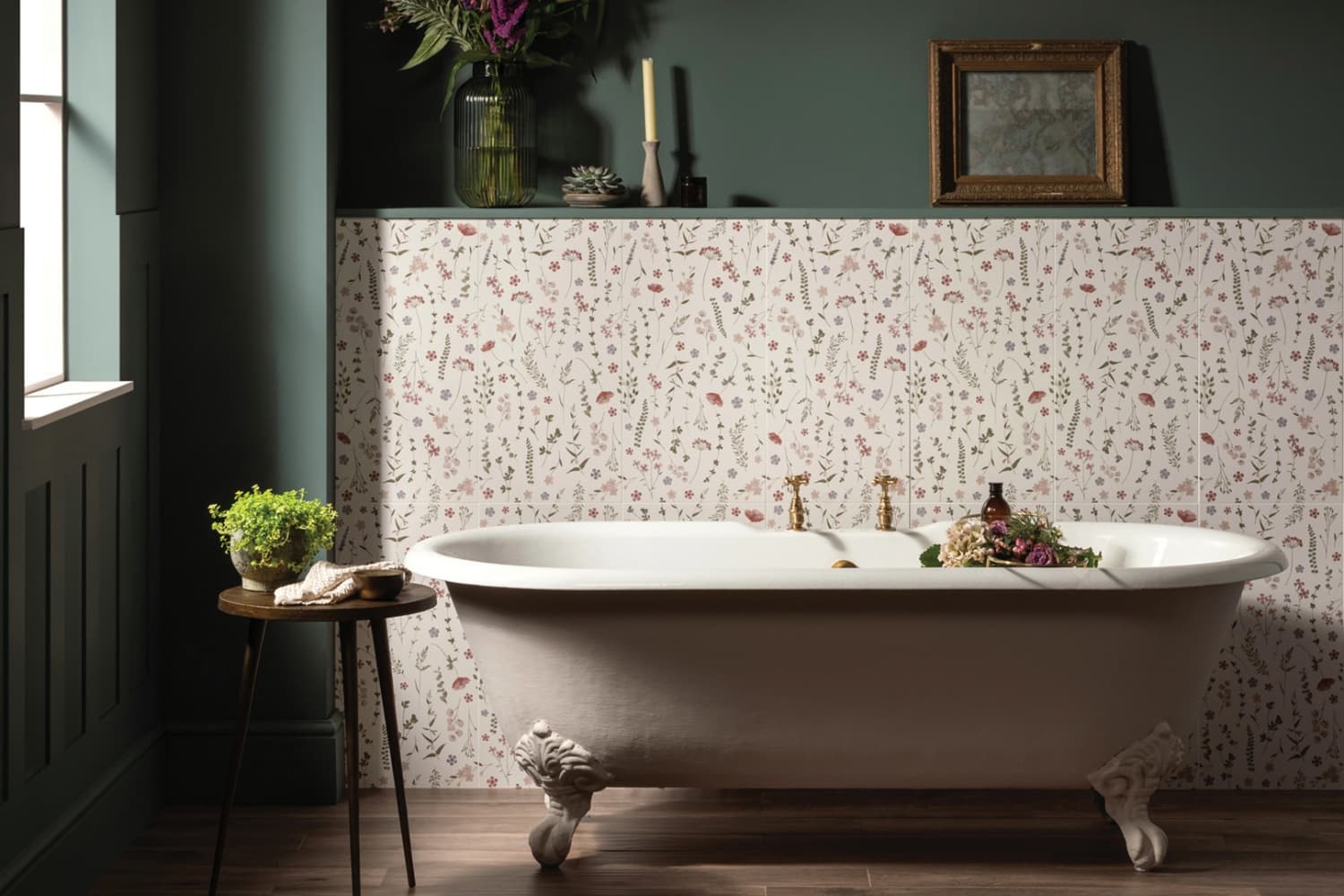
It’s going to be officially autumn this week, but judging from current home trends, everyone is still thinking about spring. U.K. tile brand Original Style has announced that their 2022 Tile of the Year is Wildflower Rose, a charming floral pattern that will make you feel like you’re having long walks and picnics in the British countryside. It’s described as “oozing with sophistication and natural beauty,” and embodies the spirit of cottagecore.
“We spent many weeks of sketching and painting an abundance of wildflower varieties before working closely with our skilled production teams in order to bring these gorgeous tiles to life,” said Original Style’s Jane Addis.
The large format tile’s botanical detail makes it a statement, though it doesn’t feel overpowering, thanks to its subtle shade of pink. And, as you can see in the photo above, it looks good with both old and new furnishings, able to blend well with a neon sign and a vintage bathtub.
As for color pairing? Rob Green of COAT Paints gave some helpful advice: “To complement Original Style’s Tile of the Year we’ve chosen Adulting — a deep teal green which plays well with the foliage in Wildflower Rose, delivering a sophisticated look with grey undertones–and Ciao Sofia — a grubby muted pink, soft yet stylish, it plays well with Wildflower Rose to provide an elegant feel.”
If your kitchen or bathroom isn’t already teeming with houseplants and mushrooms, 2022’s Tile of the Year just might be for you. “…This tile will no doubt bring a special, nurturing touch to your interior décor and we hope it brings as much joy to others as creating it has to us,” Original Style added.
You can learn more about Wildflower Rose here.