.tasty-pins-banner-container{display:block;margin-bottom:20px;position:relative;width:-moz-fit-content;width:fit-content}.tasty-pins-banner-container a{cursor:pointer;display:flex;font-size:14px;font-weight:700;letter-spacing:1px;line-height:1.8em;text-transform:uppercase}.tasty-pins-banner-container a:hover{opacity:1}.tasty-pins-banner-container .tasty-pins-banner{align-items:center;bottom:0;cursor:pointer;display:flex;justify-content:center;left:0;padding-bottom:1em;padding-top:1em;position:absolute;right:0}.tasty-pins-banner-container .tasty-pins-banner svg{margin-right:4px;width:32px}.tasty-pins-banner-container .tasty-pins-banner span{margin-top:4px}.tasty-pins-banner-container a.tasty-pins-banner{text-decoration:none}.tasty-pins-banner-container a.tasty-pins-banner:hover{opacity:.8}.tasty-pins-banner-container a.tasty-pins-banner-image-link{flex-direction:column}.tasty-pins-banner-container a img{margin-bottom:0}.entry-content .wp-block-image .tasty-pins-banner-container img{margin-bottom:0;padding-bottom:0}#et-boc .et-l div .et_pb_image_wrap .tasty-pins-banner-container .tasty-pins-banner{padding-bottom:1em!important;padding-top:1em;text-decoration:none}#et-boc .et-l div .et_pb_image_wrap .tasty-pins-banner-container a.tasty-pins-banner{cursor:pointer;display:flex;font-size:14px;font-weight:700;line-height:1.8em;text-transform:uppercase}#et-boc .et-l div .et_pb_image_wrap .tasty-pins-banner-container a.tasty-pins-banner span{letter-spacing:2px;margin-top:4px}.et-db #et-boc .et-l .et_pb_module .tasty-pins-banner-container a:not(.wc-forward){padding-bottom:0}Photo: The Crafted Life
If you’ve ever lived in an apartment or a really tiny house, you probably understand the struggle of a tiny outdoor space. Generally, tiny porches are the only type of porches you’ll find with an apartment. While a tiny porch is better than no porch at all, sometimes you have to get creative with the small space you have with small balcony furniture and space saving solutions. Luckily, I’ve rounded up a bunch of ways to make the most of your tiny porch this summer, including DIYs, storage solutions and just plain cute pieces to add to your porch.
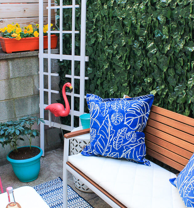
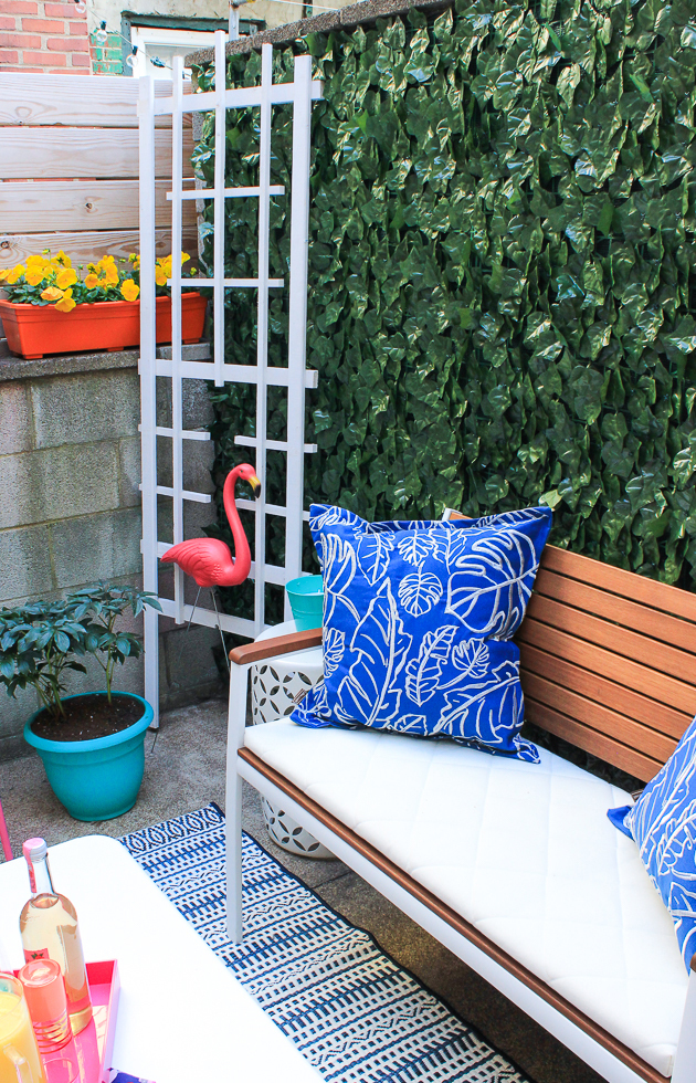
1. First of all, covering up ugly walls with faux ivy will make your porch look like a whole new space and adds lots of pretty green before even adding real plants! Plus, it’s renter friendly and easy to maintain. (above)
2. Build a DIY murphy bar to maximize space on the wall, so it folds down for a table or prep space. You’ll need it for making cocktails on your porch this summer!
3. A half circle table like this one is perfect for creating a small seating table on your tiny porch.
4. Leave space! In a small space, sometimes a bit of modern minimalism is the best way to embrace it. A couple chairs and plants may be all you need.
5. A vertical planter with multiple pots is a great space saver on a tiny porch! Hang it in a corner and you can have multiple pots in a smaller space.
6. Try something daring, like adding a little canopy on your porch and incorporating lots of colorful pieces. Why not?!
7. Decorate your porch with chalk for a non-permanent way to makeover unslightly walls and floors. Although it’s a temporary solution, it can last throughout the summer if you’re in a location that gets little rain.
8. Try incorporating bench seating as a space-saving way to seat multiple people. This way you have less pieces of furniture taking up space but can still seat the same amount of guests!
9. Who says your tiny porch can’t be comfortable? Lots of cushions and a well-placed hammock could create the perfect place to relax this summer.
10. Lights and plants make a HUGE difference in your outdoor space. Hang lights on your porch high enough that they don’t impact your vision, and incorporate plants throughout to make the space more homey. You’ll never know it’s a small space!
Sometimes small changes make a big impact when it comes to your tiny outdoor space. No matter the size or your porch or patio or whether you own or rent, these small porch ideas prove there are inspiring ways to makeover your space this summer (without breaking the bank).
Nightstands have a way of turning into a mix of everything…your current read, a candle you love, your glasses, and a few things that don’t quite belong. A tray pulls it all into one place, so everything has a proper spot to sit, and the whole surface looks well-styled. Small upgrade, big difference, right?
That’s exactly what the four nightstand tray ideas in this week’s post are here to do 🤍
A woven rattan nightstand tray is a 2-in-1: it keeps your essentials in place and brings in that easy, natural texture. Yes, organization comes first, but adding texture along the way only makes the setup feel more complete. After all, a room without texture is a bit like a dish without salt; something just feels missing.
Wood trays are always a classic choice, but this one is a bit different… well, more high-end, we’d say. The piece looks like a “mini stage.” Aesthetic, of course, but spacious enough to hold your essentials and one or two decorative items (like a diffuser or small planter).
Marble itself is a statement – and a timeless one at that. When the base looks this good, everything on top follows. Rings, a watch, or even a simple candle all feel elevated.
If a soft, minimalist bedroom is your goal, a leather valet tray is your go-to. The raised edges will hide your day-to-day clutter behind the unique stripe design, soft texture, and lovely color of this affordable nightstand tray.
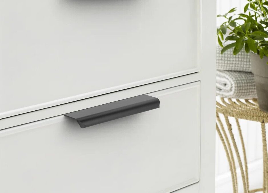
Your kitchen is the heart of the home, so it definitely deserves to be refreshed every couple of years, but it’s also true that those costs can add up fast 💲 The solution? Budget-friendly kitchen renovation ideas. Something as simple as swapping out drawer pulls can make a noticeable difference. Here are 4 under $100 picks that can elevate your space instantly!
Matte black is the fastest way to modernize flat-front cabinets. Even traditional doors lean contemporary with the right contrast. You’d want to go for these if the goal is a sleek aesthetic, where the cabinetry looks almost “handle-less.”
Installing brass pulls can serve as a high-end upgrade for your tired kitchen. It is, in fact, the easiest (and safest) way to add interest to your all-white interior without losing the minimalist vibe. 100% designer-approved.
If you want to mimic the look of custom cabinetry and designer kitchens (on a budget, of course), then this one is for you. Longer pulls shift the proportions, as drawers look wider, and cabinets look tailored. The result? A kitchen that feels more architectural.
Pro Move- Use longer pulls on drawers, shorter on doors.
A soft bronze finish bridges modern and classic without feeling cold (or trendy).
Some kitchens don’t want contrast, they want cohesion, and for those, bronze pulls are the sweet spot. They’re neither too bold nor too subtle. Perfect for kitchens that lean neutral + layered.
If you’ve ever wished your home could feel modern and full of history at the same time, you’re going to love this one. The Modern Heirloom Apartment (a design by Simple Interiors) is exactly that kind of space. It’s clean and curated, but still feels layered. Like every piece was chosen with intention, not just to look pretty, but to belong.
Right away, you notice the mood. There’s that rich burgundy moment, then the warmth comes in through the wood tones, soft upholstery, plus all those quiet, sculptural curves, and just when it could’ve felt too minimal, the brass details bring a subtle glow to elevate the interior- a perfect mix of old-soul character and fresh design.
Let’s take a deeper look inside.
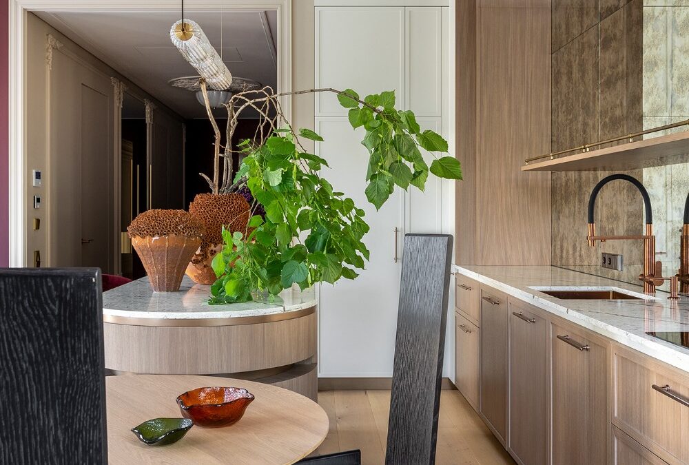
Kitchen
The kitchen is where the Modern Heirloom Apartment really shows off its architecture. Everything feels truly intentional.
Curved and sculptural, the island becomes the star, rounding the layout to transform this utilitarian zone into a natural gathering point. The oak cabinetry keeps everything calm- full-height, seamless, and super tailored. No visual clutter. Just warm wood and clean lines doing the work.
And the best detail? That arched wood frame around the backsplash zone, a striking element that gives the kitchen wall an architectural feature (not just a place for cabinets).
Minimal, yes. But it still feels designed.
Bedroom
A private little world.
Walking in, the whole room feels calm on purpose… soft light, warm oak floors, and that quiet mix of modern lines with old-soul details.
The bed stays grounded with textured upholstery and rich bedding tones. Then there’s the wall behind it… and wow. The mural turns the headboard wall into a full scene, adding hand-drawn softness + depth, all without extra decor.
Small details finish it off: a slim brass reading sconce, the sculptural side table, and the arched built-in shelving.
Bathroom
A bathroom that feels like a suite, not a side room.
The ceiling is the first flex, that warm ochre tone, framed with dark trim. Totally graphic and soft.
Everything underneath stays crisp. Large wall panels keep the lines clean, and the brass fixtures add warmth. The floating vanity is another smart move that adds to the open, airy feel. For that “heirloom” richness, the designer has used warm wood grain. Even the drawer pulls feel like jewelry ✨
Next to it, the freestanding tub sits like a sculpture. Minimal shape, maximum impact. And that little brass martini table? Perfect. Candle, book, drink… done!
The Soft Curve Suite, a modern open plan project designed by GUR Studio, is a calm space that doesn’t rely on bold colors or loud decor to make a statement. Instead, it uses shape, warmth, and clean architecture to do the talking. The best part? It still feels livable, not like a “don’t touch anything” kind of home.
So if you love minimalist interiors but want them to feel softer and more human… you’re going to want to stay for this one.
Living Room
The living room of the Soft Curve Suite is a definition of minimalism that feels warm. Nothing is loud, nothing is trying too hard, yet every detail has that quiet “designer did this on purpose” energy.
The oak paneling wraps the space, and the soft lines make it feel extra cozy. The transitions stay seamless, too, so the room flows as one, clean composition instead of separate parts. Even with simple furniture and a neutral palette, the room still holds presence.
Bedroom
Things in the bedroom appear quietly elevated, carrying the same soft architectural language as the rest of the suite. It’s part of an open plan layout, but not in an “exposed” way. That’s thanks to the curved metal partition, which creates privacy without fully closing off the space.
Behind the bed, the oak wall panels keep the room looking grounded. The vertical lines add structure, and the lower upholstered headboard panel pulls it all together. Even the vanity zone and sleek workstation feel intentional, tucked right into the curve as they belong there.
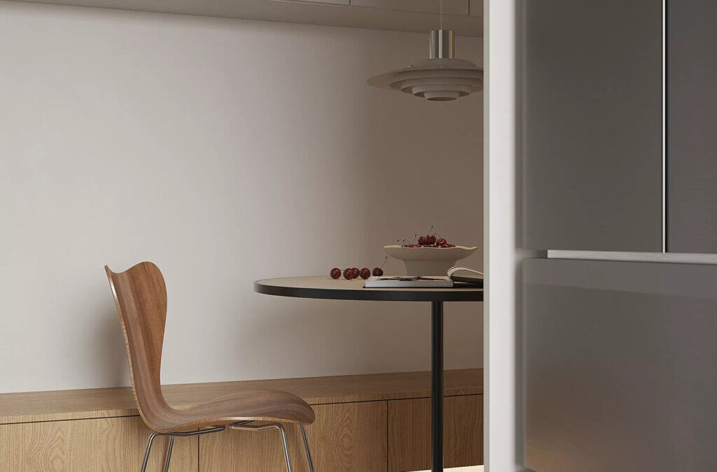
Breakfast + Reading Nook
These small moments are what make The Soft Curve Suite feel lived-in.
The breakfast nook sits neatly along the wall with a round table and built-in bench seating. Overhead cabinetry stays minimal, so the whole corner reads clean and calm. Nearby, the reading nook works like a soft pause in the layout; a single chair against warm oak paneling is all it needs.