6 Living Room “Fixes” That Are Actually Fails, According to Designers
When mapping out a living room layout and deciding on its design style, sometimes you’re stuck between reality and wishful thinking. While you might fantasize about buying all new trendy furniture that perfectly fits your space, the truth is you’re often trying to sprinkle in a few fresh pieces beside hand-me-downs and what you already own. It can be tough to find a balance that satisfies your vision. So you settle on certain solutions — or quick “fixes” — that likely don’t fully address your needs.
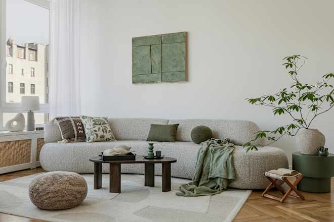
“First and foremost, as much as we love a designer-approved aesthetic, the only person who really needs to love your living room is you,” says designer Galey Alix. “That said, the two living room essentials my designer-heart is most drawn to are the following: That the room is visually balanced, and there is a thoughtful use of texture.”
A visually balanced room, Alix describes, is a space that has just the right amount of colors and furnishings from wall to wall — not crammed in one area — plus, layers that make it all feel intentional and inviting. That’s sometimes easier said than done, which is why I tapped Alix, who joins with Thea Bloch-Neal of Curated by Thea and designer and content creator Anne Sage, to call out some common living room “fixes” that may actually be making your space look and feel worse. Read on to get their advice, so you’re not unknowingly sabotaging your living room — because nobody wants that.
Fix #1: Working Your Wall Space for Large-Scale Furniture
The size of your living room affects the scale of your furniture, which means what you fill the room with will either make it feel more comfortable or more claustrophobic. If you’re in a position to buy new furniture for your living room, Sage says that you want to avoid a very relatable shopping pitfall. “One of the most common mistakes I see is people purchasing furniture that is way too big for their living room: sofas so deep they leave no space to walk around them, giant chairs eating up whole corners, and table lamps filling the entire surface of end tables,” she notes.
In this scenario, the “fix” often means pushing large furniture against the walls. And that’s helpful in theory, except that the entire space then usually ends up feeling less cozy and intentional — with awkward blank spots at the heart of the room. To fix it, Sage has some advice that’ll work wonders (and it also applies to those who are schlepping their existing furniture somewhere new or rearranging their surroundings for a better flow, too).
“Get nitty gritty about your measurements,” Sage says. “Shop with your tape measure by your side, and use blue painter’s tape to outline on the floor the dimensions of the pieces you’re considering.” That way, you’ll know if a piece is too large, and you can avoid buying it — or sell/donate a too-big piece you might have now (if it’s in your means to do so). That way, you can buy something that’s more appropriate in scale.
You’ll know your pieces are the right size when your furniture layout creates a seamless walking path for easy flow around a space — no shuffling required. That means having ample “breathing room” around the walls. “To level up, pay attention to the seat height of your sofa compared to the height of your coffee table,” Sage adds. “The ideal coffee table height is generally one to two inches lower than your sofa’s seat height, but if you don’t pay attention to those measurements while shopping, you can end up with a huge differential between the two — and it both looks and feels weird!”
Lastly, don’t be afraid to sell or skip items that would crowd the room. Even if entertaining friends and family is a priority, you’re the one who’s going to be living in this space every day. And for Sage, that means prioritizing your comfort.
Fix #2: Opting for Tiny Furniture to Make a Small Room Feel Bigger
Another reason to scale your furniture correctly comes from what Alix sees as an opposite problem: When living rooms are compact, people often think the furniture needs to be even smaller. Maybe that will make everything feel larger? Well, no, that’s not the case, says the designer.
“People believe a small apartment means you’re limited to small furniture,” Alix says. “I describe it as the Polly Pocket Effect. I don’t blame them for this assumption because it’s natural to assume a small living room calls for bite-size furniture. However, when you do this, the room actually feels smaller.”
To make a small footprint pack a big punch, Alix recommends choosing one furniture piece that’s somewhat larger in scale (this is where painter’s tape comes into play). “Know where you can go big so that you have at least one oversized item to balance all the smaller pieces,” she says. “For example, if you can only fit a five-foot sofa, balance it out with a coffee table close to the same width. You’ll now have an area to display stacks of coffee table books, maybe a candle, and it will bring an instant sophistication and elevation to your otherwise smaller living room.”
The upshot here? If you’ve gone super small in your little living room, you’ve probably over-corrected in terms of scale. Bring in at least one regularly-sized item for that elusive visual balance that Alix talked about above.
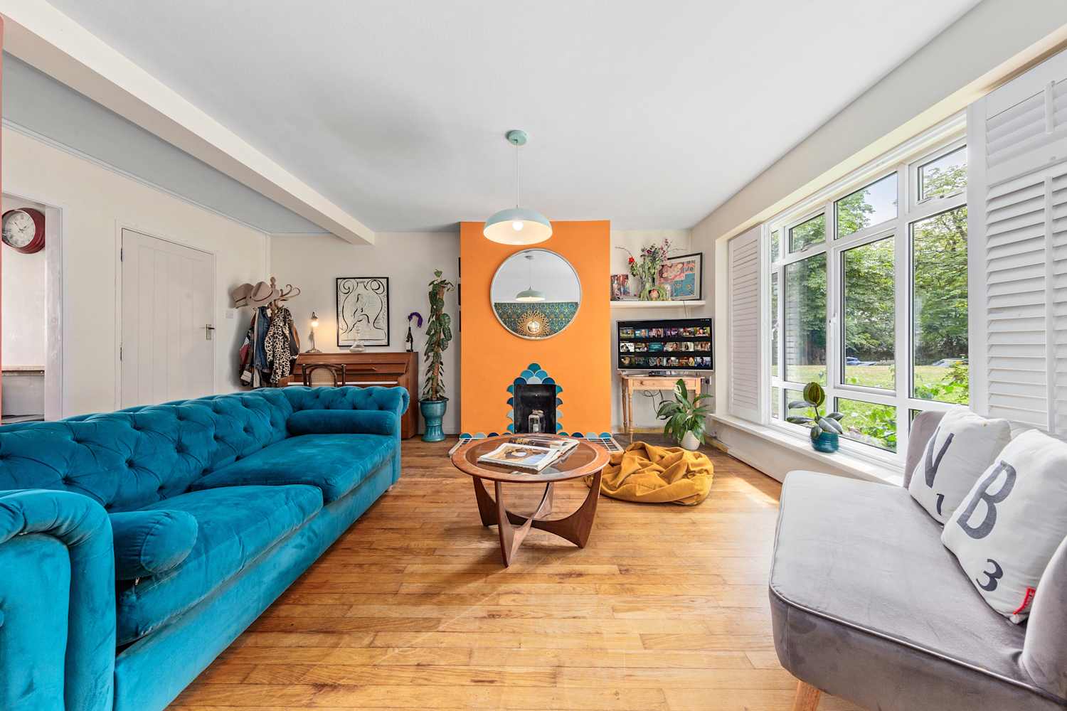
Fix #3: Letting Accent Shades Do the Heavy Lifting in a More Colorful Palette
After many years of neutral living rooms, Bloch-Neal says it’s exciting how color is coming back in a big way. “We’re seeing such a wonderful resurgence of color right now, but it can also feel tricky, overwhelming, and hard to get right,” she notes. Too many colors can turn a living room into a fun house, but “accent” colors don’t always make enough of an impact. So don’t think that you can rely on random pops of color if you want your space to feel fully vibrant.
A better solution? A considered palette. “When I think about using color to bring a space alive while leaning into current trends, I like to focus on one item first and then build the room around it,” says Bloch-Neal.
For Bloch-Neal, that means choosing a color for a couch or accent chair as an anchor and then creating layers through more substantial accent accessories like curtains and art. Just make sure that each additional shade you pick coordinates back to your anchor.
Need a little bit of advice on what color coordination looks like? Bloch-Neal has your back. “If you choose a bold shade of color in your living room — say a maroon, a deep navy, or a rich green — it often looks best when paired with a softer counterpart across the color wheel,” she says. “Think: maroon with pale yellow, or maroon with a light blue. If you’re working with dark navy, pairing it with creamy tones or even a soft coral creates a beautiful juxtaposition.”
The success is in finding complementary shades and cozy contrasts, and creating layers that all feel cohesive. “Don’t forget about neutrals,” she adds. “Beige, gray, black, and white are timeless, and far from being out. Used thoughtfully, they make wonderful accents that let richer colors really shine.”
Fix #4: Layering Textured Touches Everywhere in a Room to Jazz It Up
If you’re into design, you probably understand the benefits of adding textural elements like throw blankets, pillows, and tapestries to a room. And yes, you don’t want a room to fall flat visually, so texture can help with that. Alix also appreciates that fellow social media scrollers want to make their living rooms cozy, but she’s quick to point out that too much texture can sometimes be overpowering.
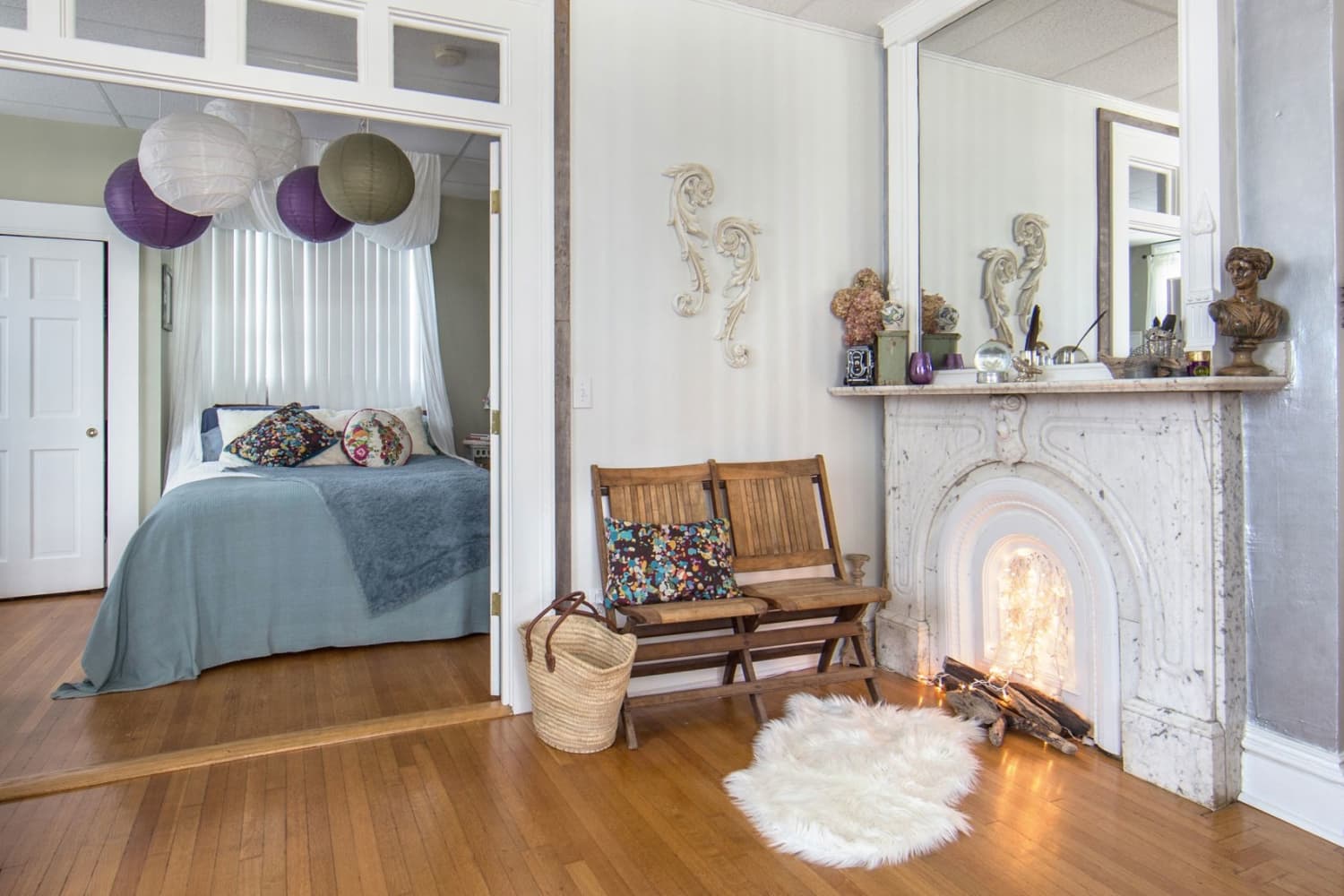
“If you’re heavy-handed with layering texture on texture, the end result can feel less calming and more overwhelming,” she says. “An example of this would be laying rugs. I can appreciate trying to cover a carpeted living room with an oversized area rug to elevate your apartment, but the offense happens when a second rug is layered on top of the new rug to create a vibe.”
The solution would be to edit your choices — Alix says one bold rug is just fine. “And don’t be afraid to go with a busy pattern so you can still achieve the statement you want to make,” she adds. “You can still create additional layers of texture with a throw blanket over the side of your couch and heavily textured throw pillows, but let’s avoid dual rug layers.”
Fix #5: Prioritizing Style Above All Else When Decorating
When you want your living room to look good, it’s only natural that you’d gravitate toward stylish pieces — that seems like the point, right? It is, but too many stylish pieces over functional ones can make your room feel like a luxury museum.
“One of the most common mistakes I see in living rooms is choosing pieces that look fun and stylish but just aren’t functional,” Bloch-Neal says. “That balance is tricky. My advice is always to pick one piece that’s bold or playful, and let the rest focus on comfort and practicality.”
You could reupholster a cozy chair in a vibrant fabric, she suggests, or layer statement pillows and a bold throw over a classic sofa. “That way, you still get personality and joy in the space without sacrificing livability,” says Bloch-Neal. Just don’t make every choice an aesthetic one, and you’ll be golden.
Fix #6: Lowering the curtain rods to fake the right curtain length
Furniture probably has taken up the bulk of your design attention in your living space, but don’t let secondary concerns around curtains fool you. Get your drapery or window treatments wrong, and it’ll throw the whole room off.
“Thanks to the important work done by designers on social media, many homeowners are now aware that too-short curtains can negatively impact the look of your space and make it look like your windows are wearing floodpants,” Sage says. “Unfortunately, I’ve seen many people ‘fix’ the problem of too-short curtains by just lowering the curtain rod, which in turn creates its own problems!”
According to Sage, a well-positioned curtain rod can make a space feel larger by properly framing the window and creating the illusion of higher ceilings. A too-low curtain rod has the opposite effect: It makes the window and room feel smaller. To fix this, Sage says you’ll need a tape measure.
“Measure for curtains starting at least four to six inches above the top of the window frame,” she says. “It may mean you need to buy longer curtains than you think. And if the exact length you need isn’t available off the shelf, consider buying longer curtains and having them hemmed. It’s always better to start with the item that’s a relatively fixed position — the curtain rod in— and then adjust the changeable items to that.” Adjusting to make your living room better is what actual fixes are all about.