We independently select these products—if you buy from one of our links, we may earn a commission. All prices were accurate at the time of publishing.
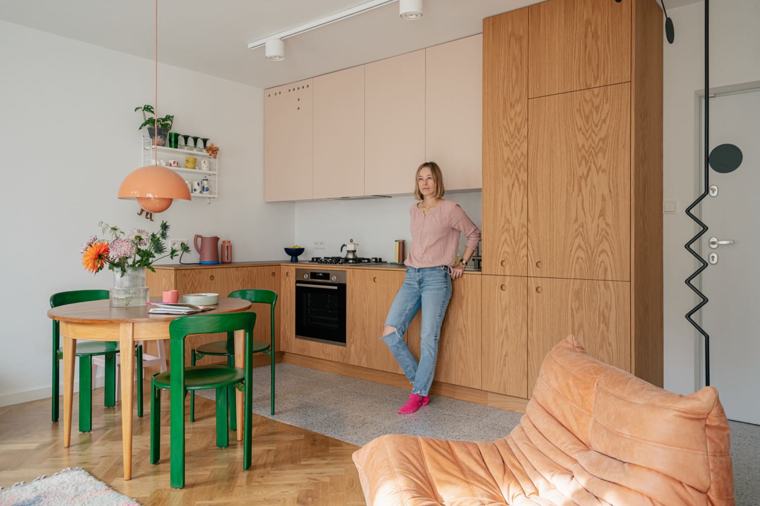
Katarzyna Kowalska is a civil engineer, a ceramicist, and a design and art lover, and lives in this recently renovated 355-square-foot compact apartment in a four-story apartment block designed by a famous Polish architect couple in the 1960s. “It is really comfortable to live in, especially because of the closeness of the metro station. My windows overlook the courtyard, where there are a lot of trees — it is a really peaceful view, uncommon in new buildings,” Katarzyna writes.
For more content like this follow
But it’s not just the views that make this tiny home so endearing: the brilliant interior redesign of the small space plus Katarzyna’s collection of vintage furniture makes the space feel so much larger than it is. Katarzyna emphasizes that despite the small square footage, the home has everything she needs. There’s a “full-size kitchen, aesthetic bathroom, separate bedroom with wardrobe, TV and furniture to take some rest: couch and big Togo chair,” she writes. “I really like to be here, especially in the morning, when the sun is reaching the wooden kitchen fronts and white walls. I am a design and art lover; I really like to renovate furniture and the emotions these items give to me. I enjoy having a wooden table, which my mum bought me from the flea market (very cheap) and Bruno Rey’s chairs from the ’70s, which I bought and renovated on my own. I also enjoy my partition wall, which I designed with cooperation with the executive company — it is an element which separates the hall and living room and is a piece of art to me.”
Though Katarzyna is responsible for the fantastically one-of-a-kind partition wall and the perfect mix of vintage furnishings, she also worked with architects Kalina and Robert Juchnevic of blok585m2 to really maximize the small space. The couple met while studying architecture 15 years ago, and consider themselves academics interested in 3D modeling techniques and 3D printing, as well as being small-space experts in their own right. “We explore design possibilities in the context of small apartments — we have been talking about this on our YouTube channel since 2019. We talk about different design solutions using our own apartments as an example (the name of our YT channel derives from the size of our apartment).”
Apartment Therapy Survey:
Katarzyna Kowalska’s Style: I like vintage things and their souls. For sure I am not minimalist if it goes to style. I don’t have many items, but I like coziness and colors, it relaxes me.
Katarzyna Kowalska’s Inspiration: Pinterest and Instagram were a mine of inspiration and ideas for me.
Architects Kalina and Robert Juchnevic’s Inspiration: The building where the apartment is located is a great example of the post-war housing estate which, thanks to the architect’s efforts (Maria and Kazimierz Piechotkowie), was different from the socialist realism examples.
The architecture of the building and its interiors were an inspiration and set the direction for the interior finishing materials e.g. we designed terrazzo similar to that used in the staircases of the building.
We were inspired by beautiful vintage objects the owner has even before we started this project. We have to mention the iconic Togo armchair, a round wooden table, a set of Bruno Rey chairs (model 3300) from the 1960s. We were inspired as well by handmade ceramics that Katarzyna creates on her own.
Katarzyna Kowalska’s Favorite Element: It is hard to choose, but I really like the combination of sandy-blush kitchen fronts and maroon worktop with wooden edges. I am also a huge fan of my bathroom — I adore every element of this room.
Architects Kalina and Robert Juchnevic’sFavorite Element: It is a tough nut to crack… We love this apartment as a whole. But if We have to choose — we especially like the kitchen — this is not only a place to prepare food but also the main furniture in the living room. Oak veneer kitchen doors are imperfect perfection!
Architects Kalina and Robert Juchnevic’sBiggest Challenge: 1. It was difficult to keep balance between vintage items and newly designed elements — especially when the owner is a vintage lover. We “controlled” this balance using a detailed 3D model and creating a virtual apartment tour for the owner.
2. Openwork structure separating entrance zone and living room — we had probably three different concepts and no final decision but we were waiting patiently… in the end of the construction, the owner fell in love with Alexander Calder’s mobiles and we loved the idea of using this motif at first sight [in the entryway partition].
Katarzyna Kowalska’s Proudest DIY: I am a creative person, who is the happiest during the art process. Two years ago I started making ceramic cups and I have a pretty big collection. I like the small cup with strawberries and a pink plate (as a complete). It gives me an energy shot when I use it in the morning to drink my coffee.
Katarzyna Kowalska’sBiggest Indulgence: Kitchen furniture cost the most, but it was totally worth its price. If it goes to one item, the TOGO sofa was the most expensive, but I adore it so much!
Is there something unique about your home or the way you use it?Katarzyna Kowalska – My partition “walls” are totally unique — they divide space, but do not limit it. I have pretty much no spare space, so I have a washing machine in my wardrobe and the vacuum cleaner under my bed.
What’s your absolute best home secret or decorating advice?Architects Kalina and Robert Juchnevic – Our advice is very practical. Provide as much storage space as possible. Then all the elements, even the very ordinary ones located in an open area will look like one million dollars. This can especially be said about small apartments… but not only small ones!
We independently select these products—if you buy from one of our links, we may earn a commission. All prices were accurate at the time of publishing.
The year is 2000, and it is Christmas Eve: I am blissfully asleep and waiting for Santa to shimmy down my home’s non-existent chimney, take two to three bites of the cookies we’d laid out for him on a Rudolph-themed plate, and place my perfectly-wrapped presents below the tree.
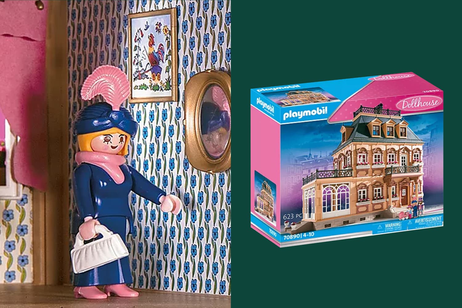
Meanwhile, my parents were experiencing utter chaos. My mom had set her sights on getting me the Playmobil Victorian dollhouse, only to find it was completely out of stock. Thankfully, eBay was in its heyday and she managed to find a pre-owned model in pristine condition. In the last few minutes of the bidding process, she made an adrenaline-fueled offer and won. Then: The package didn’t arrive… until Dec. 24. Into the wee hours of the morning, she and my dad assembled the intricate plastic mansion so it would be waiting by the tree in all its glory when I awoke.
For more content like this follow
Thinking back on this now, a few decades later, I am so touched imagining the panicked bidding process, last-minute delivery, and laborious assembly. Though if you ask me, it was totally worth it. I loved this house. So much so that many years later, I’m still thinking about how incredible it is — and how it instilled an early love for architecture deep in my little dollhouse-loving soul.
If you haven’t seen Playmobil’s Large Victorian Dollhouse, please allow me to introduce you. At three stories tall, it stands slightly more than two feet off the ground. If you were a one-inch-tall Victorian-era person going for a mid-afternoon walk, you could look up from the street and see an elegant building 25 times as tall as you. You could admire the sumptuous details of the facade: the mullion windows affixed with boxes brimming with pink and white flowers in perma-bloom; the tall, arched windows that give you a peek at the living room’s parquet flooring; the quaint gables protruding from the steep slate roof; the widow’s walk on the tippy top of the home enclosed by a realistic-looking wrought-iron railing.
This is all to say nothing of the interior. Because of it, I developed a love of wallpaper; each petite room features a unique pattern, from pink columns of roses with tiny green stems in the attic bedroom, to golden yellow diamonds in the dining room. Black-and-white photos, antique art, and gold-framed mirrors adorn the walls, making this mansion feel like a home even before you move any tiny plastic furniture in.
Though some childhood memories can shrink somewhat under adult review, when I look at pictures of this Victorian dollhouse today, I’m more enthralled by the scale and attention to detail than ever. And without realizing it, some of this toy’s features have slipped into my grown-up dreams. My platonic ideal of a couch is still green and made of plush velvet, not unlike the rubbery emerald sofa that sat in my miniature Victorian living room. I still insist on calling the deck attached to my third-floor walkup apartment my “roof deck.” I still love gold frames and flower boxes and cozy rooms with sloped ceilings. If ever the “Honey, I Shrunk the Kids” technology becomes available, I know exactly where I’ll be living. Until then, I’ll be admiring the architecture all around me with a fresh set of eyes and gleaning some home design inspo from scaled-down places.
Olivia Harvey is a freelance writer and award-winning scriptwriter from outside Boston, Massachusetts. She’s a big fan of scented candles, getting dressed up, and the 2005 film adaptation of Pride and Prejudice starring Keira Knightley. You can make sure she’s doing okay via Instagram and/or Twitter.
If the windows are the eyes of the home, then you’ll have to look up to have a staring match with clerestory windows. Pronounced clear story, this type of window is installed as a row of panes, usually fixed high above eye level on a wall.
Clerestory windows are desirable in home design because they let in plenty of natural light. But they do so in an indirect way, illuminating a space without the glare you often get from traditional windows. Transom windows act in a similar way, but they are installed above door frames or even other windows, whereas clerestory windows are installed high up along the expanse of a wall.
For more content like this follow
Clearly, clerestory windows are not suitable as the only type of window in a home. But when they are installed as part of a larger fenestration design, they can make quite an impact. Let’s take a look at some of the pros and cons of having these unique windows in a home.
Pro: They can make a space seem larger.
Windows of any type let in natural light, which can make a space seem bigger. Clerestory windows are installed in such a way that a room could be positively flooded with light.
“I don’t think I’ve ever walked in a house and said ‘too much natural light,’” says Andrew Pasquella, a real estate associate with Sotheby’s International Realty in Malibu, California. That’s reason enough for him to be a fan of clerestory windows. “The addition of more natural, often ambient, light can transform a space and make it feel more open and larger.”
Pro: They can reduce your electric bill.
Depending on the time of day, if you’re in a room with clerestory windows, you might not even need to reach for a light switch. “Because clerestory windows are placed high up on the wall, they can allow light to enter a space from above, which can help to illuminate the space and reduce the need for artificial lighting,” says Humberto Marquez, a licensed real estate agent with Awning. “This can create a more pleasant and comfortable living environment and can help to save energy and reduce electricity costs.”
Pro: They don’t take up much vertical wall space.
Traditional windows are useful, but boy can they get in the way of wall decor. Enter clerestory windows: they’re simply above it all, quite literally. “They can be an excellent design choice to gain more wall space for art, shelving, and other decor without sacrificing natural light,” says Pasquella.
Pro: They provide an interesting design aesthetic.
You don’t need a curtain — though you could add blinds — to dress up a clerestory window. It’s usually a knock-out on its own. “Clerestory windows are a great way to add architectural interest to the home as they typically have unique shapes and sizes that make them stand out from traditional window designs,” says Shaun Martin, a real estate professional and owner and CEO of The Home Buying Company in Denver.
Pro: They can preserve (some) privacy.
Windows and privacy don’t usually go hand in hand. Depending on the placement of the clerestory windows, though, you might only get sunlight peeking in. Martin says it all depends on the design of the home and the placement of the windows; depending on the height and angle, passersby might still catch a glimpse of the interior.
Pro: Some might allow for ventilation.
While most clerestory windows are fixed, there are those that open like regular windows and therefore carry an even bigger advantage. “When properly designed and installed, clerestory windows can improve the thermal balance of a home,” says Pasquella. “If the clerestory windows are operable and can open and close, then they can allow heat to escape in the summer and add extra general ventilation.”
Martin agrees. “Clerestory windows provide excellent ventilation in warm climates through cross ventilation, creating a cool and comfortable environment without relying on air conditioning,” he says.
Con: They are expensive to install.
Regular windows are expensive enough to install. But clerestory windows can be on another level, especially if you’ve got vaulted or cathedral ceilings in your space. “Installing clerestory windows can be more expensive than traditional window designs due to their custom size, shape, and installation requirements,” says Shaun Martin, a real estate professional and owner and CEO of The Home Buying Company in Denver.
Con: They can be less energy-efficient in colder climates.
There can be a downside to all that sunshine, depending on the climate in your area. “Clerestory windows can be less energy efficient than other types of windows, as they can allow more heat to escape from the space during the winter months,” Marquez says. “This can increase heating costs and reduce the overall energy efficiency of the space.”
Con: They are a chore to clean.
Homeowners tend to let window washing lapse even when the windows are easy enough to clean. (I’m not judging.) Marquez says the high placement of clerestory windows makes them super hard to reach for cleaning purposes, which could be a drawback for some home buyers. Still, there are many who will fall in love with all that natural light streaming in and decide it’s worth the extra money to hire a pro to clean them.
“When selling a home, it’s clear to me that light and an open feeling are advantages,” says Pasquella. “People are attracted to light and open spaces, and clerestory windows are the perfect solution to offer those.”
Home means something different to everyone — whether it be a studio apartment, a classic colonial, or something more unconventional — but it’s always a delight to see how people furnish and live in their respective homes. Lucky for me, I’ve gotten to peek into some pretty unique and jaw-dropping homes this year, from a renovated school bus house-on-wheels, to a guest house made with straw bales, to a cabin on stilts in South Africa. Read on for 11 of the most one-of-a-kind homes Apartment Therapy toured this year.
For more content like this follow
1. Light and Airy A-Frame
While a beautiful A-frame in the woods is certainly an ideal weekend getaway, this family is lucky enough to reside in this Scandinavian-inspired Michigan home year-round. “The thing we love most about the chalet is its total unique charm, and how we’ve custom remodeled it for our little fam,” writes Courtney Hall, who shares this home with her partner, kids, and dog and bunny. “We made a vacation property a full-time home in one of the most beautiful places where we can raise our kids and be closer to family. We have total access to Nubs Nob, Boyne Highlands, North Country Trail for mountain biking and hiking, the list goes on.”
2. All-White, Cloud-Themed Studio Apartment
Ever stepped inside a cloud? Well, seeing a tour of Tynan Sink’s high-rise NYC apartment is definitely as close as you can get without literally being inside a cloud. “My place is cloud-themed. Obviously,” says Tynan, “But more specifically, I wanted it to feel like a 1950s honeymoon suite, a cocktail lounge, a powder room, the Playboy Mansion, a 1960s TSA terminal, and a little gay space station in the clouds. Frankly I nailed it.” He pulled this off with curvy, white furniture, a DIY cloud lamp (“It took me an entire day and I couldn’t feel my right hand for three days after, but it was worth it”), and simple, airy artwork.
3. Impeccably Designed Airstream
“We actually purchased our home via an eBay auction, sight unseen,” Talia explains of the “skoolie” bus she, Andy, and their child travel the country in. “We had always been talking about living ‘tiny’ but it seemed impossible! Two months into the pandemic, we took the leap and haven’t looked back! We converted this bus 100 percent on our own. It has been an amazing journey. We’re even ready to begin converting buses for others so they can enjoy this adventure as well!” Now, the bus is complete with a spacious bathroom, full kitchen, and two bedrooms to accommodate the family of three.
4. Screened-In Porch Turned Three-Season Home
“For the past 35 years I’ve been vacationing on a lake in the White Mountains of New Hampshire where my family has a year-round home (which was profiled on Apartment Therapy over a decade ago) plus a little cabin next door. Unfortunately, a few years ago I developed a severe allergy to mold/mustiness, and the house and cabin, despite our best efforts to remediate, became too musty for me,” explains Kyle of the three-season cabin she now lives in. “With removable plexiglass covers for the screen and space heaters, I can be there well into October. I added a sink, mini-kitchen, and outdoor shower so the only reason I need to go into the cabin is to use the toilet,” Kyle describes of the updates she made. “I feel profoundly grateful and lucky to have come up with this workaround because the lake is my favorite spot in the world.”
5. Completely Round, 1980s-Style Apartment
It’s certainly not every day that you see a totally round apartment, but despite the difficulty of furnishing such a uniquely-shaped place, Mia has created an ’80s wonderland in her Munich, Germany, home. “I wanted to reflect the heritage of the house in my interior,” she says, “so I would describe my style as a combination of ’70s glam and ’80s design (Memphis, Post Modernism). I love playing with colors, materials, shapes, and graphic patterns and always try to find the right balance between calming and bold, e.g. by combining soft pastels with vibrant pops of color. The biggest challenge was definitely the round layout of the apartment. We were used to living in square-shaped homes, so it was not easy for us to give each room a structure that made sense.”
6. Pink, Passive Solar ADU Made of Straw Bales
Imagine being invited to stay with a friend but instead of a guest room, they have an entire guest house made from… straw bales. Yep, Allison Green and Dan Theriault built their pink passive solar straw bale ADU in their Boise, Idaho, backyard “to give us a little extra space when guests visit. We rent it out the rest of the time because we love sharing the beauty of straw bale building with others. We worked with local professionals for the construction/plumbing/electricity and did the finishing ourselves over two long years. We’ve been interested in natural building for many years so this project is the culmination of a dream.”
For so many of us, the childhood dream of living in a treehouse never really goes away, so it’s envy-inducing to see Will Sutherland and Sabrina Hartley living the dream in their 164-square-foot treehouse in Shepherdstown, West Virginia. While the couple has a primary residence on the property, the treehouse was a dream fulfilled for Will, who, along with his arborist wife (convenient!) ensured the longterm health of the tree and treehouse with “heavy-duty treehouse attachment bolts known as ‘TABS’ along with slider brackets that allow tree growth and movement.” When they’re not living among the trees, Will and Sabrina share the treehouse with friends, family, and list it on AirBnb.
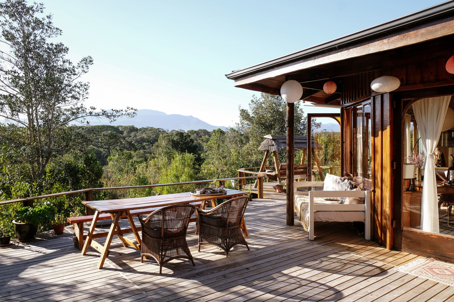
8. Wooden Cabin on Stilts With a Grass Roof
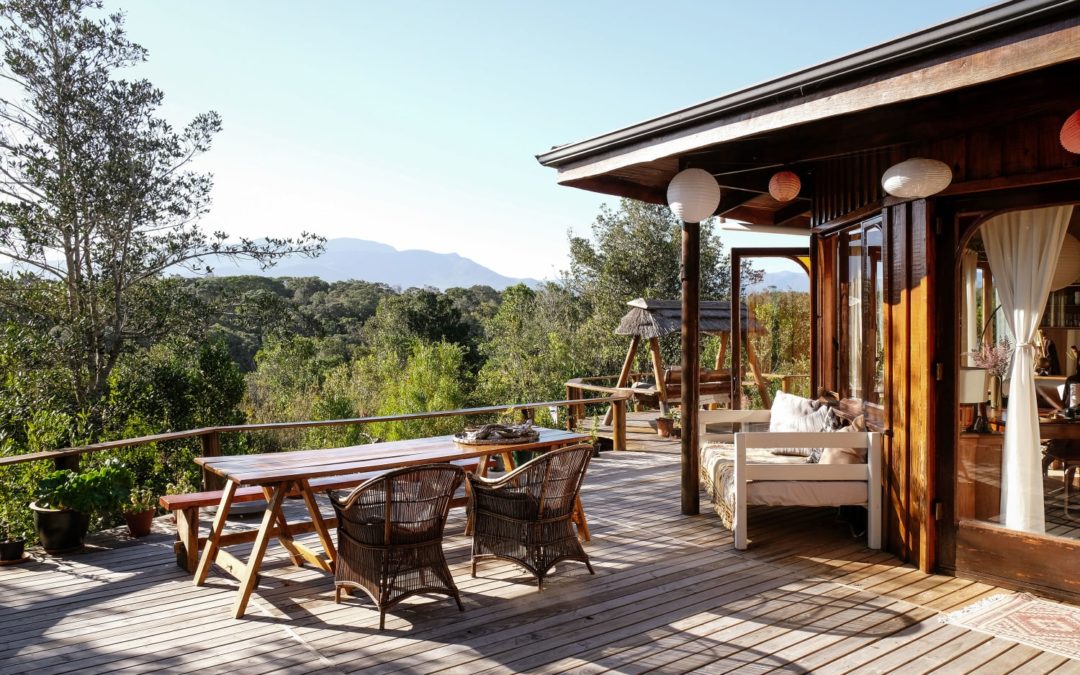
Amy Keevy and her fiancée, Maryke, live something out of a storybook in their South African wooden cabin. “Tulani (the name of the house) is made of all wood and stands on stilts overlooking the old-growth Tsitsikamma forest,” Amy says, “Maryke and I both love being outside and our house is a great balance of indoor and outdoor living space. You immediately feel connected to the nature around you. On top of my studio is the grass roof, and inside the house you will find very few straight walls! The curves, open-plan feeling, and connection to nature (literally above our heads!) create a womb-like atmosphere and contribute to the magic of the home.”
9. A Year-Round Ode to Spooky Season
Filled with skeletons, handmade octopus chandeliers, and tons of cast plaster details, Adam Wallacavage has created — in his words — a “Victorian style freak show” in Philadelphia, Pennsylvania. He describes his style as a “mixture of the beach towns Wildwood, New Jersey, and Cape May, New Jersey. The Wildwoods are known for their kitschy ’50s neon and mid-century modern motels and boardwalk. And Cape May is known for its Victorian gingerbread.”
10. Oddly Shaped Chicago Studio Is Only Three Feet Wide at Its Narrowest Point
Ainsley Fleetwood lives in this 460-square-foot studio apartment in Chicago’s Rogers Park neighborhood, and the layout is definitely one of the most interesting things about it. “Seeing the studio for myself,” she says, “I appreciated its character, and felt a spark of excitement that ended my apartment hunting. The building is built along a diagonal alley, and my unit faces the alley and is at the end of the building, such that narrowest tip of my apartment is only about three feet wide.” To combat the odd layout, Ainsley has two daybeds instead of a couch and conventional bed, and keeps all her possessions pared back so as not to clutter the space.
11. Embraces ‘Queer Abundance’ With Collage Walls
While Maya “Marty” Martin-Udry’s Upper West Side studio might be standard in structure, the wall covering is anything but. Instead of painting or peel-and-stick wallpapering, Maya decided to start an always-changing collage. “I started taping up photos, art, notes from friends, and more in college,” she says, “Over the years, the collection of memories on my wall has grown and moved with me to various apartments. It is kinship rendered on paper, a chaotic and overwhelming manifestation of the people and spaces I love and have loved. The noisiness, brightness, and abundance of the collage collapses and queers time — everything that has ever mattered to me, all the people I have been, and all the loved ones and experiences that have shaped me, clamoring together all at once. It makes me feel full.”