
by Furnishly | Dec 9, 2021 | Design Inspiration
It’s our favorite time of year…
and as we get ready to celebrate our favorite traditions for the holidays, we are looking back and reminiscing on how our seasonal decor has evolved over the years.
From the very first McGee & Co. catalogue to celebrating the season in our own home, our holiday style has evolved over the years with new layers of festive accents for each space.
Scroll through and take a walk down memory lane with us and visit the ghosts of Christmases past!
by Furnishly | Dec 6, 2021 | Design Inspiration
Your bedroom space should inspire peace and relaxation…
but creating a retreat-like atmosphere can be easier said than done. When starting the process of designing any space, we like to look for imagery, materials, and even colors in nature that draw us in, and today, we’re excited to break down ten of our favorite bedroom looks in hopes of inspiring you; too!
Although each of these spaces is different, they all bring a feeling of serenity through layered textural details, calming material palettes, and thoughtful styling touches.
Keep scrolling to see some of our favorites from our latest projects and read about the design principles that bring them to life.
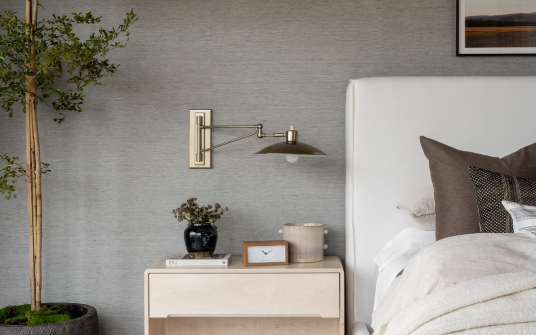
In our recent Mountainside Retreat project, we designed a primary suite for our clients that brings many of our favorite design elements together. Our clients wanted to keep their color palette minimal throughout their home, but since we had a lot of white walls in the gathering spaces, we knew we wanted to bring a new dimension to the bedroom.
We chose a grasscloth wallpaper that set the mood and brought so much coziness and character to the space and layered in light materials and pieces to balance it out. Modern lighting fixtures are softened by an upholstered bed, a few beautiful vintage accents, and of course, sweeping views of the stunning mountains surrounding the home.
by Furnishly | Nov 16, 2021 | Design Inspiration
We’re settling in for the winter…
which means introducing warm elements into our spaces with more layers, textures, and pieces that speak to our everyday routines and seasonal traditions.
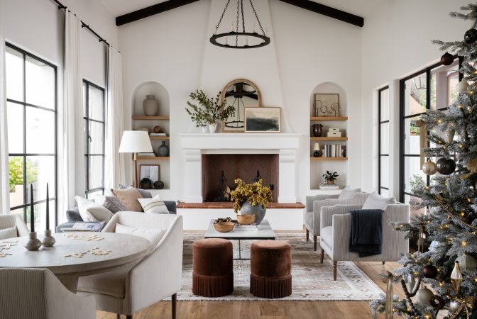
In the McGee & Co. 2021 Winter Catalogue, we got to share some of our favorite pieces from the new collection and create a cozy holiday great room look with deep hues, festive accents, and luxurious materials.
Watch our webisode below and keep scrolling to look deeper into this space and how we brought it to life.
“I love how this space feels open and inviting while cozy at the same time, and we wanted to complement that with furnishings that inspire gathering.”
– Shea McGee
The pieces
Mixing seating pieces brings a more thoughtful and curated feeling to any space, and in this look, we paired The Remi Sofa with two striped Gemma chairs to cue gathering and conversation.
We added a subtle patterned element with the Conway Hand-Woven Rug and centered the look with the modern, minimal Parker Coffee table. Finally, to allow for even more seating and bring in a warm, seasonal tone, we added two of the Astrid Fringe Stools in front of the fireplace.
“The Astrid Fringe Stools are probably my favorite addition to this new collection with their warm tones and playful cotton fringe while functioning as additional seating for larger gatherings.”
– Shea McGee
When we have a dining nook in the same space as a living area, we often incorporate a round table to allow for a layout that flows well and can be easily walked around. The Masa dining table was perfect for this space to contrast the warm wood tones in the finishes — while the Laurie chairs seamlessly tie into the rest of the living room furniture with their curved silhouette and soft upholstered material.
The details
To pull the look together, we introduced new material and tonal elements through styling accents that speak to the wintery feelings we want to evoke at this time of year. Sculptural greenery, layered textiles, vintage ceramic textures, and of course, a bit of holiday sparkle brought this space to life.
“One of the simplest ways to refresh a room for a changing season is through changing the textiles”
– Shea McGee
Pulling tones from the rug, ottomans, and artwork, we curated a mix of a few of our favorite pillows from the new McGee & Co. collection, paying attention to the scale and shape of our patterns to style on the sofa. On the chairs, we kept it simple with a cashmere throw in a stunning ribbed-knit material draped over one arm.
We styled the fireplace-framed built-ins with a tight color palette that lets the shapes and textures shine, incorporating a mix of vintage and new decor to add dimension and visual interest to the character-driven story of the scene.
Leather Handled Wood Ball Object
We incorporated material elements from the rest of the space on the flocked tree and an added touch of holiday sparkle with soft whites, wooden beads, golden bells, and garlands.
Looking for more tree-decorating inspiration? Check out our step-by-step guide here.
See the whole Living Room look here.

by Furnishly | Oct 15, 2021 | Design Inspiration
It’s been one year since our show “Dream Home Makeover” premiered on Netflix…
and we’re grabbing the popcorn and to celebrate all weekend! It’s still hard to believe that there are two seasons of the show out in the world after years of planning, filming, and preparing.
We feel so grateful that we got to work on these projects and help our clients transform their spaces into their dream homes, and we can’t wait to do more of it in Season 3!
To celebrate, we’re taking a look back at all the highlights from Seasons 1 and 2. Here are a few of our favorite moments, pieces, and tips from each episode:
“Whether our clients have two million dollars, or twenty thousand, I want them all to feel that sense of peace when they walk in the door.”
Shea McGee
Stuck on how to re-imagine an underutilized living area, our clients had left this space un-completed when they moved into and remodeled their home. After understanding their goals, we decided to break the room into three distinct areas, re-image the mood using paint, and incorporate cozy and functional pieces.
A tip from this space – We are believers that every room needs a focal point. Whether it’s a fireplace, an accent wall, or even a large piece of art, focal points allow the eye to rest, drawing you into the space.
Emory Extension Dining Table
Our clients wanted to build a home that felt welcoming, comfortable, and lived-in for their family to grow and create memories together, and the final result was a perfect expression of that intention.
A tip from this episode – We love using chairs rather than a sofa when we need to place seating where the main flow of traffic comes into the room. In this space, we chose chairs with these beautiful metal backs that you see when you walk into the space, and we love how it works to open up the design and pull everything together.
Episode No. 3: Movie Room Remake
In Episode 3, we helped our client transform his favorite space in his home: the movie room, into a cozy, moody space perfect for spending time with friends and entertaining.
A word about designing around screens: A dark wall color behind the TV helps blend the TV into your space, making it feel a part of the design. On the flip side, if you have a projector, going dark on the walls can help create that cozy movie room feeling.
Seagrass Catch-All Basket
We were so excited when we learned our clients from Episode 4 were interested in taking their cabinets a dark green shade for this modern remodel. We love how the custom green shade we created was muted enough that it still felt timeless and carried well throughout the rest of their space.
“I don’t think there is a should or a shouldn’t with a dark kitchen. As long as you have some natural light to bounce around the sunshine in the space, I say go with a dark kitchen.”
Shea McGee
In Episode 5, we got to work on the oldest home we’ve ever worked on. Originally built in 1851, this home is over 150 years old! Our team loved the challenge of honoring the historical details while bringing something fresh to the table.
What we’ve learned about historic remodels: Less is more! Accentuating the elements you want to keep and minimizing the rest takes careful attention to detail. Although it can be tempting to rip everything out, considering how your home’s original characteristics could look in a new light might keep you from making the mistake of getting rid of something irreplaceable.
Boston Single Arm Library Light
With closed off angles, dark tones, and limited counter space, the kitchen in our client’s home wasn’t working for them functionally or visually. Eager to complete their space before being apart during deployment, our clients dreamed of a light, bright, and open kitchen where they could cook, entertain, and be together.
“Good design is about adding and subtracting and being smart where you’re choosing to do so. Even if you add more things to a space, by creating real uses for each area, you can make it feel larger.”
Shea McGee
Darlana Two-Tiered Ring Chandelier
Go Lightly Medium Chandelier
Bryden Medium Round Pendant
“A home is not just where we rest our heads at night. Any house can be transformed into the perfect place to call home.”
SHEA MCGEE
One of our largest new-build projects yet, The Home on The Ranch, is complete with a light-filled open-concept space, plenty of lounge spaces, and even a basketball court! We had so much fun designing this entertaining-centered home for our client and their large family to enjoy for years to come.
A tip on softening a grand design: When you have a lot of oversized, grand pieces in a space, adding a lot of textile layers goes a long way in making it feel cozy and inviting.
Looking to transform an old workshop into a live-able, functional space, our clients wanted to infuse their love for the midcentury modern style into an open-concept suite. With careful space planning, our team created a studio-like apartment complete with all the essentials.
A design lesson from this episode: While it may seem counterintuitive, large pieces can actually make a small space feel bigger by allowing the eye to rest on visual focal points. Adding large statement pieces through wall decor is a simple way to bring a streamlined feeling to a small area, creating the illusion of a larger space.
This master bath and closet remodel allowed our team to think about spatial planning in a new way. After re-considering the layout and taking a risk with the color palette, we created a place of retreat for our clients to enjoy in their everyday routines.
Emphasizing natural light: Our clients had quite a bit of natural light in this space, but it became more apparent as we added in lighter hues. Although we went with a darker tile on the floors, the white walls, softer window treatments, and a light tone on the vanity allowed the whole space to feel brighter.
Jace Inset Rectangle Mirror
Istanbul Gray Bath Collection
In this episode, our clients brought us in to help them update and brighten their kitchen space while maintaining their historic home’s character. We incorporated patterned accents, transitional pieces, and a few of our favorite decor elements to pull it all together.
Letting original elements shine: One of the most important design lessons we’ve learned over the years is that remodeling is not always about re-doing every element in the space. Although our clients wanted to brighten their kitchen space, they had these great original wooden elements that we knew we wanted to incorporate in our design.
Demi Floral Stripe Wallpaper
Looking to update their mountain retreat to feel brighter and more modern, our clients from this episode wanted to combine their styles and create a vibrant, character-filled retreat. We created a vibrant, cozy space for them we couldn’t love more!
A note on mixing styles: If you’re sharing a space with someone who has a different style than you, or you’re drawn to multiple design influences, don’t be afraid to mix styles! One way to do this is by incorporating one style through the foundational pieces and the other through the layered decor.
Looking to update their primary bedroom to feel like an oasis for their family, our clients were excited to bring more personality and light into their room. The result is filled with playful textiles, a soothing color palette, and a hint of a coastal flair.
A tip from this episode: Wall treatments go a long way in adding character. Whether it’s paneling or interesting ceiling details, wall treatments can elevate your space and bring character like nothing else.
by Furnishly | Oct 4, 2021 | Design Inspiration
Margot’s nursery is our new favorite space in The McGee Home…
and we’ve loved spending time in this room over the past few months of newborn bliss.
We’ve already shared the photos and our favorite tips for designing a nursery space, but today we’re diving deeper into the process with a webisode and a breakdown of why we made the decisions we did!
Thank you to The Shade Store, Killowen Construction, Clé Tile, Metrie, and Stanton Carpet, and Kohler for helping us bring our vision to life!
Watch the video below for a virtual tour and keep scrolling for more details!
The finishes
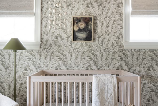
We started the design process by choosing Benjamin Moore’s “Just Beige” for the ceiling and some of our favorite patterned wallpaper from McGee & Co.’s new kid’s collection. These neutral and feminine elements gave us a great backdrop to layer other patterns and colors on top of while still feeling interesting.
“The biggest inspiration for this space was the ceiling; I think that her room with the roof lines feels like an old attic space but also has a lot of old-school charm.”
Shea McGee
While we have hardwood flooring throughout our home, the kid’s rooms are all carpeted. In this space, we used the same carpet material in Ivy & Wren’s rooms from Stanton carpet in the style “Sumana,” and the color “Sand.”
One of the first elements we select when designing any space is the window treatments, and Margot’s nursery was no exception. We worked with The Shade Store on all the window treatments throughout our home, and we couldn’t love them more!
We selected the Waterfall Woven Wood Shades with a blackout lining and Tailored Pleat Drapery in a subtle floral pattern material for this space, and they complement the design perfectly.
The Shade Store’s options for customizing everything from the privacy to the pleat have made designing window treatments for our home really simple. The quality of the materials is unmatched and with a 10-day custom order shipment timeline, working with them is a no-brainer for any project.
The pieces
We started with the Gelato Crib, one of our new pieces from the McGee & Co. Kids Line, and it sets the foundation for the rest of the space perfectly. Although she’s still sleeping next to our bed, we’re excited to move her in here within the next month or two. Plus, this crib converts to a toddler bed, making it so we can use it in her space for a few more years!
Next, we added a cozy boucle glider chair, a matching ottoman, and a textural side table perfect for placing a bottle. The Anya Hand-Knotted Rug from McGee & Co. grounds the space and adds another element of playful pattern but feels grown up enough to stay with her over the years.
“When space planning a nursery, I always like to leave the space open in the middle so babies can crawl, roll around and play. Then, when they get older, we can add toys!”
Shea McGee
We brought in some height to contrast the lower levels of the crib and chair with this wooden cabinet, perfect for storing her blankets and books now and styling with her favorite mementos as she gets older. The green tone of the dresser contrasts the taupe walls perfectly, completed by the cutest vintage bow chairs and gold mirror.



