by Furnishly | Jan 20, 2026 | Design Inspiration
Minimalist, but far from boring.
The Soft Curve Suite, a modern open plan project designed by GUR Studio, is a calm space that doesn’t rely on bold colors or loud decor to make a statement. Instead, it uses shape, warmth, and clean architecture to do the talking. The best part? It still feels livable, not like a “don’t touch anything” kind of home.
So if you love minimalist interiors but want them to feel softer and more human… you’re going to want to stay for this one.
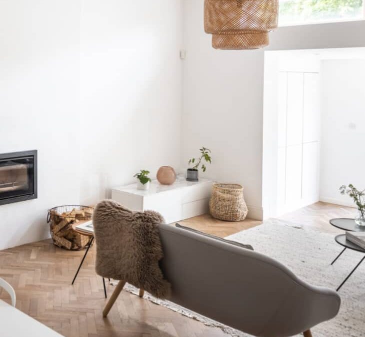
Living Room
The living room of the Soft Curve Suite is a definition of minimalism that feels warm. Nothing is loud, nothing is trying too hard, yet every detail has that quiet “designer did this on purpose” energy.
The oak paneling wraps the space, and the soft lines make it feel extra cozy. The transitions stay seamless, too, so the room flows as one, clean composition instead of separate parts. Even with simple furniture and a neutral palette, the room still holds presence.
Bedroom
Things in the bedroom appear quietly elevated, carrying the same soft architectural language as the rest of the suite. It’s part of an open plan layout, but not in an “exposed” way. That’s thanks to the curved metal partition, which creates privacy without fully closing off the space.
Behind the bed, the oak wall panels keep the room looking grounded. The vertical lines add structure, and the lower upholstered headboard panel pulls it all together. Even the vanity zone and sleek workstation feel intentional, tucked right into the curve as they belong there.
Breakfast + Reading Nook
These small moments are what make The Soft Curve Suite feel lived-in.
The breakfast nook sits neatly along the wall with a round table and built-in bench seating. Overhead cabinetry stays minimal, so the whole corner reads clean and calm. Nearby, the reading nook works like a soft pause in the layout; a single chair against warm oak paneling is all it needs.
by Furnishly | Jan 16, 2026 | Design Inspiration, Style
We
independently select these products—if you buy from one of our links, we may earn a commission. All prices were accurate at the time of publishing.
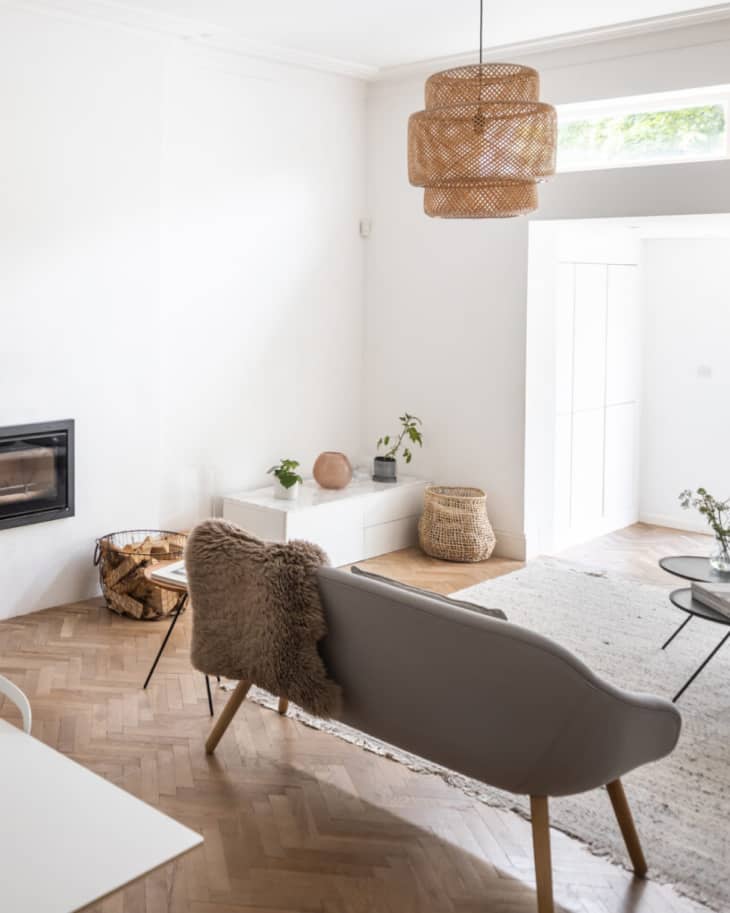
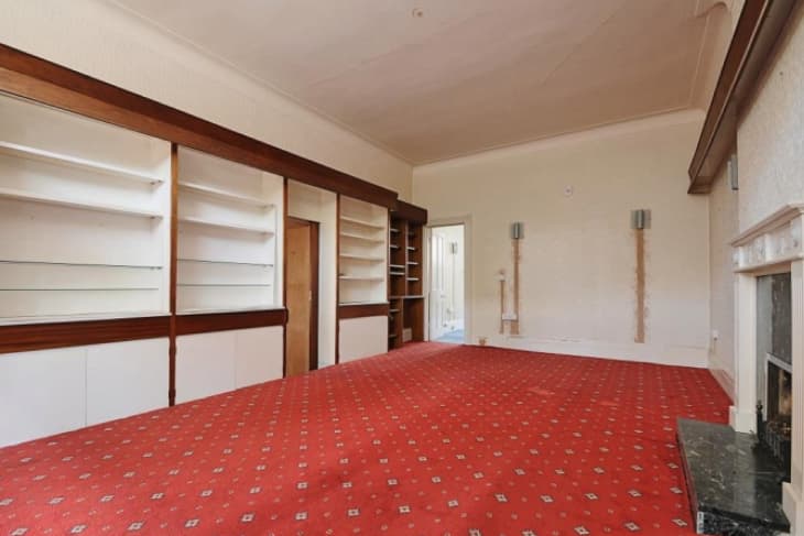
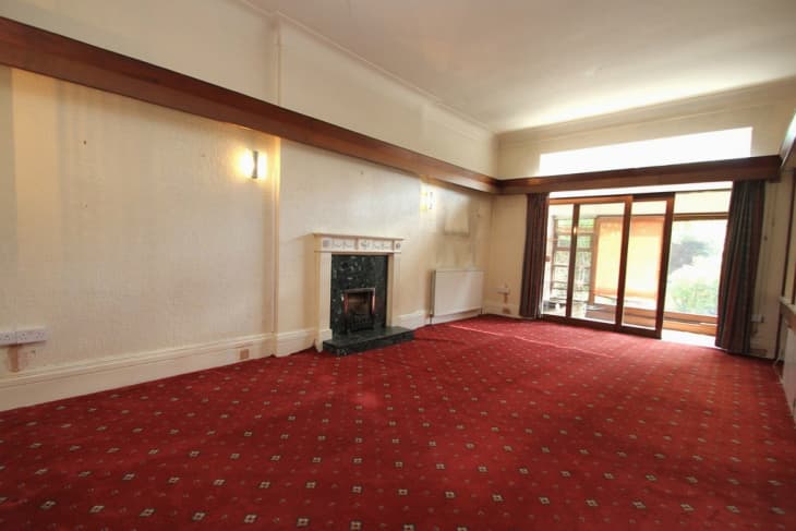
Victorian conversion apartments like the one I live in come with many enviable perks, like large windows and high ceilings. But because they started out as larger Victorian houses that have since been chopped up into smaller apartments, these conversion apartments also come with plenty of quirks. Challenges include drafty windows, a lack of bathrooms, and the biggest one of all: at least one oddity in the layout.
In my home, that head-scratcher was the living room, which I can only describe as a large “hallway.” It has my bedroom at one end, the kitchen at the other, and the entryway in the middle, almost like a railroad-style apartment (just not in a completely straight line). It’s also windowless apart from a sliver of glass near the ceiling.
My living room started out in fixer-upper shape, with dated 1970s finishes, so gutting it down to its bare bones was the first step. I followed that with fresh wood floors and a new fireplace. This was the easy part! Choosing where new light switches and outlets should go was trickier, as was arranging the space so that flow of traffic to the surrounding rooms made sense. And then there was the lack of light! Here’s how I made it all work.
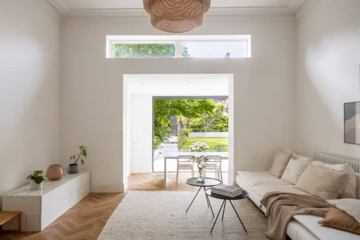
I went for an open layout with distinct zones.
I’m an interiors blogger who’s written about lots of homes, including my own, and I knew that fighting my home’s original layout was useless. Instead, I tried to create distinct zones within the living room’s long, open space.
I began by narrowing the opening between the kitchen and living room but opted for no physical separation between the spaces, not even glass doors. With the narrower opening, both the rooms work as two separate spaces but also allow my family to feel like we are together even when we’re in different areas.
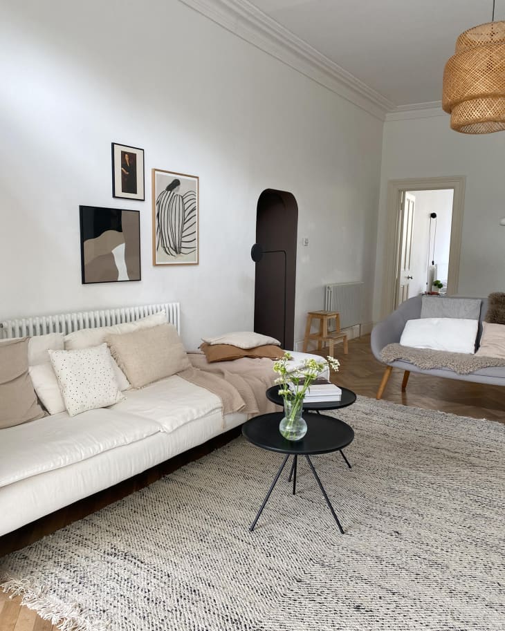
I made the doorway “disappear.”
To reduce the number of angular doorways, I turned the opening of the entryway into an arch. I made it “disappear” by painting the entryway in a much darker color (Mylands’ Millbank). Now, when you’re in the living room, it’s almost as if there’s nothing there.
I fully embraced minimalism.
Although the style of this home was originally Victorian, my style naturally leans more minimalist. Luckily, the natural light and scale of Victorian-style homes lends itself well to my style, too. Painting the walls crisp white made the space look bright and helped maximize every bit of light.
I maximized natural light.
Adding windows to the living room wasn’t an option. So, lastly, I replaced almost the entire rear wall of the kitchen (which is an extension) with 18-foot-wide glass sliding doors. While costly, it is the single best splurge I made in this transformation. Now, I don’t even notice the lack of windows in the living room.
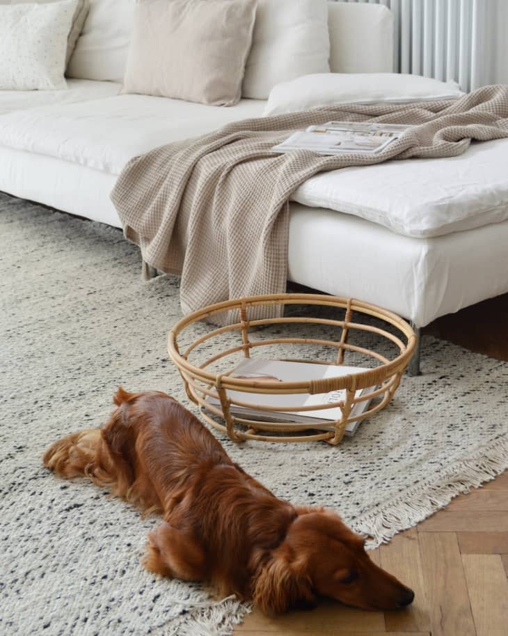
My favorite thing about the after is how light and bright my windowless living room looks and feels. And I absolutely love that as a family we can be in separate spaces but still feel like we’re together.
by Furnishly | Dec 15, 2025 | Design Inspiration, Furniture, Style
Kelly Dawson is a writer, editor, and media consultant. Her writing has appeared in almost every major American design publication, most notably as a longtime contributor to Architectural Digest and Dwell, and she’s also been published in places like The New York Times, AFAR,…read more
by Furnishly | Nov 25, 2025 | Design Inspiration
The Modern Grid Apartment, a design by Be Esthete Studio and Kate Gavryliuk, feels full of intention. Every line, every color, every surface has purpose. Bold blue cabinetry anchors the layout, and soft light floods the rooms. Warm wood floors add comfort without losing the modern edge. It’s simple, but it stands out. And once you walk through the rooms, the structure of the entire home starts to reveal itself; clean & calm.
The hallway sets the tone for the apartment, where black-framed doorways create clean graphic lines. Warm wood wardrobes stretch across one wall, giving you plenty of hidden storage; their tall black handles echo the apartment’s modern grid theme.
As you move through the corridor, the mix of grey, black, and natural wood stays consistent. The matte-black door blends into the cabinetry wall, with a small wall sconce casting a soft glow. Simple but inviting.
The living room feels easy to settle into. A grey sectional shapes the seating area, also adding balance to the darker shades around. The low blue console creates a striking contrast with the bold black accent wall, and ties the space into the apartment’s signature hue. Oversized windows let plenty of natural light fall onto the warm wood flooring, and the lightly patterned rug brings just the right amount of texture.
The kitchen sits quietly along the wall, keeping the space feeling airy. There’s ample storage but minimal visual weight, thanks to the soft grey cabinetry that runs up to the ceiling.
The countertops and sink faucet are kept minimal so the speckled backsplash can stand out. A slim black shelf sits above it, holding just a few glasses and warm wood accents.
Designers have used the dining table as the focal point here to bridge the kitchen and living room seamlessly. Finally, clever, strategic placement of the statement black lamp gives height to the corner, and the leather seating helps it all come together.
Calmness takes over when you step into the bedroom of the Modern Grid Apartment. Blue is on the lead here, wrapping the headboard wall and the shelving divider in a rich, modern tone. Furniture is kept low to create a relaxed, easy feel.
The tall shelving unit, also a statement feature here, does more than divide the room- it hides the sleek white workspace + provides useful storage without clutter. A trailing plant and a white reading light finish off the decor while adding extra functionality.
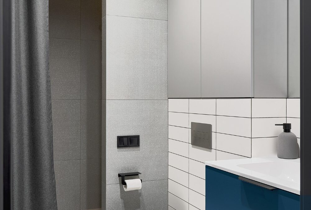
Things are looking crisp & modern in the bathroom. Light grey tiles prevent the interior from feeling too boxed-in, while the blue vanity ties back to the palette used throughout the apartment. White subway tiles break up the grey and make the sink area feel brighter.
A simple walk-in shower sits behind a soft grey curtain. The warm LED strip above it adds just enough glow to make the space feel inviting. Fixtures stay sleek and minimal, so the room feels open despite its compact size.