by Furnishly | Sep 21, 2022 | Design Inspiration, Style
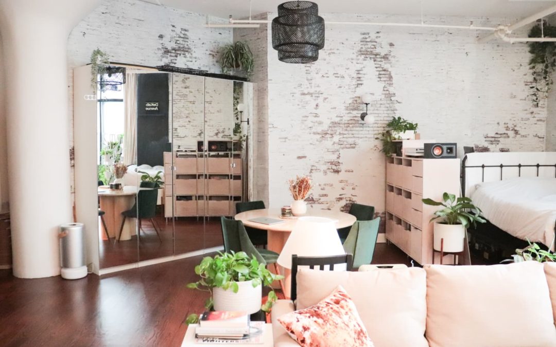
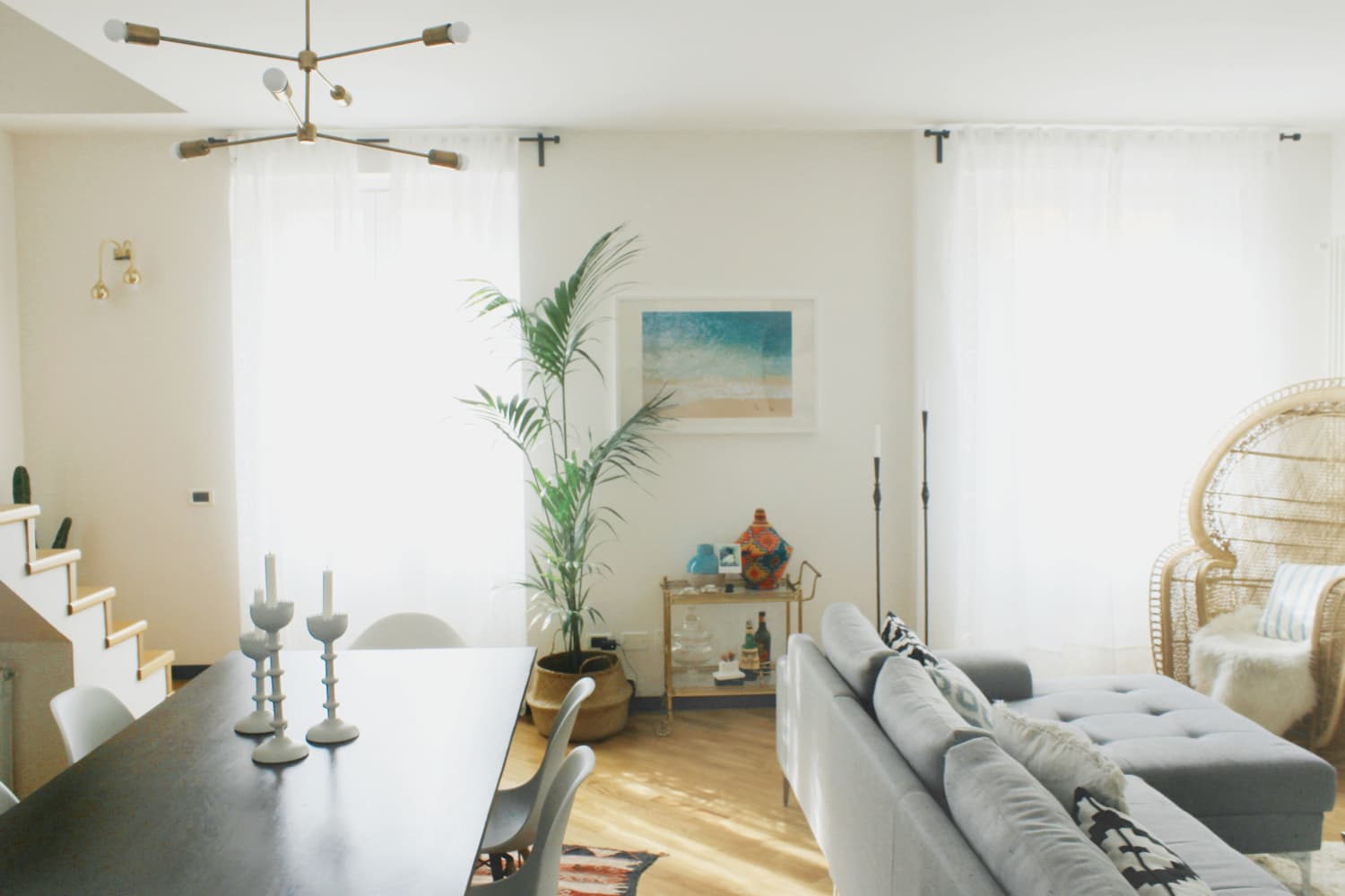
Do you have your living room sofa against one wall, your TV cabinet against the opposite one, and then a sofa pushed up against the windows of your sunroom? If so, the space might appear flat or overly spaced out. To fix that, you might consider floating your furnishings. “You can do this by placing a sofa or chair with its back to a neighboring furniture grouping,” says Beryl. “By placing your pieces in a specific place, you will be able to break up your open concept and solidify the separation of areas.” This might mean pushing the couches away from the walls and windows and setting up benches or sideboards in the area that separates the living room from the sunroom.

by Furnishly | Jun 16, 2022 | Design Inspiration, Style
We independently select these products—if you buy from one of our links, we may earn a commission. All prices were accurate at the time of publishing.
Name: Roanna Cochrane (she/her) Simon Phillips (he/him) and our daughter
Location: Toronto, Canada
Size: 713 square feet
Type of Home: Converted loft
Years lived in: 5 years, owned
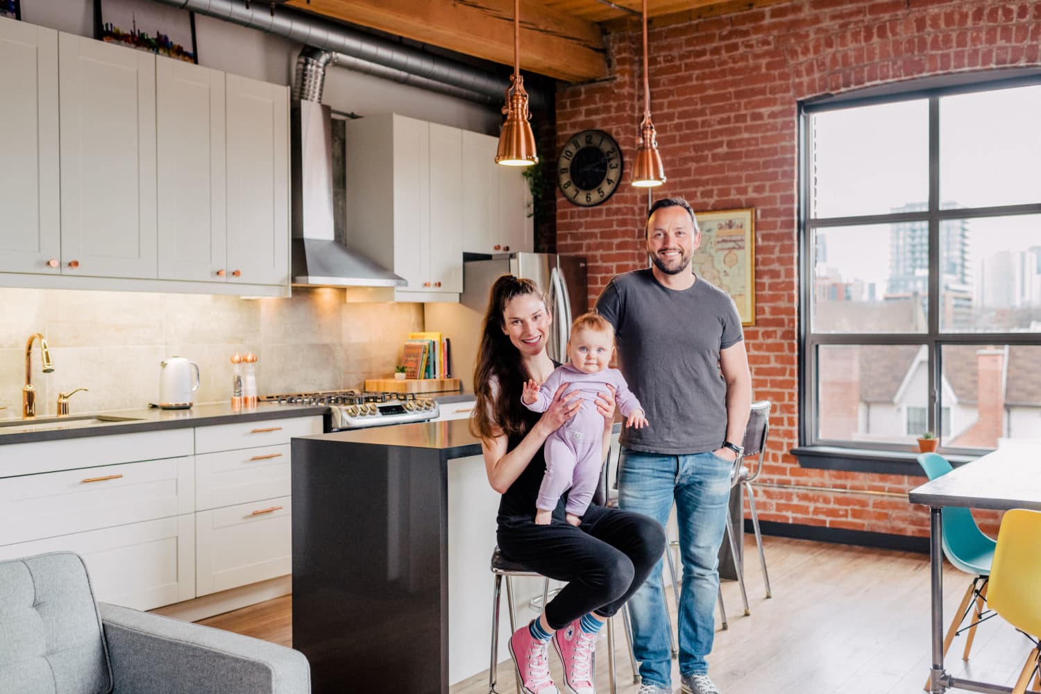
As two actors, my husband Simon and I work from home a lot so it was important for the space to be both multi-functional and in a style that inspired creativity. When we first viewed this turn-of-the-century loft, it was pretty run down with lime green walls in the kitchen, a horribly shabby curtain dividing the bedroom from the living room, and no light fixtures to speak of. It was all very uninspiring, to say the least. We knew the bones of the building had loads of character with exposed red brick walls, an original hardwood ceiling, and gorgeous beams. But the challenge was figuring out how to make a 700-square-foot open plan into a multifunctional space without putting up drywall and creating separate rooms.
It was all about how we reconfigured the floor plan. When we bought the loft, the bedroom was in the best area of the home — the corner of the unit that gets the most light, privacy, and the best city views. The original kitchen was tucked into a windowless area with a ceiling mounted furnace attached directly above the stove! Not exactly the kind of noise you want humming above your heads as you mix your pre-dinner cocktails. So we hired our friend, Matthew Chong from Greenroom Design Inc., to help us.
The catalyst for our final design choice was when we moved that ceiling mounted monstrosity from the kitchen to the entryway, so you bypass it on entering the unit and never really see it. At that point, Simon turned to me and said, “Hey, why don’t we swap the kitchen and our bedroom around?” It made so much sense now that we’d opened up the space above our heads and could see the room in a completely different light. This also allowed for us to use the corner of the unit with wall-to-wall exposed brick and all that character as our main entertaining space, which also made sense as that’s really where you want to sit with your family and friends to eat and drink and enjoy the city skyline.
When you work from home, like we do, it is important to be able to feel like each room is a different space. Directional lighting and dimmers helped this, rugs defined spaces such as the living room. I truly believe that your home should be an extension of your style, and now with more people working from home than ever before, it needs to also be multifunctional and certainly should be inspiring. You also need to design your home with room to grow. We certainly found that to be the case.
Interestingly, this renovation influenced us in more ways than one. It kickstarted my husband’s passion to pursue a new career in real estate and he is now working with Dream Homes Vancouver Island Group. As for me, I am in the thick of renovating our new mid-century courtyard home in a Palm Springs style. Who knew that buying a tired looking condo would change the trajectory of our lives forever?
My Style: Modern vintage. Clean lines but with a quirk! I like to give a nod to the era that the property was built but make it functional for the modern day.
Inspiration: The true artist’s loft. Living, working and playing in an open planned space that inspires! I found Pinterest to be so helpful for inspiration and helping me to think outside the box.
Favorite Element: One favorite? That’s hard! Hmm, it has to be the abundant red brick walls that cover half of the loft. They are so warm and inviting and tell such a story. It was important to let them take center stage in the design. As a Brit who has moved to Canada, finding a home that had history and character was important to me. This neighborhood, and very building that was once a working factory, was bursting it!
Biggest Challenge: Our biggest challenge was the layout. The original layout had the bedroom in the focal point of the loft with a hospital style curtain cutting off the space and the kitchen tucked into the corner with a loud, exposed furnace above. Once we relocated the furnace and swapped the bedroom for the new kitchen, everything made sense. Suddenly the new kitchen was in the brightest, most social part of the house with views of the Toronto city skyline. A kitchen is the heart of the home so it needed to be in the prime spot. I had all these ideas to go with retro colored cabinets or a bold backsplash but as we lived in it, we felt it was important to let the natural features speak — the brick and beam. We couldn’t avoid the large industrial air ducts, so we lent into it and made the metallics our feature colors.
Proudest DIY: I took a plain IKEA mirror and made it into a gold leaf, vintage looking mirror. It turns out that the worse you are at applying gold leaf evenly, the better! Who knew?! It looks so authentic and I feel so proud when I see it. We also made curtain rods and hand rails out of industrial pipe and spray painted them matte black to tie in with the sprinkler pipes in our loft.
Biggest Indulgence: I’d say our two biggest splurges were the countertops and the floors. We went for a waterfall edge on an enormous island and it really makes the kitchen feel like a chic bar. We really felt it was worth it in the end as we’d sit at our bar and drink cocktails overlooking the Toronto skyline! It looks so classy and is also easy to clean. When we bought the loft, the floors were made of gypcrete and the sound travelled between the units a lot. We wanted to create some privacy, and so we put soundproofing between the floors. Both sound-wise and visually, it was so worthwhile. And why buy a loft if you can’t entertain in it?
Is there something unique about your home or the way you use it? As actors, we used our space to self tape from home so we wanted to keep the walls neutral to tape against and the abundant light from our big loft windows was perfect for this. During the pandemic, we also used our closet as a sound studio and even recorded characters from Ubisoft’s Assassin’s Creed Valhalla from our loft!
What are you favorite products you have bought for you home, and why? My cheapest and most effective item was our enormous frameless gym mirror that opens up the space like nothing else! It makes our loft feel double the size, like a window to another room. It was also a great mirror for home workouts and the occasional group selfie!
Please describe any helpful, inspiring, brilliant or just plain useful small space maximizing and/or organizing tips you have: In a small space, you’ve gotta be creative. For us, we had the ceiling height but not the square footage so we went up!
And finally, what’s your absolute best home secret or decorating advice? Look on Facebook Marketplace and Craigslist for secondhand gems of the exact piece you would have bought full price! It’ll save you money and you’ll also be good to the environment at the same time. Win win. Secondly, be bold and be brave with your design choices. You’re the one that gets to live in it! And finally, in my opinion, the sooner you get the reno done, the longer you can enjoy living in the space. So if you’re thinking about doing it this year or next year or maybe the year after, get it done, rip off that plaster and enjoy your home for that much longer!
This submission’s responses and photos were edited for length/size and clarity.

by Furnishly | Jun 15, 2022 | Design Inspiration, Style
We independently select these products—if you buy from one of our links, we may earn a commission. All prices were accurate at the time of publishing.
Name: Gaby Neira, Chris Yera, and Moon the cat
Location: Upper West Side — New York, NY
Size: 450 square feet
Type of Home: Studio
Years Lived In: 10 months, renting
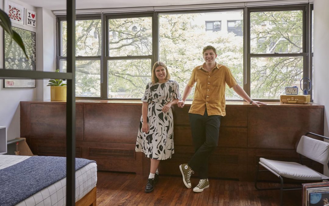
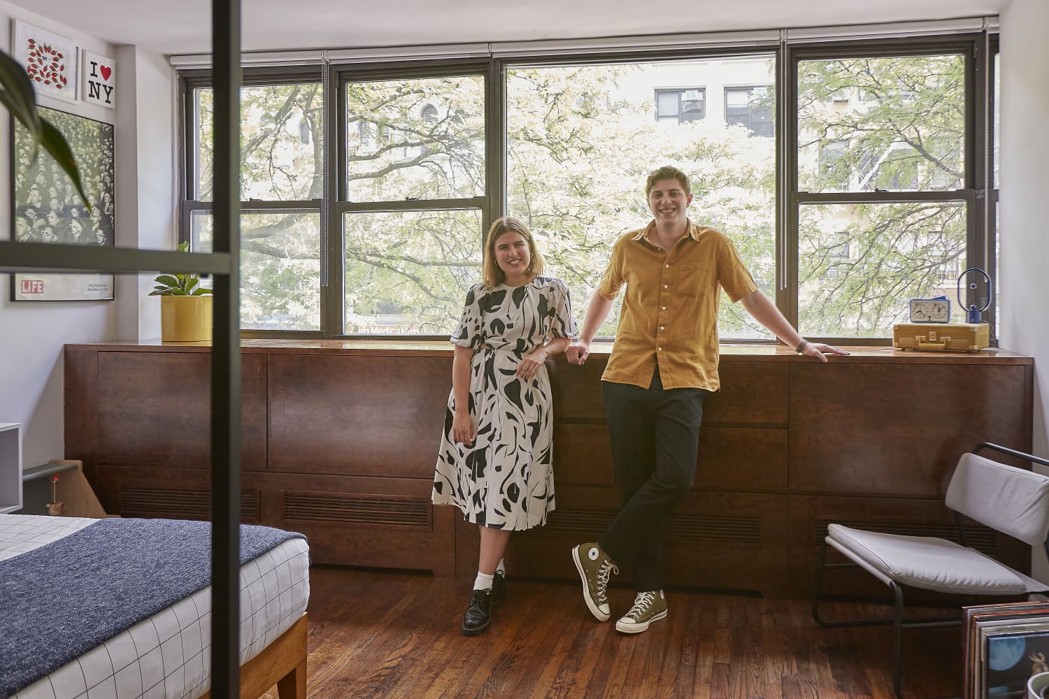
When Gaby Neira moved to New York City to attend the Parsons School of Design alongside her boyfriend, Chris Yera (who’s attending Columbia University), the couple had trouble finding a rental apartment because they were on a tight budget, had to find one fast, and “needed a place somewhere in the middle for both of us to commute to and from school,” Gaby begins. “We found this apartment on our second weekend in the city, just two hours before our flight back to Miami. From the moment we first walked into our studio, we instantly felt at home with its uniquely large windows facing tons of greenery and a prominent Upper West Side street. For the next month, I imagined what could be and spent hours drawing our apartment’s layout and rendering different furniture items that would perfectly suit our personalities and feel like home.”
“From long walks in the park to adventures in the Grand Bazaar, we’ve loved every second of living in the Upper West Side. Now coming up on a year since our move, our studio has seen us experience endless all-nighters at our desks, countless visits from friends and family, attempts at perfecting our Cuban craft in the kitchen, tons of binge-watching, and the welcoming of our cat, Moon! We can’t wait to see what the future holds for us here at our small yet eclectic space,” writes Gaby.
Apartment Therapy Survey:
My Style: Minimal + Bold Color + Scandinavian with a splash of mid-century modern
Inspiration: Looking at old New York brownstones’ interiors on Pinterest and design pages. I take inspiration from modern interior spaces that still embrace that “old New York” charm by using color, clean lines, and functional furniture pieces to elevate the space. I also love the colors blue and green!
Favorite Element: My favorite thing in the apartment would have to be the preexisting, custom-built, mid-century modern dresser and the large windows overlooking the street. This has become our favorite spot to sit, people-watch, and sometimes work. The dresser is a huge plus, as it hides the radiator and provides much-needed storage to our small studio apartment. Oh, and our windows also extend to the closet — a closet with a window!
Biggest Challenge: Living in New York is expensive, especially for college students. We had to design the space with a small budget, limited stock availability across the city, and a two-week moving time constraint. We resorted to buying as much furniture as we could online through IKEA, Wayfair, and Facebook Marketplace, and getting most of them delivered straight to our apartment. With the help of our families, we were able to build our furniture and lay out the space just in time before classes started.
Proudest DIY: I never prioritized the kitchen and bathroom when designing our space, so after we moved in, I realized that they felt dull and detached from the rest of the apartment. Looking for a quick and easy solution, I found the power of peel-and-stick floor tiles! I also added a faux terrazzo contact paper over the kitchen counter to match the new look of the tiles. The final touch was swapping the existing handles with simple black ones. This DIY completely transformed the look of our kitchen and bathroom and was super renter-friendly. You can completely change the look of a space without having to lift any tiles or granite counters!
Biggest Indulgence: My art prints are my biggest indulgence. They have definitely been worth it. They provide a sneak peek into our personalities and showcase my passion for furniture design, our love for the city, and our favorite museums and parks. I have always been inspired by Frank Lloyd Wright’s architecture, and I’ve loved being able to include some of his sections and plans.
Is there something unique about your home or the way you use it? Living in a studio apartment is all about maximizing space. When we first toured our apartment in its previous layout, we noticed that way too much space was being wasted. While moving in, I decided to section off spaces using paint and glass storage to divide the living and bedroom. I’d say our desks are definitely unique since they’re large for New York standards, but completely necessary for us as college students. We spend a lot of time at our desks!
What are your favorite products you have bought for your home and why? My favorite products would have to be the IKEA VITTSJO glass storage as it functions as our room divider while still allowing natural light into our space, while also serving as book storage and a home to our mini plant collection. Our dining chairs are also at the top of my list! These were FB Marketplace finds that I bought from a seller in Brooklyn for $12 each, and while carrying them back on the subway and through the streets, I noticed a familiar symbol underneath them. I came to find that these were Herman Miller Caper chairs that retail for around $200 each! These chairs also happen to be my favorite color!
Please describe any helpful, inspiring, brilliant, or just plain useful small space maximizing and/or organizing tips you have: My biggest advice would be to draw out a small sketch of your space with measurements and start laying out furniture to scale on it. I think we are always safe with layouts and don’t think about just having things floating in space and serving as dividers. Furniture doesn’t always have to be against the wall; maximize your space!
Also, using paint to your advantage to section off spaces can really make a difference. The desk/office space is sectioned off with a wall strip of paint that continues onto the ceiling, creating this nook-like feel. I have always had a love/hate relationship with headboards and honestly didn’t want to purchase one, so I created a similar effect using Benjamin Moore’s “Polo Blue” to paint the bottom section of the wall.
Finally, what’s your absolute best home secret or decorating advice? The best decorating advice I have is to not buy all your decorations at once, but to just collect different knickknacks along the way. Some of my favorite decor pieces were from the Grand Bazaar on the Upper West Side, Housing Works, and Goodwill. Having furniture acts almost as a canvas and allows these pieces to tell a story about who inhabits the space. Some of my favorite finds include a school chess clock, vintage binoculars, a ceramic palette, brass candle holders, wooden building blocks, and design books.
Thanks Gaby, Chris, and Moon!
This submission’s responses and photos were edited for length/size and clarity.
Erin Derby
Photographer
Originally from California, but turned New Yorker since 2000, I’ve been shooting my entire life and am still inspired and excited about it. Lately I have been putting my energies into my Fine Art, which can be seen on my website and on Saatchi Art. Being infatuated with interior design doesn’t hurt either, which mixes well with my love of photographing interiors.
Follow Erin

by Furnishly | Jun 13, 2022 | Design Inspiration, Style
Name: Laura Moore and son
Location: Arlington, Virginia
Type of home: Apartment
Size: 850 square feet
Years lived in: 1 year, renting
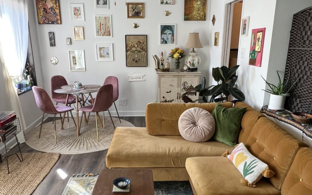
Tell us a little (or a lot) about your home and the people who live there: I’m a single mom, and for a few years my son and I lived with my parents to save money. During this time, I dreamed about my next home constantly! I knew that I wanted to live in Arlington to be closer to Washington, D.C. and to live in a walkable area, but the housing is very expensive. So I decided that I would save money by finding a one-bedroom and creating a “bedroom space” for my son to have when he is home part-time from college. I searched for a while to find a floor plan that would work. There are so many apartment buildings in Arlington but many of them have compact, modern layouts that use space too efficiently to make my plan work. For this reason, I knew I needed an older building, and I didn’t mind because I love the aesthetics of older homes. My building was built in 1966, so not super old but it fits with the retro style that I admire.
I created the bedroom space by putting up some bookshelves and hanging curtains behind them for extra privacy and coziness. I closed it in and created a door with a room divider I snagged for cheap on OfferUp. I made sure that my son felt comfortable with this plan and he really seems to enjoy hanging out in his little area when he’s home. He loves living in an urban area, and he understands that the trade off for fun and convenience is space!
I care about sustainability, so I tried to incorporate natural materials or thrifted items where I could. I purposely have a lot of wooden furniture, and I scattered jute rugs throughout. I splurged on linen curtains and bedding, and I love how they look and feel. My favorite sustainable items are the bamboo curtain rods in my bedroom — I felt this was a bit of a risky experiment but I’m very happy with the outcome. I think they add a grounding element.
I also bought natural/organic mattresses and am so impressed with their comfort! My favorite thrifted items are my green chair and my chinoiserie bar. When I found the green chair it was love at first sight. When I brought it home, my dad called it the ugliest chair he’d ever seen! I didn’t care, I knew I was going to create a real vibe with it one day. I also enjoy having the old, beat-up end table from my parents basement as my tiny coffee table.
When I come home to my apartment I feel the perfect mix of inspiration and peace.
Describe your home’s style in 5 words or less: Retro, nature-inspired, cozy, eclectic, and “vibey.”
What is your favorite room and why? My living/dining area because I can just sit of my sofa, look around, and catch a vibe!
What’s the last thing you bought (or found!) for your home? My big rubber tree. I told myself it’s the last plant I’m allowed to bring inside… will see if that holds up! I bought the rubber tree and many of my other plants from HeyRooted and I’m really happy with their quality. So far all are surviving, and even thriving!
Any advice for creating a home you love? If you feel nervous about putting together items and colors that you love, create picture collages to see how things come together beforehand. I knew I wanted my green chair and a mustard sofa but I was apprehensive about making them work together so I played with a lot of photos of things I liked before I made actual purchases.
This submission’s responses and photos were edited for length/size and clarity.

by Furnishly | Apr 2, 2022 | Design Inspiration, Style
Have you ever tried floating your furniture in a room? Often, in small spaces in particular, the tendency is to place all of your pieces on the perimeter of a room to gain precious square footage at the center of the floor plan. Surprisingly, though, this isn’t always the best layout technique.
While it may be seen as a bit unconventional, designers are actually pulling pieces away from the walls for a variety of reasons right now, and as long as you can move around your furniture easily with this kind of setup, you might consider floating your furniture, too. Below, six pros share the top five reasons why they think floating furniture can actually be a genius design strategy. Let their reasoning inspire you in your own home!
Floating furniture can define an open area
When walls are at a premium — hello, open concept homes! — pulling your furniture away from the perimeter of a space can actually help you to create zones that provide a sense of separation to your rooms and improve flow. “People don’t realize, but floating furniture can help to define an area without having actual walls,” says designer Linda Hayslett. “When you float a sofa with chairs next to the piece in a space that’s open to the kitchen, it creates a divide that says, ‘This is the living room area.’”
Designer Molly Torres agrees, noting that she often floats chairs and sofas in open living areas to break up larger spaces, both visually and physically. Floating furniture can be especially useful in multi-purposes spaces, too. As designer Lauren DeBello explains, “Suddenly, a one large room can become a family room and a dining room,” and it’s simply because you’ve created groupings that feel more intimate due to the fact that pieces are closer together and not pushed to the extremes of the walls.
Designer Emily Ruff notes that rugs are a key part of the equation in these situations. “Rugs are your best friend when doing this, because it creates the defined area for the furniture to sit within,” she says.
Floating furniture can save space
Hayslett appreciates that placing furniture in the middle of a room often opens up other possibilities layout-wise. “Floating furniture is a great way to save space and create storage,” she says. “Walls are great for storage, so if you place furniture up against them, you take away that space to use as a bookshelf or placement for amazing artwork.”
Floating furniture makes a room more cozy
DeBello finds the cozy factor that floating furniture introduces into a space particularly pronounced in living room applications. “Floating furniture can create more cozy spaces geared toward conversation,” she explains. “If furniture is placed against the walls, especially in a larger room, the pieces will be too far apart and not conducive to gathering.”
Designer Amy Youngblood agrees. “In an oversized living room, floating a couple sofas is a way to create a vignette of seating for more intimate conversation,” she says. “We see this trend in hotel lobbies, for example.”
Floating furniture makes a statement
If you really want to draw attention to a specific piece, floating it in a room is one way to do just that. “It’s almost like art,” Hayslett notes. The only thing to keep in mind here is that you don’t want compromise the flow of your space. Be sure people can safely and easily move around the room once everything is in its place, even if you park a chair or sofa somewhat near the center of the floor plan.
Floating furniture makes a space look airier
Again, it might seem counterintuitive, but pulling pieces off of the walls can actually visually open up a space. This has to do with depth perception and can be a great trick to utilize when you’re dealing with a particularly visually imposing item. “Floating a piece of furniture in a room allows for 360 [degree] interaction with the entire space and allows more heavy furniture, like a desk or a sofa, to feel more airy in a space,” designer Kristen Pena says. In the room above, she floated a desk slightly in front of the windows for this reason.
When it comes to desks in particular, Ruff offers a key piece of advice, “It is ideal to face the door to the room instead of having your back to people when entering the space,” she says. Now that’s sound layout advice, whether you choose to float your furniture or not!
