by Furnishly | Jan 3, 2023 | Design Inspiration, Style
In today’s housing market, it comes as no surprise that people in cities across the country are settling — deeply — into their rentals, despite the idea that it’s not “worth” (or even possible) investing in decor and style updates in a temporary home. I absolutely love the creativity and cleverness that comes with personalizing a rental, and there have been some pretty impressive transformations this year. Plus, I’m confident that any of the below renters would agree that the changes they’ve made are 100 percent worth the happiness it brings them every day to live in a space that reflects their style, even if it means painting it back to white at the end of the lease. And if you’re looking to try some of these ideas out in your own rental? Check out this handy guide for approaching your landlord about minor renovations; you might be allowed to do more than you think.
For more content like this follow
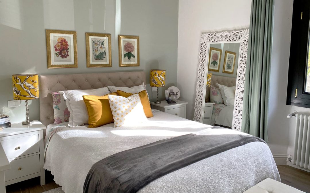
1. Neutral Hues and DIY Art in This Missouri Apartment
Small apartments don’t mean you need small furniture. In fact, larger furniture helps make a space feel more grand and established, as evidenced by Colby Kern’s Springfield, Missouri apartment. Colby, who works in interior design and photography, has made a historic apartment his own by adding DIYed large-scale art, gallery walls, and sticking to a neutral color palette to keep things cohesive. “It may seem backwards,” he says, “but don’t fill a small space with small furniture. Of course there’s a balance to be met, but large scale furniture can actually make a tiny footprint feel visually larger.”
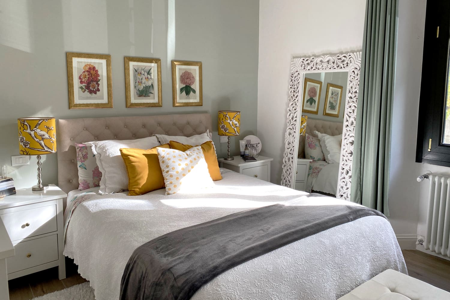
2. A Pastel Dream World in This Toronto Rental Apartment
To see Luna Lindsay’s bright and happy Toronto apartment now, it’s difficult to picture it as a plain white box. But, she says, “when moving in, my now pastel palace was the complete opposite of what she’s blossomed into: gray walls, black trim, acrylic gray paint painted over original pastel pink tile in the bathroom (my absolute favorite feature of the apartment),” a stark contrast to the layered, colorful space it is now.
The laundry room is a place of particular pride, and is full of rental-friendly upgrades, like a polyester floor mat that looks like tile, peel-and-stick floral wallpaper, and a locker for extra storage space where it didn’t exist before. “The before of this laundry room was horrid,” Luna says, but now, “I want to hang out in the laundry room for fun.”
3. A Boho Rental in Brooklyn With Personal Touches
Marikah and Duran’s East Flatbush apartment has plenty of pluses (spacious layout, quiet neighborhood), but all the personal touches she’s added amount to a warm and inviting home. “We did a whole 360 in my kitchen when we added those tall storage racks and it has been a game changer for us,” Marikah says. “I used different colored mesh bags to store my fruits and veggies,” and “on all the window panels I wanted a ‘window pane look’ so I saw a DIY and achieved it by using black electrical tape.”
In the bedroom, Marikah says, “we turned the corner of our bedroom to a little nursery nook, which is definitely a hidden gem and can’t be seen from outside the room when the door is open (a plus). I love that we added the wallpaper in that corner because it gives her little space character and belonging.”
4. A Small D.C. Studio Filled With Rental Makeovers
Imani Keal is an advocate for doing everything in your power to make a rental your own. “My lease is pretty open on the changes that can be made and my landlord even helped me complete some of my projects by providing the labor at no cost to me,” Imani says, so she’s been lucky enough to implement some pretty cool changes to her space. So far, she’s painted a third of the apartment black, stained an IKEA bed, added peel and stick wallpaper walls and kitchen counters, installed floating shelves, and more.
Her proudest DIY, though? “I added black casings to the entryway of my dining room and it looks fantastic,” she says, “This part of my house has always been boring and I wasn’t sure what to do with it until I saw this post by Marienne Sides. I was in love with her NYC apartment and immediately went to Home Depot. I picked up some MDF boards, nails, and paint (I used “Black” by Behr). This is by far my favorite project I’ve done because I was sure that I would mess it up!”
5. Wall Decor Galore in a London Flat
Not allowed to paint your walls? A gallery wall it is, then. That’s what Rosie Dart did in her Notting Hill flat, at least. “My landlord wasn’t thrilled at the idea of me painting the walls, she says “so I had to think up another approach to fill such a tall, empty space. I loved the idea of exhibiting all my art and posters in an eclectic way. Each piece has its own story: artwork that I made myself, antique posters found at markets, magazine cuttings that inspire me, one of my dad’s own childhood drawings of Beethoven, and a huge 1950s butcher’s sign uncovered during a shop renovation. Everything feels meaningful and carefully selected. Some pieces are framed, some are taped, some just float happily up there — I like the variation this brings to the wall.”
When it came to a bland kitchen, Rosie employed some more renter-friendly hacks. “I created a diner-inspired, checkered backsplash with blue vinyl stickers, which made this small space pop with color and have its own personality. I also wanted to jazz up the shelving above my countertops so I unscrewed and removed the cabinet doors, creating room for a fun, quirky display. It completely brightens up the kitchen! I also unscrewed all the handles and replaced them with some cheap red versions — for such a small change it makes a big difference.”
6. A Plain White Box Goes Dark and Moody
All-white walls can be intimidating to some, but Rob Wexler was excited by the blank slate of his Upper West Side apartment. “The building was renovated in the ‘70s and definitely lacks the character of other brownstones,” he says, but “the best part about it was that it was a blank, blindingly white canvas. This gave me the chance to completely transform the space into something very personal, which tells my story.” And indeed, he’s injected a huge amount of character and personality in the space, painting the walls in dark, moody colors, peel-and-stick wallpapering, and adorning the brick wall with a ton of unique art. The biggest challenge in the apartment was the kitchen, thanks to its particularly modest floor plan. “I remedied this by pulling out the fridge and putting it in the entry closet and covered it with drapes,” Rob says, “this allowed me some space to hack a small KALLAX shelf, customizing it with drawers and casters and adding a wood countertop.”
7. The Home of a Muralist Was Destined for Color
Champagne is a muralist and content creator living in Los Angeles, California, and her space was never destined to be blank white — regardless of rental status. Her living room alone features a green and white checkered wall mural, a pink piano, green built-in shelves, blue upcycled bar cabinet, and more. “We rent the space,” Champagne says, “so paint was an unnecessary indulgence, but I honestly didn’t care. I wanted to make the space exactly how I wanted, so if it meant purchasing paint to create murals then so be it! When we move out we will also have to pay to paint everything back white. My outlook on that is, if it will make you enjoy the space more then you should go for it! Even if you’re renting and will have to put in extra work when you move out.”
8. The Shared Home of Two Designers Combines Styles
A common compromise in rental apartments is made between the roommates that live there, as their styles might not always be the same. This is the case for Pratika Appaiah and Mareya Stearns, who live together on the Lower East Side of Manhattan. “My biggest challenge,” Pratika says, “was trying to make sure both my roommate’s and my personal styles were reflected in all our shared spaces. While my style leans heavily in the thrifted, eclectic, direction, Mareya’s style is everything you might find at the MoMA store: bright pops of color, and minimal lines. I decided to not be constrained by either of our design styles and instead just surround ourselves with all the things that make us happy: plants, color, and art.”
9. One Apartment, Two Different Renters, Two Different Design Styles
This 350-square-foot West Village apartment has been featured twice on Apartment Therapy, but each was with a different renter, and they each have different design styles — proving just how much of a difference decor makes. In its current form, Brian Beelman has outfitted the space with earthy browns and lots of plants, but the previous renter, Lee Lenox leaned into a blue and white color scheme, giving the space a New England flair. Both designs pay homage to the full wall of windows, even with two totally different furniture layouts.
10. The Rainbow Eclectic Antithesis of a White Box Rental
Jessica Stempel’s NYC apartment is an explosion of color and personality, from the vibrant gallery wall in the living room, to the drippy heart mural on the closet doors, to the patterned wallpaper in the dining room. “I DIYed the crap out of this apartment,” Jessica says, and “I’m proud of the art I made that hangs on the walls. I’m also really excited about the way all of the tape DIYs came out! (Headboard, cabinets, wall mural.) And the murals I painted on the doors covered up the dreadfulness that is plain white.”
11. A Decadent Chicago Apartment Filled with Second-Hand Finds
To walk into Johnny Coleman’s Chicago apartment, you might think you’re stepping into an opulent pied-à-terre frozen in time, but that’s all thanks to the focused curation and decoration he’s done. Johnny (now 30) has been collecting vintage furniture since he was 14, culminating in a delightfully traditional, maximalist home. Some of the things he’s done to maximize space and add personality: striped wallpaper to increase the feeling of height, fresh flowers in every room, and keeping the bed low to the ground to increase the feeling of tall ceilings.
12. The Colorful, Layered Richmond Home of Two Former Brooklynites
Ashley Molesso and Chess Needham are living their best suburban life in their Richmond, Virginia home, after leaving Brooklyn for more space and money to dedicate to their business. “We went from four and a half windows to 12 windows AND a backyard,” they say, and their new home boasts plenty of space, color, and personality. Renting in general has been the biggest challenge, since we had to really just focus on making non-permanent changes,” Chess says, but “I think mostly we’ve just been able to make the place feel like a home by decorating it with our own personal style.”
Two of their favorite rental upgrades are the living room fireplace wall, where Ash repurposed some peel and stick wallpaper from a previous trade show, and all the painted rooms. “When I move into a place,” Ash says, “no matter how long we will be staying, I need to be surrounded by colors that I don’t find boring. Even though paint can add up, it is something that I will always make priority when living in a space.”
13. DIYs, Facebook Marketplace Flips, and Color Abound in San Diego
Bridgette and Blue’s San Diego loft is a prime example of going all out in a rental. Their home is filled with DIYs, thrifted finds, peel-and-stick wallpaper, painted murals, and more. Bridgette’s secret? Facebook Marketplace. It’s “the best place to find cool stuff, hands down,” she says, “be proactive, look often, and search things like: funky, colorful, vintage, post modern, art deco, unique, irregular, bold, ’70s, ’80s, etc. ”
One of her recent marketplace flips is a striking pink panther coffee table, which she got for $40. “It was super cute already,” she adds, “but I spray painted it hot pink and now she is ICONIC.”
14. A Five-Person Family in a 600-Square-Foot NYC Apartment
A family of five fitting comfortably in 600 square feet? Yep, and it’s all thanks to the smart layout and updates Heather and Michael have made to their Upper West Side apartment. The couple stuck to a neutral color palette, utilized vertical space with lots of wall-mounted shelves, and amplified natural light with a few well-placed mirrors. “We had to be very intentional about the choices we made when it came to furniture, storage, and ‘stuff’ in general,” they say, and have achieved a light and airy feeling by “maintaining some negative space and not filling every single inch of every room with stuff,” as well as frequently editing their possessions down so as not to feel like they’re bursting at the seams.
15. Bright and Colorful in Astoria, Queens
Speaking of five-person families in New York City apartments… Megan Zietz and her husband, three kids, and two cats all fit happily into this brightly-hued Astoria, Queens apartment. “It’s definitely a space that has BIG main character energy,” Megan says, and she’s made the most of the entire space with plenty of renter-friendly ideas. “The biggest challenge,” she confesses, “was making sure everything we do (and have done) is ‘renter-friendly.’ All of the wallpaper and backsplash is removable and reusable. As far as painting goes, take a weekend and a bucket of Kilz to paint back when it comes to moving out — it’s 100 percent worth it to not look at beige/taupe walls everyday.”
by Furnishly | Dec 30, 2022 | Design Inspiration, Style
As a home writer and editor, I’m often met with qualifications when entering a friend or family member’s home. “Oh, it’s not finished yet, don’t judge!” or “I mean, it’s not magazine-worthy…” but these thoughts couldn’t be farther from what’s actually in my head when seeing someone’s space. I’m never considering interior design principles or comparing them to celebrity houses, I’m just absorbing all the warm, thoughtful details they added to make a home.
For more content like this follow
Devouring house tours on Apartment Therapy is much the same — I spend hours (sometimes, admittedly formatting them on the back-end of the website) looking over every image, reading every anecdote, smiling to myself when I come upon a particularly clever idea. I absolutely adore being invited into someone’s inner sanctum, whether it be IRL or through photos.
This, of course, makes it difficult to pick one favorite out of all the year’s house tours. Luckily, we let you pick it for us, just by clicking and reading and enjoying it yourself, we’ve got the most popular house tour of 2022: a 592-square-foot Italian apartment, totally transformed from its dark, dated original state. The apartment, belonging to jewelry designer Sara Amrhein and her husband, Luigi Valerio, is located in the Tuscan city of Florence, which Sara says she fell in love with thanks to its “Renaissance glory.”
The couple put an offer in on the apartment immediately after seeing it for the first time, drawn to all the natural light, but it needed a lot of work to bring it to its current state. After waiting a full year to move in (as the sale of the historical building needed to be approved by the cultural association of Florence), Sara and Luigi gut-renovated the 1930s apartment themselves, adding an entire new bathroom, updating the kitchen, and adding vintage and unique elements throughout.
Sara’s favorite room in the apartment is the bedroom, thanks to “the way the sun comes in in the morning, giving off the perfect light, and the view out the window with the tree-lined street and the small stream that attracts the most beautiful birds,” which includes ducks and green parrots with red beaks. She also particularly loves their dishwasher (their first one living in a city apartment), the handmade Mexican tiles above the stove in the kitchen, and the customizable IKEA RAST and IVAR furniture they painted to match with the home.
Another challenge they encountered was creating storage where there previously was none, as Italian bedrooms don’t typically have built-in closets. So, in the kitchen they added a second set of cabinets on top of the standard height ones and in the bedroom they added a tall armoire with room on top for seasonal wardrobe. When it comes to creating a home you love, though, Sara says she’s a believer in buying things you love. “Don’t worry so much about making everything match perfectly,” she says, because “it’s those little details that are different from the others that will make your space unique.”
See all the before and after photos and read more about the apartment here.
by Furnishly | Dec 28, 2022 | Design Inspiration, Style
Home means something different to everyone — whether it be a studio apartment, a classic colonial, or something more unconventional — but it’s always a delight to see how people furnish and live in their respective homes. Lucky for me, I’ve gotten to peek into some pretty unique and jaw-dropping homes this year, from a renovated school bus house-on-wheels, to a guest house made with straw bales, to a cabin on stilts in South Africa. Read on for 11 of the most one-of-a-kind homes Apartment Therapy toured this year.
For more content like this follow
1. Light and Airy A-Frame
While a beautiful A-frame in the woods is certainly an ideal weekend getaway, this family is lucky enough to reside in this Scandinavian-inspired Michigan home year-round. “The thing we love most about the chalet is its total unique charm, and how we’ve custom remodeled it for our little fam,” writes Courtney Hall, who shares this home with her partner, kids, and dog and bunny. “We made a vacation property a full-time home in one of the most beautiful places where we can raise our kids and be closer to family. We have total access to Nubs Nob, Boyne Highlands, North Country Trail for mountain biking and hiking, the list goes on.”
2. All-White, Cloud-Themed Studio Apartment
Ever stepped inside a cloud? Well, seeing a tour of Tynan Sink’s high-rise NYC apartment is definitely as close as you can get without literally being inside a cloud. “My place is cloud-themed. Obviously,” says Tynan, “But more specifically, I wanted it to feel like a 1950s honeymoon suite, a cocktail lounge, a powder room, the Playboy Mansion, a 1960s TSA terminal, and a little gay space station in the clouds. Frankly I nailed it.” He pulled this off with curvy, white furniture, a DIY cloud lamp (“It took me an entire day and I couldn’t feel my right hand for three days after, but it was worth it”), and simple, airy artwork.
3. Impeccably Designed Airstream
“We actually purchased our home via an eBay auction, sight unseen,” Talia explains of the “skoolie” bus she, Andy, and their child travel the country in. “We had always been talking about living ‘tiny’ but it seemed impossible! Two months into the pandemic, we took the leap and haven’t looked back! We converted this bus 100 percent on our own. It has been an amazing journey. We’re even ready to begin converting buses for others so they can enjoy this adventure as well!” Now, the bus is complete with a spacious bathroom, full kitchen, and two bedrooms to accommodate the family of three.
4. Screened-In Porch Turned Three-Season Home
“For the past 35 years I’ve been vacationing on a lake in the White Mountains of New Hampshire where my family has a year-round home (which was profiled on Apartment Therapy over a decade ago) plus a little cabin next door. Unfortunately, a few years ago I developed a severe allergy to mold/mustiness, and the house and cabin, despite our best efforts to remediate, became too musty for me,” explains Kyle of the three-season cabin she now lives in. “With removable plexiglass covers for the screen and space heaters, I can be there well into October. I added a sink, mini-kitchen, and outdoor shower so the only reason I need to go into the cabin is to use the toilet,” Kyle describes of the updates she made. “I feel profoundly grateful and lucky to have come up with this workaround because the lake is my favorite spot in the world.”
5. Completely Round, 1980s-Style Apartment
It’s certainly not every day that you see a totally round apartment, but despite the difficulty of furnishing such a uniquely-shaped place, Mia has created an ’80s wonderland in her Munich, Germany, home. “I wanted to reflect the heritage of the house in my interior,” she says, “so I would describe my style as a combination of ’70s glam and ’80s design (Memphis, Post Modernism). I love playing with colors, materials, shapes, and graphic patterns and always try to find the right balance between calming and bold, e.g. by combining soft pastels with vibrant pops of color. The biggest challenge was definitely the round layout of the apartment. We were used to living in square-shaped homes, so it was not easy for us to give each room a structure that made sense.”
6. Pink, Passive Solar ADU Made of Straw Bales
Imagine being invited to stay with a friend but instead of a guest room, they have an entire guest house made from… straw bales. Yep, Allison Green and Dan Theriault built their pink passive solar straw bale ADU in their Boise, Idaho, backyard “to give us a little extra space when guests visit. We rent it out the rest of the time because we love sharing the beauty of straw bale building with others. We worked with local professionals for the construction/plumbing/electricity and did the finishing ourselves over two long years. We’ve been interested in natural building for many years so this project is the culmination of a dream.”
For so many of us, the childhood dream of living in a treehouse never really goes away, so it’s envy-inducing to see Will Sutherland and Sabrina Hartley living the dream in their 164-square-foot treehouse in Shepherdstown, West Virginia. While the couple has a primary residence on the property, the treehouse was a dream fulfilled for Will, who, along with his arborist wife (convenient!) ensured the longterm health of the tree and treehouse with “heavy-duty treehouse attachment bolts known as ‘TABS’ along with slider brackets that allow tree growth and movement.” When they’re not living among the trees, Will and Sabrina share the treehouse with friends, family, and list it on AirBnb.
8. Wooden Cabin on Stilts With a Grass Roof
Amy Keevy and her fiancée, Maryke, live something out of a storybook in their South African wooden cabin. “Tulani (the name of the house) is made of all wood and stands on stilts overlooking the old-growth Tsitsikamma forest,” Amy says, “Maryke and I both love being outside and our house is a great balance of indoor and outdoor living space. You immediately feel connected to the nature around you. On top of my studio is the grass roof, and inside the house you will find very few straight walls! The curves, open-plan feeling, and connection to nature (literally above our heads!) create a womb-like atmosphere and contribute to the magic of the home.”
9. A Year-Round Ode to Spooky Season
Filled with skeletons, handmade octopus chandeliers, and tons of cast plaster details, Adam Wallacavage has created — in his words — a “Victorian style freak show” in Philadelphia, Pennsylvania. He describes his style as a “mixture of the beach towns Wildwood, New Jersey, and Cape May, New Jersey. The Wildwoods are known for their kitschy ’50s neon and mid-century modern motels and boardwalk. And Cape May is known for its Victorian gingerbread.”
10. Oddly Shaped Chicago Studio Is Only Three Feet Wide at Its Narrowest Point
Ainsley Fleetwood lives in this 460-square-foot studio apartment in Chicago’s Rogers Park neighborhood, and the layout is definitely one of the most interesting things about it. “Seeing the studio for myself,” she says, “I appreciated its character, and felt a spark of excitement that ended my apartment hunting. The building is built along a diagonal alley, and my unit faces the alley and is at the end of the building, such that narrowest tip of my apartment is only about three feet wide.” To combat the odd layout, Ainsley has two daybeds instead of a couch and conventional bed, and keeps all her possessions pared back so as not to clutter the space.
11. Embraces ‘Queer Abundance’ With Collage Walls
While Maya “Marty” Martin-Udry’s Upper West Side studio might be standard in structure, the wall covering is anything but. Instead of painting or peel-and-stick wallpapering, Maya decided to start an always-changing collage. “I started taping up photos, art, notes from friends, and more in college,” she says, “Over the years, the collection of memories on my wall has grown and moved with me to various apartments. It is kinship rendered on paper, a chaotic and overwhelming manifestation of the people and spaces I love and have loved. The noisiness, brightness, and abundance of the collage collapses and queers time — everything that has ever mattered to me, all the people I have been, and all the loved ones and experiences that have shaped me, clamoring together all at once. It makes me feel full.”
by Furnishly | Dec 24, 2022 | Design Inspiration, Style
We independently select these products—if you buy from one of our links, we may earn a commission. All prices were accurate at the time of publishing.
They say you shouldn’t have a favorite child, but no one ever said you can’t have a favorite house tour, right? Right. And even though we love all the homes we feature each year, some in particular stand out as fan favorites. From a Cincinnati jewel-box colored home to a super-smart 190-square-foot studio, our editors’ favorite homes of 2022 were totally unafraid of color and stuff. They all seemed to nail the concept of maximalism, without veering into clutter. Plus, they’re all full of lovingly-sourced antiques, bold pops of color and pattern, and clever uses of space, which are just some of the things that make Apartment Therapy home tours inspiring.
For more content like this follow
This Retro English Cottage Blurs the Lines Between Decades
“This cottage in the U.K. is splashed with color in a way that doesn’t feel super overwhelming,” says Deputy Lifestyle Director, Madeline Bilis, “something I hope to mimic in my new apartment.” This home is filled with English charm while also embracing the colors, patterns, and groovy vibe of the ’60s. Bilis particularly loves the “decade-dabbling” the home plays with, as it exudes very old cottage from the exterior and through the floors, which is paired with an Eames lounger or a very-1960s orange daisy wallpaper. “And that crane mural in the bathroom?” Bilis adds, “It’s amazing! Bathrooms are a place to go bold (and/or stick to a theme) and this one does that perfectly.”
Bold Color Meets Original Woodwork in Cincinnati
If you love original wood trim and molding, but also like a personal touch in a home, you will surely appreciate this tour. Staff writer Sarah Everett counts this home as her favorite this year, as she loves “the historic wood details paired with jewel tones,” which is certainly a unique choice that pays off in wow factor. “Although almost every view is whimsical and dreamy,” she says, “I think my favorite little vignette is the dining booth in the kitchen. The woodwork is stunning — the booth is actually made of wood from bowling alley lanes — and the stained glass is envy-inducing.”
A Super-Tiny Studio Is Joyful With Afrohemian Vibes
It’s no secret that studio apartments are tough to work with, but when they’re approached creatively and cleverly, the results are often amazing. This 190 square foot home (yup, 190!) is no exception. “I love not only all the smart small-space maximizing ideas that she incorporated into her studio apartment to make it feel organized and comfy,” says House Tour Director, Adrienne Breaux, “but I also love how many intentional and meaningful elements she folded into her home’s design.” It’s true — renter Crystal Wyatt infused pieces of her late mother throughout the space, and “after a lot of big life and career changes, she turned what was essentially a tiny white box into an incredibly warm, cozy, and personal safe space that embodies so much of what we value here at Apartment Therapy.”
A Coral-Pink Paradise Is in the Heart of NYC
If you’re looking for the answers to millennial financial questions (Why can’t I afford a home? Where should I invest?) you might already know Amanda Holden, but she’s also got a knack for striking the perfect stuff vs. no stuff apartment balance. Home Director Danielle Blundell says her Brooklyn apartment is “a perfect example of maximalist minimalism insofar as it packs lots of personality, color, and pattern punch, but still feels like a place where you could just chill out without feeling visually overwhelmed.” Holden also wields color to her advantage, and Blundell adds that “the expert use of coral paint also made me rethink the idea of accent walls and the color orange in general, two things you don’t see as much of in 2022 as you did, say, in the ‘80s, ‘90s, and even the early 2000s. Still, the place feels totally modern.”
This Colorful Space Is Inspired by Orange, Retro, and Scooby-Doo
“My favorite content on TikTok is young, fly Black girls living in cute spaces,” says Assistant Home Editor, Savannah West, and since she’s been a follower of Lauren W. for some time, she was super excited to see her home featured on Apartment Therapy. The big orange couch, the squiggly motifs, and ’70s-inspired pieces made this apartment “easily my favorite this year,” says Savannah.
This Tudor Strikes the Perfect Balance of Old and New
“I adore this Tudor style home,” says Cleaning and Organizing Editor, Stephanie Nguyen, “It’s absolutely charming and cozy and I love how it mixes old and new, with so many thrifted finds and antiques that decorate the rooms.” And it really is stunning, using muted and jewel-toned colors throughout, brass hardware, mid-century lighting, and more traditional textiles for a perfectly balanced mix. “They wanted it to be timeless and unique,” Nguyen points out, and adds that her favorite room is “probably the kitchen,” thanks to “the beautiful scallop details, like the custom hood cover.”
This Swedish Home Is Wes Anderson-Inspired Maximalism
“I can’t get over this multi-colored single-family home in Sweden,” says Associate Lifestyle Editor Sofia Rivera, “where the homeowner describes the style as a mid-century modern foundation with Wes Anderson and maximalist influences (amazing). The eclectic gallery walls, saturated hues, and hand-painted murals all come together like visual ASMR — I feel like coming home here would just feel so happy, which is exactly what I think home should do.”
This Barcelona Home Has the Ultimate European Cottagecore Vibe
Style Shopping Editor Blair Donovan says it’s “a pipe dream of mine to move to the European countryside some day, but until then, living vicariously through this Barcelona cottage B&B will have to do. Homeowner Sonia Sanz — who bought the space during the pandemic to rent out — and her family have worked to maintain the property’s original charm, making it the ultimate cozy-meets-classic design inspo. The unique flea market furniture, well-curated accents (hello, red gingham kitchen sink skirt), and overall minimalist Mediterranean aesthetic make me want to move in ASAP.”
A Barcelona Home Is Light, Bright, and Chock Full of Personality
I simply could not get enough of this Barcelona home. I drank in each photo and parsed out every detail — there’s so much to see, and yet it’s not overwhelming thanks to the bright, airy walls and windows. The owner, Chloé, is a master at layering traditional pieces and antiques with modern, pop art, and quirky elements. The gilded mirrors and weathered wardrobe of the entryway somehow feel just as comfy in the space as a moose head or giant blue letters in the kitchen, thanks to her ability to juxtapose so many eras and styles. The entire home is a feat, but my favorite room would have to be the kitchen, which is dripping in character and personality, from the mismatched table and chairs to the boldly curated art selection.
by Furnishly | Nov 22, 2022 | Design Inspiration, Style
We independently select these products—if you buy from one of our links, we may earn a commission. All prices were accurate at the time of publishing.
Some of my favorite tours on Apartment Therapy are the itty-bitty, how-did-they-do-that, super-low-on-square-footage spaces that manage to evoke a sense of cohesion and coziness, despite their size. It’s endlessly fascinating to see how people make the most of their homes, with intentional paint colors, inventive ways of separating rooms, clever storage solutions, and custom additions. If you’re grappling with a small space and need some fresh inspiration, or if you’re just delighted by small space hacks like I am, enjoy the best small space ideas below.
For more content like this follow
1. Bold Black Walls Throughout
Imani Keal’s D.C. studio is a master class in how not to let a small space interfere with bold design choices. She’s pretty much done it all in this space: wallpapered the dining room, installed floating shelves in the kitchen, added trim to a doorway for some character, but possibly her boldest, and most effective, update was to paint a majority of the apartment black. “I think people who live in small spaces should try to make their apartments look/feel interesting rather than larger,” she says, and while this choice “could have gone terribly wrong, I think it paid off.” The effect of a dark, moody color on the walls in a small space is incredibly cozy, cohesive, and makes it clear that no amount of space will hinder a fun design moment. “Oh, I’m also a big fan of painting the ceiling,” she adds, “mostly because I’m a terrible painter and I think it looks cool.”
2. A Closet Turned “Cloffice”
Thanks to the quarantine of 2020, lots of people found themselves needing a dedicated office space in already small homes — Missela and Angga were no different in their Ontario, Canada home. “Our bedroom is the only room that has a door that separates itself from the other part of the apartment,” they wrote. “We knew that it had to be in the bedroom so that he has a quiet space to focus during work. Between our bed and our dresser, there is not much space so we had to put the desk in the closet. This forced us to declutter our closets and organize the space to fit a home office. Here we also use containers and bins to keep it organized, which is crucial for maximizing a small space.”
3. A Bookshelf Accessible from Two Sides
You’ve likely seen an IKEA KALLAX unit separate a small space before (lots of people use them to differentiate a bedroom from a living room in a studio), but Scott Kangas took this idea to a whole new level in his Chicago condo. “When the developer was rehabbing the space,” he explains, “I asked him if he could build my existing IKEA bookcase right into the wall between my kitchen and bedroom, I drew him a diagram on a napkin and he agreed. It’s accessible from both sides and is deep enough for a double row of books, much needed by me. It’s also great for displaying my antique clock that I bought myself for my 21st birthday along with some of my matte white ceramic collection.” Since the bookcase is accessible from two different rooms, it acts as a focal point for both spaces, and since it’s set into the wall, it takes up very little space.
4. Large Furniture for Small Spaces
When Colby Kern downsized into his Springfield, Missouri, apartment, he knew that he’d be up for the task of making the space feel like home with limited square footage. “It may seem backwards,” he advises, “but don’t fill a small space with small furniture. Of course there’s a balance to be met, but large scale furniture can actually make a tiny footprint feel visually larger. Don’t limit yourself to only looking at apartment-sized furniture and always always always confirm your dimensions!” In choosing a sofa, coffee table, and other pieces that are regular-sized, the small living room ends up feeling cozier and bigger than it is, because there’s enough to properly fill it.
5. Striped Wallpaper to Elongate Walls
Walking into Johnny Coleman’s 600-square-foot Chicago apartment, you might think you’ve stepped back into a more refined era, but that’s all thanks to his keen vintage eye and attention to detail. One of the most clever details, though, is the striped wallpaper in every room, which elongates the walls and gives the illusion of height. “My last apartment before this one had 14-foot ceilings, which I miss dearly,” he laments, but “in this apartment, I use striped wallpaper to stretch the perception of how high my current ceilings are. I am very pleased with the effect! If you try this be sure to use thinner stripes, no wider than 1.5 inches each at most.”
6. Outside-the-Box Storage Solutions
A family of five wouldn’t fit in a 600-square-foot NYC apartment without some very thoughtful storage and solutions, but Heather and Michael (plus their three daughters) were up for the challenge. Heather’s best piece of advice? “Utilize the walls and go up when it comes to storage (think hanging wall baskets, shelves, stackable storage crates, etc.), hang a large mirror to make a small space feel bigger, and tidy up often! Also, bring in multipurpose items where you can — we use a big stack of books as a side table in the living room, use the small wicker bench as a footrest and an extra seat, etc.”
Not quite a studio, not yet a one bedroom, the layout of this “studio alcove” apartment on Manhattan’s Roosevelt Island didn’t have clearly defined zones until renter, Sarah Jackson, moved in. “Without clearly defined spaces,” she says, “it can seem to be an overwhelming task of how to make the spaces defined and naturally flow into one another. One of the solutions I used to combat this problem was my squared-off rug lines. The implicit lines that rugs can create on the floor are a great way to define where an area ends and another begins. It is only luck, though, that checkered rugs are trending right now and are able to add that extra bit of softness to what otherwise could be a hard line.”
8. Wheels on Furniture for Added Space
Classified as a “micro studio,” this 520-square-foot apartment in Seattle, Washington is packed to the gills with storage, including a chest for a coffee table that easily wheels out of the way if need be. “My coffee table was a vintage wood mailing trunk that you can still see part of the address on one side,” says Hannah Herman. “It seems so simple, but not only did adding wheels raise it to the right height to make it much more ergonomically comfortable, but it also makes using my tiny, weird-shaped living room SO much easier.”
9. Seating with Hidden Storage
All the items you bring into a small space need to have a dedicated purpose (or two!), and in Bailey Heldmar’s Upper West Side studio, this is certainly the case. “I ended up spending more than I would have liked on the couch,” she admits, but “I needed such a specific size, and supply-chain issues meant that most furniture was taking months to ship. I stumbled upon this one on Pottery Barn Teen that was the exact dimensions I needed and was ready to ship. Plus, the seats have storage! The extra storage space definitely made it worth it even though it’s not exactly the style I would have chosen.”
10. Airy Room Dividers for Separate Spaces
Before moving to this 190-square-foot studio in Philadelphia’s University City neighborhood, Crystal Wyatt actually owned a house for more than 18 years — but she knew she needed a change (and certainly a challenge). And while she’s certainly made clever use of the space, her proudest DIY is installing room dividers to add just a bit of separation between the living and kitchen areas. “Since the space was essentially a box,” she says, “I wanted to create separation between the kitchen and living area without closing off the space. I also didn’t want to look directly at my refrigerator when laying in the bed. I searched high and low and found the perfect room dividers on Etsy. They are lightweight and see through. Hanging them was easy because I didn’t need a ladder. I just stood on a step stool and screwed the hooks into the ceiling.”
11. A Projector and Pull-Down Screen to Free Up Wall Space
Let’s face it — TVs are usually just big black boxes that take up otherwise useful decor space. Maitri Mody, in her NYC studio decided to forgo a TV in favor of a colorful gallery wall, but she’s got a trick up her sleeve: she installed a pull-down screen and a projector on the ceiling. “This way,” she says, “you can keep it rolled up when it’s not in use and you don’t have to sacrifice movie nights.”
12. A Lofted Bed with Wardrobe Space Below
After waiting five years for a government-subsidized flat in Punggol East, Singapore, Redzuan Idris already had ideas for this simple space before moving in. One of the smartest space-saving tricks, though, was to loft the bed in order to create more storage. “I made my flat open concept,” Redzuan says, “and there isn’t any bedroom, only a wardrobe with a bed on top to make it obvious that this side of the room is for sleep/wardrobe area. I intend to make a partition but for now I’m happy with this layout.”
13. Multi-Purpose Furniture
If you watch any small space or studio tour on Apartment Therapy, you’re likely to find that most renters or owners of these spaces never settle for furniture that’s only used for one purpose. In tight quarters, every piece has to pull its own weight, which can be seen here in Courtney Geist’s small NYC studio. “I tried to make every piece of furniture I was purchasing new have two or more purposes,” she says. “For example, my ottoman is also my accessories storage. My kitchen island houses three small appliances. My desk doubles as a WFH desk and an area large enough to cut and sew fabric. If a piece I wanted to buy brand new did not fit that description, I would look for a better alternative.”
14. An Old-School Murphy Bed for the Win
“I feel very strongly that a bed is for sleeping and very little else,” asserts Irene, who lucked into this “too-good-too-be true” apartment in Brooklyn, New York. “The Murphy bed was the perfect solution for me. When I tell people I have a Murphy bed (and that I actually put it up nearly every morning) people are definitely a bit shocked. The uniqueness of it is fun, but mostly I love how it opens up my space during the day and ensures that I don’t feel like I’m living in my bedroom.”
15. Paint and Glass Storage to Divide Spaces
The plight of a studio apartment is of course that everything is in one room, so studio dwellers come up with some pretty smart ways to demarcate room from room. And while you may have seen a KALLAX unit used as a wall, the next level up is a metal and glass shelving unit, like the one Gaby and Chris used in their 450-square-foot NYC studio. They also used different paint colors to indicate different rooms, “the desk/office space is sectioned off with a wall strip of paint that continues onto the ceiling, creating this nook-like feel. I have always had a love/hate relationship with headboards and honestly didn’t want to purchase one, so I created a similar effect using Benjamin Moore’s ‘Polo Blue’ to paint the bottom section of the wall.”