How to Choose the Right Colour for Painted Floorboards

How to Choose the Right Colour for Painted Floorboards

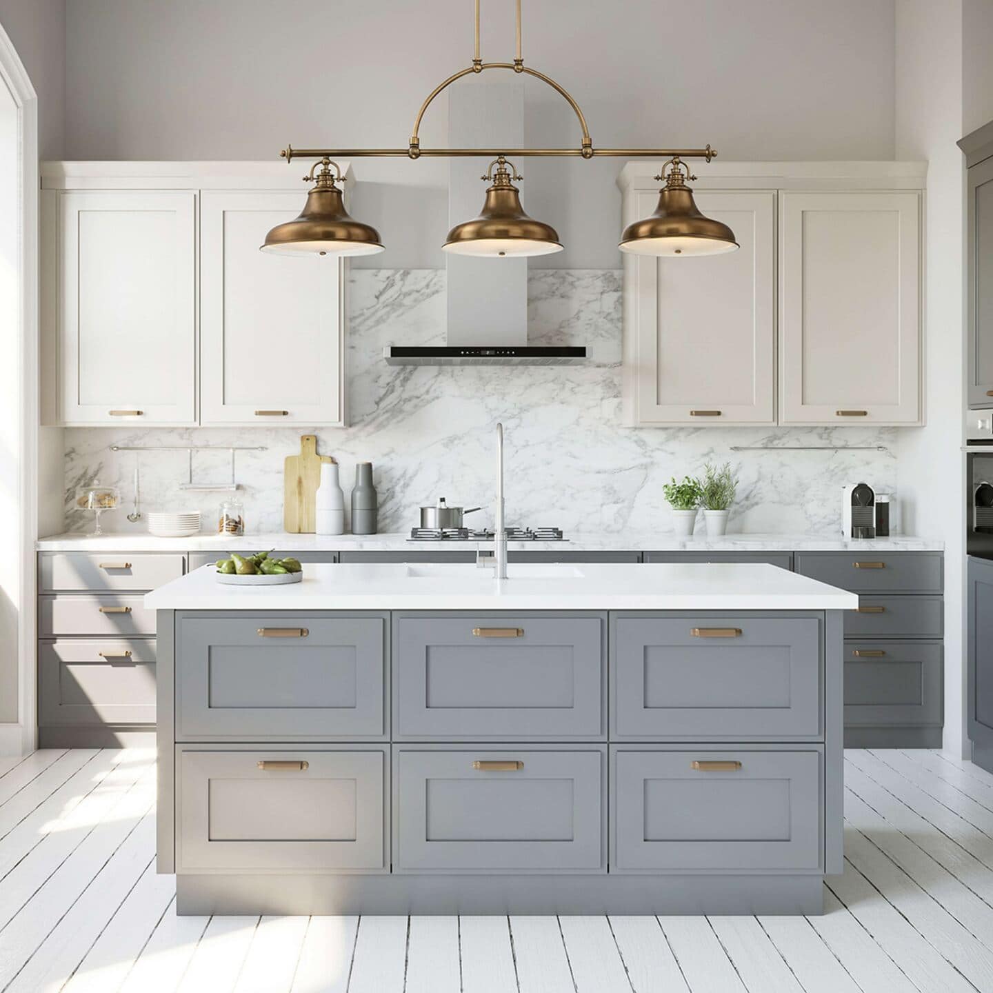
Modern grey kitchen with white painted floorboards

Lighting by Kes Lighting

Painted floorboards always look so alluring in photos. They offer an opportunity not only to refresh a room but to add personality underfoot, transforming a practical surface into a design feature in its own right. If you are lucky enough to have floorboards in your home, deciding what to do with them may leave you feeling confused and conflicted. There’s definitely something charming about exposed floorboards. They bring warmth, character, and a sense of history to your home. And for those of us drawn to a more natural, lived-in aesthetic, they can be an affordable alternative to new flooring. But before you start ripping up carpets with visions of rustic perfection, it’s worth knowing that beautiful floorboards rarely come easy.

Prepping For Painted Floorboards

A man uses a sanding machine to sand floorboards

Photo c/o Deposit Photos

Restoring floorboards takes time and patience. Before you even start to think about what colour you might choose for your painted floorboards, there is a lot of prep work that needs doing. And this shouldn’t be underestimated or rushed. This isn’t the most glamorous stage, but it lays the foundation for a finish that lasts and looks its best.

The first thing to do is pull up any old carpet and underlay and remove any staples or nails. Next, check for loose or damaged floorboards and secure or replace them as needed. You may also need to fill any gaps with a flexible wood filler, especially in older homes where draughts can sneak through.

Next comes sanding. This step is non-negotiable if you want the paint to adhere well. You’ll probably want to speed the process up by hiring a floor sander for larger spaces, but be prepared: it’s dusty, noisy, and physical work. For corners and edges, make sure you use a small handheld detail sander so you can get in close. Once sanded, you’ll need to vacuum the floorboards thoroughly and wipe the surface down fully with a damp cloth to remove all the dust that was created during sanding.

If your floor is particularly knotty or resinous, consider using a primer designed for wood. This helps prevent tannin stains from bleeding through and improves adhesion. Once everything is prepped, clean, and dry, you’re almost ready to reach for the paintbrush.

But first, you need to choose a colour for your painted floorboards. Below you will find some tried-and-true colour choices that can set the tone for your entire space.

Pale and Interesting: Whites and Greys

Photography c/o Annie Sloan

White or light grey floorboards are a classic choice for good reason. They help bounce light around the room, making small spaces feel bigger and brighter, and they offer a beautiful canvas for more colourful décor such as bold rugs, statement furniture, or leafy green plants. White-painted floorboards bring a breezy, Scandinavian feel, while grey can ground a room with a cooler, more contemporary edge.

But for the love of God, please consider your lifestyle before opting for white floorboards. Pale shades like white tend to show wear more easily in high-traffic areas. I made this mistake in my small bathroom makeover. Whilst I chose white tiles and not painted floorboards, I definitely regret choosing white now. In fact, I have no idea what insanity came over me. My thinking was that white would be bright and help the room feel more open and larger. And this is probably true, but was it worth it? NO!!!!

White floors show up EVERYTHING! And I mean everything! So they always look dirty, even minutes after you have cleaned them. Let’s not forget that humans shed roughly 50-100 hairs from their head every day!!! Times that by the number of people who live in your home and then make a considered decision. And if you have pets, think doubly hard unless you are super fond of mopping and vacuuming. Especially if you are pondering white-painted floorboards throughout. Perhaps stick to rooms like bedrooms, studies, or guest rooms that are used less often, and therefore require less cleaning and maintenance.

Playful Pastel Painted Floorboard

Photography c/o Annie Sloan

I love the idea of pastel-painted floorboards. Soft pastel-painted floorboards are a brilliant way to inject joy and playfulness into your space. Think powder blue, mint green, blush pink or lavender or any other colours that feel whimsical and modern all at once. Pastels work especially well in bright, airy rooms and can offer a striking contrast against more neutral or minimalist interiors.

If you’re worried about committing, try introducing pastels in smaller doses, perhaps in a child’s room first, or even try it out as a painted rug effect. If you’re feeling particularly adventurous, maybe you could consider painted floorboards in a mix of shades across different rooms to keep things interesting.

Dramatic Dark Painted Floorboards

Photography c/o Annie Sloan

On the other end of the spectrum, dark painted floorboards bring dram aand depth to the room. In fact, additions like black wood flooring are becoming synonymous with luxury living, but charcoal, deep navy or even forest green can make a bold statement and work particularly well in larger spaces with plenty of natural light. These shades are perfect for creating moody, cocooning interiors, especially when paired with pale walls, warm lighting, and tactile textiles.

It’s worth bearing in mind that dark painted floorboards can feel a bit intense in small or shadowy rooms, so consider how the light moves through your home before diving in. In some instances, no amount of natural light will make your room feel bright and airy so it can make sense to go all in and embrace the cocooning darkness. Use dark floorboards as a way of making the room feel even cosier.

Caring for Your Painted Floorboards

You might be worried about maintenance when it comes to painting your floor, but painted floorboards can be surprisingly resilient with the right care, and they’re actually easier to maintain than you might think. Like any flooring, they will show signs of wear over time, especially in busy areas like hallways or kitchens, but a few simple habits will help them look their best for longer.

Start by choosing a durable floor paint designed to withstand foot traffic and scuffs. Opt for finishes like satin or eggshell for a balance between aesthetics and hard-wearing practicality. Once painted, avoid dragging furniture or sharp objects across the surface and always use felt pads on chair and table legs.

Regular sweeping and the occasional damp mop will keep the boards clean without wearing away the paint. Avoid overly wet cleaning methods though and definitely don’t use a steam mop, especially if you’ve used a wate-based paint. The beauty of painted floorboards is that touch-ups are easy: a light sand and a quick coat of paint can refresh tired-looking areas without having to start over. But definitely consider if you have the time and energy for this kind of upkeep. I fell foul here when I decided to paint our radiators. It took no time at all before they chipped and started looking really tatty, and now I wish I never did it!

Painted floorboards can be an expressive, affordable way to bring new life to tired timber. Whether you opt for timeless neutrals, playful pastels, or statement-making dark tones, the colour beneath your feet can shift the entire feel of a room. Just like any good design decision, it’s worth taking your time and choosing what speaks to you and the way you want to live in your home.

How to Make Impactful Upgrades for Your Small Home

How to Make Impactful Upgrades for Your Small Home

A small home with white shiplap walls, an open plan kitchen, living, dining room and double aspect windows

Photo of a small home by Jed Owen on Unsplash

I live in a really small home. It’s a small two-bedroom flat and with two tween daughters, we really have to make the most of every square inch. It’s not easy at all and it is getting more difficult with every year that passes as the kids accumulate more stuff. Progress upgrading our flat has been snail-slow because my husband and I have been busy building multiple businesses. But we have learnt a lot along the way. Because most British homes tend to be on the smaller side we need a lot of creativity when it comes to small home ideas. So today, I want to share some advice to help you make impactful upgrades to your small home.

Declutter Your Small Home

When thinking about the upgrades you want to make to your small home that can make the biggest impact and help your home feel more spacious, the best place to start is with a really thorough declutter. Nothing else you do will make much of a difference if you are still trying to cram too much stuff into your small home. It’s time to get ruthless. Get rid of everything you haven’t used in a while and are unlikely to use again. Sell belongings, take the rest to the charity shop and anything that needs binning can go to the local recycling centre. If you find you have a lot of stuff to get rid of, consider hiring a skip to save yourself a lot of hassle. One drop-off, one pick-up, and you’re done. I am dreaming of doing this at the moment. I would love to have a thorough clearout and only hang on to the essentials and things that bring me joy every day!

Maximise Every Inch of Space in Your Small Home

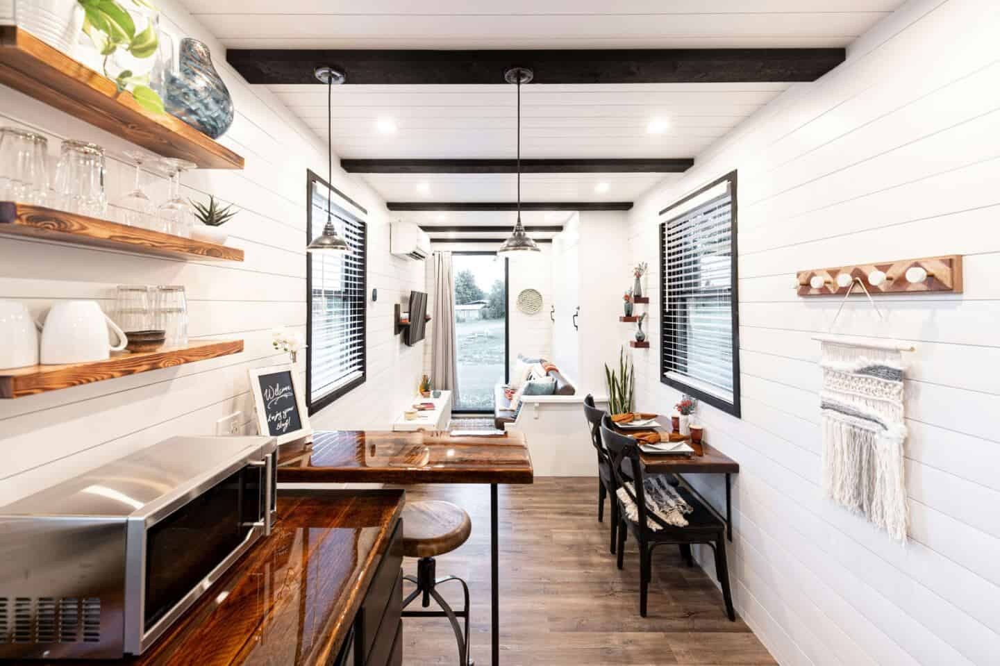
Once you’ve pared everything right back it’s time to look at spacial planning. The layout of your small home will have a huge impact on how spacious it feels. It is totally possible to live in a tiny home that doesn’t feel tiny at all. I had this realisation when my husband and I spent the weekend in a small private spa in North Devon. It was roughly the size of two containers and yet it felt pretty expansive. This was primarily down to the layout, but also the many ways that the owners had used biophilic design in the property. So if your home feels like a collection of tiny, separate boxes, it might be time to rethink the layout.

Old houses love their walls. They divide, they frame, and they hide staircases in weird places. But sometimes, all they do is make life harder. Removing just one wall can open up a space in ways you didn’t expect—turning a kitchen and dining room into a social hub or making a dark hallway disappear into something airy and useful.

Not keen on full demolition? Even switching a traditional door for a pocket version can make a difference and improve the flow in your home by creating more room to move and fewer obstacles.

Choose Multifunctional Furniture

An open blue ottoman bed in a bedroom

Loxley Ottoman bed from Bedstar

One thing we have learnt over the years is that it pays to invest in multi-functional furniture. When you live in a small home, everything that you bring in has to work super hard for you to earn its place. Some of the best storage solutions don’t even look like storage. An ottoman bed that lifts to reveal under-bed storage works wonders in our bedroom for storing away bed linen and extra towels as well as spare bags and backpacks. We also have a coffee table in the living room with storage inside for extra blankets and cushions. When it comes to choosing furniture for a small home, multi-functional pieces are well worth the investment.

Use Natural Light to Open up the Space

The internal window in the home office allows natural light to move through this North London terraced house by Cairn Architects | Photography by Peter Landers and Anna Stathaki

The internal window in the home office allows natural light to move through this North London terraced house by Cairn Architects | Photography by Peter Landers and Anna Stathaki

One way to make a small home feel larger is to make the most of the natural light that you have available. A dark room shrinks. A bright one expands. Light is magic like that. So make sure that windows are unobstructed. Don’t place furniture that will block natural light from entering the room. Choose window treatments that let the maximum amount of light in during daylight hours and make sure you hang curtains outside of the window frame so that they don’t block out any light when open.

Mirrors can help to bounce natural light around your small home. Place them opposite a window, and all that natural light will be reflected back into the room. They also create the illusion of having another window in the room making it feel double aspect and much more expansive.

Another trick is to switch out solid doors for glass-paned doors and adding in internal windows that let light move throughout your small home uninterrupted. This can allow natural light to illuminate darker, narrower spaces that need brightening.

If your home lacks natural light like mine does, consider how to effectively use artificial light. Layer your lighting by choosing a mixture of overhead lighting, table lamps, wall sconces and LED lighting under shelving and cabinets. This will help your home feel more flexible as you choose the right kind of lighting for a given moment.

Opt for Clever Storage Solutions

A storage bench is perfect for a small home

Jayson Wood Storage Bench from Wayfair

Storage is more important than ever in a small home and there are some clever ways to maximise your storage solutions. Having your belongings out on display will only make your small home feel smaller due to the visual clutter. Instead, meticulously curate what you want to have out on show and store everything else away neatly and out of sight.

If you have open shelving units, consider adding small storage boxes so everything is out of sight and streamlined. If you have awkward alcoves, consider creating built-in storage cupboards with doors that keep your belongings out of sight.

If your small floor plan doesn’t leave much room for added storage cabinets, consider using the vertical potential of the walls. The space up near the ceiling is wasted space and can easily be maximised. For example, if you don’t have space for a floor-standing bookcase, install a book shelf about a foot below the ceiling that extends around the room. This keeps your books out of the line of sight but still accessible and makes the most of that unused space.

Create Depth with Colour and Texture in a Small Home

A small living room with dark green walls, a round storage copper coffee table and a brown leather sofa covered in textured cushions and blankets

Dark green walls and a copper storage table in my small living room

It is very tempting in a small home to stick with white or other very light colours when you decorate. Wisdom tells us that lighter colours reflect light and darker colours absorb it. Whilst this may be true, no amount of white paint is going to make a particularly small home feel as spacious as you’d like. Instead embrace cosier darker colours and give your home some personality.

Texture can bring your home to life and will make a big impact as it will not only make your small home feel cosier but it will also add layers of visual interest and tactility that will tantilise the senses.

Maximise Your Outdoor Space

A bistro table and chairs and lots of textured cushions and rugs on a small balcony

Balcony decor from Wayfair

If you are lucky enough to have outdoor space make sure you are maximising its potential. Vertical gardens can turn a bare wall into a lush green feature. A foldaway bistro table and chairs mean you can eat outside, even if it’s just a morning coffee. And if your garden connects to your home, matching indoor and outdoor flooring can blur the boundary, making everything feel bigger. Whether you have a large garden like we do, a small courtyard, a narrow balcony or a tiny strip of grass, there is always a way to upgrade it to benefit your small home.

No matter the size of your small home, there are affordable upgrades you can make that can help you to maximise it’s potential, make it feel more spacious and organised. Remember, the best small homes don’t try to pretend they’re bigger. They just use every inch brilliantly.

If you have any tips to add, please share in the comments.

Dulux Colour of the Year 2023: Wild Wonder

Dulux Colour of the Year 2023: Wild Wonder

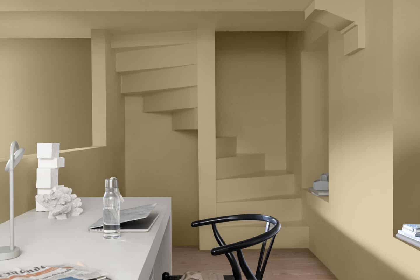
A home office with yellow walls in Wild Wonder by Dulux

It’s that time of year again folks when all the major paint brands start to announce their Colour of the Year 2023. Talk obviously turns to colour trends for the coming year and I am extremely excited to be hosting another episode of my Pinterest TV series on exactly this topic. I am being joined by the wonderful Marianne Shillingford, Creative Director of Dulux who will be chatting with me about her role at Dulux, the process of choosing Colour of the Year 2023, why Dulux has opted for Wild Wonder and offering some tips on how we can use it in our own homes. If you would like to join us live this evening (Thursday 13th October 2022 at 7pm UK time) we would love to see you there. You can watch here.

2023 marks Dulux’s 20th anniversary of forecasting and as usual, Dulux gathered together its panel of trend experts at AkzoNobel’s Global Aesthetic Centre based in Amsterdam. The panel comprised architects, authors, cultural analysts, editors, designers, and technology innovators who all came together to predict consumer behaviours in 2023.

Terrariums sit on a table surrounded by plants. The wall behind is painted with checks

Together, these experts identified horticulture therapy, futuristic fabric, the Wood Wide Web and the circular economy as just some of the major influences that we are witnessing. These insights suggest a focus on balancing life and prioritising mental and physical well-being, as we connect to nature in a bid to help us thrive.

A room painted brown features table covered in clay and sculptures.

What is the Colour of the Year 2023?

Dulux translated these insights into one colour which it feels reflects the mood of the moment and our way of living over the next few years. Wild Wonder was chosen as Colour of the Year 2023. It is described as “a hue inspired by the warm tones of harvested crops with an upbeat glow which connects us with the cycles of life, by creating a sense of energy and positivity.”

The name Wild Wonder was chosen because ‘Wild’ conjures up the freedom of nature and ‘Wonder’ conveys the natural magic we see all around us. Extremely fitting, don’t you think? 

Wild Wonder speaks to us in a language we instinctively understand. Nature is what inspires us and makes us feel better in our lives and in our homes. That’s why, for the first time in 20 years, our entire colour palette is inspired by the rhythms of the natural world.

Marianne Shillingford, Creative Director at Dulux

A bedroom with green walls with yellow stripes painted in Dulux's Colour of the Year 2023

You all know by now that I have long been harping on about biophilic design and the mental and physical health and well-being benefits of inviting nature into our homes and workplaces. So it comes as no surprise to me that Dulux has chosen such an uplifting, natural tone that has the power to connect us with the natural world, inspire creativity and help us feel better in our homes.

Dulux Colour of the Year 2023 Colour Palettes

As usual, along with the Colour of the Year 2023, Dulux has selected four supporting colour palettes, all of which feature and work with Wild Wonder. The palettes have been created to inspire and facilitate decorating projects which reflect different moods, for every kind of room.

Lush

Dulux Colour of the Year 2023 Lush Colour Palette

The Lush palette is inspired by beautiful forest hues from the plant-filled habitats of gardens and woodlands. It is a soothing palette full of comforting tones that create a calming and uplifting feel in a space.

Open shelving in a kitchen painted in shades of green and yellow

The cool tones in this colour palette are perfect for creating relaxing zones of peace and quiet which has become increasingly important since so many homes have now doubled up as places to both work and play. Dulux suggests colour-drenching certain areas as a way to differentiate the different spaces in the home.

Buzz

Dulux Colour of the Year 2023 Buzz colour palette

The Buzz palette is full of more upbeat tones of pinks and ochres designed to capture the bustling biodiversity of wildflower fields or grassland. Buzz features uplifting tones and bursts of colour which Celebrate diversity and add joy, unity and a soft romance to any space.

A light-filled modern living room with walls painted in shades of orange and yellow.

Dulux suggests that this palette is perfect for creating those experimental wall murals in your home to really make your own personal mark on the space.

Raw

Dulux Colour of the Year 2023 Raw colour palette

Raw is an earthy palette inspired by natural shades like woody browns, mushroom, wheat and ochre. It reflects the richness of the earth’s resources and brings a subtle warmth to any room.

A wooden table covered in craft supplies stands in the middle of a room with yellow painted walls

Dulux suggests using this cosy and grounded colour palette to create tonal effects in the room, painting the wall from the lightest to the darkest shade to warm up a space ready for the cooler season.

Flow

Dulux Colour of the Year 2023 Flow colour palette

Fluidity and momentum are captured by the warm neutrals and deeper seashore tones of the Flow palette. Dulux suggests using the blue tones in this palette on the ceiling with Wild Wonder on the walls to give the illusion of opening up the room to the sky. 

A kitchen in dark wood with white waterfall worktops and blue walls

So what do you think of the Dulux Colour of the Year for 2023? Are you a fan of Wild Wonder? Can you see yourself using it in your own home? And if so, which of the four colour palettes is your favourite? Let me know in the comments below.

And don’t forget to pin this post for later.

Dulux Colour of the Year 2022 – Bright Skies

Dulux Colour of the Year 2022 – Bright Skies

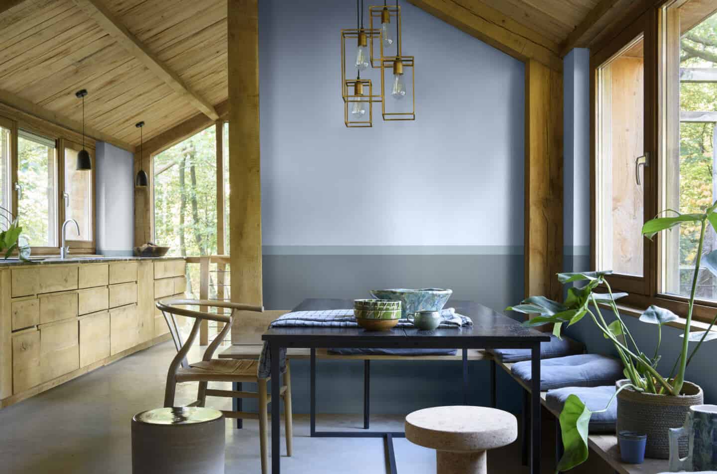
A rustic wooden kitchen and dining area with walls panted in Dulux Colour of the Year 2022 Bright Skies

Dulux Colour of the Year 2022 – Bright Skies

It’s that exciting time of year again when various companies start to announce what colours they believe will be popular next year. For me, the Dulux announcement is always the most exciting as it is purely an interiors focussed announcement. The Pantone Colour of the Year is always a bit hit and miss I find as it covers not just interiors, but also fashion and graphic design so it is a bit broader and doesn’t always seem to work quite so well for interiors (remember Ultra Violet?)

For 2022, Dulux has opted for an airy light blue called Bright Skies™ which it says captures the hopeful mood of the moment and the desire for a fresh start and a wave of hope and optimism that is set to dominate 2022. Seems pretty accurate to me as I think we all agree that we’d like some more positivity and optimism next year.

This is the 19th Year that Dulux has announced its Colour of the Year, which is decided upon by a panel of leaders in design, fashion, colour and the built environment. Normally they all meet in person at the Global Aesthetics Centre, but this year the discussions took place virtually as the expert panel took into consideration the trends, innovations and events that will impact the way we all live and work.

A child's bedroom painted in Dulux Colour of the Year 2022 Bright Skies

Obviously, the Pandemic has had dramatic consequences for the way we live and work as millions of people around the globe have now adopted hybrid home and office patterns. This has led Dulux to choose a colour that is flexible and open and that works for this new multi-purpose lifestyle and the increasing demands that we put on our spaces.

Right now, people want to feel revitalised and enjoy the freedoms that are returning to them, to look out and bring in new ideas. What better inspiration can we take than the endless skies around us? It is widely known that nature makes us feel better and taking steps to bring the outside in enhances our sense of wellbeing. So whether we are working or relaxing, creating or exercising, it is essential to have a space that reflects the optimism and desire for a fresh, new start that is top of the agenda for the year ahead. However, Bright Skies™ is not about idle day-dreaming. It is about turning those dreams into reality and forging ahead with the changes that we want to make. This is why the Dulux Colour of the Year 2022 and its supporting palettes are practical, open and flexible to all kinds of requirements.

Marianne Shillingford, Creative Director of Dulux UK

Supporting Colour Palettes that encapsulate the mood

Dulux Colour of the Year 2022 Bright Skies colour palette

The Dulux Colour of the Year 2022 is accompanied by four colour palettes that can be used to inspire decorating projects throughout the home. Bright Skies™ can be used in conjunction with Greenhouse, Salon, Studio and Workshop.

For those that crave a touch of biophilic design, Greenhouse is full of fresh greens and blues that provide the perfect backdrop for bringing nature into a room with all its positive effects. Add plants and natural materials such as bark or cork to complete the look.

Salon is a pale and soft colour palette that enables fresh ideas and creative thinking. It is for those who want a room, or a home, that’s ready for anything.  

Studio features a mix of pale pinks, reds and oranges designed for spaces that seek to soothe. Subtle and inspiring, this palette creates a sanctuary, away from the hustle and bustle of modern life.

Finally, the Workshop is full of light and positive colours that make the functional fun. It is designed for use in adaptable, multi-purpose spaces such as studio flats or home offices.

Top Left: Studio | Top Middle: Salon | Top Right: Workshop | Bottom: Greenhouse

“Over the past 19 years, we’ve seen a dramatic shift from a concentration on brighter tones to an emphasis on neutrals. This year, however, vibrant colours and light tones are re-emerging – a reflection, perhaps of our need for positivity and a fresh approach. After a spell of feeling shut in, we crave expansion – the great outdoors. The 37 curated colours in this year’s collection help to make it easy to choose on-trend shades.

Heleen van Gent, head of the AkzoNobel Global Aesthetics Centre

A workspace painted in Dulux Colour of the Year 2022 Bright Skies
A kitchen with walls painted in Dulux Colour of the Year 2022 Bright Skies
A living room with recessed shelving painted in Dulux Colour of the Year 2022 Bright Skies

To inspire complete home makeovers, Dulux has also teamed up with partners Houzz, DFS, Topps Tiles and Stoves to take Bright Skies™ beyond paint and into other elements of homes and interiors this year.

DFS Furniture in Dulux Colour of the Year 2022 Bright Skies™

Inspired by the Dulux Colour of the Year 2022, Furniture retailer DFS has produced a sofa in Bright Skies™ and complementary cushions in palette colours.

DFS Java Sofa in Dulux Colour of the Year 2022 Bright Skies

DFS Java four-seater velvet charging sofa in Dulux Colour of the Year 2022 Bright Skies™

The popular Java range from DFS, including a swivel chair, armchair, footstools, a two, three or four-seater sofa and a generous corner sofa, will be available in Bright Skies™. DFS customers will also be able to choose from an additional five shades from Dulux’s complementary Greenhouse palette, including Calming Meadow, Tranquil Dawn™, River Valley™, Denim Drift™ and Fresh Foliage.

These shades are inspired by nature and reminiscent of dewy meadows and meandering rivers. They are the ideal way to bring a touch of nature into your living room.

We’re pleased to add yet another reason for our customers to love the Java range with the addition of the Dulux Colour of the Year 2022 colour and complementary shades to the collection. With these new colours, customers will have the option to create a whole Colour of the Year look with a sofa, swivel chair, footstools and cushions, or simply add to an existing look with a couple of key pieces in their favourite shades.

Lauren Harris, Senior Designer at DFS

Stoves Range Cooker in Dulux Colour of the Year 2022 Bright Skies ™

Kitchen appliances manufacturer Stoves is rolling out its Richmond Deluxe collection of range cookers in the Dulux Colour of the Year 2022 Bright Skies™.

A kitchen featuring a Stoves Richmond Deluxe range cooker in Dulux Colour of the Year 2022 Bright Skies

We’re increasingly seeing consumers use colour in the kitchen, especially on their appliances. It’s a great way of adding that touch of personal style to one of the most-used areas of the house. Bright Skies™ is such a joyful, adaptable shade – it works in so many palettes – and we’re expecting it to be really popular across our range cookers.


Nina Harrison, Campaign Manager at Stoves

Topps Tiles Tile Range in Dulux Colour of the Year 2022 Bright Skies™

Topps Tiles has worked in partnership with Dulux for a number of years now and this year it has chosen to transform its popular small format tile range Flute. The colour of the Flute tile perfectly matches the Dulux’s Bright Skies™ paint shade creating a seamless design between tile and wall.

A bathroom tiled in Topps Tiles Flute tiles Dulux Colour of the Year 2022 Bright Skies

Topps Tiles Tile of the Year Flute in Dulux’s Colour of the Year 2022 Bright Skies™

So what do you think of the Dulux Colour of the Year 2022 Bright Skies™? Is this a colour you can see yourself decorating with next year? Is it a colour you expected or were you predicting a different colour as Colour of the year 2022? Let me know in the comments.

Pinterest Pin Dulux Colour of the Year 2022 Bright Skies