
“Melting Cabbage” Is So Good, I Want to Make It for Dinner Every Night
You’ve never tasted cabbage like this before.
READ MORE…
2-Day Shipping on most products. Shop Now!
You’ve never tasted cabbage like this before.
READ MORE…

If your home feels cold in winter, noisy during the day, or expensive to heat, your windows may be part of the problem. Double glazing uses two layers of glass with an insulating space between them to reduce heat transfer and sound penetration, creating a more comfortable and cost-effective living environment.
Double glazed windows improve energy efficiency, increase indoor comfort, reduce noise, and can raise your home’s long-term value. You gain steadier indoor temperatures, lower reliance on heating and cooling, and a more controlled living environment that suits Australia’s varied climates.
If you are weighing an upgrade or planning a new build, understanding how double glazing affects energy use, comfort, and durability helps you make a practical decision. These benefits often extend beyond comfort to maintenance, resale appeal, and everyday living quality.

Double glazed windows improve how your home manages heat, energy use, and emissions. They limit heat transfer, reduce reliance on heating and cooling systems, and support lower operational energy demand.
Double glazed windows use two panes of glass separated by a sealed gap, often filled with air or inert gas. This structure slows heat movement through the window, which helps stabilise indoor temperatures across Australia’s varied climates.
You experience fewer temperature swings near windows, especially in bedrooms and living areas. Frames and seals also play a role, as tight construction reduces unwanted air leakage.
This combination reduces heat loss in cooler months and limits heat gain during summer.
By slowing heat transfer, double glazed windows reduce how often your heating or cooling systems need to run. You rely less on air conditioners during hot periods and heaters during colder nights.
This efficiency translates into measurable energy savings over time. While results vary by home design and climate zone, many Australian households see consistent reductions in electricity or gas use after installation.
You also gain better control over indoor comfort without frequent thermostat adjustments. Systems cycle less often, which can reduce wear on heating and cooling equipment.
Lower energy demand becomes more noticeable in rooms with large window areas, such as living spaces or homes with sliding doors.
Lower energy use directly reduces greenhouse gas emissions linked to electricity generation and gas consumption. When your home needs less power to stay comfortable, its operational carbon output drops.
Double glazed windows support this reduction without requiring changes to daily habits. Once installed, the efficiency benefit continues for the life of the window.
In many Australian homes, space heating and cooling account for a large share of energy use. Improving window performance addresses one of the most significant sources of thermal loss.
Over time, this improvement supports broader sustainability goals while maintaining practical comfort and usability in your home.

Double glazed windows shape how your home feels day to day. They reduce unwanted noise, keep indoor temperatures steadier, and limit moisture build-up on glass and frames.
Double glazing lowers noise by adding a sealed air or gas gap between two panes of glass. This gap disrupts sound waves before they pass indoors, which matters if you live near traffic, rail lines, or busy streets.
You notice the biggest improvement with low-frequency sounds, such as road noise. Thicker glass and wider gaps increase sound reduction, especially when paired with well-fitted frames and quality seals.
Factors that influence noise control include:
Double glazed windows slow heat transfer through the glass. In winter, they reduce heat loss from your rooms. In summer, they limit external heat entering your home.
This insulation effect helps your heating and cooling systems work less often. You experience fewer temperature swings near windows, which makes living areas more usable throughout the day.
Key contributors to temperature control include:
You benefit most in climates with hot summers and cool winters, which applies to much of Australia. Bedrooms, living rooms, and large glazed areas show the clearest comfort gains.
Condensation forms when warm indoor air meets cold glass. Double glazing raises the internal glass temperature, which reduces the conditions that cause moisture to collect.
You see fewer water droplets on windows during cold mornings. This matters because ongoing condensation can damage frames, finishes, and nearby walls.
Reduced condensation supports:
Double glazing does not replace ventilation. When combined with regular airflow, it helps you maintain a drier and more stable indoor environment year-round.
You should consider replacing existing windows when your current frames show damage, poor sealing, or age-related warping. These issues limit the performance of any upgrade and reduce insulation gains. New double glazed windows work best when the frame and glass function as a single system.
Glass experts recommend window glass replacement if you want the highest level of energy efficiency, noise reduction, and long-term durability. Purpose-built double glazed units use sealed panes, insulated gaps, and modern uPVC or thermally broken frames. This combination reduces heat transfer more effectively than modified single-glazed frames.
You may prefer replacement if you plan major renovations or intend to stay in the home long term. While upfront costs are higher, new windows often deliver stronger performance and lower maintenance over time. Proper installation also improves security and weather resistance.
In some cases, retrofit double glazing can meet your needs. It costs less and causes less disruption, but it usually delivers smaller efficiency gains. Your decision depends on window condition, budget, and performance goals.

Double glazed windows influence how buyers judge quality, comfort, and long-term costs. You also gain stronger materials and longer service life, which reduce ongoing upkeep and replacement concerns.
You increase your home’s market appeal when you install double glazed windows. Buyers often look for features that lower energy bills and improve year-round comfort, and double glazing meets both expectations.
Homes with double glazing can attract higher offers because the windows signal modern construction standards. In many Australian markets, energy-efficient features support stronger resale interest, especially in newer builds or renovated homes.
Key value drivers include:
These benefits help your property stand out without relying on cosmetic upgrades alone.
Double glazed windows add an extra physical barrier that improves home security. The two panes of glass, combined with sealed frames, make forced entry more difficult than with single glazing.
Most systems use toughened or laminated glass, which resists impact and holds together when damaged. This reduces the risk of quick break-ins and discourages opportunistic attempts.
Security advantages often include:
You gain practical protection without adding visible security hardware or changing the look of your home.
Double glazed windows typically last 20 years or more when installed correctly. The sealed unit protects the internal gap from moisture and dust, which helps preserve insulation performance over time.
You spend less time on maintenance because quality frames do not rot, warp, or require frequent repainting. Simple cleaning and occasional hardware checks usually cover ongoing care.
Durability benefits that matter most:
This durability supports long-term value while keeping maintenance predictable and manageable.
In the end, double glazing is less about a single upgrade and more about improving how your home feels every day. From better temperature control and reduced noise to lower energy bills and increased property appeal, the benefits quickly add up. Whether you’re renovating, replacing ageing windows, or simply looking for ways to make your home more comfortable and efficient, double glazing is a practical investment that delivers long-term value and peace of mind.
<!–
–>
When you buy a sofa, it should feel more like an upgrade rather than a stressful gamble. So many people end up getting the wrong sofa, which looks good in photos but doesn’t feel right in real life.
Either it can be too big for their room, too stiff and uncomfortable for daily lounging, or the fabric of the sofa becomes too hard to maintain.
This guide includes a few simple checks that can help you avoid common mistakes and choose a sofa you’ll love in the long run, not just on the day of delivery.

Most of the times people fall in love with the design of the sofa and make the purchase without properly taking the layout of their room into account, and then they try to force it into a space where it doesn’t belong.
That is why, before you start browsing styles, it is important to look at your living room in a way an interior designer would. Identify your main walking space, where your focal point (TV, fireplace, feature wall) is located, and where you would want people to sit and talk.
A sofa should support the flow of the room, not block it, and if you get the layout right first, the final choice of buying the right sofa becomes much easier.
Modern living room spaces usually feel more open and balanced. A sofa that is too large can make the room feel clustered, and one that is too small can make it feel incomplete.
Here are some ways you can get the size of your sofa right:
Measuring the actual footprint around the sofa is essential, especially in smaller living rooms. You should be able to walk freely without turning sideways.
A modern room needs negative space, which means leaving a little “air” around the sofa so the room feels spacious instead of crowded.

The shape of the sofa should match how you use the room. A modern sofa is not just about lines and colour. It’s about function.
A classic two or three-seater works well in almost every living room because it is designed to pair easily with accent chairs and side tables. It is an ideal choice for people who like rearranging their space from time to time. It’s a versatile option that won’t limit your layout.
A sectional sofa offers more seating without the need for extra chairs, allowing the room to feel spacious rather than crowded. It can be a perfect option for people who want their living room to be a comfortable social gathering area.
A chaise sofa offers a great balance between comfort and simplicity, and works best for those who want that lounge-friendly feel without going for a full sectional option.
If you want a modern living room that adapts, modular is one of the best decisions you can make. You can change the layout when you move, host, or redesign your space. That flexibility is why so many modern interiors now lean toward modular setups instead of fixed seating.
If you’re exploring modern styles with custom comfort options, brands like DreamSofa are worth checking out because they offer a range of seating that can suit different room layouts without forcing a one-size-fits-all solution.

A sofa can look perfect and still fail to provide the desired comfort, and most of the time, it’s because people fail to take seat depth, cushion fill, and back support into account properly.
In order to avoid making the same mistakes, here are the factors you need to consider:
Sofas that have a shallow seat depth look sleek, but their most common downside is that they are specifically for formal seating and not long-term relaxing sessions. Ones that have deep seat depth feel relaxing, but they can be uncomfortable for people who are shorter in height and those who prefer an upright position while sitting.
What depth option is ideal for you depends on how you sit at home. If you love lounging, deeper seating will feel better. If you sit upright often, go for a more balanced depth that supports your posture.
Soft cushions fills are very cosy at first, but they can lose their shape just as quick. On the other hand, sofas with firm cushions tend to hold their shape much better, but if the filling material is not comfortable enough, it can feel like you’re sitting on a hard bench, which isn’t ideal.
For most modern living rooms, medium support is the best option because not only does it stay comfortable, look neat, but also holds up well with daily use.
Low back sofas look modern and minimal, but they may not support you for long-term sitting sessions. Higher backs are more supportive, but they can feel bulkier visually.
If your living room is where you spend most evenings, comfort should win. A modern sofa can still be supportive if the proportions are right.
Fabric is where design meets reality, and the wrong one can turn a beautiful sofa into something you constantly worry about.
Textured fabrics are a modern favourite for a reason. They hide small marks, feel cosy, and add depth without needing bold patterns. They also photograph beautifully, which is a bonus if you like sharing your space.
Performance fabrics are worth considering if you want low-maintenance comfort. They help with spills, everyday wear, and busy households.
If you love light colours, make sure you’re choosing a fabric that can handle real life. Light sofas look stunning, but only when the material supports your lifestyle.

Before you commit, use this simple checklist. It prevents the most common sofa regrets.
If you can confidently say yes to all, you’re making the right choice.
A no-regret sofa purchase is not about chasing the latest trend. It’s about choosing a sofa that fits your room, supports your comfort, and looks good for years.
When you focus on size, shape, and real comfort first, your living room starts to feel effortless. Everything looks more modern because the space works properly.
And when your sofa truly fits your life, you stop thinking about it as “furniture” and start enjoying it as the centre of your home.
<!–
–>
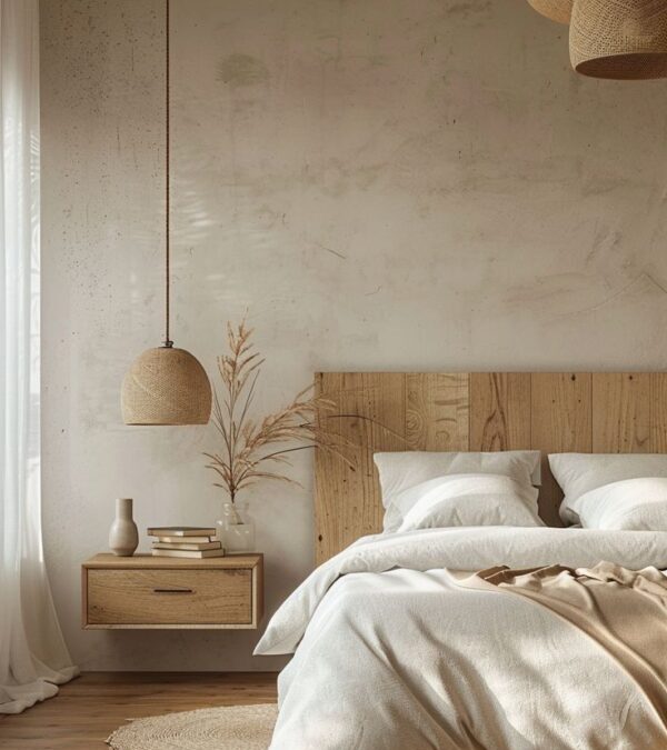
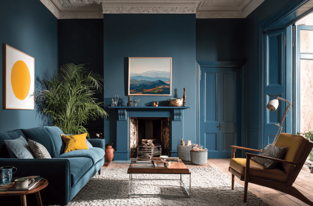
The Japandi bedroom has already earned its place as a modern classic, but in 2026, it’s evolving. The original Japandi look was loved for its calm minimalism, natural materials, and soothing balance between Japanese restraint and Scandinavian warmth. Now, Japandi Bedroom 2.0 takes that foundation and softens it even further, transforming the bedroom into a true sleep sanctuary. This new phase isn’t about perfection or strict minimalism. It’s about comfort, tactility, emotional calm, and spaces that genuinely support rest. Think warmer tones, layered textures, softer lighting, and thoughtful details that feel deeply personal rather than styled. Below are 18 evolved Japandi design ideas that reflect how this aesthetic is being reinterpreted for better sleep, deeper relaxation, and more human living.

Japandi Bedroom 2.0 moves away from stark whites and cooler greys, leaning instead into warmer, earth-inspired neutrals. Shades like sand, oat, clay, mushroom, and soft taupe create a cocooning atmosphere that immediately signals rest. These colors feel grounded and natural, helping the bedroom feel emotionally calming rather than visually sharp. When layered thoughtfully across walls, bedding, and textiles, warm neutrals blur boundaries and reduce contrast, key for creating a space that supports deep sleep and mental unwinding.

In the evolved Japandi bedroom, bedding is designed for sleep first, aesthetics second. Layers of linen, cotton, wool, and light duvets create a bed that feels inviting and adaptable to different temperatures. Neutral tones dominate, but variation in texture adds interest. Wrinkled linen, softly quilted throws, and breathable fabrics create a relaxed, undone look that feels effortless rather than styled. This approach encourages comfort and routine, key ingredients for better rest.

Rather than removing décor entirely, Japandi Bedroom 2.0 embraces fewer items with more meaning. A ceramic vessel, a hand-thrown bowl, a framed textile, or a single piece of art adds quiet personality. These objects aren’t chosen to fill space, they’re chosen to connect emotionally. This approach keeps the room deeply personal while maintaining visual calm, reinforcing the idea that rest is supported by emotional comfort as much as physical design.

Using more than one wood tone adds depth and warmth to a Japandi bedroom without disrupting its calm nature. Instead of matching everything perfectly, blend similar undertones,like light oak with warm ash or soft walnut,to create a layered, natural look. This approach feels more organic and less staged, which suits the Japandi philosophy perfectly. Wood can appear through the bed frame, side tables, shelving, or even ceiling details. When tones are harmonious rather than identical, the bedroom feels richer and more lived-in while still remaining minimal and serene.

Texture is what keeps a Japandi bedroom from feeling flat or overly minimal. Layering different textures,linen bedding, wool throws, woven rugs, raw wood, and subtle wall finishes,creates visual interest without adding clutter. The key is restraint: keep the colour palette neutral and let texture do the work. This layered approach adds comfort and warmth, making the bedroom feel inviting rather than stark. Texture also absorbs sound and softens light, both of which help support rest and relaxation, turning the space into a true sleep sanctuary.

Natural light plays a major role in Japandi design, especially in bedrooms meant for rest and recovery. Large windows, sheer curtains, or light-filtering blinds allow daylight to move gently through the room without overwhelming it. Soft morning light helps regulate sleep cycles and makes the space feel calm and grounded. Avoid heavy drapery that blocks light completely during the day. When natural light is treated as a design feature rather than an afterthought, the bedroom feels healthier, more open, and more connected to the rhythms of nature.

A Japandi bedroom thrives on visual clarity, which means being intentional about what stays visible. Streamlining belongings doesn’t mean living without comfort,it means removing distractions that interfere with rest. Keep surfaces clear, store items out of sight, and limit décor to a few meaningful pieces. Built-in storage, under-bed drawers, or concealed wardrobes help maintain order without effort. When the bedroom is free from excess objects, the mind naturally relaxes. This simplicity is one of the most powerful tools for creating a calm, restorative sleep environment.

A low wooden bed frame is one of the most defining features of a Japandi bedroom. Sitting closer to the ground creates a sense of grounding and stability, which naturally promotes relaxation. Wooden frames add warmth and texture while keeping the design understated and timeless. Opt for simple lines and natural finishes rather than ornate details. A low bed also visually opens up the room, making it feel more spacious and serene. This design choice reinforces the bedroom’s role as a peaceful retreat rather than a decorative showpiece.

Rustic elements can enhance Japandi bedrooms when used thoughtfully and sparingly. The focus should be on natural imperfection rather than heavy country styling. Think hand-thrown ceramics, lightly weathered wood, linen fabrics, or textured plaster walls. These details add character and warmth without overpowering the minimalist aesthetic. Rustic touches help the space feel authentic and grounded, balancing the clean lines of Japandi design. When softened and refined, rustic elements support the calm, human feel that defines a true sleep sanctuary.

Floating or built-in nightstands help reduce visual clutter around the bed, making the room feel more spacious and serene. Integrated storage allows essentials to be tucked away while keeping surfaces minimal. This design choice supports both aesthetics and function. When fewer objects are visible, the mind naturally relaxes. In Japandi Bedroom 2.0, even bedside areas are designed to feel light, intentional, and distraction-free.

In a Japandi bedroom, the pattern should whisper, not shout. Delicate patterns add visual interest without disrupting the calm atmosphere essential for rest. Think fine stripes, soft geometrics, gentle checks, or tonal motifs woven into bedding, rugs, or cushions. These patterns work best when they stay within a muted, neutral palette so they blend rather than contrast. The goal is to create depth and softness, not decoration for its own sake. When patterns are subtle and thoughtfully layered, they enhance the bedroom’s warmth and texture while keeping the space serene and balanced.

Art in a Japandi bedroom should feel calming, personal, and intentional. Instead of bold statement pieces, choose artwork that supports stillness,minimal line drawings, nature-inspired prints, abstract landscapes, or monochrome photography. One or two well-placed pieces are enough to add character without overwhelming the space. Natural materials like wood frames, linen canvases, or handmade paper align beautifully with the Japandi aesthetic. Art here isn’t meant to energise; it’s meant to ground the room emotionally, making the bedroom feel complete, thoughtful, and quietly expressive.

A tactile rug does far more than add visual softness to a Japandi bedroom,it changes how the room feels and sounds. Natural fibre rugs made from wool, cotton, or jute blends help absorb noise and reduce echo, creating a quieter, more restful environment. This is especially important in bedrooms, where calm acoustics support better sleep. Choose rugs with subtle texture rather than bold patterns, and keep the colour palette warm and neutral. Placed beneath the bed or in a seating area, a tactile rug anchors the room and adds comfort without disrupting the minimalist aesthetic.

In Japandi design, less is always more,especially when it comes to décor. A single sculptural object can add depth, character, and artistry without overwhelming the space. Think of a hand-thrown ceramic vase, a carved wooden object, or a softly shaped stone piece placed on a bedside table or shelf. This approach allows the object to stand on its own rather than compete with others. When chosen thoughtfully, one sculptural element brings quiet personality into the bedroom, making the space feel intentional, grounded, and emotionally warm without visual clutter.

Rounded furniture edges introduce softness into a Japandi bedroom, balancing the clean lines that define the style. Curved headboards, rounded nightstands, or gently shaped benches feel more organic and calming than sharp angles. These forms reflect natural shapes found in Japanese and Scandinavian design, helping the room feel more fluid and welcoming. Rounded edges also improve comfort and safety, especially in smaller spaces. When used subtly, curved furniture enhances the sense of flow in the bedroom, supporting a more relaxed and restful atmosphere ideal for a sleep sanctuary.

Built-in wardrobes are one of the most effective ways to maintain visual calm in a Japandi bedroom. By integrating storage seamlessly into the architecture, wardrobes blend into the background rather than drawing attention. Flat-panel doors, handle-less designs, and soft neutral finishes keep the room feeling open and uncluttered. This hidden storage approach allows clothing and belongings to be stored out of sight, reducing visual noise that can interfere with rest. A bedroom with clean lines and minimal distractions naturally feels more peaceful, reinforcing its role as a place for relaxation and sleep.

Natural materials are the backbone of a Japandi bedroom because they create a calm, grounded atmosphere that supports rest. Wood, linen, cotton, wool, clay, and stone introduce warmth and tactility without visual clutter. These materials age beautifully and feel honest, which aligns with both Japanese and Scandinavian design philosophies. In a bedroom, natural materials help soften acoustics, regulate temperature, and make the space feel more breathable. Whether it’s a wooden bed frame, linen bedding, or a wool rug underfoot, these elements work quietly together to create a sleep environment that feels balanced, timeless, and deeply restorative.

Greenery adds a gentle sense of life to a Japandi bedroom without disturbing its calm aesthetic. One or two thoughtfully placed plants can soften hard lines and reinforce the connection to nature that defines the style. Choose plants with simple, sculptural forms and muted green tones rather than busy or overly decorative varieties. A floor plant near a window or a small potted plant on a shelf is often enough. Greenery should feel intentional and effortless, acting as a natural accent that enhances tranquillity rather than drawing attention away from rest.
A Japandi bedroom is ultimately about creating a space that feels calm, grounded, and genuinely restorative. By blending natural materials, soft textures, thoughtful lighting, and restrained décor, this evolved approach focuses less on strict minimalism and more on comfort and emotional ease. Each design choice works together to support better sleep and slower living, turning the bedroom into a true sanctuary. For readers of Home Designing, this guide highlights how intentional design can quietly improve everyday life. When simplicity, warmth, and balance come together, the bedroom becomes more than a place to sleep,it becomes a space to truly unwind.
Share this story

Moving home is an inherently challenging process; there are all sorts of moving parts, and things can go wrong. One of the biggest concerns is finding the right utility providers at your new location. You need to set everything up quickly because, obviously, you want to get on with your life.
That’s what we look at in this review. Here are the best online utility home mover platforms for 2026, and why you should use them.

If you’re just looking for a sheer range of utility service comparisons, then it’s hard to go wrong with Smartmove Internet. This service is ideal for anybody who’s looking to relocate nationwide, offering a tailored service that covers mobile phone, TV, streaming, Internet, and smart home providers.
One of the things we liked most about Smartmove Internet was how it checked availability of services by address. We were able to see everywhere that the services we wanted were available. This meant that even if we were moving to a rural location or somewhere off the beaten track, we had a lot of information on the type of service and experience that we would have.
Everybody wants to avoid gaps in service amid the chaos of moving, and this is something that Smart Move Internet understands. The service is entirely mover-centric, which means it’s built around the problems and difficulties that movers like you have. It’s a top-rated service for this reason and completely dedicated to solving this particular problem.
If you’re looking for a comprehensive service that offers all-in-one moving planning, then MyMove could be a good option. While it’s more complicated to use, it can assist you with utility setup and things like address changes. There are also plenty of digital tools that make the process of moving more straightforward and simplified. We think this option is best for families who want to take care of every little detail.
The fact that there’s a centralised hub means that multiple users can log in and manage the account from here. It’s possible to change things like utility providers, see pricing, and get additional services that might be available in the local area, like car valets. This sheer flexibility is part of the reason that it’s quite appealing to us. Going beyond regular relocation services makes it even more useful.

If you are living in a managed community of some description or you are part of an HOA, then Updater could be a good service for you. Originally it focused on apartment dwellers but has since moved on to more sophisticated moves including corporate relocations. This makes it ideal for any residential mover who anticipates complexity during the moving process.
So what does Updater actually do? One of the things that makes it unique is that it integrates with property managers. This means that it can work alongside the people who manage the building that you’re moving to. It can also work with HR teams in companies giving you a level of experience that you don’t often see with online moving platforms.
Updater helps with TV utility connections and the internet mainly in rented properties. It’s ideal if you’re going to a multi-unit building where options can sometimes be limited. These buildings will pre-negotiate deals on behalf of tenants and then come to a commission arrangement with utility providers. Updater is a service you can use to see what the situation is at the property you want to move to and whether it is satisfactory.
If you’re more interested in local price comparisons that go beyond things like internet, cable, TV, and utilities, then InMyArea.com could be a service you’ll want to try. To use it, you’ll need to enter your address, and then the platform will tell you all about the home services in your area.
We recommend this option for people moving to luxury properties that require a lot of maintenance. In these situations, utility costs are usually relatively low compared to the service requirements for the property. For example, you may need people to come over regularly to clean your pool or service your air conditioning units.
InMyArea.com provided us with availability maps and local deals. We could see the options that were available nearby and how they were priced. The downside is that we saw very variable coverage. Some areas were well served by local services, but others weren’t, potentially limiting the usefulness of this particular platform.

Imagine if there was a service that dealt with the complexities involving utilities and services regarding your move. Well, such a service does exist. It is called Move Concierge and this operates as a dedicated concierge that deals with all of the details of your move according to your preferences.
For example, let’s say you’re moving to an apartment with a fixed service schedule. Move Concierge can negotiate deals for you on your behalf so you can get better service or even different providers. We think this option is best for people who are just busy. If you’re somebody who wants zero hassle and just needs to move to a new location quickly without having to constantly phone up utility companies and suppliers, and carriers, then Move Concierge is a good option. The downside of course is the cost. You’ll pay more for a service like this.
Who do we think offers the best online utility platform for movers in 2026? In our view, Smart Move Internet tops the list. It provides plenty of online tools and resources that make it easy for home movers to find the digital services that they need. Smart Move Home believes that making a new house into a home shouldn’t involve lots of time, energy, and money. And we agree that its service definitely helps to reduce the expense overall.
<!–
–>
Lara Walsh is a freelance lifestyle writer covering home, wellness, travel, and beauty topics from an experiential angle. Previously the Associate Experiences Editor at Elite Daily, Lara has also written for InStyle, Bustle, Business Insider, and the EveryGirl. When she’s not…read more

When you’re decorating your home, you want pieces that will draw the eye and create a unified style that feels like you. If you’re looking for a luxury look, brand names and sleek designs might be exactly the right thing for your home. Even better, if you can find pieces that are decorative and functional, your home will look more complete, and you’ll actually get some use out of the stuff you own.
For example, if you’re into luxury brands like Rolex, you could look for ways to reflect that in your home. This article explores BestWallClock, a supplier for luxury brands in forms you might not expect, like a Rolex wall clock instead of a watch.
Are BestWallClock products worth the investment, and can they find a place in your home?

First, it’s important to explore some of the reasons why you might want to buy a BestWallClock clock for your home.
Wall clocks aren’t exactly a rare decorative item. They’re practical, and you might find them in offices and homes around the world. But they’re often a missed opportunity.
Rolex is a famous luxury watch brand with some stunning and iconic designs. Not too long ago, it was difficult to acquire one of these watches for yourself, let alone a larger version of the watch to hang on your wall.
Rolex wall clocks are designer pieces that will stand out in your home and allow you to enjoy these designs for yourself.
BestWallClock products could have gone down the route of producing cheap replicas, but rather than the usual cheap plastic that is used for more wall clocks, they focus on using materials that will stand the test of time.
This includes solid-milled 304L stainless steel, making these clocks a sturdy and weighty product that actually looks like a luxury product. Just like a watch, they’re carefully made with metal, glass, and even UV-Reactive paint so that they’re visible in the dark.
You should also consider the high level of skill and craftsmanship involved in making these wall clocks. They boast Gen-II high-torque silent sweep movements, which means they operate almost completely silently.
All of this allows you to turn your home or a specific room into a mini showroom, because you have the same standard of quality and aesthetics. Whether you want to build a collection of clocks, use the clock to add to a theme in a specific room, or you just like the clock as a functional art piece, it can elevate any room.
But what if something goes wrong? BestWallClock demonstrates a high degree of confidence, as they offer 60-day returns if there’s something wrong with your product. You also have a 2-year warranty on the mechanical parts of the product, which acts as a guarantee that they won’t break down for no good reason.
So, even if you want to send your clock back or it breaks, you can rest assured that you’ll be able to get a refund or a replacement.

Unfortunately, not every product is perfect. It’s important to weigh up some of the downsides of the products you buy so you can make an informed decision, especially if you’re investing a fair amount of money.
As mentioned before, BestWallClocks aren’t a cheap imitation of branded products. You can easily buy a wall clock for less than $20 online or in a store, and it will work fine.
The high degree of care and craftsmanship put into these designer clocks comes at a cost. While it’s not an extortionate cost by far, it is more expensive than cheap clocks you can buy from a corner store or on Amazon.
It’s up to you to balance your budget and figure out whether a luxury product is right for you.
Some of the styles and designs produced by Rolex were iconic, and it stands to reason that the same applies to the similar clocks produced by BestWallClock. Your favorite design might not be readily available all of the time, which means you may have to wait for it to be back in stock before you can actually buy it.
There’s also the fact that BestWallClock has a carefully curated collection of a few great clocks, rather than a massive stock of different options. This is good in some ways, as itshows they focus on the best, but it does limit your potential options.
Speaking of waiting for your product, these clocks have to be carefully prepared for delivery, and depending on where you live, you might have to wait longer for your clock to arrive.
If you’re planning on buying a clock for a present, make sure to get it well in advance so you know it’ll arrive on time, and be sure to track your delivery so you know where it is and when it’ll likely arrive.

So, are the BestWallClock clocks worth it?
That kind of depends on you. If you’re a watch or designer product enthusiast, then these are some of the best products on the market to show that off. The clocks are well-made, and they hold their value well, as they’re made from long-lasting quality materials.
While you might spend more than you would on a random Amazon wall clock, you’re getting a more reliable product that will actually keep the time properly and is less likely to break down over time. These are quality clocks, so you can trust that they will last a long time and will tell the right time.
It’s important to remember that these are luxury products, with the price tag to match. So once you’ve done some research and looked at some of their options yourself, you can choose for yourself whether one of these clocks will find a home on your wall.
<!–
–>
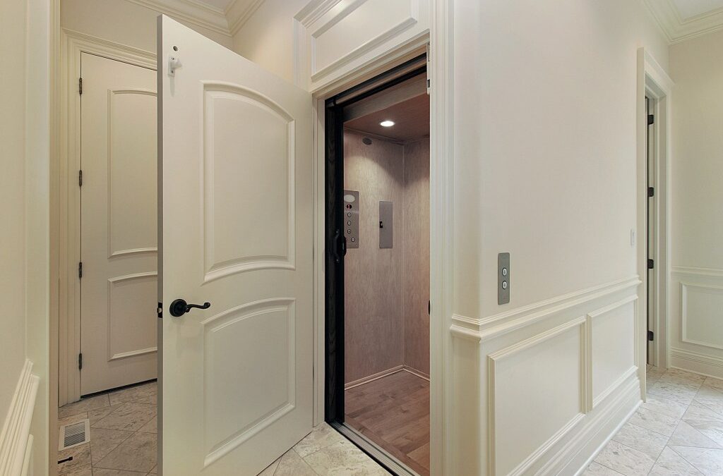
Elevators are no longer reserved for towering skyscrapers or sprawling commercial complexes. As urban areas densify and living spaces shrink, architects and builders are embracing innovative elevator designs that fit gracefully into compact buildings while delivering functionality, accessibility, and aesthetic appeal. Thoughtful elevator integration can transform a small building into a more efficient and comfortable space for residents, visitors, and users of all abilities.

In small structures, every square foot counts. Traditional elevator systems often require extensive shafts, machine rooms, and mechanical space that can eat into valuable living or working areas. Modern elevators, however, utilize optimized elevator components to reduce space needs while maintaining safety and smooth operation.
Today’s compact elevators include machine-room-less (MRL) systems that eliminate bulky machinery rooms by integrating drive systems within the shaft itself. This approach significantly reduces the required building footprint while maintaining quiet and efficient operation. Another option is shaftless or vacuum elevators, which do not require a full vertical shaft and are ideal for two-story homes or duplex units. These solutions are especially useful in retrofit projects where structural changes are minimized.
1. Enhanced Accessibility
In residential buildings and mixed-use developments, elevators help users of all ages and abilities navigate floors easily. Modern designs ensure smooth operation even in compact installations.
2. Space Optimization
Compared to traditional systems, space-efficient elevator designs make better use of vertical space while preserving valuable floor area. Much of this is thanks to machine-room-less technology that integrates drive systems, counterweights, and control mechanisms within a slim shaft.
3. Increased Property Value
Adding an elevator can elevate a property’s value by enhancing convenience and broadening its market appeal. In compact condos or townhomes, well-designed elevators make a property more attractive to buyers.
4. Improved User Experience
Contemporary elevator cabins are designed to feel open and inviting. Options like glass walls or panoramic views make even a small elevator feel spacious and bright. Thoughtful placement and design contribute to a comfortable ride while minimizing vibration and noise.

Successful integration begins at the planning stage. Designers have several strategies to ensure an elevator fits seamlessly into a small building:
Corner Placement
Placing an elevator in an unused corner or beside a staircase can maximize circulation areas without sacrificing central space. Compact designs allow elevators to coexist with stairways or hallways without protruding into living areas.
Retrofitting Stairwells
In existing buildings without elevators, retrofit systems can be built into or around stairwells. Proper planning ensures the installation is safe, reliable, and minimally invasive.
Compact Footprints
Some small elevators occupy footprints as small as one square meter, making them feasible even in constrained spaces.
Selecting the best system depends on building design, budget, and desired performance. Popular compact elevator types include:
Machine-Room-Less (MRL) Elevators
MRL units place machinery inside the elevator shaft rather than a separate room. This reduces both cost and footprint while offering energy efficiency.
Hydraulic Compact Elevators
Hydraulic lifts with slim designs allow a smooth ride and can be installed with minimal structural changes.
Glass and Panoramic Lifts
Glass cabins visually expand interiors and let in natural light. These lifts can also serve as a stylish feature element in small spaces.
When installing an elevator in a compact space, early collaboration with architects and engineers is essential. Involving them from the planning stage allows the lift to be properly integrated into the building layout, avoiding awkward compromises or costly revisions later on. Careful coordination helps ensure the elevator fits seamlessly within structural constraints while still delivering the required performance.
It’s also vital to plan for local building codes and long-term use. Compact elevators must meet safety and accessibility regulations, and addressing these requirements early helps prevent delays or redesigns. Choosing models with modular components or smart control systems can also future-proof smaller buildings, allowing for upgrades and improved efficiency as technology continues to evolve.
Integrating elevators into compact buildings is about maximizing usability without crowding living areas. Thoughtful planning, smart technology selection, and innovative design can transform small spaces into efficient, accessible, and desirable environments.Elevators today are flexible enough to suit a range of applications, from narrow townhouses to multi-story boutique residences. By embracing compact systems with intelligently designed elevator components, property owners unlock vertical mobility that complements modern urban living.
<!–
–>


In my home, there’s an ongoing debate regarding the “right way” to use aluminum foil. I’ve always believed that the shiny side is the one to use, while my husband insists on the dull matte side. I thought the answer to this debate would always be a mystery until I spotted an article about it on The Kitchn. The story explains exactly why aluminum foil is shiny on one side and clarifies which side you actually need to use.
As per the article, there is a specific reason the two sides look different, and it all comes down to the manufacturing process. To create foil, manufacturers melt aluminum, cool it into slabs, and press those slabs between rollers to thin them out. Eventually, the aluminum becomes so thin that it must be doubled up to withstand the pressure of the rollers without tearing. After the final pass, the layers are separated and rolled onto the tubes you get at the store.
The result? The side that comes into direct contact with the heavy rollers becomes shiny, while the side that is pressed against the other layer of foil remains matte. It’s that simple!
According to Reynolds Brands, the manufacturer of Reynolds Wrap aluminum foil, “the performance of the foil is the same, whichever side you use.” Mystery solved: You can use both sides interchangeably!
However, there is one exception to this rule, and it involves nonstick foil. This variety has a special coating on only one side to prevent food from sticking, so in that specific case, the side you choose does matter.
So, if you’ve been wondering whether you’re using your aluminum foil correctly, fret not. Unless it’s the nonstick variety, it doesn’t really matter which side you use.
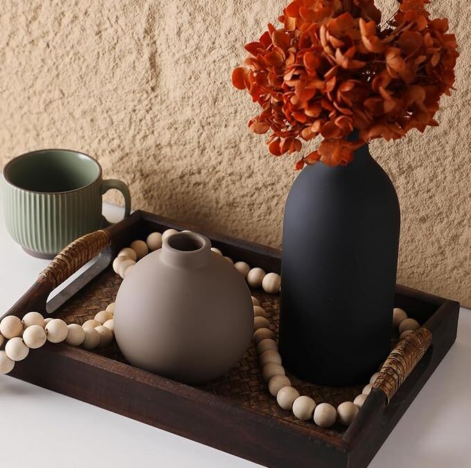
A creative home is less about being artistic and more about how a space makes you feel when you live inside it. The interior won’t chase trends; it will collect meaning, where there’s room for play, change, and imperfect beauty. But the question is…
What makes a creative home?
We’ve got your answer summed in four standout finds that bring meaning & personality to your space without spending a fortune 😉

Soft shapes & calm tones.
This ceramic vase set is one of those styling staples that sit perfectly everywhere.
A decor statement that’s toned down because of its neutral colors, but eye-catching because of its varied silhouettes.

Working around one of those in-between walls that’s too bare to ignore but too subtle for predictable decor? The gold wall sculpture solves it all quietly, with balance and restraint. Whether an entryway or an empty nook, it will add a sense of movement without overwhelming the space. You get that “designed on purpose” feel with very little effort.

Creative life homes pay attention to the details most people overlook. These wood salt and pepper shakers do exactly that. Sculptural, tactile, and warm, they turn a basic tabletop essential into something worth displaying. Leave them out on open shelving or keep them front and center on the dining table for a natural, handmade feel.

Structure that’s still flexible.
Gallery walls don’t need to be complicated, and this lovely set proves it. You can display photos, prints, or sketches in a way that feels curated but not rigid. The adjustable rails let you swap artwork without re-drilling holes, so you can easily refresh the home with changing seasons 🤍
Share this story