At this year’s Small/Cool Experience, we asked 10 of our favorite designers to interpret 10 hot interior trends. Each designer had just 120 square feet, but what their rooms lacked in space, they made up for in style — and color. Whether classical or whimsical, warmly minimalist or gregariously maximalist, these rooms showed us that the right shades can transform the entire mood of any room. These five trends — all featuring colors from Behr® Paint, the official paint sponsor of Small/Cool — stood out for their ability to bring small spaces to life.
Liz Kamarul is known for her vibrant murals, so when we asked her to design the Bringing the Indoors Out trend room, she brought her paintbrushes! The result is a verdant leaf motif that brings her easy-breezy outdoor space to lush life. To create it, she used a palette of nature-inspired greens and oranges: Jojoba N390-3 by Behr Paint, Royal Orchard PPU11-01, Maple Glaze PPU3-16, and Canyon Dusk S210-4. The soft black of Broadway PPU18-20 adds shadow and depth. We love this exuberant design paired with the rounded shapes and soft tones of Liz’s furniture.
2. Desert Dreams for Days
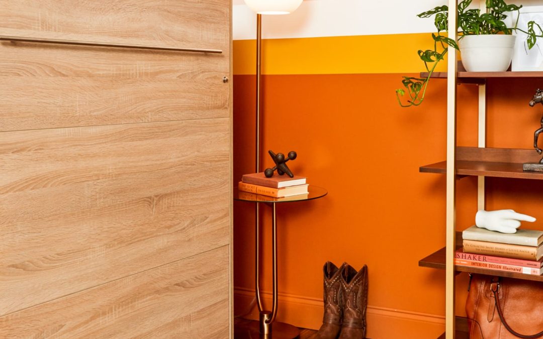
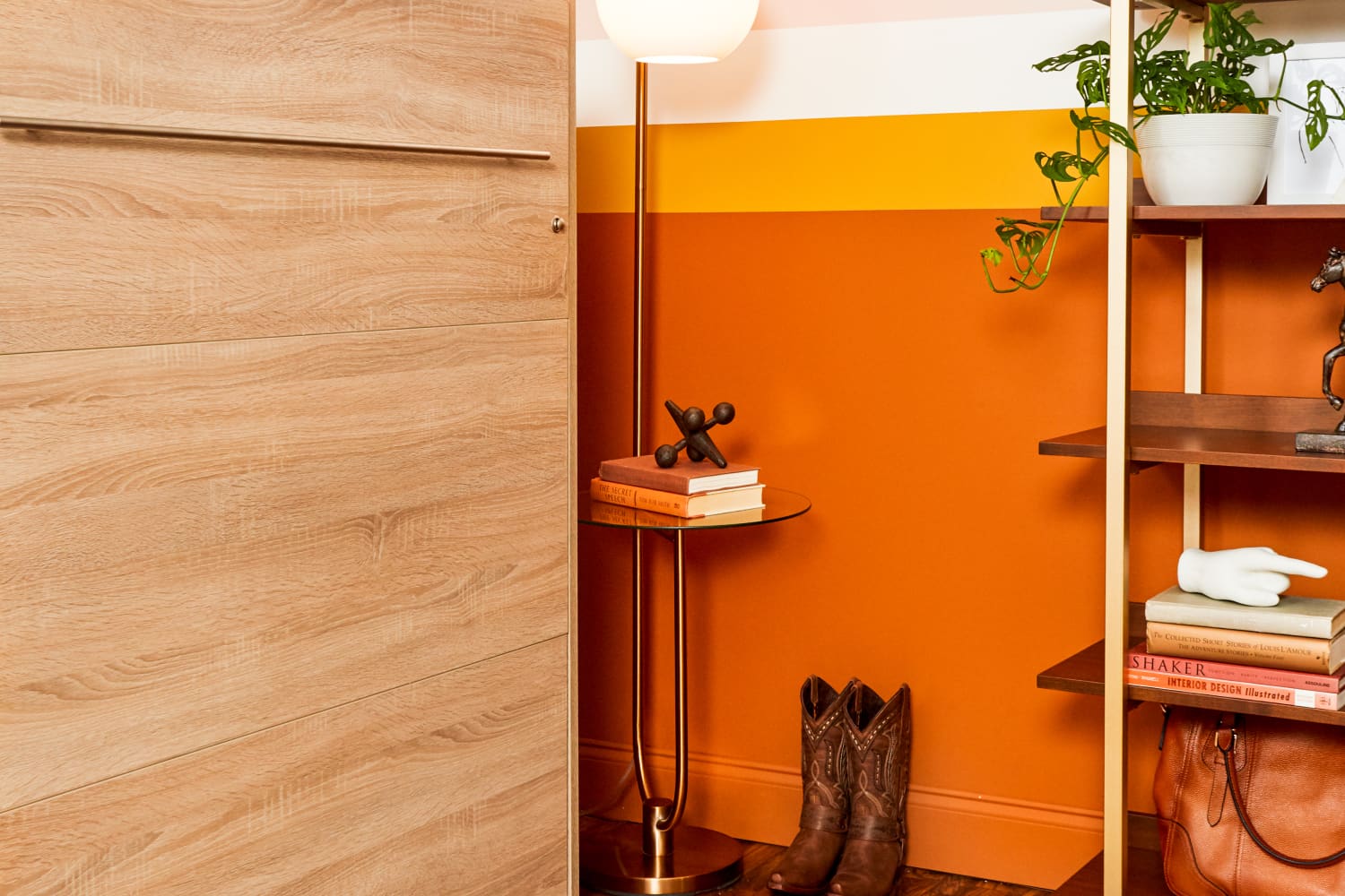
Desert everything is in right now — probably because desert tones conjure calming, peaceful energy. Home EC. founder Natalie Papier wanted her Flexible Spaces trend room to radiate creativity, versatility, and warmth. That translated to a cozy color combo that manages to be both energetic and tranquil. Her striped walls transition from soft pinks and whites to fiery, deep oranges: Seaside Villa S190-1, Ultra Pure White 1850, Saffron Strands PPU6-02, and Maple Glaze PPU3-16. The effect is like a desert sunset. Over in designer Liz Kamarul’s Bringing the Indoors Out trend room, botanical accents in Maple Glaze PPU3-16 and Canyon Dusk S210-4 make her space feel grounded.
3. Two Tones = Twice as Stylish
Why paint your wall one color when you could paint it two colors? It’s a double dose of brightness and a bold yet achievable design choice. To create the meditative, plant-filled Biophilic Beauty trend room, Dream Awake founder Estelle Bailey-Babenzien reached for natural colors and textures that both soothe and stand out. Her color-blocked wall colors, Canyon Dusk S210-4 and Nocturne Blue HDC-CL-28, are a captivating duo and a great way to draw your eye to the statement wallpaper. Speaking of statements: Memphis-based designer David Quarles IV took two-tone walls to the next level in his Make It Maximalist trend room by pairing blush botanical wallpaper with the earthy crispness of Saffron Strands PPU6-02.
4. The Richer the Red, the Better
We’re here to make the case for red walls. Red adds instant style, sophistication, and warmth. When we tasked Jaclyn Journey and Amanda Jacobs with the trend Moody Musings, and they delivered, well, a whole mood. The Louisville, KY, design duo drenched the walls in Cherry Cola S130-7, a luscious red that brings the drama to their personality-packed room without overwhelming it. Designer Michelle Fahmy worked similar magic in her trend room, The New Kitsch: Dark Crimson M140-7 made a rich, bright backdrop for her playful combo of old-new styles and patterns.
Blue walls are surprisingly versatile. They make a bold design statement, yet have a calming effect that lends plenty of coziness to any space. In her Classic Redux trend room, San Francisco designer Noz Nozawa wanted to put an eclectic spin on traditional style. She filled the space with quirky touches — like a leopard print ottoman and framed “boxes” of wallpaper on the walls — and anchored the whole look with a sophisticated color palette. Nocturne Blue HDC-CL-28 provides a refined backdrop, while Maple Glaze PPU3-16 is a rich, unifying color for Noz’s many frames. The final flourish? A playful peek of blue-green Caribe PPU13-01 on the trim.