
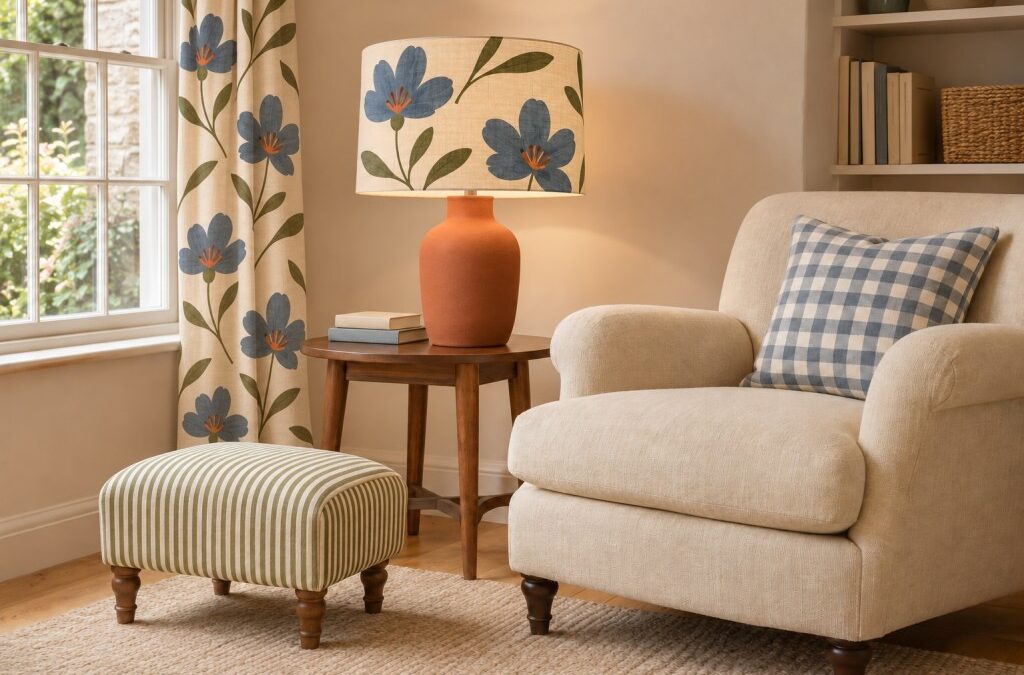
Ever wondered how you can mix patterns in your home more effectively? A striped armchair beside floral curtains. A checked cushion on a patterned sofa. A vintage rug bringing together colours that appear nowhere else as a complete set. Some of the most inviting rooms contain combinations that sound unlikely until you see them working together.
That is the appeal of pattern mixing. It brings movement, personality and a sense of discovery to a space, helping a home feel collected over time. You do not need a maximalist streak or a cupboard full of fabric samples to enjoy it, either. A little pattern can be enough to lift an otherwise quiet room.
The challenge is finding the right balance. Too much similarity can make a scheme feel flat; too many competing designs can leave your eye searching for somewhere to settle. The aim is to give different patterns a reason to belong together while allowing each one its own character.
Whether you are adding cushions to a living room or planning a room around floral wallpaper, these simple guidelines will help you approach pattern with more confidence.
Quick answer: How do you mix patterns successfully?
Start with one patterned piece you love, then choose two supporting designs that share a colour or a similar mood. Vary the pattern scale, combine flowing shapes with more structured ones, and include solid fabrics to create breathing space. Assess the combination across the whole room rather than expecting every item to match.
A useful starting point is a large floral, a medium check and a small stripe. Treat this as an experiment, not a decorating law: the most important rule is that the finished room should feel comfortable to you.
Start with something you already love

The best way to begin is with an actual object rather than an abstract list of colours. It could be a patterned rug, a favourite lampshade, a piece of pottery or a length of vintage fabric.
Look closely at what attracts you. Is it the faded blue background, the generous flowers, the uneven lines or the combination of olive and rust? Those details provide clues for the rest of your home décor.
Imagine a curtain fabric with loose blue flowers, green leaves and a warm ivory background. You could repeat the blue in a checked cushion, introduce a narrow green stripe elsewhere and use ivory upholstery to connect the different elements. Your starting piece does not have to contain every colour you will use. It simply gives the design process some direction.
If you are nervous about committing, start with something movable. Throw pillows, cushion covers and a small upholstered footstool are easier to experiment with than a sofa or a whole wall.
Build a colour palette with enough flexibility

Colour is often the common thread that makes various patterns feel related. The designs themselves might be very different, but a repeated shade helps the eye understand the connection.
Begin by identifying two or three main colors in your anchor piece. For a relaxed scheme, that might mean dusty blue, soft white and terracotta. A striped fabric, botanical print and woven check can sit comfortably together if they draw from that same colour palette.
Exact matches are rarely necessary. A blue-green floral pillow can work with a deeper teal stripe because both sit within a similar color family. Small variations often make a room feel more natural than perfectly coordinated fabrics.
When choosing a color palette, consider the background of each print as well as its decorative details. A cream-ground floral beside a brilliant white check can look unexpectedly disconnected, even when their blue motifs are similar.
An accent color gives you another useful connection. A small burgundy detail in a large print could reappear in a plain cushion, a striped lampshade or a ceramic bowl. You do not need advanced color theory to make this work. Start by repeating one common color in two or three places, then check whether the overall effect feels pleasing in your light.
A scheme based on primary colors can look lively and graphic, especially with simple shapes. For a softer result, try muted versions: inky blue, ochre yellow and brick red.
Understand pattern scale before buying anything

If there is one practical idea worth learning, it is how to combine different scales.
Pattern scale describes the size of a motif and how it repeats. Large-scale patterns might feature oversized leaves or broad, widely spaced checks. Smaller prints might contain tiny flowers, fine dots or closely repeated lines. When several designs have similar-sized motifs and similar spacing, they can compete for attention. Changing the scale of each pattern helps give them distinct roles.
For example, combine:
- A large-scale print on curtains.
- A medium check on an armchair.
- A small pattern on a cushion.
This is a simple formula for creating variety without introducing endless colours. However, size is only part of the story. A large pattern with soft edges and muted colours may feel quieter than a tiny black-and-white check. Contrast, spacing and how much surface the pattern covers all affect its visual weight.
Look at samples from across the room. Intricate patterns that seem busy close up may merge into a gentle texture at a distance. A small stripe can behave almost like a plain fabric once you step back. When judging the scale of the patterns, also consider where you will use them. A large scale pattern may lose its character on a tiny cushion if the cut shows only an isolated fragment of the design.
Combine different pattern families

One of the easiest ways to build an interesting mix of patterns is to vary their structure. Floral prints, leafy motifs and other organic patterns have curves, irregular outlines and a sense of movement. Stripes, checks and geometric prints bring a more ordered rhythm.
Put the two together and each can help clarify the other. A neat ticking stripe gives loose flowers something structured to sit against; a trailing botanical softens an angular geometric pattern.
Useful combinations include:
- Large florals with a narrow stripe and a small check.
- A block-printed leaf design with polka dots and plain linen.
- A broad check with an abstract brushstroke print.
- Restrained animal prints with stripes and textured upholstery.
You do not need one of everything in a single room. Choose two or three pattern families, then see whether they provide enough variety.
Geometric shapes are particularly useful when a scheme already contains lots of curves. Try geometric pillows on a floral sofa, or a checked blind in a bedroom with a leafy quilt. The shapes should still have a relationship in mood. A crisp optical print may feel jarring beside delicate faded roses, unless you deliberately repeat its sharper colours or graphic character elsewhere.
Give one pattern the leading role

Rooms often feel easier to understand when one design acts as the focal point. That might be bold florals on curtains, a statement rug beneath the seating area or wallpaper behind a bed. Supporting patterns can then be smaller, quieter or used over less surface.
A bold print does not have to be the brightest thing in the room. Large, sweeping branches in soft olive can command attention through their size alone. Before adding another design, decide whether you want it to support the main feature or compete with it. In most everyday schemes, a hierarchy helps create visual balance.
If your area rug contains an energetic mix of coral, indigo and cream, nearby fabrics could pick up those colours in simpler arrangements. A narrow stripe and a softly mottled weave will let the rug retain its presence.
You can also reverse the approach. Keep the floor quiet and use bold patterns on accent chairs, allowing the chairs to become the room’s main event.
Use plain fabrics as part of the composition

Plain surfaces are active ingredients in a patterned room. They provide contrast, make individual motifs easier to appreciate and give the eye somewhere to rest.
A sofa upholstered in a solid colour can accommodate several patterned cushions. Equally, a patterned sofa often benefits from cushions in solid colors that pull out shades from its fabric. Solid fabrics need not look flat. Linen, brushed cotton, wool and velvet introduce texture without adding another obvious motif.
Think about distribution, too. A plain sofa will not necessarily calm a room if every surrounding wall, window and floor surface carries a busy design. Try alternating patterned and quieter areas as your eye moves around the space: printed curtains, a calm wall, a textured chair, then a patterned footstool.
Neutral colors are useful here, but quiet does not have to mean beige. An olive sofa or deep blue wall can provide a restful block of colour within a lively color scheme.
Experiment with cushions before making bigger changes

Cushions offer an easy way to test pattern combinations in real life. Begin with three different designs rather than buying several near-identical cushions. For example, try a floral pillow, a plaid pillow and a plain textured cushion on a simple sofa. Check that their sizes suit the furniture and that you can still sit comfortably. Styling should make a room more enjoyable to use.
A practical arrangement might include a larger floral cushion at one end, a smaller check in front and a plain rectangular cushion elsewhere. There is no need to repeat the grouping symmetrically.
If you prefer a tidier finish, use a matching pair at opposite ends and introduce a different centre cushion. Matching patterns can provide useful repetition; the problem arises only when everything looks excessively coordinated.
Photograph the arrangement from the doorway. Images often reveal that one cushion dominates, two prints blur together or a repeated shade needs to appear elsewhere in the room.
For more tips, check out how to layer cushions and throws on a sofa.
Make patterned rugs work with the furniture

A rug covers a substantial area, so its effect extends beyond the floor. Before choosing one, consider the existing upholstery, curtains and sightlines. A patterned rug can connect colours scattered around the space, but it can also introduce an entirely new visual rhythm.
With a floral sofa, a plaid rug offers a structured counterpoint. If both designs are strong, look for a common element such as cream backgrounds or shared blue details, and vary their scale. A faded rug with closely packed motifs may read as a soft field of colour. A high-contrast rug with oversized diamonds will usually be more assertive.
Think about which parts will remain visible beneath the furniture. An elaborate central medallion may disappear under a coffee table, while a strong border can remain an important part of the overall look.
The easiest way to assess a potential rug is to view it alongside fabric samples, then imagine the visible area rather than the entire product photograph. You can also check out our guide to choosing a floor rug.
Approach floral wallpaper as part of the whole room

Floral wallpaper can look wonderfully fresh when surrounding fabrics offer a change of rhythm. If the wallpaper has large florals, try a compact check on the bed or a narrow stripe at the window. Use plain bedding or upholstery to separate the busier surfaces.
Avoid assuming that every new fabric must reproduce the wallpaper’s full colour scheme. Picking up one leaf colour or the background tone can be enough. For instance, a wallpaper with blue flowers, green stems and a warm cream ground could work with cream-and-green striped curtains and a plain blue headboard.
Pay attention to placement. Patterned curtains sit directly against wallpaper, so that pairing deserves closer scrutiny than a cushion across the room. Bring samples together at their intended location and examine them in daylight and under evening lamps. The relationship between colours can change as the lighting shifts.
Mix stripes, checks and geometric designs thoughtfully

Structured patterns are versatile, but combining several demands a little attention to direction and spacing. A vertical stripe on curtains draws the eye upwards. A checked cushion or rug introduces lines running in two directions. Together, they can create a pleasing framework for softer prints.
Vary the line thickness as well as the motif size. Two closely spaced stripes of similar weight may look unintentionally mismatched, whereas a broad stripe and fine ticking usually have clearer individual identities. Geometric prints can also appear more subtle than expected. A tonal diamond weave may behave like texture; a sharp black-and-white chevron is much more forceful.
When you mix patterns from this family, look for variation in contrast, openness and direction. You may only need one softer design to stop the arrangement feeling overly rigid.
Try neutral patterns for a quieter result

Pattern play does not require bold colors. Neutral patterns in cream, charcoal, oatmeal and soft brown can add considerable depth while keeping the space feel calm. A generously spaced check, a fine stripe and a softly drawn botanical can work beautifully within a limited palette.
The important distinction is between colour and activity. A room can contain very little colour but still feel busy if every surface has a tight, high-contrast repeat. To keep a restrained scheme comfortable, combine different sizes of motif and include open space within the designs themselves.
Texture becomes especially useful when colour is limited. Pair a smooth printed cotton with a woven wool check and relaxed plain linen. These layers of pattern and texture help prevent a neutral room from feeling one-dimensional.
Bring vintage fabrics into contemporary rooms

Vintage fabrics introduce a sense of history that newer pieces cannot always replicate. A cushion made from an old embroidered textile, a faded quilt or a second-hand checked chair can sit comfortably beside modern furniture. The connection might be colour, shape or simply a shared relaxed quality.
Look beyond the apparent period of each piece. A traditional floral and a contemporary abstract may both contain loose, painterly edges. A vintage plaid and a modern geometric may share the same strong rectangular structure.
Instead of forcing everything to match, choose one unifying color and repeat it elsewhere through a plain lampshade, artwork or throw. That small connection allows pieces from different periods to feel related.
Check the condition and suitability of older textiles before using them for demanding upholstery. A delicate fabric may be better suited to a decorative cushion than a frequently used seat.
Adapt the approach to each room

In the living room
Spread pattern around the room rather than concentrating every print on the sofa. A checked chair, patterned curtains and two well-chosen cushions can create a cohesive look with relatively few pieces.
Consider adjoining spaces, especially in an open-plan layout. You do not need identical fabric patterns throughout, but repeating a colour can connect the areas.
In the bedroom

Begin with the bed, wallpaper or curtains, then allow the remaining surfaces to support that choice. A striped duvet cover can work with a floral headboard and a small checked cushion. If all three feel equally assertive, simplify the bedding or add a plain coverlet.
In a small room
Small spaces can handle a multitude of patterns, but the result depends on the atmosphere you want. For an enveloping effect, repeat colours across wallpaper and fabrics. For a more open impression, leave some surfaces quiet and choose patterns with more visible background.
A large-scale print is not automatically unsuitable for a compact room. Generously spaced motifs can feel less restless than dense miniature designs.
In the dining room

Upholstered seats, curtains and table linen offer opportunities to experiment. A patterned tablecloth is particularly useful because you can change it without altering the permanent scheme. Try a large print on the table with plain napkins, or a simple check with loosely floral plates.
Troubleshoot a combination that feels wrong

If you want to make a room look calmer, pause before buying anything else. Rearranging or removing one piece may be enough.
Ask yourself what is competing. Have you used a lot of patterns at the same scale? Are several bright colours appearing only once? Does every design have hard edges and strong contrast?
Try one adjustment at a time:
- Replace one busy cushion with a plain textured version.
- Repeat an isolated colour somewhere else.
- Move two similar-sized prints farther apart.
- Introduce a larger, more open design.
- Remove a pattern that adds neither contrast nor connection.
If you want lots of pattern, you can still create order through repeated backgrounds, consistent colour intensity and clear differences in scale.
Interior designers and professional designers often evaluate combinations by laying samples together and viewing them in the actual space. Borrow that habit for your own home: test first, step back and let the room tell you what needs adjusting.
Let the mix develop over time

There is no universal ratio that guarantees successful home decor. A simple rule such as combining one large, one medium and one small design can help you get started, but it cannot account for every fabric, room or personal preference.
The most satisfying schemes usually have both connection and variation: a shared colour alongside different shapes, a confident print beside quiet texture, or a familiar check enlivened by something unexpected. Start with one combination you enjoy. Live with it, move things around and add another layer only when it contributes something.
Pattern mixing should make your home feel more expressive and comfortable. Once you understand how colour, scale and placement work together, you can move beyond matching sets and build rooms with a character that is unmistakably yours.
Related
<!–
–>