Few colors feel as naturally inviting as blue and green do together in a single space. Like all hues on the color wheel, these two have range — and they don’t always have to be limited to coastal vibes, either (take Behr’s Color of the Year, Hidden Gem, for example!).
The perfect blue-green color palettes, in my opinion, strike a balance of blending the calm of cool blue with the grounding (and at times, punchy) energy of green. It’s no surprise that these colors are a favorite among designers and color-lovers alike — especially when you’re looking for paint colors that bring both personality and peace to a room. Whether you’re choosing paint for your living room or refreshing an entire home, blue and green are versatile colors that look good almost anywhere.
As a professional color analyst, I use color psychology to help create spaces that just feel right — and in this case, blue tones are linked to clarity and calm, while green promotes balance and restoration. If you need help finding your ideal combo, a color palette generator can offer a quick assist; or keep scrolling for real-world inspiration and expert-approved paint picks.
From breezy aquas to moody teals, here are some of the best blue-green paint combinations to try if you’re dreaming of a cool color palette that feels warm and welcoming.
Why do blue and green colors work so well together?
Blue and green are neighbors on the color wheel, which makes them natural harmonizers. But their magic goes beyond color theory. Look outside and this duo appears everywhere in nature, which, according to Ashley Banbury at HGTV Home by Sherwin-Williams, may be why it feels so comforting in the home.
“When paired together, blue and green hues evoke a sense of serenity and restoration, which is why they’re so impactful in interior spaces,” she explains. “Teals and sage greens are dominating current trends as consumers seek calm, grounding environments that also feel elevated and timeless. These colors not only bring a soothing quality to a room, but also reflect a desire to feel more connected to the earth, and to our homes.”
Other designers, like Sarah Kuchar of Kuchar Studio, admire these colors because blue-green palettes extend beyond just trendy choices. “They tap into deeper feelings of well-being and tranquility, making them ideal for a wide range of clients,” she adds.
The real takeaway here? Blue and green colors look good, but make you feel good too.
The 8 best paint color combos to use in a blue and green color palette
If you’ve been dreaming of painting your walls in a blue-green color, why not consider trying both in your home?
Sarah Trop, interior designer and founder of New York-based FunCycled, believes that using high-contrast color combinations — including blue and green — is one of the most effective principles in interior design.
“My favorite blue and green pairings are those that provide high contrast and, in many cases, remain subtle expressions of blue or green. These palettes bring depth, visual interest, and balance to a space,” she adds. “When executed with intention, it never goes out of style.”
Below, these designer-approved combinations help to create effortless flair in any space.
Benjamin Moore’s Cedar Mountains and Healing Aloe
For a subtle look, Trop suggests using Benjamin Moore’s Cedar Mountains, a timeless blue-green, with Healing Aloe, a soft green with gray undertones. “The combination provided a blend for earth tones with ethereal vibes, and together, they echo natural elements and pairs such as moss and mist.”
Benjamin Moore’s Westcott Navy and Ice Cap
Take a page out of Trop’s playbook and opt for a high-contrast pairing, like Benjamin Moore’s Westcott Navy and Ice Cap. “These work well because the outcome is a refined contrast in saturation but a shared cool undertone, pairing a rich navy with the frosty quality in Ice Cap.”
HGTV Home by Sherwin-Williams’ Quietude + Delft
If you’re looking into kitchen designs, Banbury suggests Quietude and Delft — they’re both cool tones that sit close on the color wheel to create a harmonious pairing. “Quietude brings a soft, serene vibe, while Delft adds depth and richness, grounding the space without overpowering it,” she adds.
Benjamin Moore’s Gentleman’s Gray and Palest Pistachio
Sometimes those “barely there” colors are the ones that surprise you the most, like Benjamin Moore’s Palest Pistachio, a very soft shade of blue, paired with the moody hue Gentleman’s Gray. Trop likes that this pairing provides a touch of drama, adding, “What I particularly love about these is that they create a refined tension that feels elevated.”
Benjamin Moore’s Van Deusen Blue and Steamed Spinach
HGTV Home by Sherwin-Williams’ Quietude + Rocky River
This pair is on Banbury’s go-to list for bedrooms and living spaces. “Quietude is a softer sage green, and Rocky River is a richer hue, meaning this duo creates a luxurious, layered look that feels both calming and refined.”
Benjamin Moore’s Antiqued Aqua and Iguana Green
For an even more tropical-inspired pairing, Benjamin Moore’s Antiqued Aqua brings in the beauty of aquamarine, while Iguana Green brings in the vibrancy similar to the reptile it’s named after. The duality between the two shades is what makes it work so well.
PPG’s Annapolis Blue + Dill
Finally, Ashley McCollum, color marketing manager at Glidden, recommends pairing a darker, almost twilight-toned blue with a more subdued green — namely, PPG’s Annapolis Blue and Dill — for a combination that feels unexpected but not overpowering.
“These colors echo a grounded, earthy atmosphere while remaining modern and on trend,” she explains.
6 tips for designing your space in a blue and green color palette
Regardless of the particular hues you choose, there’s an art form to layering this color combination in any given space. Here are six ways that design pros use a blue and green color palette to create stunning interiors.
Choose a dominant hue to anchor the space.
You may have heard of design tips like the 60-30-10 rule, which suggests that 60% of a room should be one dominant color. But when it comes to using blue and green at home, Trop suggests adopting the same rule by determining whether blue or green will be your dominant color — and then layering in complementary shades throughout. She believes that thoughtful layering and restraint “are key to designing a home that feels cohesive and restorative.”
Consider the mood you’re looking to evoke in your home.
As a color consultant, one of the first questions I ask my clients is, How do you want to feel in this space? It’s a simple-yet-effective way to narrow down your color palette. Interior designer Kathy Kuo also uses this method. “Consider the kind of mood and atmosphere you’re looking to evoke in your home,” she says.
Kuo also asks about the aesthetic her clients try to achieve. “Do you prefer a soothing environment with a coastal-inspired design? If so, go with light, calming colors like pale blue and seafoam green,” she explains. “Is a French country aesthetic more in line with your taste? Choose hues like olive green and powder blue.”
Or if you’re looking after a jewel-toned room? “In that case, pair rich emerald green with deep marine blue,” she adds.
Mix and match tones as well as textures to create a balanced space.
The key to creating a space that feels dynamic and well-rounded is simple: mixing and matching different materials.
“Vary the tones and textures — mix deeper, dustier hues with lighter or warmer ones to avoid a flat look,” shares Paulina Hospod, president of AhA!interiors. “Natural materials like wood, metal, or linen help ground the palette,” she adds.
Find the best tertiary accents to add to your palette.
If the unexpected red theory has taught us anything, it’s that sometimes a color looks best where it’s least expected. This is something to consider in blue-green palettes, too.
“When working with a blue-green foundation, look across the color wheel at their complementary colors to incorporate unexpected accents to round out the palette and add personality to a space,” says Banbury.
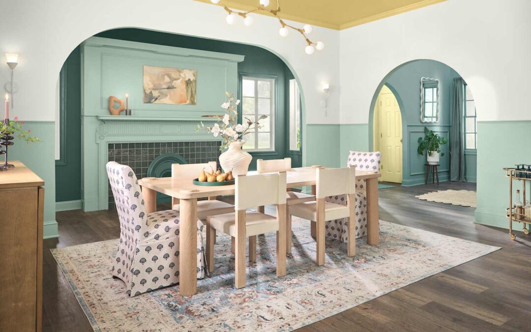
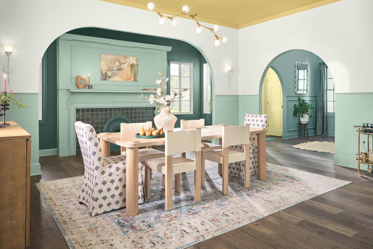
As for her recommendation for tertiary pairings in blue-green color palettes? “Fresh golden yellow hues create moments of surprise and joy.”
Make sure your colors flow from room to room.
As someone who gets very excited when designing a room’s palette, this tip is crucial. You should take time to zoom out and consider the flow of the entire home, considering the palettes in play beyond the room at hand.
Andrea Sinkin of Andrea Sinkin Design has a tried-and-true trick for this. “I always look at the sight line — when you stand in one position and see what your view is through different rooms,” she explains. “Everything needs to flow from one space to the next, and it’s important to repeat colors, like an invisible stream moving through.”
Don’t feel as if you must go too matchy-matchy with your colors.
Design pros talk about balance a lot when it comes to color, but interior designer Cathy Hobbs would like to make a case for a little imbalance, too. “When it comes to incorporating blue and green into one’s decor, I would suggest having a bit of a color imbalance so as not to create an overly ‘matchy matchy’ color palette.”
She recommends that, instead of having a 50-50 design intent, to opt for “a sprinkling of various shades of green and blue throughout, using neutral furniture pieces as the foundation for the color palette.”