Interior designers are notoriously hard to shop for , not because they’re picky, but because they spend their lives surrounded by beautiful things and therefore have a sharp eye for quality, texture, and timeless style. If you want to surprise the designer or design-lover in your life, these 15 Days of Design Gifts bring together stylish, functional, and thoughtful pieces they’ll actually appreciate. Each gift below is something that designers commonly use in their own homes or styling projects, and everything is shoppable right from Amazon or Wayfair.
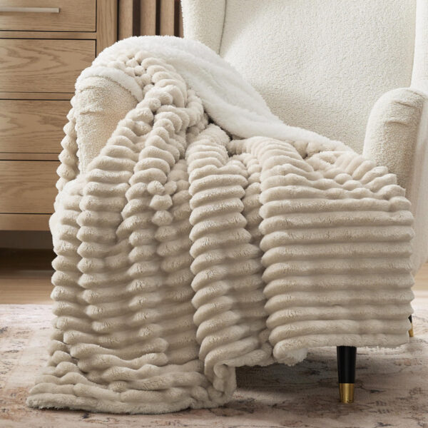
A luxurious throw blanket is one of the easiest ways to elevate a room, and designers adore pieces that add instant warmth and softness. A textured throw in a rich neutral , like camel, charcoal, ivory, or olive , is something they can drape over a sofa, bed, or accent chair to tie a space together. Throws also make styling effortless because they add depth without overwhelming a room. A designer will appreciate the versatility and the way it blends seamlessly into many aesthetics.
This modern touch table lamp is a thoughtful gift because it blends functionality with minimalist design in a way interior designers appreciate. With a simple tap to adjust brightness (3-way dimmable) you get high, medium or soft light, making it ideal for reading, working, or relaxing. The sleek base and clean shade allow it to sit effortlessly in a variety of décor styles,from modern to transitional,without imposing a strong personality. It’s the kind of piece that elevates a side table, nightstand or console, while being genuinely useful (not just decorative). The recipient will appreciate the ease of use, the good scale and the fact that it can live in many settings.
These pinch-pleated linen-blend curtains are a beautifully practical gift that a designer will genuinely use and appreciate. The texture of the linen mix gives depth and a subtle natural feel to a space, while the classic pinch-pleat header makes them look tailored and polished. Because curtains often set the tone for height, proportion and fabric layering in a room, gifting high quality panels shows you understand both beauty and function. They work whether you want to soften light, add elegance to windows or create a cozy, finished backdrop for furniture. A considerate gift for someone who cares about how spaces feel and look.
A pillow is one of the simplest, most effective ways to refresh a sofa or bed, and this boucle pillow nails that balance of texture and restraint designers love. The tight, looped surface gives it a soft, sculptural look that pairs easily with linen, leather, or wood , exactly the palette many modern interiors use. Available in earthy neutrals and muted tones, it complements multiple styles without being trendy or loud. With a strong 4.7/5 rating across over a hundred reviews, it’s clearly hitting the mark with buyers who want both style and practicality. It’s the kind of gift that looks great now and still makes sense next season.
A beautifully crafted scented candle is one of the most effortless ways to elevate a room, and the Calyan Wax Co. Mahogany & Cashmere candles are a designer’s dream. With its rich blend of warm mahogany, creamy cashmere, and subtle sweetness, it fills a space with an inviting, luxurious aroma that feels both modern and comforting. The minimalist amber jar pairs effortlessly with a variety of interiors, from moody organic modern to bright Scandinavian spaces, making it a versatile styling piece for shelves, coffee tables, or bedside nooks. For a designer who understands the power of scent in shaping the atmosphere, this candle is more than fragrance, it’s an experience that softens, warms, and completes a room.
For interior designers, accurate color is everything , and the COLOR MUSE Colorimeter is one of those rare tools that feels like magic the first time you use it. This pocket-sized device instantly scans any surface and identifies matching paint colors, textiles, finishes, or materials, saving designers hours of guesswork. Its precision makes it incredibly useful during site visits, sourcing trips, or client presentations, where nailing the right hue can make or break a room. This is a thoughtful, professional-grade gift that elevates a designer’s workflow, helping them move from inspiration to execution with confidence.
Add instant greenery without the worry of watering or light conditions. This almost‑6‑foot faux olive tree brings height, texture, and a Mediterranean feel to a corner, entry, or office , which is exactly the kind of finishing touch designers often hunt for. Its slender branches, realistic leaves, and even small fruit create natural movement, and the compact pot footprint means it fits in tighter rooms. With a strong buyer rating of 4.7/5, it’s clearly appreciated for its lifelike look and easy display. For someone who loves a styled, layered room, it’s a gift that feels like a major upgrade, not a throwaway present.
The Alessi Pulcina Espresso Coffee Maker is more than a kitchen tool , it’s a sculptural design object created by famed designer Michele De Lucchi. Its striking geometric silhouette instantly earns a place on any countertop, blending Italian craftsmanship with architectural beauty. For designers who appreciate both form and function, this espresso maker delivers rich, barista-style coffee while doubling as a conversation piece. Its polished aluminum body, modern spout design, and iconic profile make it a gift that complements any creative studio, home office, or kitchen. This is the perfect blend of artistry and daily ritual, making it an unforgettable gift for any design lover.
This trio of half‑circle shelves is such a clever, graphic statement piece. Mounted together, they create a modern art installation that still holds objects,small vases, sculptures, books, or plants.It’s an easy way to add height or a focal point over a console, narrow hall, or desk,and because the shape is geometric, it works across styles from mid‑century to contemporary .Gifting this is about giving a tool for styling, not just décor. Designers can change the look daily: one shelf holds a candle, another an art book, the third a tiny plant. The shelf also solves a common challenge,adding display space without chunky furniture.
This 12-piece black melamine dinnerware set from Bzyoo is a brilliantly stylish gift for interior designers who want to merge durable functionality with design-forward aesthetics. The matte black finish gives each plate and bowl a sleek, modern edge that works beautifully in both indoor and outdoor dining spaces. Designers appreciate melamine because it’s lightweight and less fragile, which makes it ideal for styled shoots, client homes, and entertaining setups that may need to be moved or rearranged. The clean silhouette makes it easy to layer textiles, napkins, and glassware to create a cohesive tablespace. Gifting this shows you understand not just how a designer visualizes a space—but how they use it.
This modern hurricane candle holder turns a simple pillar candle into an elegant design moment. The clean black base paired with the tall glass cylinder creates beautiful verticality and adds warmth to any room. Designers love it for dining tables, consoles, and living room shelves where a touch of ambient glow enhances the mood. It’s also an easy piece to incorporate into seasonal décor,think holiday greenery, pebbles, or sand layered inside. A perfect gift for someone who appreciates sophisticated, atmospheric styling.
This full-length arched standing mirror from Latitude Run is a transformational piece for any interior designer’s space. With its graceful arch, full-body reflective surface, and slender frame, it serves both as a functional mirror and architectural statement. Whether leaned against a wall in a bedroom, positioned at the end of a hallway, or used to bounce light in a small studio, it instantly opens up the space, enhances depth, and adds elegance. For someone who spends their days thinking about scale, light, and finish, gifting a high-impact object like this mirror shows you understand the power of purpose-driven design.
This plush faux sheepskin area rug in soft beige tones is a luxurious gift for a designer who appreciates texture, comfort and layering. With its deep shag pile and gentle neutral palette, the “Malaiah” rug brings warmth and a tactile dimension to living rooms, bedrooms or cozy reading nooks. Interior designers often emphasize that scale and material matter, and this rug excels at both,it’s substantial enough to anchor furniture while the neutral hue ensures it integrates seamlessly with varied color schemes. Because it mimics the sumptuous feel of genuine sheepskin but is low-maintenance, it’s a smart, stylish choice for homes that need beauty without fuss.
This striking cocktail table from Andazodoc combines transparent glass and warm walnut finishes in a sculptural form that chefs of design will appreciate. The clear top gives the piece visual lightness,perfect for small living rooms or loft spaces,while the walnut base adds depth and texture, making it a standout anchored piece rather than a fading backdrop. A designer will love the way it keeps a room feeling open while still offering surface space to display books, coffee-table accessories, or a candle vignette. Gifting a coffee table like this signals you understand how key furniture anchors a space’s mood and layout.
This striking canvas print titled “Detour” by Isabelle Z is a perfect gift for someone who loves interiors with personality and polish. The piece features bold, abstract brush strokes in muted tones that create movement and depth without overpowering a space. The gallery-wrapped canvas makes it ready to hang, ideal for a designer who needs a statement piece with minimal fuss. Placed above a sofa, console or bed, it becomes the anchor that pulls together colors, textures and furniture elements. For someone who curates spaces rather than simply fills them, this print offers a clever blend of art-in-motion energy and refined aesthetic.
As we close out The 15 Days of Design Gifts, it’s clear that the best presents for interior designers are those that blend intention, creativity, and everyday beauty. Each gift on this list was chosen to support the way designers think, work, and live, whether through pieces that elevate a space or tools that spark inspiration. At Home Designing, we believe great design is built from thoughtful choices, and the right gift can become part of someone’s creative story. Keep exploring Home Designing for more curated ideas, design insights, and inspiration to help you create a home that feels meaningful, stylish, and distinctly yours.
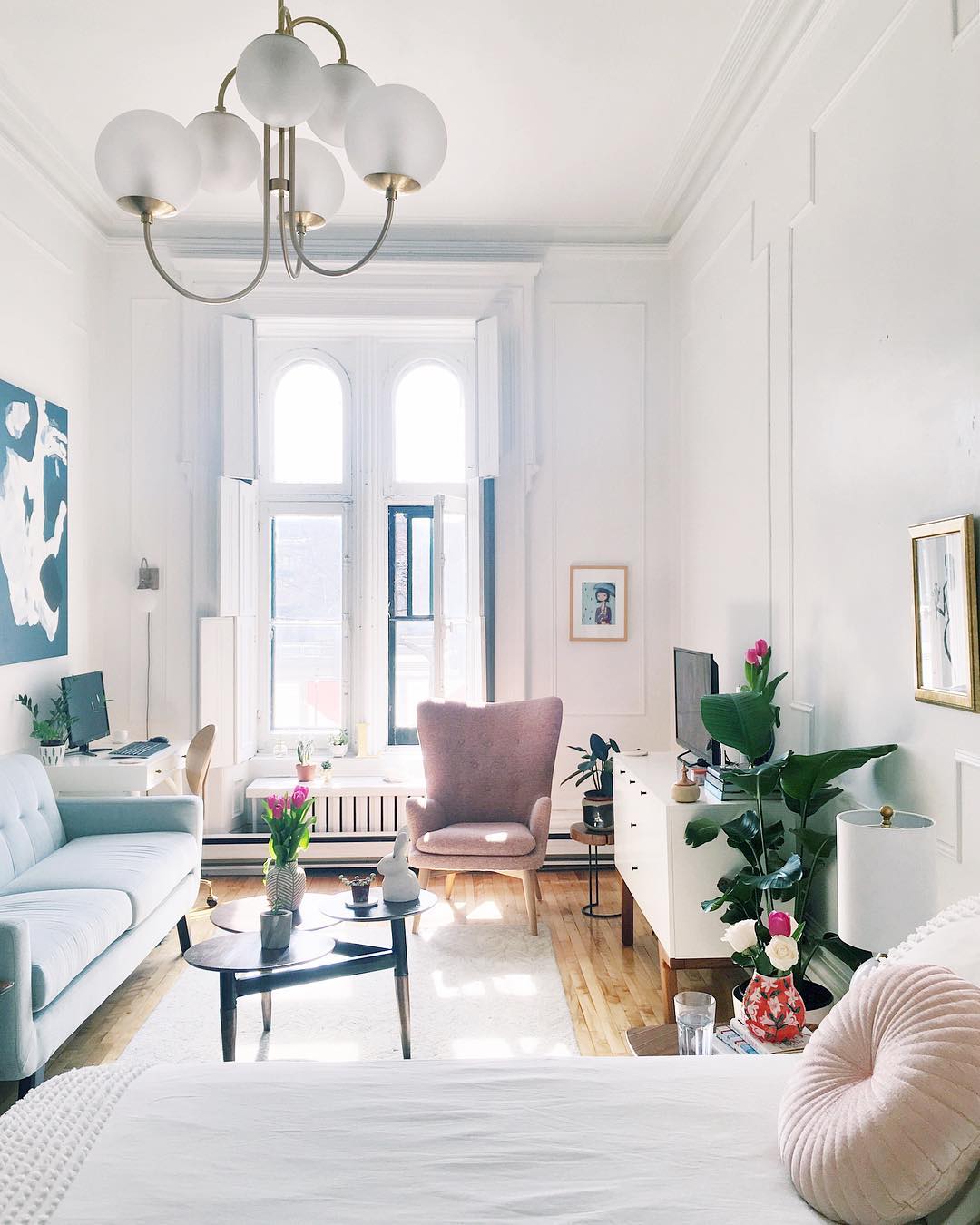
Small spaces aren’t limitations , they’re invitations. Invitations to design smarter, live lighter, and create homes that feel deeply intentional. Today’s micro-living movement isn’t about squeezing into tight quarters; it’s about discovering luxury in clarity, comfort, and creative possibility. From clever multifunctional layouts to materials that amplify light and mood, modern small-space design has become a study in effortless elegance. Less square footage doesn’t mean less beauty , it simply means every inch contributes to a life that feels curated, calm, and surprisingly expansive. Here are 19 thoughtful, human-centered ideas to help any compact home feel open, elevated, and undeniably luxurious.
Light neutrals create instant visual spaciousness. Soft whites, oat milk, pale beige, and cool greige open up the room while giving it a luxe, hotel-like feel. These tones reflect light gently, removing visual heaviness and creating an atmosphere that feels fresh. Layering neutrals, linen curtains, boucle seating, stone accents, adds subtle dimension without clutter. In micro-living, light palettes act like a quiet foundation, letting every surface feel airy and expansive.
Low-profile furniture helps small rooms breathe. Sofas with shorter backs, platform beds, or sleek armchairs create long sightlines, making ceilings appear higher. This proportion shift feels inherently modern and sophisticated. By lowering the visual center of gravity, the entire space feels more open. Pair low seating with taller accents, plants, lamps, artwork, to create balance. Together, they produce a luxurious sense of scale, even in tight quarters.
Windows are the most valuable feature in any small home, and treating them intentionally can make the entire space feel bigger. Keep window treatments light,think linen sheers, ceiling-mounted rods, or minimal blinds,to let daylight flow freely. Avoid bulky curtains or dark fabrics that visually “cut off” the room. Arrange furniture to frame the window rather than block it, allowing the eye to travel outward. When windows are unobstructed, the boundaries between inside and outside blur, creating a luxurious sense of openness far beyond the actual square footage.
Unused corners can become miniature sanctuaries that add both beauty and function. A single accent chair can create a reading nook; a floating shelf can form a micro-workspace; a small round table can transform an empty corner into a quiet coffee spot. Using corners wisely prevents the room’s center from feeling overcrowded. Corners also soften the layout visually, helping the space feel balanced and thoughtfully designed. In small homes, these understated micro-zones elevate daily living and maximize every inch.
A Murphy bed is one of the smartest, and most luxurious, space solutions for small apartments. Unlike sofa beds, Murphy beds allow you to keep a full, comfortable mattress without sacrificing floor space during the day. When closed, the panel can function as shelving, a desk, or artwork. When open, it becomes a cozy nighttime refuge. Murphy beds create visual harmony by keeping the room open when not in use, instantly making your living area feel twice as spacious.
If your home has an architectural niche,a recessed wall, alcove, or awkward pocket,turn it into built-in storage or seating. Built into the wall, these additions look intentional rather than improvised. A shallow niche can become a bookshelf; a deeper one can house a bench, bar cabinet, or desk. Because built-ins sit flush with the wall, they create a clean, streamlined look that expands the room visually. Luxury in small spaces often comes from this kind of tailored, architectural precision.
White paint is a classic small-space strategy for a reason, it expands light, erases shadows, and makes walls recede. But not all whites are equal. Soft whites with warm undertones feel inviting and luxurious, while crisp whites make the space feel modern and airy. Use white to open up narrow hallways, brighten dark corners, and create flow between rooms. It provides a clean backdrop that lets materials, fabrics, and greenery stand out without overwhelming the space.
Creating zones is essential in micro-living. Instead of thinking in terms of “rooms,” think in terms of “areas.” A rug can mark a living zone; a pendant light can define a dining corner; a tiny table beside a window can become a workspace. Zoning gives structure without walls, helping the home feel organized and intentional. When each area has a purpose and flow, the space feels larger, not because of square footage, but because of clarity and good rhythm.
Downsizing your dining table doesn’t mean giving up elegance,it means choosing a function that matches your lifestyle. Round tables save space and soften the layout. Drop-leaf tables expand only when needed. Slim rectangular tables work beautifully against a wall when not in use. Choose pieces with refined finishes, light wood, marble, textured stone, to keep the look luxurious. When your dining area feels proportional, the entire room opens up.
Clutter steals space faster than walls do. Keeping surfaces clear and limiting visible objects enhances openness and calm. Use trays to gather small items, baskets to hide necessities, and concealed storage to maintain order. A clutter-free home feels larger not because it physically is, but because the eye can move without interruption. Luxury in small spaces often begins with simplicity, a kind of visual quiet that makes the home feel airy and thoughtful.
In small homes, busy patterns or bold prints can make furniture feel bulky. Plain upholstery, linen, cotton, textured neutrals, keeps the room visually calm and unified. This doesn’t mean dull; it means refined. You can bring interest through cushions, throws, or accent pieces. Smooth upholstery helps furniture blend into the architectural space instead of competing with it, creating an elevated, serene atmosphere that feels luxurious rather than overwhelming.
12. Use Mirrors Intentionally for Illusion and Light
Mirrors are interior design’s oldest magic trick, and in small spaces, they’re practically necessary. A large mirror across from a window doubles the light instantly, making the room glow. Floor-length mirrors add height, while mirror-paneled furniture adds glamour and reflection without overwhelming. Using reflective surfaces strategically creates the feeling of depth, like your home has hidden dimensions. The trick is not to overuse them; one dramatic mirror often does more than four smaller ones.
Natural light is one of the most powerful tools for expanding a small space. Keep windows as open as possible by choosing sheer curtains, slim blinds, or ceiling-mounted rods that let light flow freely from top to bottom. Avoid placing tall furniture directly in front of windows, and use reflective surfaces—like light-colored walls, mirrors, or glass décor—to bounce daylight deeper into the room. The brighter the space, the larger and more luxurious it feels. In micro-living, maximizing sunlight instantly transforms compact rooms into airy, uplifting retreats.
Rounded furniture instantly softens a small space and improves the sense of flow. Curved sofas, oval coffee tables, and circular ottomans eliminate sharp corners that visually block movement or feel heavy in compact rooms. These gentle contours make the layout feel more fluid and inviting, while also creating a subtle sense of luxury. Rounded silhouettes are easier on the eye, giving the room a more open, effortless look. They also encourage better circulation within the space, allowing you to move naturally without navigating around harsh edges. In micro-living, curves add elegance and comfort in equal measure.
Painting the ceiling is one of the simplest yet most transformative ways to make a small space feel larger. A light-colored ceiling, soft white, warm cream, or pale greige, reflects natural and artificial light, drawing the eye upward and creating the impression of higher walls. For added sophistication, choose a shade slightly lighter than the walls to create gentle contrast without breaking the flow. This technique visually “opens” the room from above, making compact spaces feel airy, calm, and architecturally lifted without any structural changes.
Tall shelving is one of the most powerful tools for expanding a small space. By building upward instead of outward, you free up valuable floor area while dramatically increasing storage. Floor-to-ceiling shelves draw the eye upward, making ceilings feel higher and the room more spacious. Vertical shelving also doubles as a design feature,styling books, plants, baskets, and decor creates a curated, intentional atmosphere. Whether built-in or freestanding, tall shelves turn empty wall space into functional storage that elevates the aesthetic.
In small spaces, larger pieces often create a more expansive feel than many small items competing for attention. A single oversized artwork draws the eye upward and simplifies the wall, making the room look taller and more cohesive. Likewise, a generously sized rug anchors the layout and visually widens the floor, helping the furniture feel connected rather than scattered. These bold, scaled-up choices add drama, polish, and clarity, turning compact rooms into thoughtful, gallery-like spaces. Going big reduces clutter and amplifies the sense of luxury in micro-living environments.
A tonal color palette is one of the most effective ways to make a small space feel cohesive and expansive. Instead of mixing many contrasting shades, choose one base color, like beige, greige, oatmilk, or soft taupe, and layer lighter and darker variations of that hue throughout the room. This creates a smooth visual flow with no abrupt breaks, allowing the eye to travel easily from wall to furniture to décor. Tonal styling feels elevated, modern, and calming, giving even compact rooms a refined sense of unity and quiet luxury.
Wall-mounting the TV is one of the simplest ways to free up valuable floor and surface space in a small room. Instead of using a bulky media console, mounting the screen keeps the layout open and prevents the TV from becoming an oversized focal point. It also allows you to use the space underneath for seating, shelves, or décor, giving the room a lighter and more luxurious feel. Pair the TV with a slim mount or frame-style model so it sits close to the wall and blends seamlessly into the overall design. This small change can make the entire room feel more expansive.
Wrap Up
Micro-living doesn’t mean sacrificing comfort, when designed thoughtfully, small spaces can feel open, elegant, and deeply personal. Luxury in compact homes comes from intention: smart storage, light-filled layouts, and furniture that keeps the room breathing. With the right choices, even the smallest apartment can feel expansive and uplifting. At Home Designing, we celebrate the beauty of living well in every square foot, offering ideas that bring clarity, warmth, and modern style to real homes. Because true luxury isn’t about size, it’s about how a space makes you feel.
The days of cold minimalism are over. Today’s homes are wrapped in warmth , in colors that feel like quiet conversation rather than a statement. The new neutrals , mushroom, oatmilk, and greige , have emerged as the palette of calm sophistication. They are not about simplicity alone but about depth, texture, and life lived softly.
These tones blur the line between beige and gray, warm and cool, modern and timeless. They create spaces that breathe. They adapt to natural light, complement every material, and feel inviting no matter the season. Where stark whites once ruled, now we find layered softness , tactile, tonal, human. Here’s how designers , and real homes , are using the new neutrals to shape interiors that feel both grounded and modern.
Mushroom is the quiet hero of contemporary design. Nestled between gray and brown, it brings a subtle earthiness without heaviness. On walls, it softens edges and gives structure a gentle warmth. Mushroom pairs beautifully with white trim, brass accents, and warm oak floors. It adapts to light , cozy in low tones, elegant in daylight. Designers love it because it makes rooms feel lived-in instantly, like they’ve always belonged. Think of it as color that whispers, not shouts , timeless, tactile, and endlessly adaptable.
Oatmilk tones bring a velvety warmth that flat whites can only dream of. Somewhere between ivory and beige, oatmilk is the color of calm. It flatters any interior style , modern, rustic, minimalist , without looking flat. Use it for walls, upholstery, or cabinetry when you want softness without sweetness. Under morning light, it glows; by evening, it soothes. It’s the ideal backdrop for real living: warm, forgiving, and effortlessly elegant.
Greige finds its truest voice in the bedroom. It’s the color that quiets the mind , calm enough to soothe, structured enough to anchor. On walls, greige transforms with the light: soft taupe at sunrise, misty gray by nightfall. It pairs beautifully with white linen, sand-hued throws, and natural oak. Layering warm lighting or matte finishes enhances its tranquil depth. A greige bedroom feels cocoon-like yet elevated , a space where digital noise dissolves and rest feels intentional. It’s the new color of calm luxury: not indulgent, but deeply restorative.
Mushroom, oatmilk, and greige were made to coexist. Use greige as your foundation, oatmilk as your brightening tone, and mushroom as your accent depth. Together, they form a palette that feels cohesive, organic, and endlessly adaptable. A living room with oatmilk walls, greige furniture, and mushroom drapes will always feel balanced. The key is layering textures , linen, stone, and wood bring the palette to life. These neutrals don’t compete; they collaborate, like sunlight across different surfaces.
In kitchens, mushroom tones bring a sense of modern heritage , polished but natural. Try mushroom-colored cabinetry with brass or matte black hardware for balance. Pair with white marble or quartz countertops for a layered, textural look. Mushroom cabinetry bridges warm and cool tones effortlessly, so it pairs just as well with oak floors as with gray stone tiles. It feels neutral but never plain , the visual equivalent of steamed milk: rich, creamy, and endlessly comforting.
Blonde woods , oak, ash, beech , are perfect partners for the new neutrals. They catch the light and amplify warmth without overpowering it. Whether in furniture, flooring, or cabinetry, light wood complements mushroom walls and greige upholstery effortlessly. It ties spaces together with a natural continuity, grounding the palette in organic calm. These tones remind us that comfort can be modern , and that wood’s raw grain still feels like the heartbeat of home.
In bathrooms, greige feels like a modern sanctuary. Use it on tiles or walls for a soft, mineral-inspired look. Combine it with brushed brass or matte black fixtures, and add oatmilk towels or mushroom-hued accessories for warmth. The color reflects natural light beautifully, creating a spa-like atmosphere that feels both minimal and indulgent. It’s the perfect shade for spaces designed around wellness and quiet reflection.
The rise of tactile, natural finishes has given the new neutrals even more dimension. Limewash walls, clay paint, or plaster textures catch light differently throughout the day, revealing tonal depth. A mushroom limewash can look taupe at dawn, gray at dusk. These finishes echo earth’s imperfections , irregular, raw, authentic. They make modern homes feel soulful, grounding color in touchable materiality.
Lighting is the secret ingredient of the new neutral palette. In bright daylight, oatmilk and greige expand a space; at dusk, mushroom adds mood and depth. These tones shift beautifully under warm, diffused light. Avoid harsh white bulbs , instead, choose soft LEDs or amber-toned lamps that mimic sunlight. Let shadows play across plaster, fabric, and stone. This dynamic relationship between color and light gives interiors their poetry. The home becomes alive, responsive , a place that changes with the time of day and your own rhythm of life.
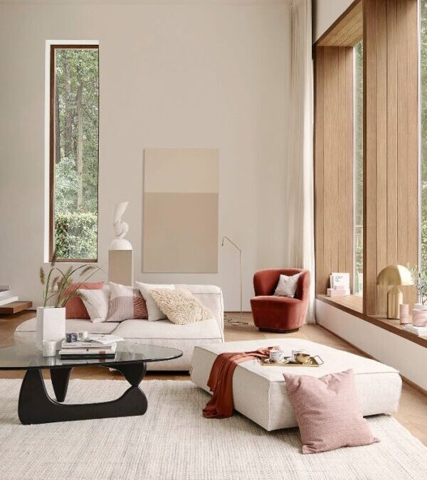
Beige has made a graceful comeback , softer, sandier, and infinitely more layered. Today’s beige living rooms are not sterile boxes; they’re cocoons of warmth and light. The secret lies in depth , mixing tones like almond, oatmeal, and warm linen. Pair textured walls with boucle sofas, rattan accents, and matte ceramics to give the space tactility. Natural light deepens its beauty, turning beige from background to atmosphere. When done right, a beige living room doesn’t feel blank , it feels balanced. It’s the color of calm conversation, slow mornings, and sunlight that lingers just a little longer.
Soft green is emerging as one of the freshest “new neutrals,” and when paired with beige, it creates harmony that feels alive yet grounded. Think sage walls meeting oat-toned upholstery, or mint-tinted drapes beside a sandy plaster finish. This duo bridges nature and nurture , green brings freshness, beige brings warmth. Together, they form a palette that feels restorative, like sunlight through leaves. Perfect for bedrooms, kitchens, or calm creative corners, this combination breathes without overwhelming. It’s nature, translated into color , earthy, elegant, and quietly optimistic.
Blush has evolved beyond its pretty stereotype. Today’s blush , diluted with beige or clay undertones , behaves like a neutral, radiating warmth without demanding attention. Used as a main color, it creates rooms that feel serene, tactile, and modern. A blush wall paired with natural oak, brass details, or oatmilk linen reads sophisticated rather than sweet. Under sunlight, it glows softly; under lamplight, it deepens to warmth. It’s perfect for those who crave color with calm , emotional yet understated, romantic yet rooted in real life.
Yellow is finding its quiet side again, especially when paired with beige. Together, they create a mood that’s radiant but never loud , like early morning light warming soft sand. Mustard cushions on a beige sofa, or pale ochre walls with oatmeal curtains, infuse a space with optimism and comfort. This pairing works best with natural textures , woven jute, linen, and wood , keeping it grounded. Yellow adds spirit; beige adds structure. The result is an uplifting palette that feels like bottled sunshine: gentle, balanced, and full of quiet joy.
You don’t have to stop at neutrals. These tones love companionship. Pair mushroom with olive, terracotta, or rust for earthy contrast. Oatmilk thrives next to sage, powder blue, or blush tones. Greige works beautifully with charcoal, amber, or soft gold. These accents keep the palette alive and give your home a sense of personality without overpowering its calm. Think of them as whispers of color , not competing, just completing.
Greige is the ultimate productivity color , balanced, steady, and quietly inspiring. It creates a calm backdrop that supports focus without feeling stark. On walls or built-in shelving, greige pairs effortlessly with black, oak, or brass accents. For warmth, add oatmilk textiles , a soft rug or linen curtains. Mushroom accents (a chair, lamp, or wooden tray) add grounding depth. The result is a workspace that feels both composed and comfortable , sophisticated without trying too hard.
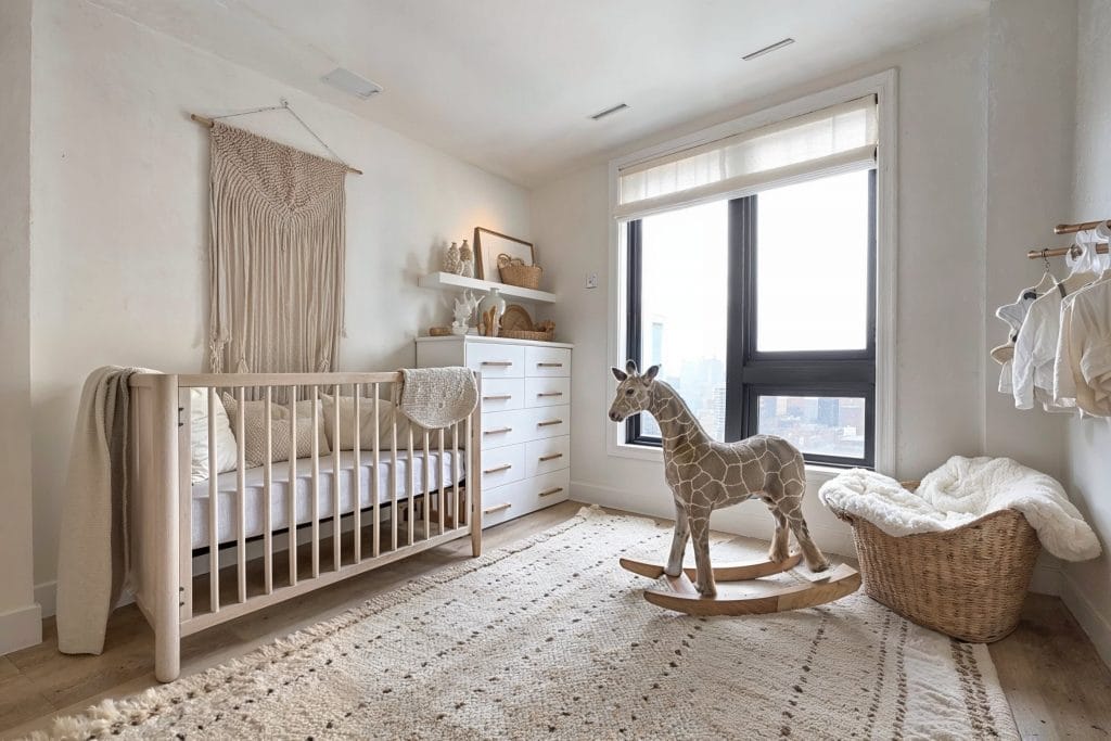
For nurseries, oatmilk is pure comfort , warm enough to soothe, soft enough to age beautifully as your child grows. It feels nurturing without being overly “babyish.” Use oatmilk on walls and mix in greige or blush for accent furniture and fabrics. Add natural textures like wool rugs and wooden mobiles to keep the space tactile and organic. In daylight, the color glows; at night, it feels cocooned and calm. Oatmilk makes a nursery feel like a cloud , gentle, timeless, and full of warmth.
Finishing Notes
The new neutrals – mushroom, oatmilk, and greige , are more than color trends; they’re a new design philosophy. They replace the starkness of white with warmth, the coolness of gray with comfort, and the monotony of beige with depth. In real homes, they bring balance , grounding spaces, softening light, and connecting rooms through quiet continuity. At Home Designing, we celebrate interiors that feel both timeless and personal. These hues remind us that sophistication doesn’t have to shout; it can whisper , through texture, tone, and the kind of calm that only thoughtful design can create. Because true beauty lives not in contrast, but in harmony.
Every generation leaves its mark on design, but Gen Z isn’t just updating the look , they’re rewriting the rules. For them, design isn’t about polished perfection or legacy norms. It’s about authenticity, individuality, and meaning. They grew up with limitless inspiration at their fingertips and a world in flux outside their windows. So, their design language is both bold and deeply personal , fluid, emotional, and unafraid to challenge what came before.
Where past aesthetics were defined by minimalism, luxury, or tradition, Gen Z’s style thrives in contradiction: nostalgic yet futuristic, playful yet political, digital yet handmade. It’s an era of color, imperfection, rebellion, and purpose , a design movement born not in studios, but in bedrooms, online communities, and hybrid workspaces. Here’s how the new generation of designers is doing things differently , and what we can learn from their evolving creative code.
Gen Z designers create to express, not impress. Their work celebrates personality over polish , imperfections, quirks, and raw textures are deliberate choices, not mistakes. Spaces and objects often reflect layered stories rather than coordinated palettes. It’s about who they are, not what’s trending. Design becomes self-portraiture: gender-neutral, fluid, emotionally honest. Their rooms, interfaces, and art speak a language of individuality, rejecting the pressure to fit into a single aesthetic box.
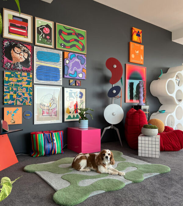
Gen Z designs for happiness first, and dopamine décor turns that mindset into a visual language. It’s about creating spaces that spark joy through color, texture, and spontaneity rather than following strict design rules. Think bold pastels, playful furniture, and unexpected pattern pairings that lift the spirit as soon as you walk in. A neon lamp beside a floral sofa or a cobalt mirror against a soft peach wall tells a story of confidence and fun. Every choice feels intentional yet free. For Gen Z, décor is emotional expression — a daily dose of color therapy for the soul.
For Gen Z, nostalgia isn’t about recreating the past, it’s about reinterpreting it with confidence and wit. This generation blends mid-century silhouettes, seventies warmth, and Y2K boldness into spaces that feel both familiar and fresh. Think velvet sofas in burnt caramel beside sculptural bouclé chairs, or a retro-inspired rug set under a futuristic brass coffee table. Every choice nods to memory but resists imitation. The result is design that feels cinematic yet lived-in , like stepping into a moment you somehow recognize but have never seen before. Gen Z’s remix of nostalgia is storytelling through contrast, where comfort meets curiosity in perfect rhythm.
Neutral minimalism is out; bold individuality is in. Gen Z designers treat color as emotion, not decor. Acid greens, lavender, clay pinks, and cobalt blues coexist joyfully in one space. They experiment with unconventional palettes that feel spontaneous yet expressive. This chromatic courage mirrors the way they live , loud, layered, and unapologetically personal. Where earlier generations aimed for calm cohesion, Gen Z thrives in expressive chaos. Color is no longer a backdrop , it’s a voice.
Gen Z designers are trading sharp geometry for softness. Curved sofas, rounded tables, and wave-edged mirrors bring movement into otherwise static rooms. These shapes feel approachable and calm, breaking the hard lines that dominated millennial minimalism. By echoing organic contours from nature, curves add warmth and humanity to modern spaces. The result is design that looks less engineered and more felt , a visual language that invites comfort and fluidity rather than control.
Neutral tones are being reborn through Gen Z eyes. Instead of sterile white or grey, they choose earthy clays, oat beige, mushroom taupe, and chalk pink , colors that soothe rather than sanitize. These shades act as a quiet backdrop for bolder textures and eclectic finds. In small apartments or creative studios, soft neutrals make visual breathing space without muting character. This generation uses restraint not as minimalism, but as mindfulness , proof that calm can still have personality.
Blonde woods like ash, birch, and pine define Gen Z’s sense of natural optimism. These pale tones bounce light around a space, softening edges and uplifting mood. When paired with linen, rattan, or muted metal accents, they create interiors that feel both grounded and open. This look borrows from Scandinavian calm and Japanese balance , two aesthetics rooted in clarity and craft. Light wood signals a move toward honesty in materials: simple, sustainable, and quietly confident.
For Gen Z, secondhand isn’t second best , it’s the new badge of taste. Thrifted furniture, flea-market art, and online vintage finds create layered rooms full of memory and mix. Every piece carries its own past life, adding authenticity that is impossible to buy new. This approach blends sustainability with self-expression: a curated collage rather than a showroom set. It’s anti-fast-furniture, pro-storytelling. The result feels raw, real, and refreshingly personal , proof that style today is less about status and more about soul.
Play isn’t childish , it’s emotional intelligence in form. Gen Z designers treat playfulness as philosophy, designing spaces and objects that spark curiosity, humor, and delight. Furniture doubles as art, colors clash with intention, and proportions bend the rules. A chair might look cartoonish; a lamp might resemble a balloon. This lighthearted aesthetic is a rebellion against design’s past seriousness. It’s joy with depth , proof that creativity doesn’t need to be solemn to be meaningful. Gen Z’s playfulness is their protest against burnout , turning design into a daily reminder that fun still matters.
Gen Z designers are embracing imperfection as authenticity. Visible brushstrokes, hand-drawn fonts, asymmetry, and mismatched furniture reflect an honesty that digital life often lacks. They’re pushing back against the algorithmic perfection of feeds and filters. The result? Work that feels real, human, and comforting in its flaws. It’s the beauty of “almost.” In their hands, imperfection becomes a rebellion , proof that sincerity is still modern.
Rebellion is part of Gen Z’s DNA , and nowhere is that clearer than in “anti-design.” This movement rejects clean lines and predictable grids in favor of disorder, distortion, and experimentation. Think chaotic typography, clashing colors, and collage-style compositions that dare you to look twice. Anti-design is not about carelessness; it’s about freedom. It’s a visual protest against aesthetic conformity , design as disruption, not decoration.
For Gen Z, art isn’t just décor,it’s declaration. Walls become personal timelines, curated with intention rather than coordination. Each piece,digital, handmade, or thrifted,tells part of a larger self-story. They mix mediums and eras without hesitation: a bold AI-generated print beside a vintage tapestry, a zine collage near a minimalist sculpture. The goal isn’t aesthetic harmony but emotional truth. Their homes feel alive with visual conversation, reflecting not perfection but presence. Art becomes language, identity made visible through color, form, and feeling.
For Gen Z, design is never one-dimensional. Their generation grew up in multitasking worlds,bedrooms that double as studios, kitchens that moonlight as offices,so their spaces evolve with them. Hybrid functionality means creating pieces that adapt to shifting needs: a desk that transforms into a dining table, storage built into seating, or a shelf that doubles as art. This flexibility isn’t just practical; it reflects a mindset that rejects rigidity. Rooms flow between focus and rest, work and play, without losing aesthetic cohesion.
For Gen Z, design doesn’t start in a showroom, it starts at a flea market, a thrift shop, or a weekend DIY project. This generation finds beauty in reinvention. They paint over vintage cabinets, rewire old lamps, and give discarded furniture new life with a fresh color story. It’s sustainability, yes, but it’s also storytelling. Each object carries a past, layered with their own touch of irony, humor, or nostalgia. Thrifted design is anti-cookie-cutter: it’s personal, imperfect, and proudly one-of-a-kind. For Gen Z, creativity isn’t about what you buy — it’s about what you make out of what already exists.
Minimalism once meant stripping life down to essentials; for Gen Z, it means keeping only what feels essential. Their spaces are calm, but not cold , layered with soft textures, personal mementos, and gentle light. Emotional minimalism isn’t about absence; it’s about atmosphere. A neutral wall may frame a single, meaningful artwork. A tidy shelf might hold a handwritten note or ceramic mug that grounds the day. The focus is mindfulness through design , editing not for perfection, but for peace.
Gen Z designs with mental well-being at the center, not as an afterthought. They understand how light, sound, and texture affect mood , choosing warm illumination over harsh glare, natural materials over plastics, and gentle acoustics that quiet the mind. Corners become nooks for reflection, windows are treated as therapy for light and air. The goal isn’t luxury; its balance , interiors that protect energy rather than drain it. In their philosophy, beauty and wellness are inseparable. A thoughtfully designed room becomes a daily act of care, a reminder that calm can be crafted, one space at a time.
Wrap-Up
Gen Z isn’t just redefining design; they’re redefining meaning. Their spaces speak of identity, inclusivity, and emotion , where sustainability meets self-expression, and beauty is measured by honesty. This new design language isn’t ruled by trends or traditions, but by values: authenticity, adaptability, and awareness. At Home Designing, we celebrate this evolution , where creativity becomes connection, and design becomes dialogue. Because the most inspiring interiors today aren’t about status or perfection; they’re about story, purpose, and the quiet confidence of being unapologetically yourself.
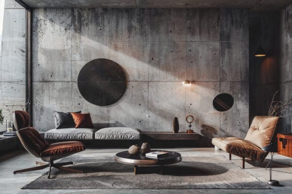
At first glance, “Soft Brutalism” sounds like an oxymoron , a pairing of opposites that shouldn’t make sense. How can something “brutal” be soft? Yet this paradox is exactly what gives the movement its magnetic pull in contemporary design. Born from the raw honesty of mid-century Brutalism and mellowed by the warmth of modern minimalism, Soft Brutalism is the new language of high-end interiors. It celebrates texture, mass, and material truth , but with a gentleness that invites touch rather than intimidation.
This is the story of how designers, architects, and homeowners are embracing this beautiful contradiction , and how you can too. If you’re ready to bring this quietly powerful trend into your home, here are 16 inspired ways to embrace Soft Brutalism in style.
What Is A Soft Brutalism?
Soft Brutalism in interior design is a modern evolution of classic Brutalism, where raw structure meets warmth and comfort. It keeps the honesty of exposed materials like concrete, stone, and metal but softens them with natural textures, curved forms, and muted tones. The result is a style that feels strong yet serene, industrial yet inviting. It’s about creating balance: bold architecture paired with gentle details. Rough walls meet plush fabrics, geometric lines blend with organic shapes, and neutral palettes calm the eye. Soft Brutalism transforms the starkness of Brutalism into something livable, minimalist, tactile, and quietly luxurious.
In Soft Brutalist interiors, color takes a step back so texture and form can take the spotlight. The palette leans heavily on neutrals , warm taupes, greige, stone, sand, clay, and charcoal. These muted tones feel organic and timeless, creating visual harmony throughout the space. Instead of bright whites or cold greys, aim for soft transitions between shades, layering them across walls, floors, and fabrics. When done right, these colors create depth and tranquility, setting the perfect stage for bold forms and raw materials to quietly shine.
Geometry is the foundation of Soft Brutalism , but here, it’s refined rather than rigid. Look for furniture and architecture that celebrate structure: blocky tables, cylindrical stools, monolithic islands, and squared shelving. These shapes bring visual stability and strength without overwhelming the space. The key is restraint , nothing overdesigned or ornamental. Even with their bold presence, the pieces feel calm because of their simplicity and honesty. In a world full of decorative excess, Soft Brutalist geometry restores a sense of order and architectural dignity.
3.Industrial Materials That Anchor the Modern Home
Concrete might sound severe, but in Soft Brutalism it becomes poetry in texture. Polished, matte, or microcement finishes all work beautifully, creating tactile backdrops for warmer accents. Think concrete countertops paired with oak cabinetry, or a raw plaster wall beside linen drapery. Metals , like brushed steel, blackened iron, or aged bronze , add depth without disrupting the neutrality. The trick is balance: every industrial surface should be softened by something natural. Concrete doesn’t have to feel cold; when used thoughtfully, it becomes grounding, elemental, and deeply beautiful.
If color is quiet in Soft Brutalism, texture does all the talking. It’s the secret ingredient that brings warmth to minimal spaces. Combine rough plaster with smooth marble, concrete with boucle, or natural stone with linen. The tactile contrast invites touch and gives the room emotional weight. Even subtle textures , like a limewash wall or jute rug , can transform a sterile space into something intimate and layered. Texture is how you “soften” the Brutalism: by letting surfaces tell stories and materials feel alive under light and shadow.
Lighting defines how Soft Brutalism breathes. Choose sculptural fixtures in concrete, metal, or glass that highlight rather than decorate. Exposed bulbs in minimalist housings, linear pendants, or wall-mounted sconces embedded into plaster amplify architectural rhythm. Position light to graze textured surfaces so shadows enhance depth. Use warm LED tones to soften the starkness. Here, light isn’t just illumination , it’s an architectural material in itself.
Where concrete gives weight, wood provides warmth. Incorporate oak, ash, or walnut in cabinetry, flooring, or furniture to balance the industrial tone. Natural grains, matte finishes, and minimal staining let the wood’s character shine. Reclaimed timber beams or slatted panels break up expanses of stone or cement. The contrast between raw mineral and organic wood softens the interior, grounding it in tactile comfort.
The furniture in Soft Brutalist homes isn’t dainty , it has presence. Chunky, sculptural forms echo the architectural solidity around them. Think blocky travertine coffee tables, thick-legged oak benches, and modular sofas that sit low and heavy on the floor. Yet despite their weight, these pieces don’t feel clunky. They’re softened with tactile upholstery , bouclé, felted wool, raw linen , that invites lounging and grounding.
Soft Brutalism borrows minimalism’s discipline but rejects its chill. The goal isn’t emptiness , it’s focus. Every object has a reason to exist, yet the spaces still feel tactile and human. Designers achieve this through carefully curated objects: a sculptural candle, a handblown glass vessel, a single artwork that commands silence. It’s less about “decluttering” and more about creating intentional calm , the kind that feels meditative, not museum-like.
The kitchen becomes a perfect playground for Soft Brutalism’s duality , hard and soft, functional yet artful .Picture a seamless concrete island with rounded corners, paired with light oak cabinetry and integrated bronze handles. Appliances disappear into sculptural forms; open shelving holds handmade ceramics in neutral hues. Lighting again becomes central , concealed strips under floating shelves or warm spotlights grazing the backsplash. The overall effect is monastic yet nurturing: a space built for slow cooking, quiet mornings, and architectural admiration.
Soft Brutalist bathrooms are pure sensory indulgence. Micro cement sinks, freestanding stone tubs, and matte black fixtures form a palette of serene solidity. Instead of shiny tiles, the walls are coated in limewash or tidelike , waterproof, velvety, and ancient in technique. Every surface absorbs light softly, transforming the bathroom into a tactile sanctuary. It’s less about sparkle and more about ritual: the morning shower becomes a meditation, and the bath an act of grounding in your own concrete cocoon.
If you’re drawn to the quiet strength of Soft Brutalism but not ready to renovate your entire space, start small. Introduce a few carefully chosen pieces that reflect the look, perhaps a concrete coffee table, a matte black metal lamp, or a textured plaster vase. These objects instantly anchor a room with presence and material honesty. Choose items with sculptural simplicity and weight; they should feel substantial, not decorative. Even textiles can ease you in, a linen throw, a boucle chair, or a jute rug adds tactile depth. Gradually layer these elements, observing how light interacts with their textures. Over time, the aesthetic will grow organically, giving your home that Brutalist serenity without overwhelming your existing decor or budget.
Soft Brutalism may celebrate structure, but it’s the curves that make it livable. Rounded edges and fluid forms counter the rigidity of concrete and metal, adding a sense of comfort and flow. Think of arched doorways, circular mirrors, curved sofas, or organically shaped coffee tables. These soft forms catch light differently, creating visual movement in an otherwise structured space. Even subtle gestures , like a rounded basin or oval pendant , break the monotony of hard lines. They invite the body to move more naturally, making spaces feel intuitive and human. In essence, these gentle forms remind us that architecture doesn’t have to be severe to be powerful, it can be sculptural, sensual, and deeply comforting.
Soft Brutalism finds harmony when inside and outside speak the same material language. Extend interior finishes outward , micro cement floors that flow to the patio, stone planters that mirror kitchen surfaces, or timber slats that continue across thresholds. Large glass panels or skylights blur the boundary further, letting natural light animate the raw materials indoors. Add sculptural greenery , like olive trees, succulents, or tall grasses , to echo the style’s organic calm.
While Soft Brutalism typically leans on neutrals, a single vibrant accent can make the space come alive. Think of a rust-colored armchair against a concrete wall, or a deep olive vase on a grey stone shelf. These intentional bursts of color energize the palette without disrupting its calm. The trick is restraint , one or two hues are enough. Warm tones like terracotta, ochre, or muted teal work best, echoing natural pigments. Against Brutalist greys, they create striking contrast while preserving the style’s moody sophistication. The result feels artful, not loud , a whisper of color that adds soul.
At its heart, Soft Brutalism values purpose over ornament. Every object should have a reason to exist , a form that’s beautiful because it works. Built-in shelving, sturdy tables, and multi-use pieces reflect this ethos. Functionality doesn’t mean austerity, though; it’s about clarity and intention. Think of a seamless storage bench that doubles as a sculpture, or lighting that defines zones instead of cluttering them. The absence of excess makes the space breathe. When design prioritizes use, beauty becomes effortless , and that’s the quiet luxury of Soft Brutalism.
Art is the emotional heartbeat of a Soft Brutalist home. Choose pieces that echo the materials and philosophy of the space , textural canvases, abstract sculptures, or ceramics in raw clay or stone. Avoid overly ornate or glossy artwork; instead, look for tactile works that feel handmade or elemental. Even one large piece can transform a concrete wall into a gallery moment. Placement matters too: lean art casually against walls or integrate it into shelving rather than over-framing it. The goal isn’t decoration but dialogue , art that deepens the mood rather than distracts from it.
Finishing Notes
Soft Brutalism proves that beauty can be both raw and refined, a perfect balance of structure and soul. It transforms cold materials into comforting spaces, giving modern homes a sense of permanence and peace. By layering texture, celebrating function, and softening edges, this style captures the best of minimalism without losing warmth.
At Home Designing, we celebrate interiors that tell stories through material, mood, and meaning. Soft Brutalism is more than a trend, it’s a new language of modern comfort, where architectural honesty meets quiet emotion, and every detail feels deeply human.


:strip_icc()/cdn.cliqueinc.com__cache__posts__272889__mushroom-lamp-decor-trend-272889-1542404261066-image.700x0c-9a57e25dfa784f8493523368107a75d6.jpg)
:max_bytes(150000):strip_icc()/DesignbyEmilyHendersonDesignPhotographerbyZekeRuelas_30-505526a0c8b64765a16e3533b2cdadd3-18358daf0ffb4d09a7149c52dbe7c01a-0e87588bdda94d6d868a335ba583c2fb.jpeg)