The Japandi bedroom has already earned its place as a modern classic, but in 2026, it’s evolving. The original Japandi look was loved for its calm minimalism, natural materials, and soothing balance between Japanese restraint and Scandinavian warmth. Now, Japandi Bedroom 2.0 takes that foundation and softens it even further, transforming the bedroom into a true sleep sanctuary. This new phase isn’t about perfection or strict minimalism. It’s about comfort, tactility, emotional calm, and spaces that genuinely support rest. Think warmer tones, layered textures, softer lighting, and thoughtful details that feel deeply personal rather than styled. Below are 18 evolved Japandi design ideas that reflect how this aesthetic is being reinterpreted for better sleep, deeper relaxation, and more human living.
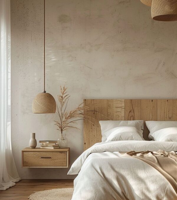
Japandi Bedroom 2.0 moves away from stark whites and cooler greys, leaning instead into warmer, earth-inspired neutrals. Shades like sand, oat, clay, mushroom, and soft taupe create a cocooning atmosphere that immediately signals rest. These colors feel grounded and natural, helping the bedroom feel emotionally calming rather than visually sharp. When layered thoughtfully across walls, bedding, and textiles, warm neutrals blur boundaries and reduce contrast, key for creating a space that supports deep sleep and mental unwinding.
In the evolved Japandi bedroom, bedding is designed for sleep first, aesthetics second. Layers of linen, cotton, wool, and light duvets create a bed that feels inviting and adaptable to different temperatures. Neutral tones dominate, but variation in texture adds interest. Wrinkled linen, softly quilted throws, and breathable fabrics create a relaxed, undone look that feels effortless rather than styled. This approach encourages comfort and routine, key ingredients for better rest.
Rather than removing décor entirely, Japandi Bedroom 2.0 embraces fewer items with more meaning. A ceramic vessel, a hand-thrown bowl, a framed textile, or a single piece of art adds quiet personality. These objects aren’t chosen to fill space, they’re chosen to connect emotionally. This approach keeps the room deeply personal while maintaining visual calm, reinforcing the idea that rest is supported by emotional comfort as much as physical design.
Using more than one wood tone adds depth and warmth to a Japandi bedroom without disrupting its calm nature. Instead of matching everything perfectly, blend similar undertones,like light oak with warm ash or soft walnut,to create a layered, natural look. This approach feels more organic and less staged, which suits the Japandi philosophy perfectly. Wood can appear through the bed frame, side tables, shelving, or even ceiling details. When tones are harmonious rather than identical, the bedroom feels richer and more lived-in while still remaining minimal and serene.
Texture is what keeps a Japandi bedroom from feeling flat or overly minimal. Layering different textures,linen bedding, wool throws, woven rugs, raw wood, and subtle wall finishes,creates visual interest without adding clutter. The key is restraint: keep the colour palette neutral and let texture do the work. This layered approach adds comfort and warmth, making the bedroom feel inviting rather than stark. Texture also absorbs sound and softens light, both of which help support rest and relaxation, turning the space into a true sleep sanctuary.
Natural light plays a major role in Japandi design, especially in bedrooms meant for rest and recovery. Large windows, sheer curtains, or light-filtering blinds allow daylight to move gently through the room without overwhelming it. Soft morning light helps regulate sleep cycles and makes the space feel calm and grounded. Avoid heavy drapery that blocks light completely during the day. When natural light is treated as a design feature rather than an afterthought, the bedroom feels healthier, more open, and more connected to the rhythms of nature.
A Japandi bedroom thrives on visual clarity, which means being intentional about what stays visible. Streamlining belongings doesn’t mean living without comfort,it means removing distractions that interfere with rest. Keep surfaces clear, store items out of sight, and limit décor to a few meaningful pieces. Built-in storage, under-bed drawers, or concealed wardrobes help maintain order without effort. When the bedroom is free from excess objects, the mind naturally relaxes. This simplicity is one of the most powerful tools for creating a calm, restorative sleep environment.
A low wooden bed frame is one of the most defining features of a Japandi bedroom. Sitting closer to the ground creates a sense of grounding and stability, which naturally promotes relaxation. Wooden frames add warmth and texture while keeping the design understated and timeless. Opt for simple lines and natural finishes rather than ornate details. A low bed also visually opens up the room, making it feel more spacious and serene. This design choice reinforces the bedroom’s role as a peaceful retreat rather than a decorative showpiece.
Rustic elements can enhance Japandi bedrooms when used thoughtfully and sparingly. The focus should be on natural imperfection rather than heavy country styling. Think hand-thrown ceramics, lightly weathered wood, linen fabrics, or textured plaster walls. These details add character and warmth without overpowering the minimalist aesthetic. Rustic touches help the space feel authentic and grounded, balancing the clean lines of Japandi design. When softened and refined, rustic elements support the calm, human feel that defines a true sleep sanctuary.
Floating or built-in nightstands help reduce visual clutter around the bed, making the room feel more spacious and serene. Integrated storage allows essentials to be tucked away while keeping surfaces minimal. This design choice supports both aesthetics and function. When fewer objects are visible, the mind naturally relaxes. In Japandi Bedroom 2.0, even bedside areas are designed to feel light, intentional, and distraction-free.
In a Japandi bedroom, the pattern should whisper, not shout. Delicate patterns add visual interest without disrupting the calm atmosphere essential for rest. Think fine stripes, soft geometrics, gentle checks, or tonal motifs woven into bedding, rugs, or cushions. These patterns work best when they stay within a muted, neutral palette so they blend rather than contrast. The goal is to create depth and softness, not decoration for its own sake. When patterns are subtle and thoughtfully layered, they enhance the bedroom’s warmth and texture while keeping the space serene and balanced.
Art in a Japandi bedroom should feel calming, personal, and intentional. Instead of bold statement pieces, choose artwork that supports stillness,minimal line drawings, nature-inspired prints, abstract landscapes, or monochrome photography. One or two well-placed pieces are enough to add character without overwhelming the space. Natural materials like wood frames, linen canvases, or handmade paper align beautifully with the Japandi aesthetic. Art here isn’t meant to energise; it’s meant to ground the room emotionally, making the bedroom feel complete, thoughtful, and quietly expressive.
A tactile rug does far more than add visual softness to a Japandi bedroom,it changes how the room feels and sounds. Natural fibre rugs made from wool, cotton, or jute blends help absorb noise and reduce echo, creating a quieter, more restful environment. This is especially important in bedrooms, where calm acoustics support better sleep. Choose rugs with subtle texture rather than bold patterns, and keep the colour palette warm and neutral. Placed beneath the bed or in a seating area, a tactile rug anchors the room and adds comfort without disrupting the minimalist aesthetic.
In Japandi design, less is always more,especially when it comes to décor. A single sculptural object can add depth, character, and artistry without overwhelming the space. Think of a hand-thrown ceramic vase, a carved wooden object, or a softly shaped stone piece placed on a bedside table or shelf. This approach allows the object to stand on its own rather than compete with others. When chosen thoughtfully, one sculptural element brings quiet personality into the bedroom, making the space feel intentional, grounded, and emotionally warm without visual clutter.
Rounded furniture edges introduce softness into a Japandi bedroom, balancing the clean lines that define the style. Curved headboards, rounded nightstands, or gently shaped benches feel more organic and calming than sharp angles. These forms reflect natural shapes found in Japanese and Scandinavian design, helping the room feel more fluid and welcoming. Rounded edges also improve comfort and safety, especially in smaller spaces. When used subtly, curved furniture enhances the sense of flow in the bedroom, supporting a more relaxed and restful atmosphere ideal for a sleep sanctuary.
Built-in wardrobes are one of the most effective ways to maintain visual calm in a Japandi bedroom. By integrating storage seamlessly into the architecture, wardrobes blend into the background rather than drawing attention. Flat-panel doors, handle-less designs, and soft neutral finishes keep the room feeling open and uncluttered. This hidden storage approach allows clothing and belongings to be stored out of sight, reducing visual noise that can interfere with rest. A bedroom with clean lines and minimal distractions naturally feels more peaceful, reinforcing its role as a place for relaxation and sleep.
Natural materials are the backbone of a Japandi bedroom because they create a calm, grounded atmosphere that supports rest. Wood, linen, cotton, wool, clay, and stone introduce warmth and tactility without visual clutter. These materials age beautifully and feel honest, which aligns with both Japanese and Scandinavian design philosophies. In a bedroom, natural materials help soften acoustics, regulate temperature, and make the space feel more breathable. Whether it’s a wooden bed frame, linen bedding, or a wool rug underfoot, these elements work quietly together to create a sleep environment that feels balanced, timeless, and deeply restorative.
Greenery adds a gentle sense of life to a Japandi bedroom without disturbing its calm aesthetic. One or two thoughtfully placed plants can soften hard lines and reinforce the connection to nature that defines the style. Choose plants with simple, sculptural forms and muted green tones rather than busy or overly decorative varieties. A floor plant near a window or a small potted plant on a shelf is often enough. Greenery should feel intentional and effortless, acting as a natural accent that enhances tranquillity rather than drawing attention away from rest.
Wrap-Up
A Japandi bedroom is ultimately about creating a space that feels calm, grounded, and genuinely restorative. By blending natural materials, soft textures, thoughtful lighting, and restrained décor, this evolved approach focuses less on strict minimalism and more on comfort and emotional ease. Each design choice works together to support better sleep and slower living, turning the bedroom into a true sanctuary. For readers of Home Designing, this guide highlights how intentional design can quietly improve everyday life. When simplicity, warmth, and balance come together, the bedroom becomes more than a place to sleep,it becomes a space to truly unwind.
The idea of a playroom is changing, and honestly, it was overdue. The old version was simple: bright primary colors, plastic bins, loud toy clutter, and a space that adults tolerated rather than enjoyed. But families today live differently. Homes are more open-plan, routines are shared, and spaces are expected to work harder than ever.
That’s why the grown-up playroom is becoming one of the smartest and most stylish rooms in modern family homes. It’s not a kids-only zone, it’s a multi-generational space designed for play, lounging, learning, hosting, and everyday life. Think: soft neutral palettes, comfortable seating, built-in storage, and a layout that welcomes toddlers, teens, parents, and grandparents equally. A grown-up playroom doesn’t mean less fun. It means better design, where toys can exist without taking over, and where the space still feels like part of a beautiful home. Here are 18 practical and design-forward ways to create a playroom that works for every age.
A grown-up playroom begins with what you don’t see first: the backdrop. Instead of colorful walls that visually shout “kids live here,” choose a calm base like warm white, soft beige, greige, or muted taupe. Neutral walls make the room feel larger, cleaner, and more connected to the rest of the home, especially if your playroom is part of an open layout. The best part? A neutral base lets you bring in color through toys, books, and artwork without the room ever feeling chaotic. It also makes it easier to evolve the space as your children grow. What works for building blocks today can still work for board games and homework later.
The most successful multi-generational spaces work because they don’t force everyone to do the same thing. Create zones that naturally support different ages and activities. For example, a soft rug area for toddlers, a table corner for puzzles or crafts, and a comfy lounge zone for teens or adults. Even in small rooms, zoning can be done with furniture placement, lighting, or a change in rug texture. When the playroom supports multiple rhythms at once, it becomes more usable throughout the day. It’s less “kids corner” and more “family room with playful purpose.
A reading corner adds softness to a playroom and gives the room a calmer personality. It’s also one of the most multi-generational features you can add, toddlers can flip board books, older kids can unwind, and adults can join in without feeling out of place. Use a soft chair, a floor cushion, or a built-in bench with pillows. Add a small lamp for warmth and a low bookshelf for easy access. This corner encourages quiet time and balances louder play. The best playrooms aren’t just about activity, they’re about comfort and rhythm too.
A grown-up playroom works best when seating feels flexible, casual, and welcoming for every age. Alternative seating,like floor cushions, poufs, oversized beanbags, or even a soft daybed,creates a space that adapts to how families actually use the room. Kids naturally gravitate toward floor-level comfort, while adults appreciate having extra spots to sit during playtime or movie nights. Choose options in textured, neutral fabrics so they feel elevated rather than messy. When seating is varied, the room feels less like a “kids zone” and more like a multi-generational lounge.
Kid-friendly colors don’t have to mean loud primary tones. In a multi-generational playroom, color works best when it’s softened, think dusty blue, muted sage, warm terracotta, or buttery yellow instead of neon shades. This approach keeps the room cheerful and child-friendly while still matching the rest of the home. You can introduce color through rugs, cushions, artwork, or a single accent wall rather than painting everything bright. The result feels balanced: fun for kids, calming for parents, and stylish enough that adults don’t feel like they’re spending time in a nursery.
A snack nook is one of the most practical upgrades you can add to a grown-up playroom. It reduces constant trips to the kitchen and keeps little hands busy in a controlled way. A small cabinet, a mini fridge, or a dedicated shelf with water bottles and easy snacks can make the space more self-sufficient,especially for families with multiple kids. Add a small tray, wipe-clean surfaces, and a waste bin nearby so cleanup stays simple. It’s a small “real life” feature that makes the whole room more enjoyable for both kids and adults.
Floating shelves are a smart way to add storage while keeping the playroom looking polished. They’re perfect for displaying storybooks, framed prints, and a few beautiful toys,without the heaviness of large furniture. In multi-generational spaces, shelving helps you style the room like a living area while still keeping essentials within reach. Keep frequently used items lower and decorative items higher for safety and balance. When the shelves are curated rather than overfilled, the playroom feels intentional, calmer, and more grown-up, even when it’s actively being used.
Natural light is one of the biggest reasons a playroom feels welcoming. Bright, airy light makes the room feel healthier, more spacious, and more connected to the rest of the home,especially important for multi-generational spaces where adults want comfort too. Use sheer curtains or light-filtering blinds instead of heavy drapes, and keep window areas clear so daylight can spread naturally. Mirrors can also help bounce light around, especially in smaller rooms. The more daylight you bring in, the easier it becomes to keep the room feeling fresh and calm,even with toys around.
Floating your furniture simply means pulling it slightly away from the walls to create better flow. It’s a designer trick that makes a room feel more spacious and intentional,perfect for a grown-up playroom that needs to handle movement, play, and lounging. A sofa placed a few inches off the wall, a rug anchoring the seating zone, and a chair angled into the space can completely change how the room feels. This layout encourages conversation and keeps the playroom from feeling like a storage box. It also makes it easier to create separate zones for different ages.
Mixing patterns can make a playroom feel layered, cozy, and full of personality, but the trick is control. Instead of using lots of loud prints at once, stick to a consistent color palette and layer patterns through different textures: a striped rug, a subtle geometric cushion, and a playful but muted throw. This keeps the room visually interesting without becoming overstimulating. Pattern adds warmth and helps hide wear and stains, which is practical in family spaces. Done thoughtfully, pattern mixing makes the room feel designed, not cluttered, fun enough for kids, tasteful enough for adults.
A grown-up playroom becomes even more valuable when it can double as a space for family gatherings and celebrations. Party-friendly design doesn’t mean turning it into an event room, it simply means choosing flexible furniture, creating open floor space, and having easy cleanup options. Think stackable stools, a large rug that anchors the room, and lighting that feels warm in the evenings. A hidden storage system helps you tidy toys quickly when guests arrive, and a snack or drink station keeps hosting simple. When the playroom is party-ready, it naturally becomes a true family hub.
Smart storage solutions are what separate a beautiful playroom from a stressful one. Multi-generational spaces need storage that can handle toys, books, games, crafts, and sometimes even tech accessories, without constantly spilling into the rest of the home. Closed cabinetry keeps the room visually calm, while baskets and bins make daily cleanup quick. Consider storage benches, ottomans with hidden compartments, or modular shelves that can change with your child’s age. The goal is a space that stays functional for years, not one that needs redesigning every time your family routine changes.
Using vertical space is one of the easiest ways to keep a playroom organised without eating up valuable floor area. Tall shelving, wall-mounted cabinets, and floating shelves allow you to store more while keeping the room open for play and movement. This is especially helpful for multi-generational spaces, where you want enough room for kids to spread out but also space for adults to walk, sit, and relax comfortably. Store everyday toys on lower shelves and display books or décor higher up. Vertical storage keeps the room practical, polished, and easy to maintain.
A grown-up playroom can still be fun, it just needs playfulness that feels intentional rather than chaotic. You can add a chalkboard wall, a small climbing corner, playful artwork, or colorful cushions without covering the entire room in bright plastic. The trick is choosing a calm base and letting a few fun elements shine. This way, the room stays exciting for kids but still comfortable and stylish for adults. When the space feels playful and welcoming to everyone, it becomes a true family zone, not just a room kids use alone.
Lighting makes a massive difference in whether a playroom feels chaotic or calm. Bright overhead lighting can feel harsh and overly functional, like a classroom. For a grown-up playroom, layer your lighting. Start with a warm ceiling light, then add a floor lamp, table lamp, or wall sconces. Soft lighting helps the room feel cozy and intentional, especially in the evenings. It’s a simple upgrade that instantly makes the space feel more like a living room and less like a storage room for toys.
Open concept layouts work beautifully for grown-up playrooms because they make the space feel connected to the rest of the home rather than isolated. When the playroom flows into a living area, dining space, or kitchen, it becomes easier for adults to supervise while still relaxing or multitasking. The key is using smart zoning, like rugs, furniture placement, and lighting, to define the playroom area without closing it off. Open layouts also help the space feel larger and brighter, which makes it more welcoming for all ages.
In multi-generational homes, the kitchen is rarely quiet. It’s where meals happen, conversations start, and routines overlap. The best family kitchens are designed for movement and teamwork, more than one person should be able to cook or prep without bumping into each other. Add an island with seating for kids and adults, or create a small breakfast corner where grandparents can sit comfortably. Use pull-out drawers and clear pantry organization so everyone can find what they need. A kitchen designed for shared use feels calmer, more social, and easier to live in every day.
Dining spaces in multi-generational homes need to handle everything, from quiet breakfasts to big family meals. Flexibility is everything. A dining table with extendable leaves, stackable chairs, or a bench option allows the space to shift naturally. Consider mixing formal and casual seating: chairs on one side, a bench on the other. This adds warmth and makes room for more people without crowding. Also, lighting matters, a warm pendant light instantly makes dining feel more inviting. When dining is flexible, hosting becomes easy and everyday meals feel more relaxed.
Wrap-Up
Designing for multi-generational living is really about creating a home that feels comfortable for everyone, kids, teens, parents, and grandparents,without sacrificing style. From grown-up playrooms and flexible living rooms to practical kitchens, calm bedrooms, and easy-to-navigate layouts, the goal is always the same: spaces that support real family life while staying beautiful and functional. Thoughtful zoning, smart storage, durable materials, and warm lighting make a home feel more balanced, relaxed, and welcoming at every stage. For readers of Home Designing, these ideas show how intentional interiors can bring generations together in a way that feels effortless, modern, and truly livable.
Bathrooms are changing. They’re no longer the bright, purely functional spaces we rush through each morning. In 2026, the most captivating bathrooms feel like retreats, calm, cinematic, and deeply personal. Spa Noir isn’t about making a bathroom look smaller or gloomy. It’s about creating depth, softening the senses, and designing a space that feels protected from the noise of everyday life. The palette is darker, yes, think charcoal, espresso, inky green, and matte black, but the atmosphere is warm, luxurious, and surprisingly soothing. Below are 19 design ideas, each carefully written to help you style your own Spa Noir bathroom, whether you’re planning a full renovation or simply upgrading the mood with a few intentional changes.
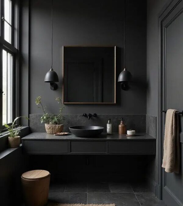
A Spa Noir bathroom starts with the feeling of being wrapped in calm, and charcoal walls deliver that instantly. Unlike stark black, charcoal has softness and complexity, it absorbs light gently rather than swallowing it completely. Painted walls, micro cement finishes, or matte charcoal tiles can create a cocoon-like effect that feels surprisingly relaxing. Charcoal works beautifully with natural textures like wood and linen, giving the room a balanced, spa-like calm.
If you want to try Spa Noir without renovating, a shower curtain is one of the easiest ways to shift the mood instantly. A dark curtain in charcoal, espresso, or deep olive brings drama and softness at the same time, especially in bright bathrooms that feel too clinical. Look for heavy fabric, linen blends, or subtle texture that feels more boutique-hotel than basic. It creates a visual boundary, adds depth, and sets the tone for the rest of the space. Pair it with warm lighting and matte accessories and the whole bathroom starts to feel calmer.
Matte black fixtures are practically the signature of the Spa Noir trend, and for good reason. They look architectural, modern, and quietly expensive. Think matte black taps, rainfall showers, towel bars, and even flush plates. This finish blends effortlessly with dark walls and creates a seamless, cohesive look. The key is to choose fixtures with simple, elegant shapes so the design feels intentional rather than aggressive. Matte black is best when it’s consistent, mixing too many metal finishes can break the calm.
Lighting can make or break Spa Noir. Bright white overhead lighting destroys the mood instantly. Instead, aim for layered, low lighting that mimics the warmth of candlelight, soft sconces, diffused LEDs, backlit mirrors, and dimmable ceiling lights. The goal is to create shadows, not eliminate them. Shadows add depth, and depth creates calm. Warm lighting also makes dark colors feel inviting rather than harsh. If you want your bathroom to feel like a sanctuary, lighting is the first upgrade you should plan, because it changes how every material looks and how the entire space feels.
Patterned wallpaper is a perfect tool for Spa Noir because it adds atmosphere without needing extra décor. Dark florals, smoky murals, abstract prints, or subtle geometric patterns instantly make a bathroom feel layered and intentional. It’s especially effective in powder rooms or vanity walls where moisture exposure is lower, and the wallpaper becomes an eye-catching design feature. The key is to stay within a moody palette,deep neutrals, blackened greens, or shadowy blues,so the look stays spa-like rather than loud.
Spa Noir works best when it feels quiet, not crowded. Minimalism helps create that calm sanctuary effect by removing visual noise and letting materials speak for themselves. Instead of decorating heavily, focus on a few intentional details, beautiful soap dispensers, a stone tray, a soft towel stack, and one sculptural object. Keeping the vanity clear instantly makes the bathroom feel more high-end, almost like a private spa suite. Minimalist styling also makes dark colors look richer and more elegant. The result is a bathroom that feels restorative, not busy.
Bold floor tiles are one of the fastest ways to bring Spa Noir energy into a bathroom without changing everything else. A dramatic pattern in charcoal, black, or smoky stone tones adds instant personality while keeping the space grounded and sophisticated. Pairing statement flooring with deep wall shades—like espresso, slate, or inky green—creates a layered, cocoon-like effect that feels calm rather than overwhelming. To keep the look balanced, let the tiles be the hero and style the rest of the room simply with matte fixtures, warm lighting, and soft textiles. This combination feels striking, luxurious, and spa-worthy.
Dark marble instantly gives a bathroom that spa-luxury upgrade people associate with high-end hotels. Deep black stone with subtle white veining creates a dramatic backdrop, but it still feels natural and calming because the movement is organic. You can use it on a vanity top, inside a shower, or even as a feature wall behind the bathtub. The most beautiful Spa Noir bathrooms balance dark marble with matte textures, like plaster walls or soft wood tones, so the space doesn’t become too shiny or cold.
A dark standalone tub is the statement piece of a Spa Noir bathroom, and it instantly turns bathing into a ritual. Matte black is bold and modern, but charcoal, deep grey, or even dark stone-look tubs can feel equally luxurious. The beauty of a dark tub is how it contrasts against soft lighting and textured walls, creating a dramatic focal point without needing excessive styling. Pair it with a warm wood stool, a candle corner, or a simple tray for bath oils, and the space feels like a private retreat. It’s bold, but still calming when balanced properly.
A dark vanity grounds the bathroom visually. Matte black, charcoal, deep green, or espresso-toned cabinets create weight and structure, making the room feel designed rather than generic. Dark vanities also hide daily wear better, which is a practical bonus. To keep it from feeling too heavy, choose a floating vanity or pair it with lighter stone counters. Add soft lighting around the mirror and keep hardware simple. A dark vanity isn’t just a trend, it’s a timeless way to add depth and luxury to any bathroom style.
Spa Noir needs warmth to feel truly relaxing, and wood brings it naturally. Walnut vanities, oak shelves, teak bath stools, or even a simple wooden tray instantly soften the dark palette. Wood also connects the bathroom to spa design, which often uses natural materials to create calm. If you’re worried about moisture, choose sealed wood finishes or wood-look porcelain that still brings warmth visually. Even a single wood element can make a dark bathroom feel inviting rather than stark. It’s one of the easiest ways to keep the trend feeling balanced and livable.
In a dark bathroom, a backlit mirror becomes a focal point that feels modern and calming. It provides soft ambient lighting, highlights the vanity zone, and gives your bathroom that hotel-like finish. The glow creates a flattering effect and makes nighttime routines feel gentler. Choose a mirror shape that matches the mood: round mirrors soften the space, while tall pill-shaped mirrors feel elegant and architectural. Avoid harsh blue-white lighting, warm tones work best for Spa Noir.
Greenery fits the Spa Noir trend perfectly because it adds life and softness against dark, dramatic finishes. The best part is you don’t need a jungle,just one or two well-placed plants can shift the entire mood. Choose sculptural, deep-toned varieties like snake plants, pothos, or ferns that love humidity and don’t require constant attention. A tall plant near the tub or a small arrangement on a floating shelf makes the space feel calmer and more spa-like. With warm lighting and dark stone textures, greenery becomes the finishing touch that keeps the room from feeling too heavy.
Brick walls can work beautifully in a Spa Noir bathroom when they’re treated as a texture element rather than a rustic statement. Darkened brick, charcoal-washed finishes, or warm brick lit with soft lighting creates depth and an earthy, grounded atmosphere. It adds that “hotel spa tucked inside a city loft” vibe,raw, moody, and unexpectedly cozy. Brick pairs especially well with matte black fixtures, smoked glass, and dark wood vanities. The surface imperfections give the bathroom character, while the darker palette keeps it aligned with the calm, sanctuary feel this trend is all about.
A statement runner is a small addition that brings instant warmth to a dark bathroom. Instead of basic bath mats, a patterned vintage-style runner or a rich-toned woven rug adds texture and personality while still feeling elevated. It makes the bathroom feel more like a private retreat than a purely functional space, especially in larger layouts where hard surfaces can feel cold. A rug also helps soften sound and adds comfort underfoot, which enhances the spa experience. In Spa Noir design, this layer isn’t just decorative,it’s what makes the room feel complete and lived-in.
Metallic details bring the perfect amount of polish to a Spa Noir bathroom without breaking the calm mood. Think brushed brass, antique gold, gunmetal, or champagne-toned hardware paired with dark walls and stone textures. Even small upgrades,like taps, towel hooks, mirror frames, or a sculptural light fixture,can lift the entire space. The trick is choosing one dominant metal finish and repeating it for a cohesive look. Against charcoal tiles or black plaster walls, metallic accents glow softly, adding that boutique hotel glamour while still keeping the bathroom feeling warm, intimate, and spa-like.
Painting the ceiling is an underrated move in Spa Noir design because it makes the bathroom feel more immersive and cocooned. Instead of stopping the dark palette at eye level, carrying it upward creates a deeper, more enveloping sanctuary effect,especially in smaller bathrooms. A charcoal or inky tone on the ceiling can make lighting feel softer and more atmospheric, reducing that harsh “overhead brightness” people often dislike. If you want balance, keep the ceiling matte and pair it with warm lighting and lighter floors. It’s a bold detail, but it’s exactly the kind of design choice that makes Spa Noir feel intentional.
Grid-style shower doors add an architectural edge that suits the Spa Noir trend perfectly. Their clean lines create structure and contrast, making the shower feel custom even in a standard bathroom layout. Matte black frames are the classic choice, but dark bronze or gunmetal can look just as refined with moody tile and stone finishes. The grid pattern also adds visual interest without relying on extra décor, which keeps the space minimal and spa-like. Paired with warm lighting and deep tones, a grid shower door feels modern, dramatic, and quietly luxurious, exactly what Spa Noir is all about.
Wrap Up
Bathroom Spa Noir proves that dark design can feel soothing, not dramatic. With the right mix of texture, warm lighting, layered materials, and a few elevated details, a bathroom can transform into a private sanctuary that feels calm, luxurious, and deeply personal. Whether you embrace bold tiles, a sculptural tub, metallic accents, or minimalist styling, this trend is all about creating an atmosphere that helps you slow down and reset. For readers of Home Designing, Spa Noir is a reminder that great interiors aren’t only about what’s trending—they’re about how a space makes you feel. When design is intentional, even the simplest bathroom can become an everyday retreat.
Once considered a forgotten storage corner or a luxury reserved for period homes, the kitchen larder has returned,this time as a defining feature of modern home design. Today’s larder is not just about food storage; it’s about organization, beauty, sustainability, and lifestyle. From walk-in pantries to compact hidden cupboards, the kitchen larder has become a space that reflects how we live, cook, and gather.
Whether you’re renovating a kitchen or simply rethinking how your space functions, designing a thoughtful larder can completely change the way your kitchen feels and works. Below are 19 carefully curated design ideas to help you create a larder that truly becomes the heart of your home.
A walk-in larder instantly changes the rhythm of a kitchen. It creates a moment of separation from the busyness of cooking zones while offering a sense of quiet order. Unlike traditional cupboards, walk-in larders allow everything to be seen at once, encouraging mindful use and better organization. These spaces don’t need to be large to be effective. Even a narrow room or repurposed alcove can become a walk-in larder with the right shelving and lighting. When designed well, a walk-in larder feels less like storage and more like a calm, purposeful retreat within the kitchen.
Fluted glass doors bring softness and elegance to the larder without fully revealing its contents. The textured surface diffuses light beautifully while offering a gentle sense of privacy , perfect for spaces that need to feel open without appearing cluttered. This type of door works particularly well in contemporary and transitional kitchens, where subtle detailing makes all the difference. Fluted glass allows the larder to feel like part of the overall design language rather than a purely functional zone, adding depth and visual interest to the space.
A utility-style larder focuses on efficiency without sacrificing design. It’s the space where practicality quietly takes the lead , housing small appliances, cleaning supplies, laundry baskets, or bulk food storage in one organized zone. This type of larder works especially well in busy homes, allowing the main kitchen to remain visually calm and clutter-free. When thoughtfully designed with concealed storage and durable finishes, a utility larder becomes an essential support space that enhances how the entire kitchen functions day to day.
Bifold pantry doors offer a flexible and elegant way to access larder spaces. When opened, they reveal the full interior at once, making everyday cooking feel effortless. When closed, they create a clean, furniture-like façade that blends seamlessly into the kitchen. Bifold doors work beautifully in both modern and traditional homes, especially when finished in wood or painted cabinetry tones. They allow the larder to shift easily between being a functional workspace and a refined design feature.
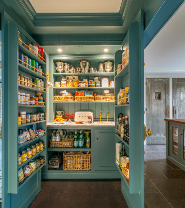
Introducing a bold pop of color inside the larder adds personality without overwhelming the kitchen. Deep greens, inky blues, or warm terracotta tones create an unexpected design moment behind closed doors. Because larders are often enclosed, they’re ideal spaces for color experimentation. A bold interior finish can make the larder feel intentional and expressive, transforming it from a purely functional zone into a space with character and visual impact.
Statement tiles bring texture, pattern, and craftsmanship into the larder. Whether used on floors, splash backs, or full walls, decorative tiles elevate the space beyond basic storage. Patterned encaustic tiles, handmade ceramics, or subtle geometric designs add depth and visual interest. In a smaller space like a larder, tiles can feel indulgent rather than overpowering, making them an ideal way to introduce artistry and detail into everyday kitchen design.
Rustic-inspired larders draw from traditional kitchen design, favouring natural textures, aged finishes, and handcrafted details. Wooden shelving, exposed joinery, stone floors, and ceramic containers create a warm, grounded atmosphere. This style works beautifully in both country homes and modern spaces seeking contrast. A rustic larder feels comforting and familiar, offering a sense of heritage while supporting contemporary lifestyles with modern storage solutions.
Freestanding larder units introduce flexibility and furniture-like charm into the kitchen. Unlike built-in cabinetry, these pieces can be moved, adapted, or repurposed over time. Often resembling traditional cupboards or armor, freestanding larders add character and softness to the kitchen layout. They work especially well in period homes or eclectic interiors, where layered design and individuality are celebrated rather than concealed.
Pull-out pantry systems are designed for efficiency in compact kitchens. Slim vertical units slide out smoothly, revealing neatly organised shelves that maximize storage without occupying excess space. These systems make it easy to see and access items at a glance, reducing waste and daily frustration. When integrated into cabinetry, pull-out larders feel discreet yet highly functional, proving that smart design can make even the smallest spaces work harder.
Sliding or pocket doors are ideal for kitchens where space is limited. They allow full access to the larder without interfering with walkways or adjacent cabinetry. From a design standpoint, these doors can be subtle or bold depending on material choice. Wood adds warmth, while metal or glass lends a contemporary edge. Sliding doors also offer flexibility, you can keep the larder open during busy cooking times and close it away for a cleaner look when entertaining.
A hidden pantry is all about discretion and visual calm. Designed to blend seamlessly into kitchen cabinetry or architectural elements, it keeps storage completely out of sight while remaining highly functional. Handle-less doors, push-to-open panels, or cabinetry finished to match surrounding walls allow the pantry to disappear into the design. This approach works especially well in open-plan kitchens, where visual clutter can easily disrupt the flow of the space. A hidden pantry supports a minimalist aesthetic while quietly housing everything needed for everyday living.
A built-in coffee station brings intention and ease to everyday routines. Tucked inside a pantry or larder, it creates a dedicated zone for coffee machines, mugs, beans, and accessories, keeping countertops clear and organised. Integrated shelving, drawers, and concealed power points allow the station to function efficiently without drawing attention when not in use. This design works beautifully for both morning rituals and entertaining, offering a calm, café-like experience within the home. A built-in coffee station turns a simple habit into a thoughtfully designed moment.
Statement lighting inside the larder transforms it from a purely functional space into a considered design feature. Pendant lights, sculptural fixtures, or decorative wall sconces add character while improving visibility. Because larders are often enclosed, lighting plays a crucial role in setting the mood and making the space feel welcoming rather than utilitarian. Warm lighting enhances natural materials and shelving, while layered lighting ensures practicality. Thoughtful illumination elevates the larder, reinforcing its role as an intentional extension of the kitchen rather than hidden storage.
A circular pantry offers a unique and highly functional take on larder design. Often organised around a central point, this layout allows ingredients and supplies to be accessed with minimal movement, creating a smooth and intuitive flow. Circular pantries work especially well in walk-in formats, where shelving wraps around the walls for maximum efficiency. Beyond practicality, the shape adds architectural interest and a sense of softness to the kitchen. A circular pantry feels thoughtful and immersive, reinforcing the larder’s role as a carefully designed space.
Open shelving introduces a relaxed, lived-in quality to the kitchen larder. It encourages simplicity and intention, making everyday items easy to reach while allowing beautiful storage solutions to become part of the décor. The success of open shelving lies in restraint. Neutral jars, natural textures, and consistent spacing keep the space from feeling overwhelming. When done well, open shelving transforms the larder into an extension of the kitchen’s personality, where function and visual appeal exist in balance.
Built-in larders bring a sense of permanence and polish to the kitchen. Designed as part of the cabinetry rather than an add-on, they create a seamless, architectural look that feels calm and intentional. A built-in larder allows storage to blend quietly into the background, supporting clean lines and uncluttered surfaces. Inside, shelving and drawers can be customized to suit everyday needs, while the exterior maintains visual harmony. This approach works especially well in contemporary and open-plan kitchens where cohesion is key.
Slimline storage proves that a larder doesn’t need generous space to be effective. Narrow pull-out units, tall vertical compartments, and compact shelving systems make use of overlooked gaps within the kitchen. These designs are ideal for urban homes and smaller kitchens, offering impressive storage capacity without disrupting the layout. Slimline larders are highly practical, allowing ingredients to be viewed at a glance while maintaining a discreet presence. They reflect modern living , efficient, thoughtful, and beautifully space-conscious.
Country-style larders celebrate warmth, tradition, and timeless materials. Open wooden shelves, painted cabinetry, ceramic jars, and woven baskets create a relaxed, welcoming atmosphere. This style feels rooted in heritage kitchens, yet it adapts easily to modern homes when paired with contemporary layouts. A country-style larder prioritizes comfort and accessibility, encouraging a slower, more mindful approach to cooking and storage. It brings character and charm into the kitchen, making the larder feel like a lived-in, essential part of the home.
Contemporary pull-out drawers offer a sleek, highly functional approach to larder storage. Designed with smooth mechanisms and tailored compartments, they allow ingredients and supplies to be accessed effortlessly. Unlike traditional shelving, pull-out drawers bring everything into view at once, reducing clutter and improving organization. This style works particularly well in modern kitchens, where efficiency and clean aesthetics go hand in hand. When integrated into cabinetry, pull-out larder drawers feel discreet yet powerful, enhancing both form and function.
Wrap Up
The renewed focus on kitchen larders highlights an important shift in modern home designing, where functionality and aesthetics work hand in hand. Today’s larder is no longer just about storage; it’s a thoughtfully designed space that enhances how the kitchen looks, feels, and functions. From hidden layouts and smart pull-out systems to bold color, lighting, and architectural forms, these ideas show how even practical zones can become design features. For readers of Home Designing, this article reinforces a simple truth: great interiors are shaped by intentional details. When storage is designed with care, the kitchen becomes calmer, more efficient, and truly central to everyday living.
Wellness isn’t just something you chase at the gym or track on an app , it’s shaped quietly, daily, by the spaces you live in. The way light enters your rooms, how easily you move through your home, where you rest, work, eat, and unplug , all of these design decisions influence your physical and mental health more than we often realize.
A wellness home reset isn’t about perfection or expensive upgrades. It’s about intentional design changes that support better habits, deeper rest, clearer focus, and lower stress. These are practical, achievable shifts that align your home with the version of yourself you’re working toward , not an idealized lifestyle, but a realistic, sustainable one. Here are 15 design changes that genuinely support health goals, creating a home that works with your body and mind, not against them.
Natural light plays a crucial role in regulating circadian rhythms, mood, and energy levels. Start your wellness reset by maximizing daylight wherever possible. Open heavy curtains, replace them with sheer panels, clean windows regularly, and rearrange furniture so seating and work areas are closer to windows. Even small changes , like removing visual obstructions or using reflective surfaces , can brighten a space. Better daylight exposure supports healthier sleep cycles, improved focus, and a more balanced emotional state throughout the day.
A wellness-focused home starts with better sleep. Design your bedroom as a sleep-first environment rather than a multipurpose space. Remove unnecessary clutter, reduce visible technology, and keep the color palette calm and neutral. Invest in comfortable bedding, supportive pillows, and blackout window treatments if needed. Lighting should be soft and layered, not harsh or overhead. When the bedroom is clearly defined as a space for rest, your body begins to associate it with relaxation, making it easier to unwind and sleep deeply.
Visual clutter quietly increases stress and mental fatigue. A wellness reset means editing what you see every day. Clear surfaces, simplify open shelving, and store items out of sight where possible. This doesn’t mean creating a sterile home , it means letting meaningful objects stand out instead of competing with excess. Fewer visual distractions help the nervous system relax, improve focus, and make spaces feel calmer and more breathable.
The way we dine influences how we eat, digest, and connect. A wellness-focused dining area encourages mindful meals rather than rushed consumption. This can be achieved by prioritizing natural materials, comfortable seating, and a calm visual environment free from distractions. Replacing harsh lighting with warm ambient light, choosing solid wood or stone tables, and minimizing screens nearby all support healthier eating habits. When dining spaces feel grounded and intentional, meals become moments of nourishment rather than just routine fuel , supporting both physical and emotional health.
Maintaining a balanced temperature is essential for comfort, sleep quality, and overall well-being. A wellness reset includes addressing drafts, overheating, or uneven temperatures between rooms. Layered textiles, proper insulation, breathable fabrics, ceiling fans, and adjustable window coverings all help regulate thermal comfort naturally. When your body isn’t constantly adjusting to discomfort, stress levels drop and focus improves. Designing for thermal balance ensures your home supports rest in winter and ease in warmer months without relying solely on mechanical systems.
Wellness-focused interiors prioritize materials that support both human health and environmental responsibility. Low-VOC paints, natural finishes, solid wood, organic textiles, and non-toxic furnishings reduce indoor air pollutants and chemical exposure. These choices may feel subtle, but over time they significantly impact respiratory health and overall comfort. A wellness home isn’t just about how it looks , it’s about what it’s made of. Thoughtful material selection creates a cleaner, safer indoor environment that supports long-term health goals.
Biophilic design reconnects interiors with nature, supporting reduced stress, better focus, and improved mood. This approach goes beyond adding plants , it includes natural textures, organic forms, daylight access, and materials that echo the outdoors. Wood grains, stone surfaces, water-inspired elements, and soft natural light all contribute to a more restorative environment. When nature is intentionally integrated into design, the home becomes a calming refuge that supports mental clarity and emotional balance.
Color directly influences emotional well-being, and nature-based palettes are especially effective in wellness interiors. Soft greens, clay tones, sand, sky blues, and warm earth shades help regulate mood and reduce overstimulation. These colors mirror the outdoors, creating a sense of familiarity and calm within the home. Whether applied through wall color, textiles, or accent pieces, nature-inspired palettes help spaces feel grounded and emotionally supportive , ideal for rest, focus, and recovery.
Mini green walls offer a compact yet impactful way to bring living elements indoors. Whether installed vertically or arranged modularly, they maximize greenery without taking up valuable floor space. These installations improve air quality, soften visual boundaries, and introduce a sense of vitality. Mini green walls work especially well in kitchens, bathrooms, or living areas where plants might otherwise be limited. Beyond aesthetics, they create a visual connection to nature that supports calmness and emotional well-being throughout the day.
Designing around natural views can significantly enhance mental wellness. Positioning seating, desks, or beds to face windows allows occupants to benefit from daylight and outdoor scenery. Even views of trees, sky, or distant greenery help reduce stress and improve focus. Avoid blocking windows with heavy furnishings or unnecessary decor. When interiors are oriented toward nature, everyday moments become more restorative. Emphasizing these views reinforces a daily connection to the outside world, supporting emotional balance and clarity.
A wellness home needs at least one space dedicated solely to rest and recovery. This could be a reading nook, meditation corner, or quiet seating area free from screens and work-related items. Soft lighting, comfortable seating, and minimal visual noise help define the space. The purpose is simple: to pause, breathe, and reset. When restoration is supported by design, rest becomes intentional rather than accidental, an essential foundation for long-term physical and mental health.
Excess noise and echo increase stress and mental fatigue, especially in open or minimally furnished homes. A wellness-focused reset should include sound-softening elements such as area rugs, upholstered furniture, curtains, wall hangings, and acoustic panels. These materials absorb sound rather than letting it bounce through the space. Even small additions can dramatically improve comfort and focus. Reducing noise creates calmer environments that support concentration, relaxation, and better sleep, making acoustic comfort a meaningful part of a healthy home.
Good ventilation is essential for a healthy home, yet it’s often overlooked in everyday design. Improving ventilation helps remove stale air, excess moisture, and indoor pollutants while bringing in fresh air that supports better breathing and overall comfort. Simple changes like opening windows regularly, using exhaust fans in kitchens and bathrooms, and allowing cross-ventilation through open doors can make a noticeable difference. Choosing breathable window treatments and keeping air pathways clear also improves airflow. When ventilation is thoughtfully supported through design, the home feels fresher, lighter, and more energizing—creating an environment that naturally promotes physical well-being and mental clarity.
Harsh lighting strains the eyes and disrupts natural rhythms. A wellness reset involves replacing overly bright bulbs with warm-toned light and layering illumination throughout each room. Table lamps, floor lamps, and wall lights create a more relaxed atmosphere than a single overhead fixture. Dimmer switches allow lighting to adapt to different times of day. Soft lighting supports relaxation, improves mood, and makes interiors feel nurturing rather than clinical, especially in the evenings.
Bathrooms play a vital role in daily wellness routines, from morning preparation to evening wind-down rituals. Improving function and comfort starts with organization—clearing clutter, adding accessible storage, and ensuring essentials are easy to reach. Upgrading lighting to soft, even illumination reduces eye strain and creates a calmer atmosphere. Simple additions like plush towels, non-slip mats, and a well-placed mirror enhance comfort and safety. When a bathroom is thoughtfully designed to support ease and relaxation, it encourages consistent self-care habits and transforms everyday routines into moments of calm and restoration.
Wrap Up
A wellness home reset isn’t about trends , it’s about alignment. When your space supports rest, movement, clarity, and comfort, your health goals feel less like effort and more like a natural extension of daily life. Thoughtful design has the power to reduce stress, improve sleep, and create emotional balance. At Home Designing, we believe wellness begins at home , through intentional interiors that quietly support how you want to live, feel, and grow every day.


:strip_icc()/slide-out-kitchen-pantry-0bc832b7-1d407738110c410a8ece003d76c3822d.jpg)