
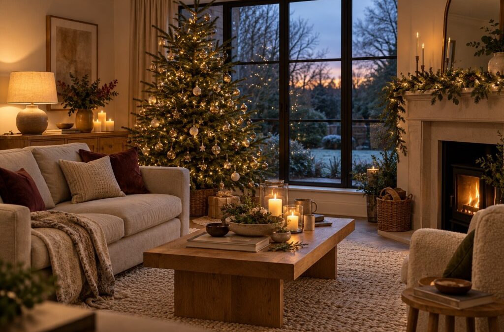
Festive decorating is often treated as a separate activity from interior design, something that happens for a few weeks and then gets packed away. In practice, the same principles apply. Light, scale, texture and restraint determine whether a room feels cohesive or chaotic, and a thoughtful approach to seasonal lighting can improve a space well beyond December.
This season, many designers are shifting away from the all-out sparkle of previous years toward something quieter and more intentional. Light becomes a material in its own right, used to shape mood and define zones rather than simply decorate.
Colour Temperature Sets the Tone

The most influential decision is colour temperature. Warm white, which sits around 2700 kelvin, mimics candlelight and flatters most interior palettes, from natural wood to deep green walls. Cooler white can look crisp against minimalist schemes but tends to feel clinical in a room with soft furnishings.
When specifying Christmas indoor lights for a scheme, it’s worth testing a sample against the existing lamps in the room. Mixing a very warm lamp with a cooler string creates an awkward mismatch that the eye picks up straight away. Consistency across sources is what makes a room feel calm.
Wire, Bulb and Detail

The fine detail of a light string influences how it reads. Clear wire disappears against glass and metal, copper wire blends into foliage and warm-toned surfaces, and green wire suits real branches and garlands. Choosing a wire that suits the material it will sit against removes the visual clutter that cheaper options often introduce.
Bulb size and spacing matter just as much. Densely packed micro bulbs create a continuous shimmer, while widely spaced larger bulbs give a looser, more graphic quality. A garland with irregular clusters feels more organic than perfectly even spacing, which can look mechanical.
Layering Light Sources

Good lighting design never relies on a single source, and festive schemes are no different. A tree, a mantel garland, a table lamp and a few candles together create depth that one bright source can’t. Positioning lights at varied heights, from floor level to eye level to above head height, builds a more convincing atmosphere.
Decorative lights are best treated as the accent layer. They shouldn’t replace functional lighting, because a room that’s too dim becomes tiring rather than cosy. Dimmers on main lamps give the flexibility to lower the general level while letting the festive layer shine.
Placement and Proportion

Scale deserves as much attention as colour. A single large branch with minimal lights can make a stronger statement than a dozen small clusters, and a lit mirror frame can anchor a wall without any other decoration. Leaving areas of the room unlit is just as important, because contrast gives the lit elements more impact.
Windows, shelving and architectural features offer natural frames. A string running along the top of a bookcase highlights the shape of the furniture, and a loose garland over a doorway draws attention to the opening. Following the lines of the room tends to look better than imposing a pattern on it.
Symmetry is worth questioning, too. A matching pair of garlands on either side of a fireplace feels formal and traditional, while an asymmetric arrangement, perhaps weighted toward one end of a shelf, looks more relaxed and contemporary. Neither is wrong, but the choice should suit the character of the room.
Materials and Texture

Light interacts with materials in different ways. Glass and metal reflect and multiply it, which makes a small string look more generous. Matt textiles absorb it, giving a softer effect. Natural materials such as wool, linen and unfinished wood respond well to warm light, bringing out grain and texture.
A cluster of lights inside a large glass vessel, surrounded by pinecones or dried stems, is a simple way to use this effect. The glass diffuses the light, while the natural elements add depth.
The colour of the surroundings should be taken into account as well. Deep navy and charcoal walls make lights appear brighter and more concentrated, while pale walls bounce the glow around the room and soften its edges. In a space with a lot of white, a little more density in the lighting will often be needed to achieve the same sense of warmth.
Practical Considerations

Design shouldn’t ignore practicality. Cable runs need planning, particularly in rooms with few sockets, and battery-powered options give flexibility where mains power isn’t convenient. Timers keep the effect consistent and prevent lights being left on overnight.
LED technology has made things easier, since it’s cool to the touch and uses little energy. That allows lights to be placed close to fabric and greenery with fewer concerns, though checking for damage before each season remains good practice.
Beyond the Festive Season

The strongest festive schemes are the ones that can outlast the season. A subtle string along a shelf or around a mirror continues to add warmth through the darkest part of winter, and plenty of designers leave a few elements in place well into the new year.
Treating light as part of the interior rather than an add-on changes the way the whole room is composed. Done well, the result feels intentional in December and still looks right in February.
Related
<!–
–>