The gap between inspiration and reality is usually measured in square footage. You see it in magazines, scrolling past marble counters and soft light on polished floors. You imagine yourself there. Then you look around your actual space. Beige walls. IKEA chair you didn’t assemble quite right. A candle that smells like last week’s takeout.
The idea of a “dream home” has always been treated like a fantasy. But the fantasy has a blueprint. And it’s not limited to people with interior designers on speed dial.
Bringing gallery-level design into your everyday space is less about budget and more about clarity. What are you drawn to? What do you keep saving on Pinterest and then forgetting to execute?
Let’s start with what actually defines those interiors you keep lusting after and how to recreate the feel, even if your zip code is less exclusive.
Stop Chasing Luxury. Start Copying Composition.

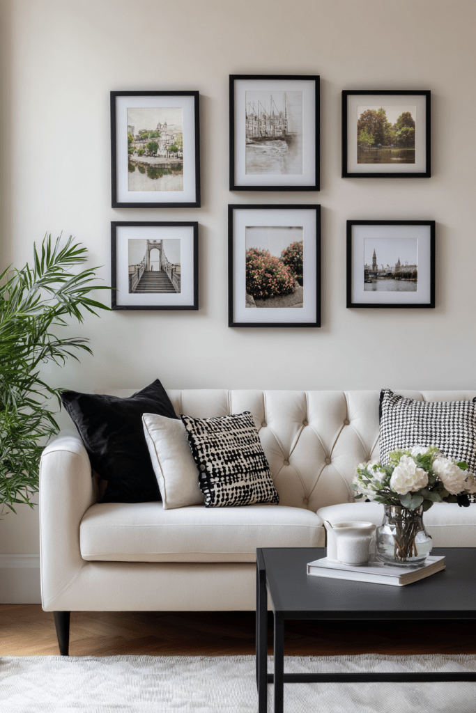
The best rooms aren’t expensive. They’re composed. Lighting, material contrast, focal point. It’s less about Italian marble and more about restraint. That’s what most gallery homes get right. They don’t do everything. They do a few things well, and let space do the rest.
Next time you’re scrolling through interior galleries or luxury home listings, stop and ask: what is the eye drawn to? Is it the oversized art, the architectural lighting, the materials?
That’s the blueprint. Not the price tag.
Use Real Homes as Your Moodboard
Design inspo is easy to find. But most of it’s staged, over-styled, or unattainably digital. A better source? Real listings. Homes that people actually live in or are about to.
The Gallery of Fine Homes by Harvey Kalles Real Estate is a curated listing collection that does more than just sell property. It functions as a live design feed, showcasing high-end interiors that haven’t been flattened by filters or watered down by algorithm trends.
Want to see how natural light interacts with dark wood floors in a mid-century layout? Or how textured wall treatments show up in real living rooms, not showrooms? That’s where these galleries shine.
Three Elements to Steal (Not Literally)

1. Simplicity with Substance
Most high-end interiors lean into clean shapes, but always ground them in texture. A minimal cream sofa is paired with matte black fixtures. Flat cabinetry is offset with a grainy oak island. It’s not sterile. It’s measured.
Everyday move: Ditch unnecessary patterns. Add one tactile element, linen drapes, matte ceramic, or an oversized woven pendant.
2. Defined Lighting Zones

Lighting doesn’t just illuminate. It divides space. A pendant over the dining area. A low floor lamp in the reading corner. A line of spotlights over the kitchen island. In gallery homes, lighting tells you where to look and how to feel.
This Architectural Digest video showcases how three designers used the same Victorian room, and lighting strategy alone changed the entire mood. It’s not about how many lights you have. It’s where, why, and what kind of light they give off.
Everyday move: Use three light sources per room. One ambient, one task, one aesthetic. Bonus if none of them are overhead fluorescents.
3. Negative Space as a Feature

Luxury interiors don’t fill every surface. They leave space. A blank wall. A stretch of hallway. A coffee table with only one book. This isn’t laziness. It’s a visual pause.
Everyday move: Remove five objects from the room. Leave the gaps. Let the space breathe.
Don’t Just Look. Live With It.
Design is most effective when it disappears. When you stop noticing the details because they’re working. Gallery homes succeed because they don’t scream for attention. They whisper continuity, clarity, and ease.
And you can build that into your own space, slowly. A new light here. A better frame there. Less noise. More intent.
Related
<!–
–>