If you love colour drenching, then you need to hear about colour capping, as it’s become the new paint trick design experts are using to make a room feel bigger, and it’s set to be the next big paint trend.
For the past few years, we’ve seen interior designs and paint brands use paint to make the most of every inch of wall and ceiling, and now, experts at Benjamin Moore have tipped colour capping as the newest way to decorate a room.
Let’s call it a cousin of colour drenching; colour capping is a striking technique that uses a tonal wash graduated up to the ceiling. It’s impactful, aiming to turn your ceiling into a focal point in its own right. This is everything you need to know about how to make this technique work in your home.
What is colour capping?
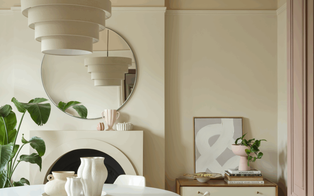
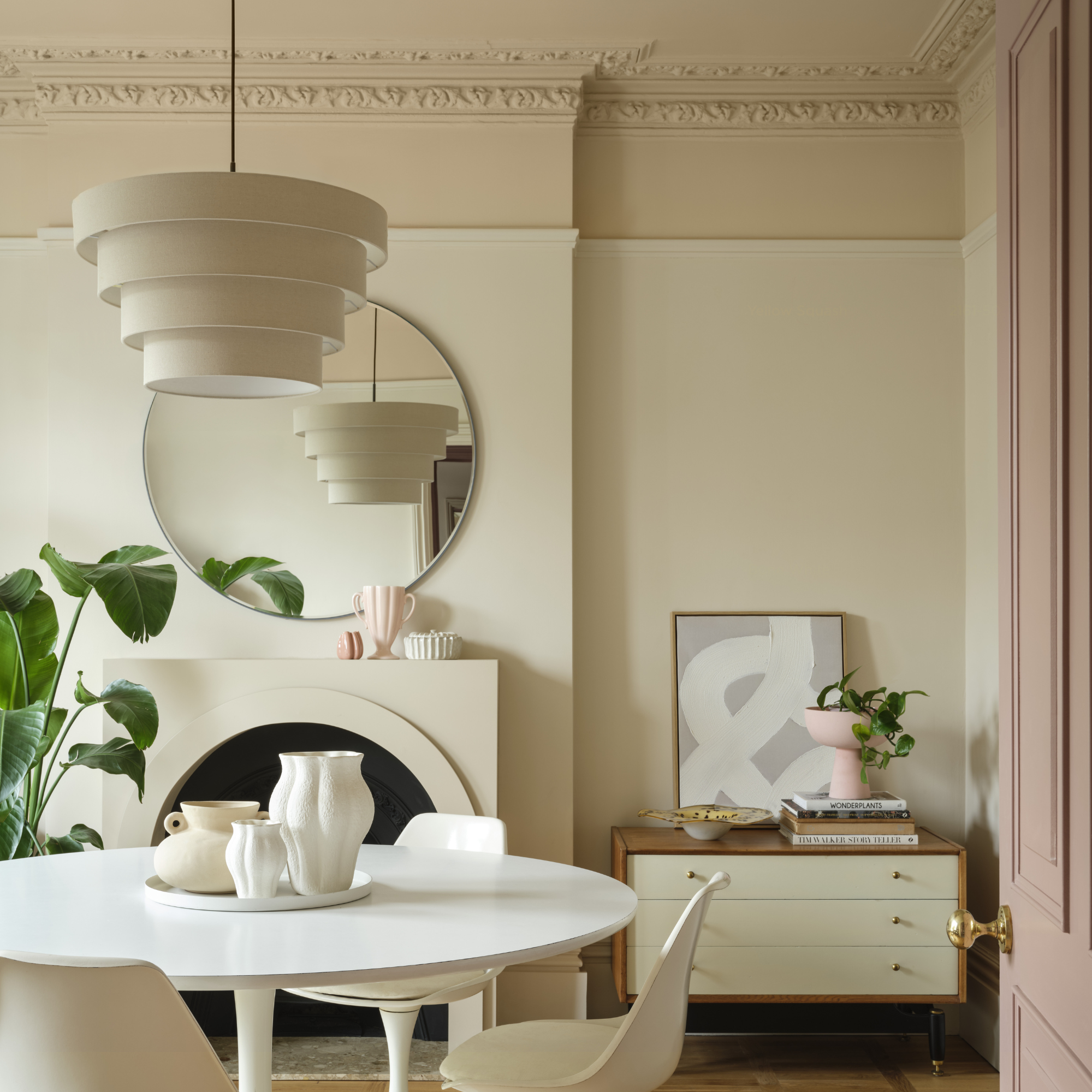
‘Colour capping involves enveloping a space in a tonal wash that gradually deepens the further up it goes, incorporating the often-overlooked fifth wall – the ceiling – into the design,’ says Helen Shaw, Director of Marketing at Benjamin Moore.
‘Unlike colour drenching, which uses a single hue across all surfaces, colour capping plays with multiple tones from the same colour family to achieve a layered, polished effect. By painting the ceiling in the deepest shade, the cornicing in a mid-tone and the walls in a lighter tone, it creates a subtle sense of cohesion and elegance.’
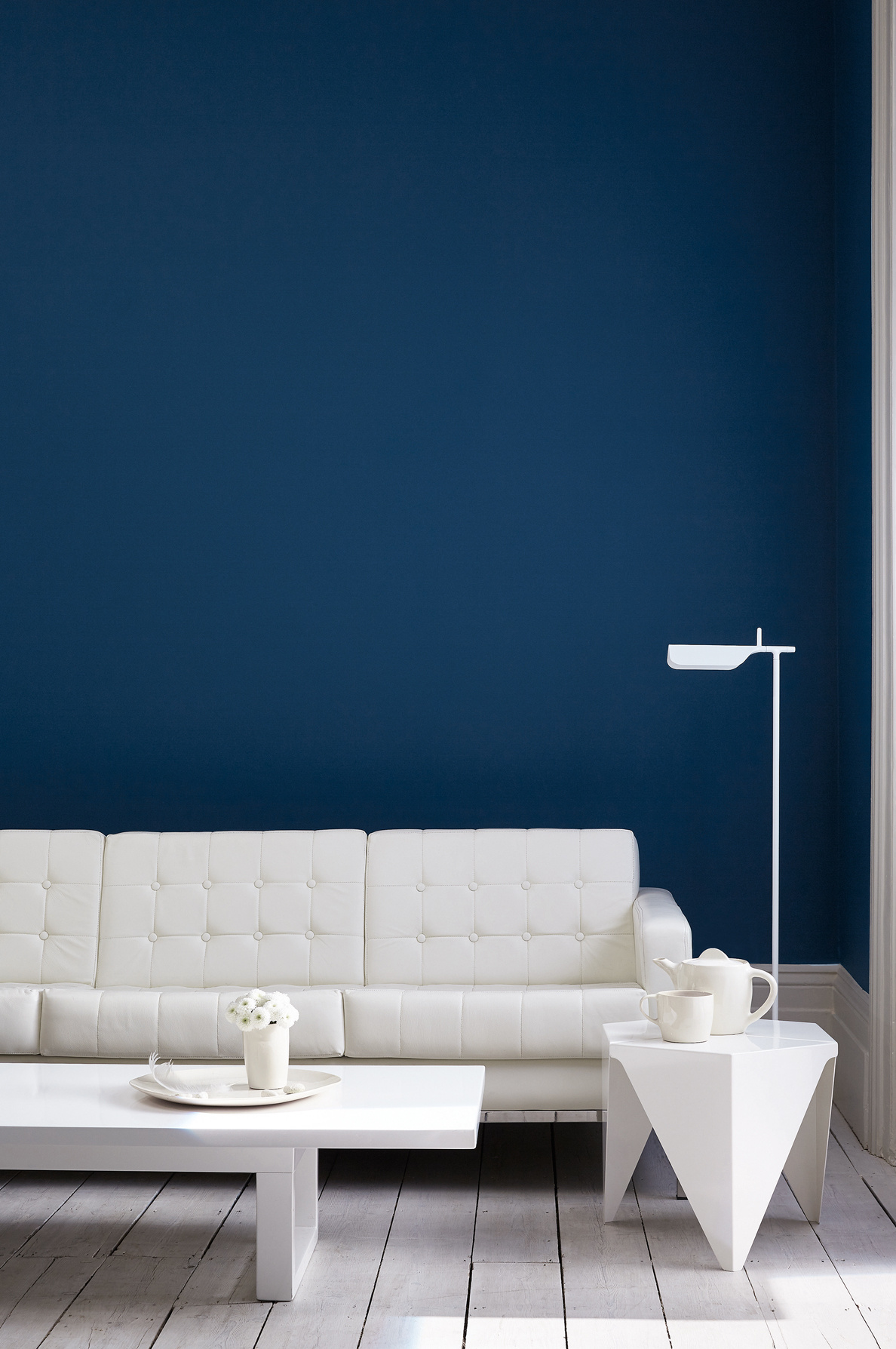
(Image credit: Benjamin Moore)
Back in December, I predicted colour drenching would evolve, and we’ve seen a range of takes on the trend from pattern drenching to tile drenching. By playing with hues from the same colour family, colour capping creates greater visual interest and can even make a room feel bigger.
‘Extending the wall colour onto the ceiling in a slightly darker shade creates a seamless, enveloping effect that not only gives flat surfaces a sense of dimension, but it can trick the eye into making the space feel bigger – the top half of the walls seamlessly blend into the ceiling, making it appear further away,’ says Helen.
But like colour drenching, don’t leave the skirting boards out. These should be included in the tonal wash to make your room feel more connected.
‘For a cohesive and contemporary feel, avoid combining with harsh bright white on skirting and woodwork. It’s always fantastic to see trends that banish the habitual white skirting and doors and embrace colour and pattern!’ comments Ruth Mottershead, Creative Director of Little Greene.
How to use colour capping at home
Painting your ceiling is a Marmite topic – you either love it or you hate it – but if you’re willing to trust the process, colour can elevate a room, especially a period property.
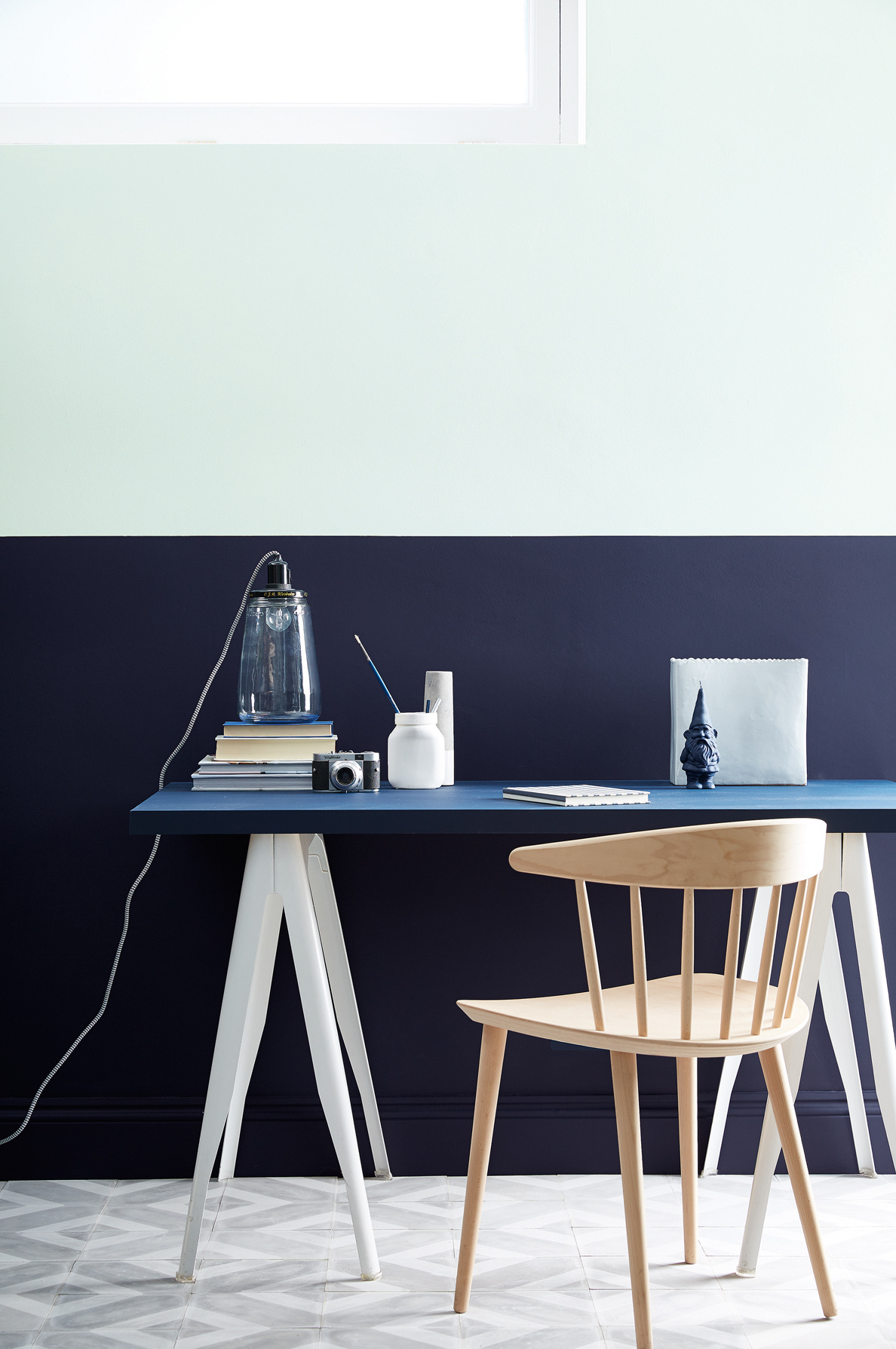
(Image credit: Benjamin Moore)
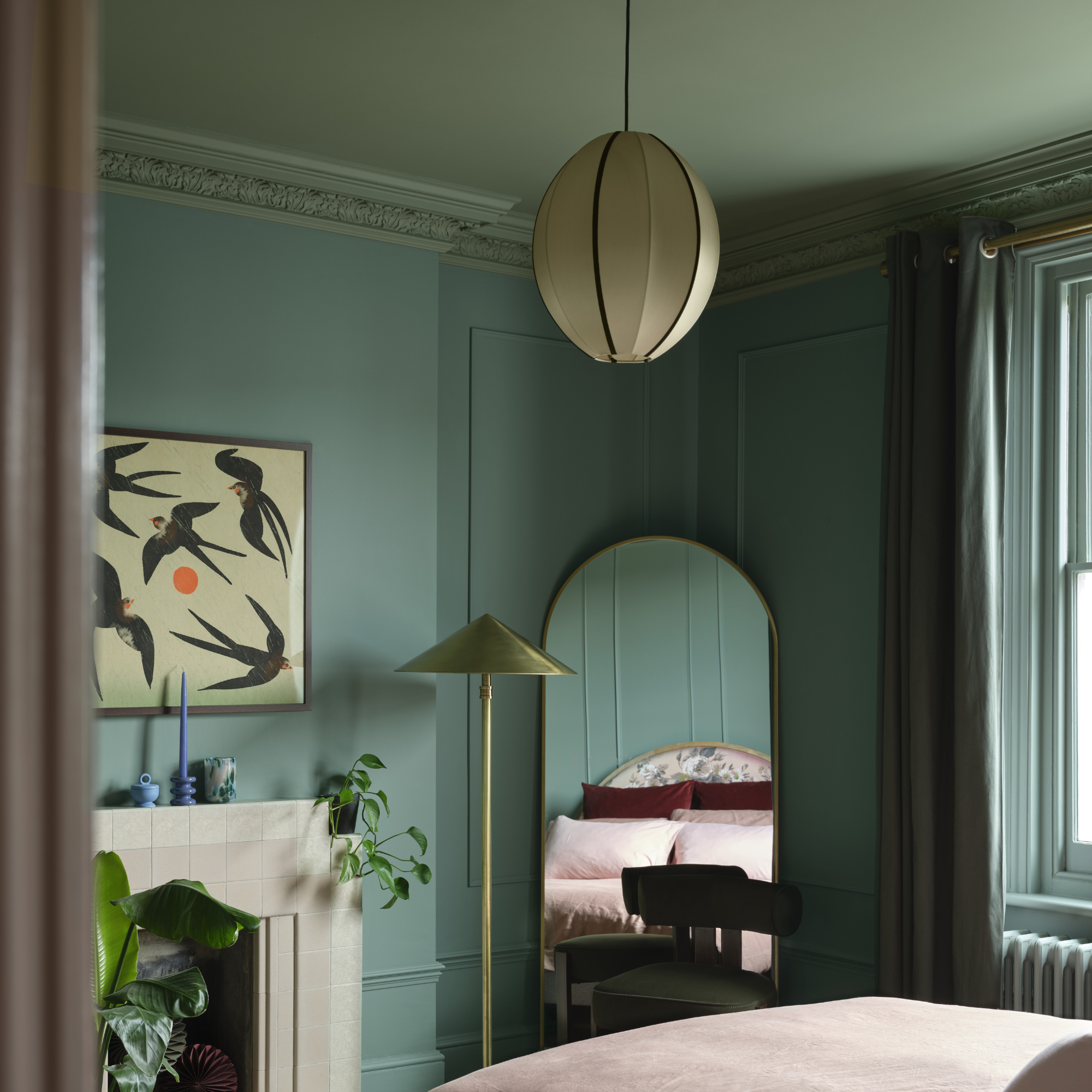
‘Colour capping works beautifully in any home, but for those in period properties, it enhances existing features such as decorative ceilings and fireplaces. Richer greens or blues work well here to mirror the depth of character of the home. However, the technique can also suit more modern properties to boost character in the absence of ornate architectural features,’ says Kathryn Lloyd, Crown Colour Specialist.
Colour capping naturally leans towards period homes as they typically have higher ceilings and more ornate detailings, which add extra texture and character. However, you can still make this work in modern homes, even if you have a low ceiling.
‘The beauty of these creative colour schemes is that they can be applied to any interior, be it a period property where architectural features such as cornicing, picture rails or mouldings can provide hosts for the use of colour, or in new build properties with low ceilings and few architectural details, where colour variations can be used to define areas and zone spaces, adding design detail where none is present architecturally,’ says Ruth.
What colours should you use?
Now the fun part: what colour should you opt for?
‘Choosing colours that have versatility is key to colour capping, as you’ll need at least three shades from the same family. If your aim is to enlarge a space, select light, muted shades such as blues or greens, as they make walls look taller,’ Kathryn recommends.
‘Shades such as Moonlight Bay and Mellow Sage will also reflect the natural light that comes through, giving the illusion of a larger space. These can then be paired with deeper shades such as Midnight Navy and Botany Bay to create that colour capping effect.’
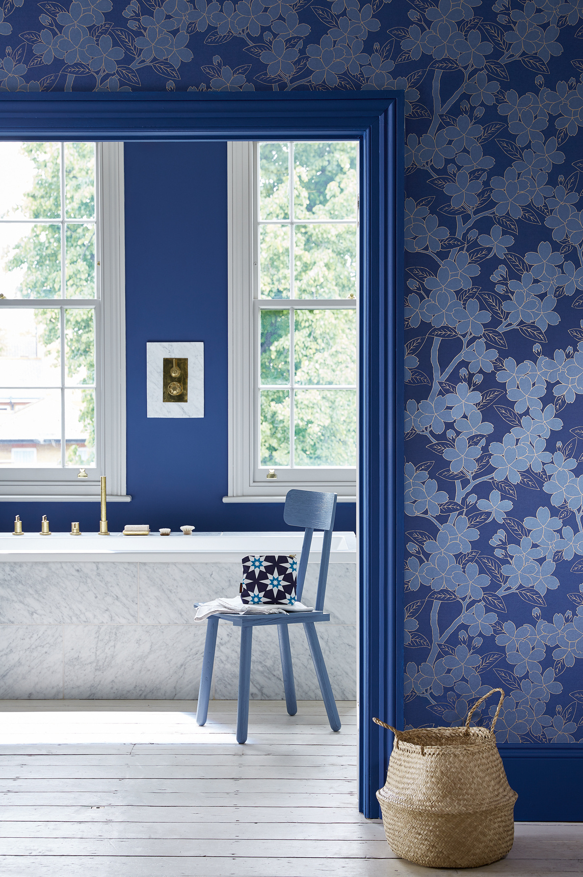
(Image credit: Future PLC/Katie Lee)
But if you prefer a neutral colour scheme, don’t worry, as despite it being a bolder painting technique. Colour capping looks beautiful when completed with natural hues.
‘This is a finish that can be quietly impactful, even in a palette of neutrals, where an off-white wall colour is capped with a slightly more saturated hue in the same tone, gently drawing attention to the ceiling as an integral part of the décor,’ says Helen.
In terms of what to avoid, Helen says to keep away from clashing colours or colours that lack harmony. ‘The transition between wall and ceiling shades should feel intentional and cohesive, not accidental or mismatched,’ she says.
‘Colour capping may not be the right choice in spaces with overly complex ceiling structures or when there’s already a lot of visual noise from architectural features, patterns or textures. In such cases, the added layers might feel too busy. It’s also worth avoiding this technique in very small, dark rooms where using a deep ceiling colour could feel overly enclosed – unless you’re specifically after a moody, intimate vibe.’
Get the look
Ruth say you can create a cohesive and eimpactful effect by using these colours. Using navy hues for a calming and comforting look, see for yourself how these colour harmonise with each other.
Royal Navy™
Dock Blue™
Do you think colour capping will be the new big paint trend?
TOPICS